 Plus
Plus

After office on Monday, why not? We couldn't think of a better way to starting the week. And Ana Andreeva and Stepan Petrov's design brings up an excuse for us to grab a beer today. Method is a restaurant located in Moscow, constructed where an old ceramic factory, carrying the spirit of Russian constructivist traditions.
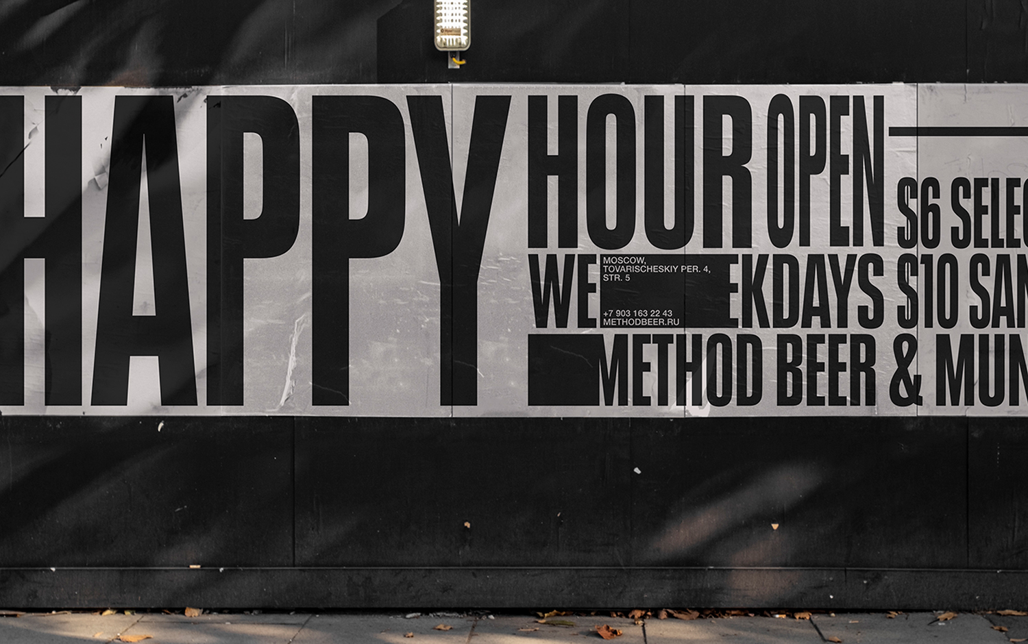
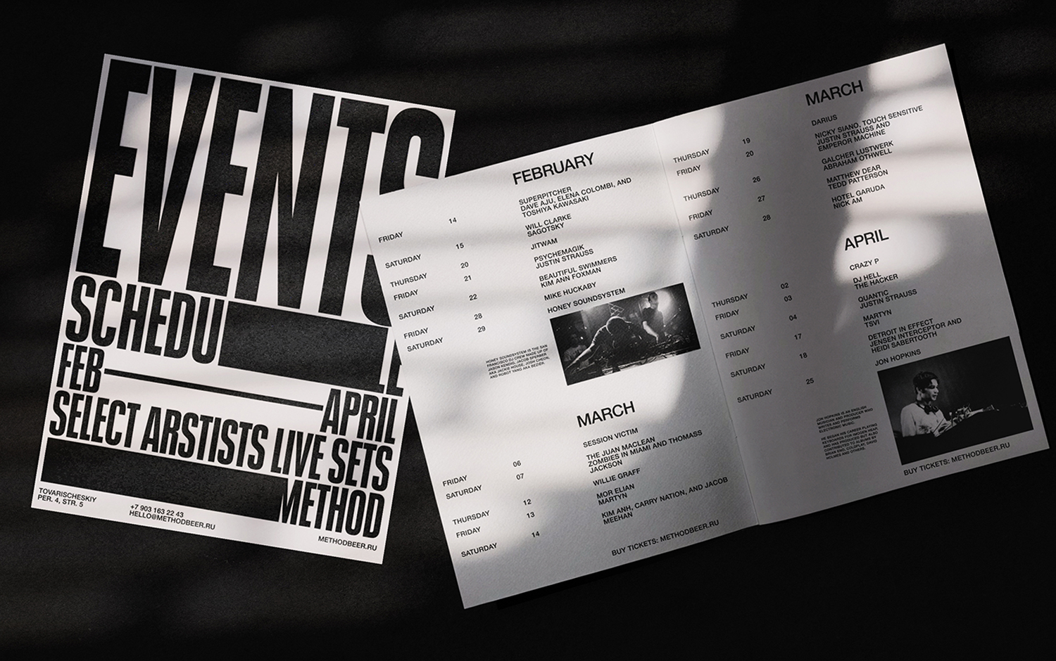
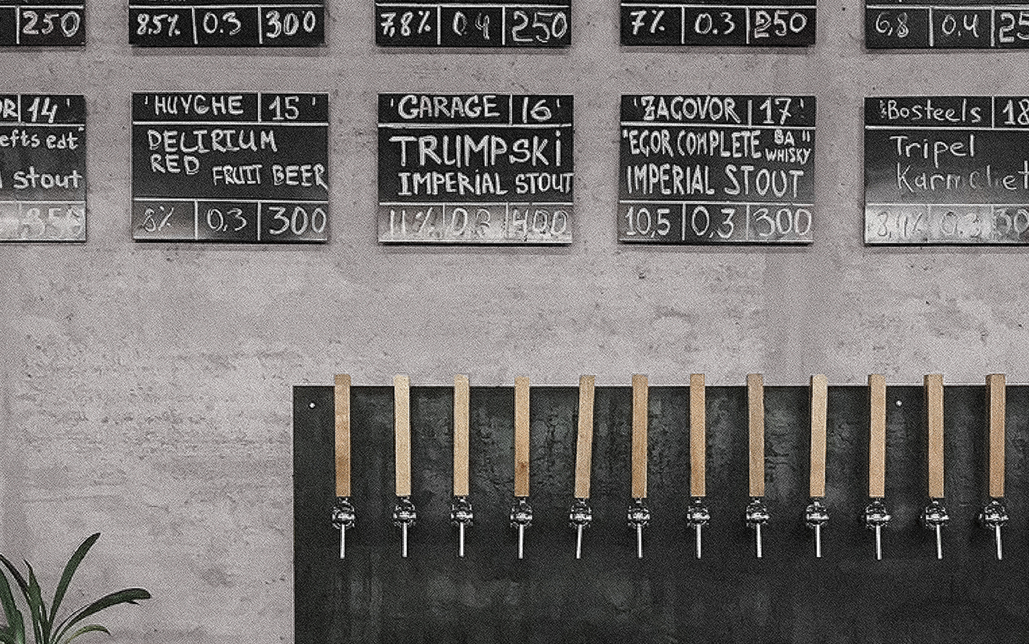
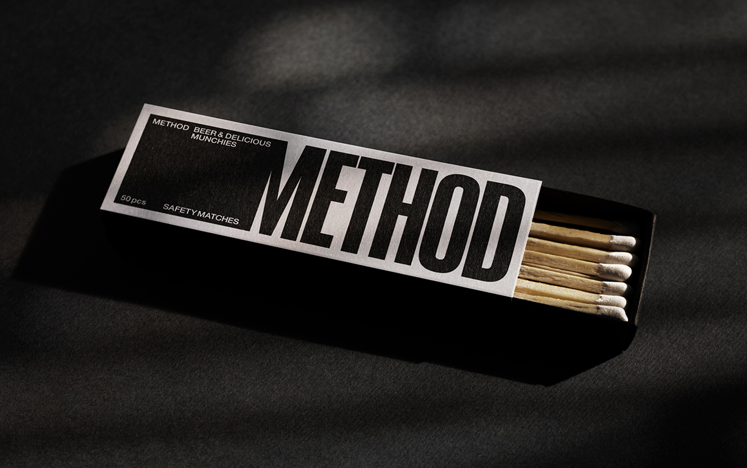
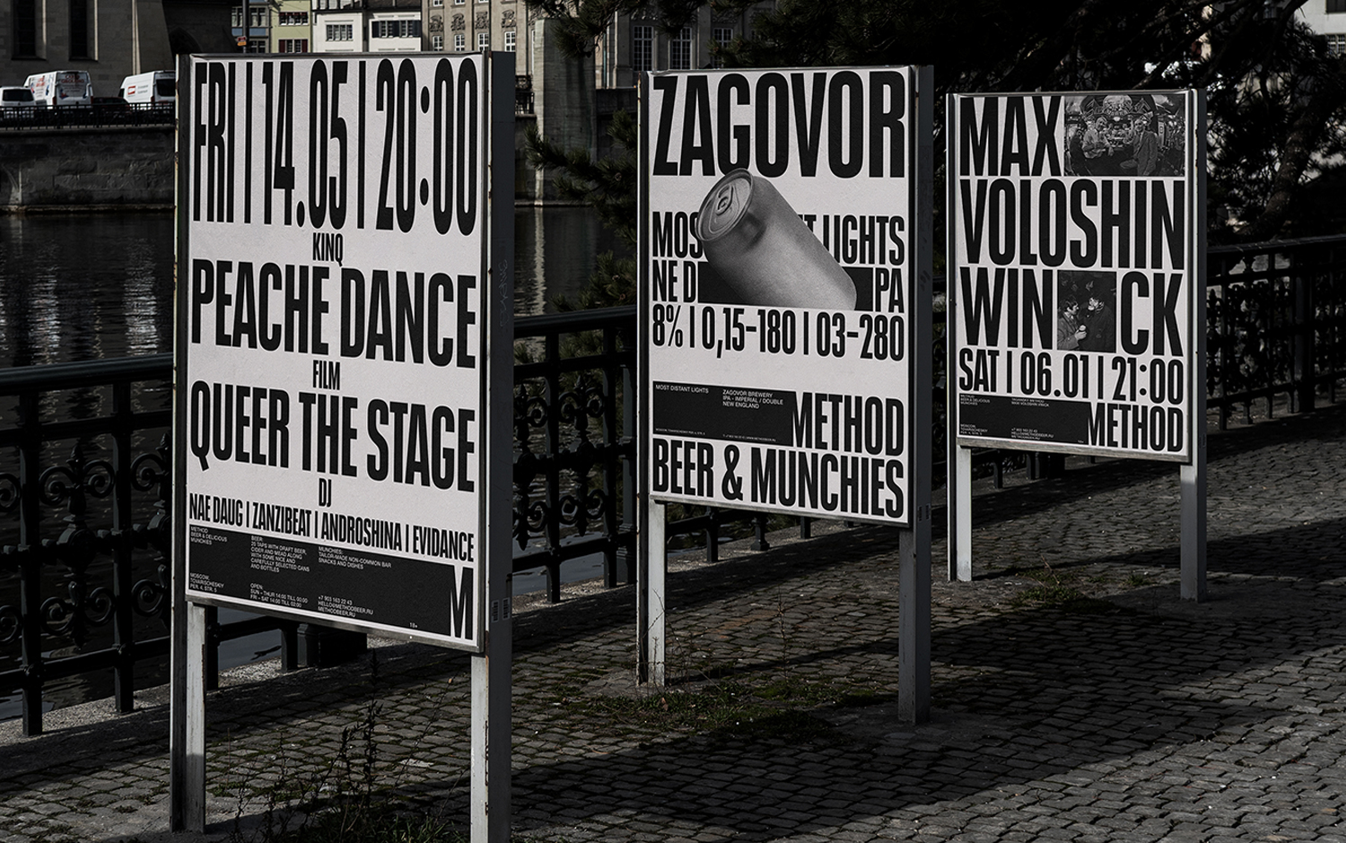
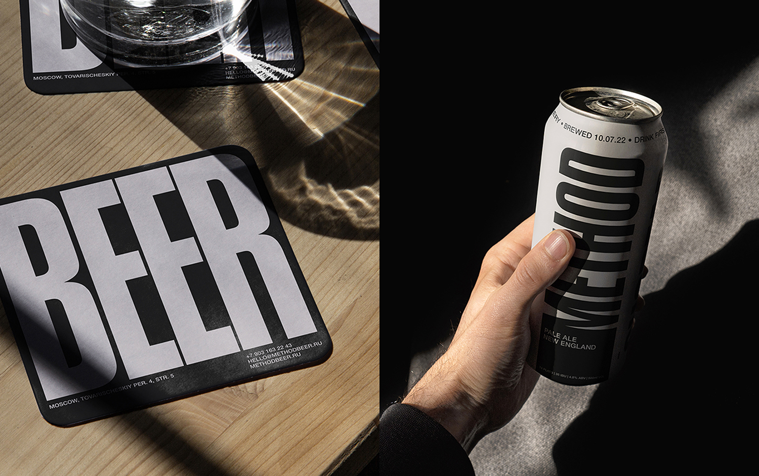
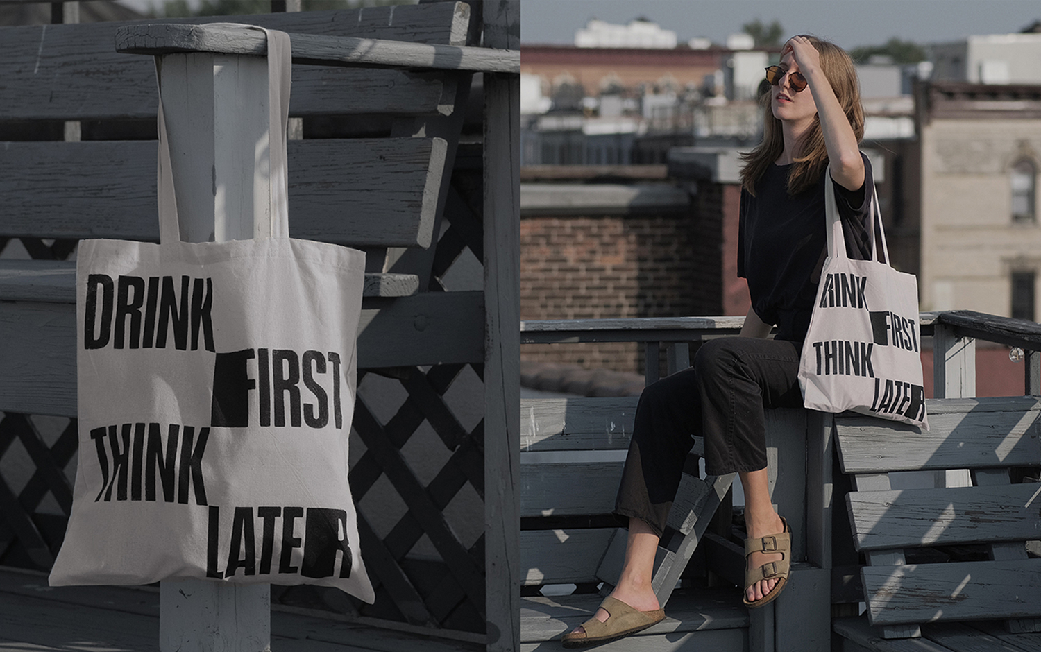
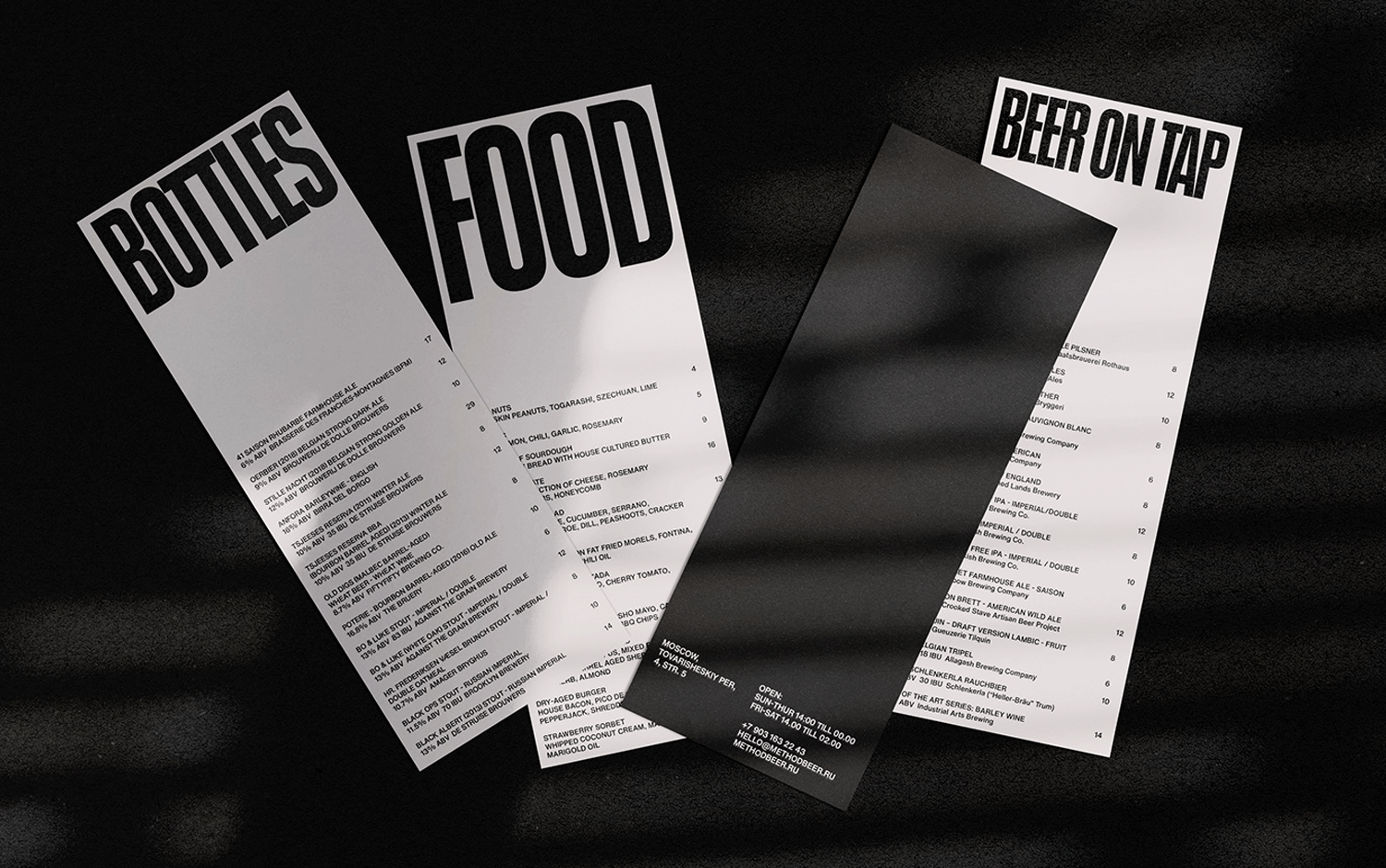
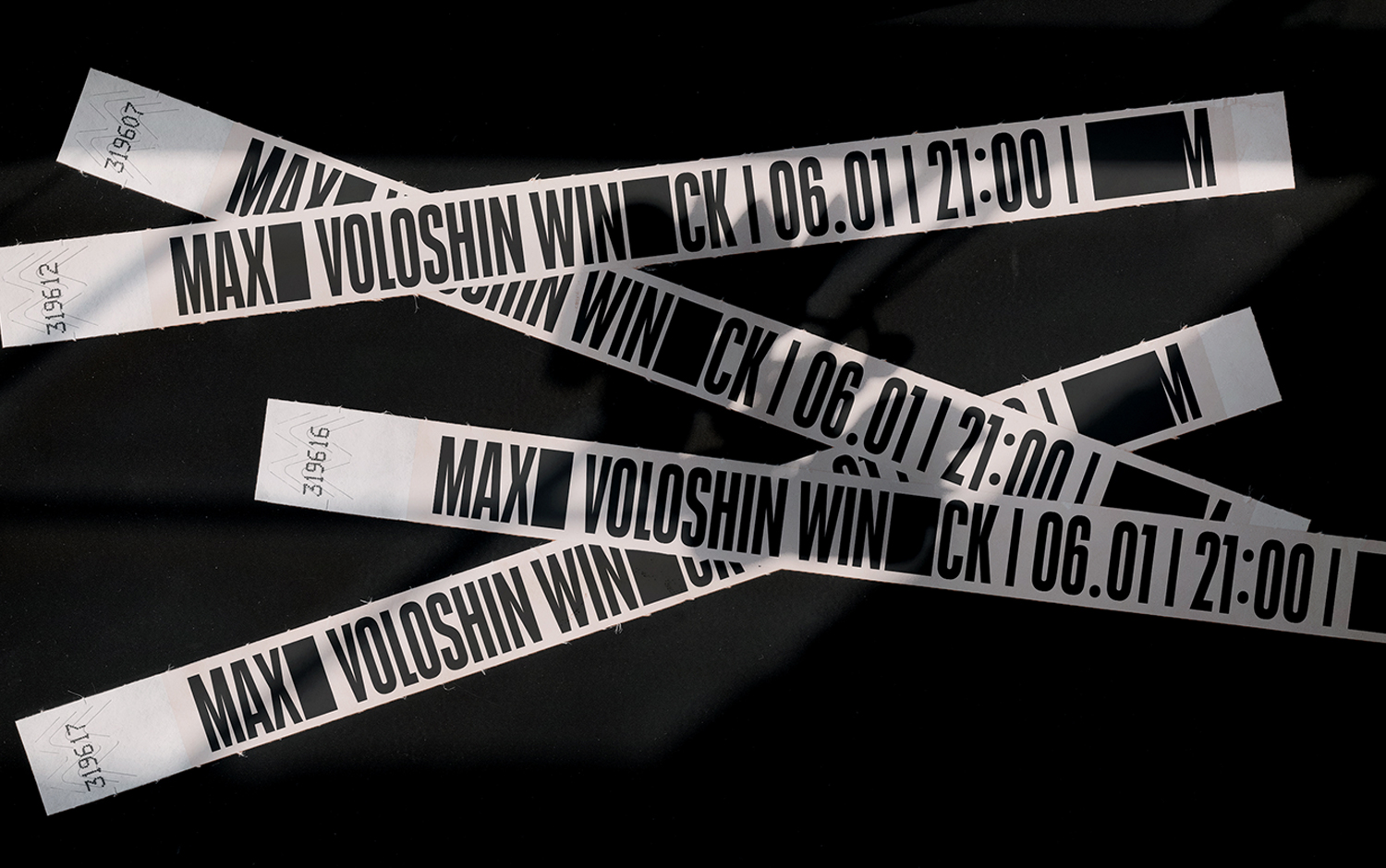
Method is a restaurant, bar, and event space. Along with interior designers, Ana and Stepan built up the place's warm yet sharp identity. The flexibility of ceramics and rigidity of Russian modernist design aesthetics: think black square. The black plaques on the restaurant walls stretch, modify, and attach to letters in the identity. Typography is flexible and clay-like - it flows and bends just like pottery. The visual language, built on sharp typography and soft muted colors, spreads along with materials and assets like merchandise, coasters and glasses, interior spaces, event brochures, website, posters, and menus. And who hasn't been in a bar and wanted to take home the splendid coasters. Well, here's the same scenario.
We are enchanted with this cool design concept for a restaurant featuring a historical background, combining Russian design and industry influences. And we're looking forward to someday visiting Method and enjoy a couple of pints. Meanwhile, we invite you to scroll down and crave a cold beer.
Credits: Ana Andreeva & Stepan Petrov
