


Armin Brenner & Markus John
April 17, 2021
Mindsparkle Mag


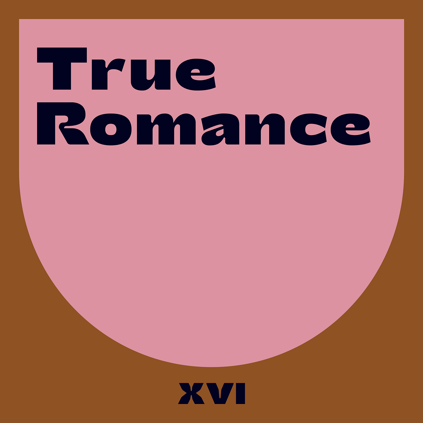
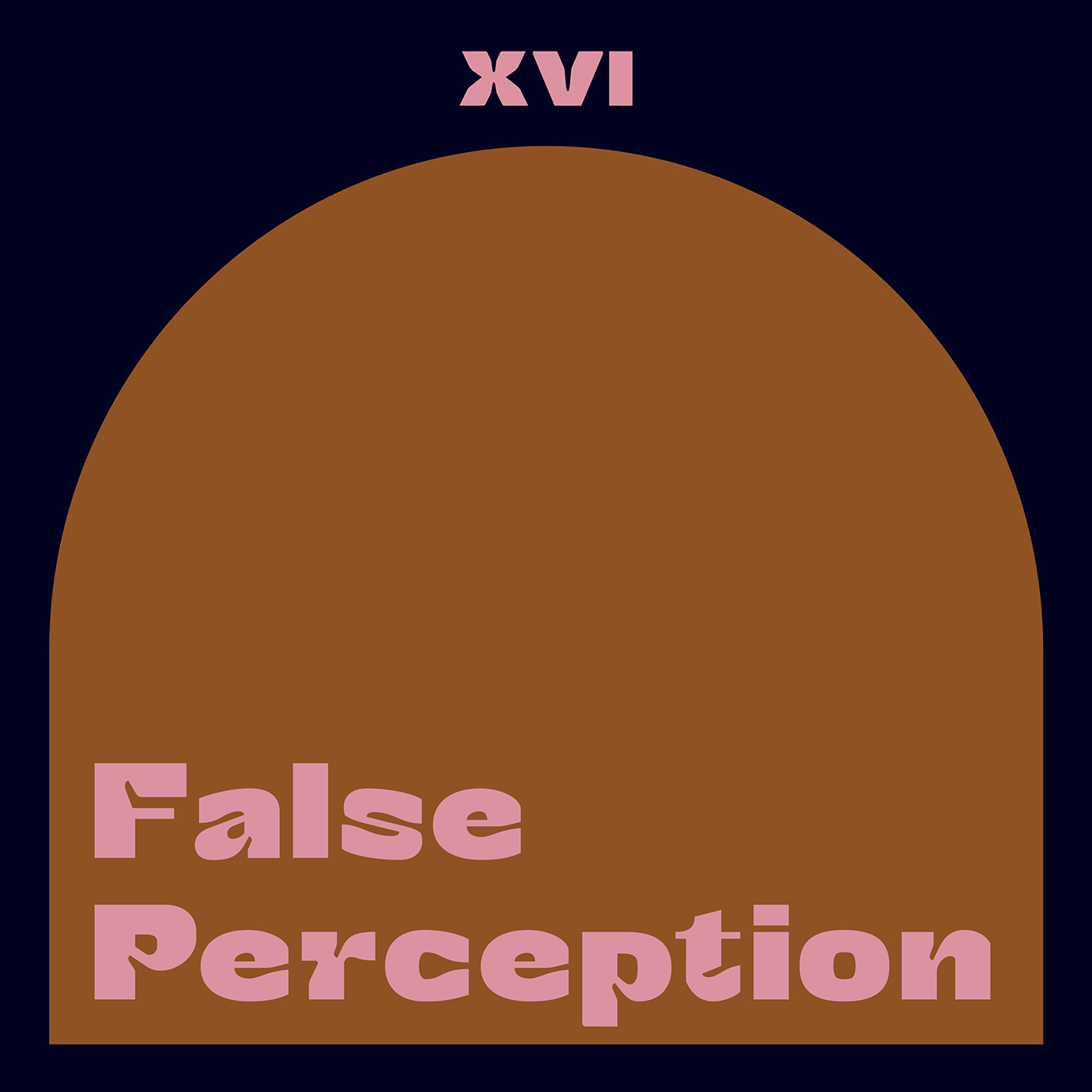
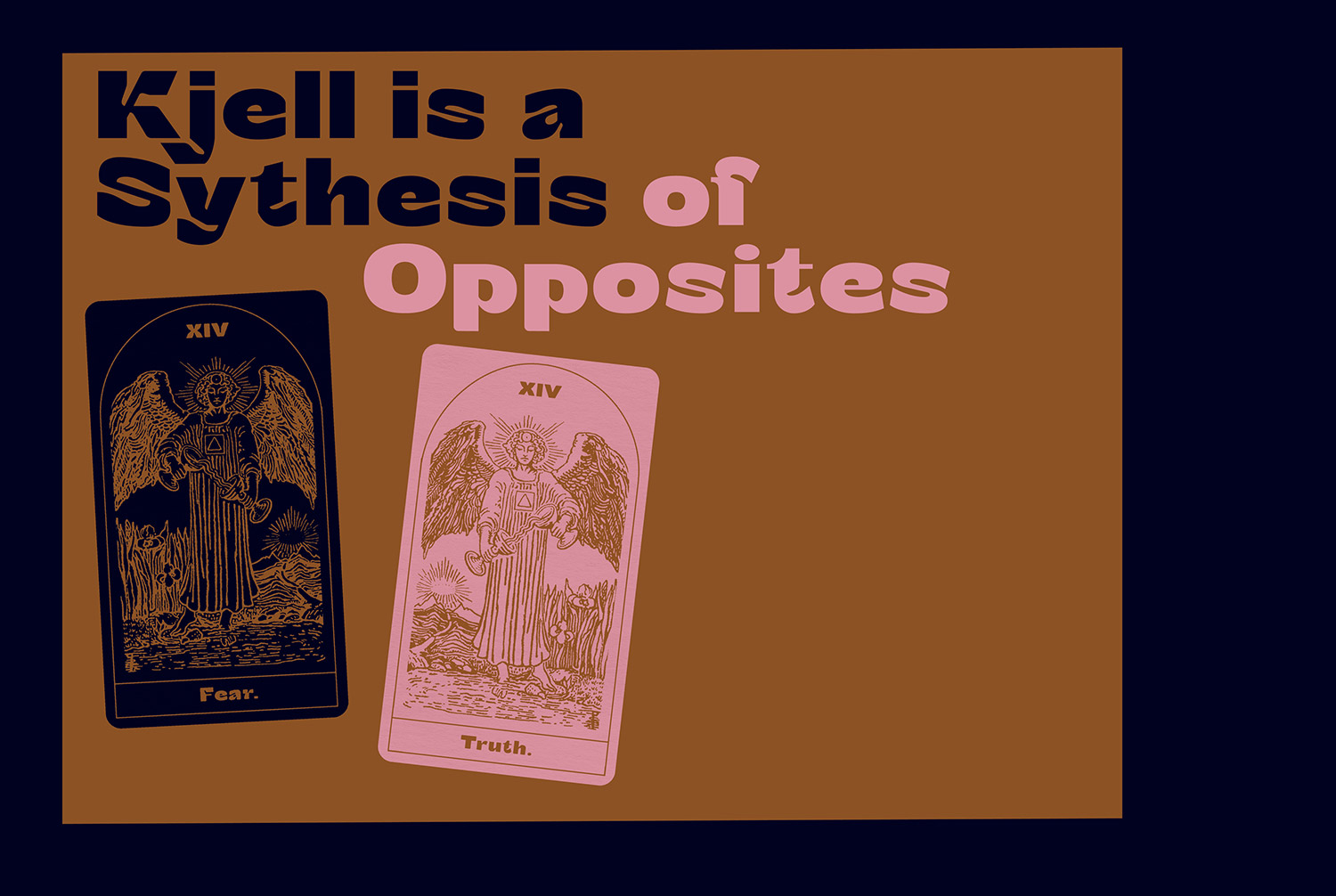
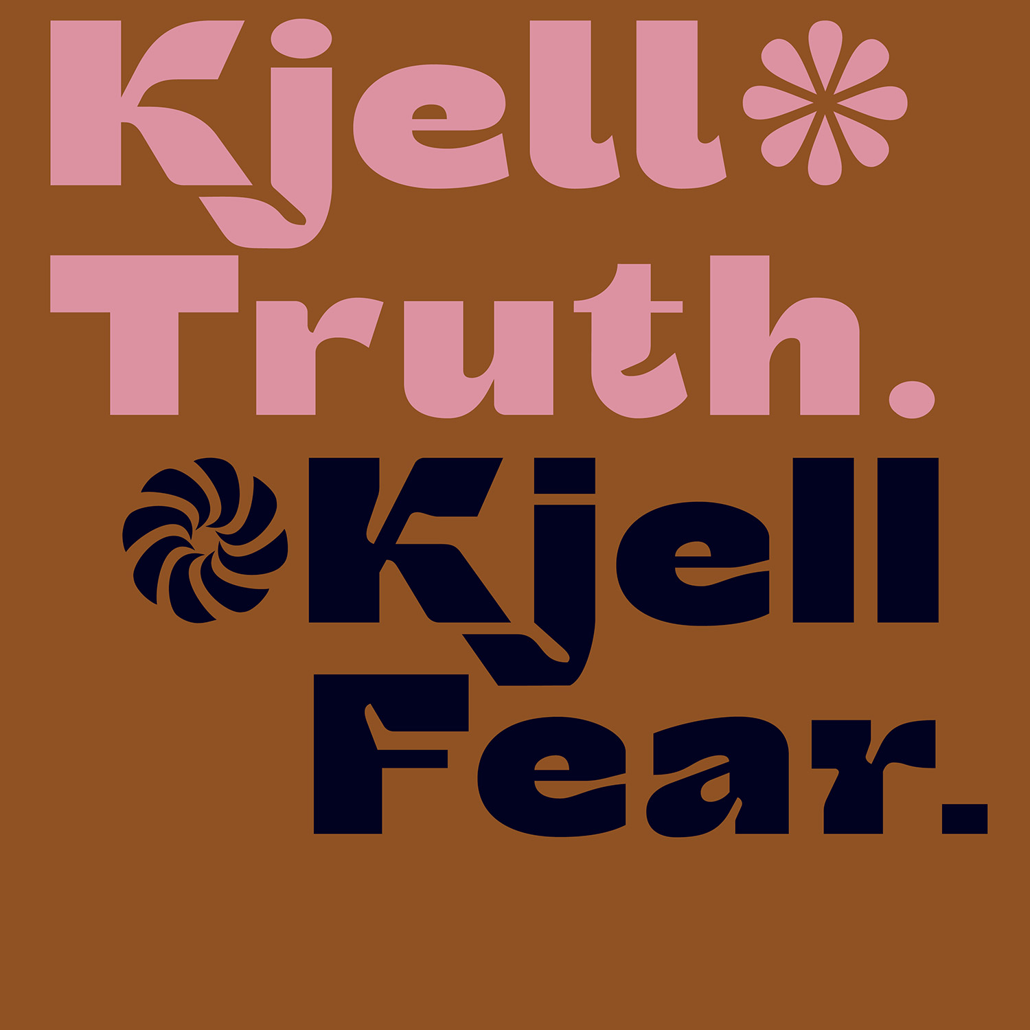
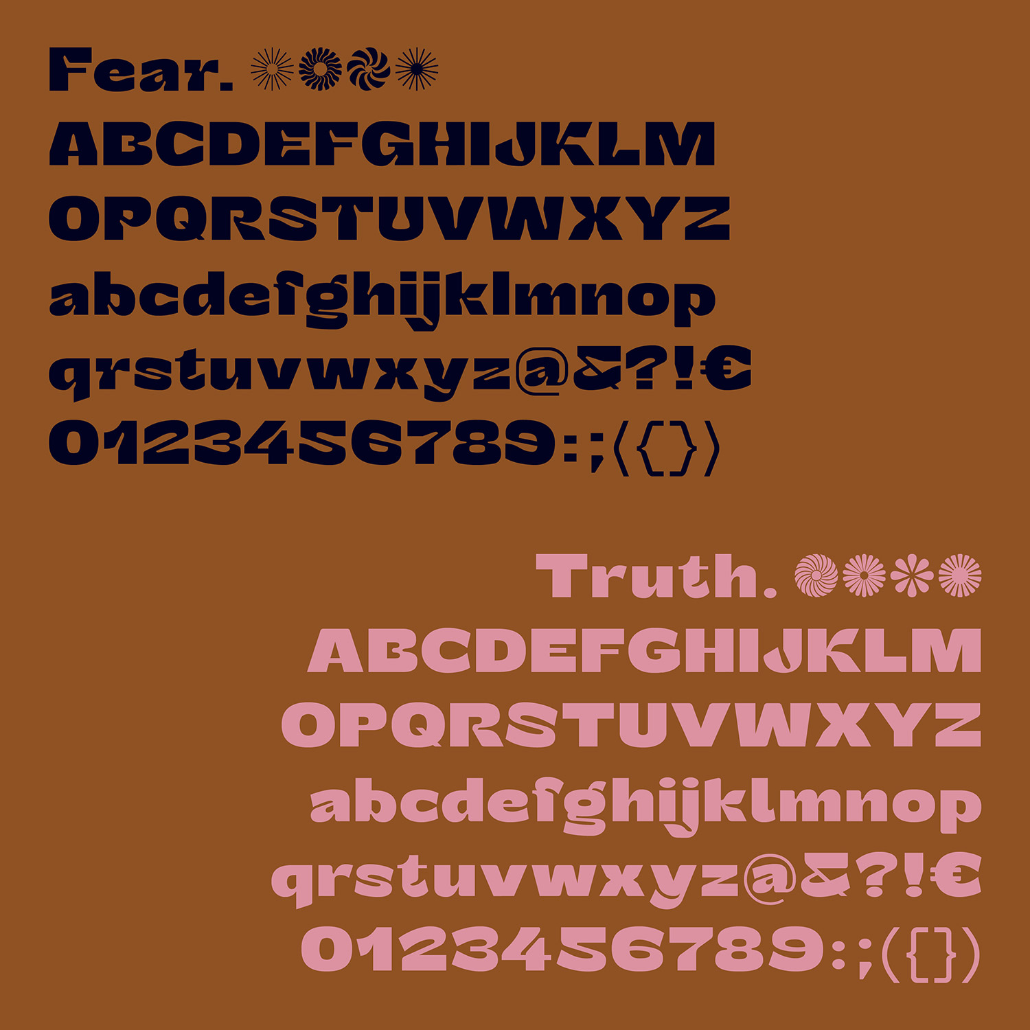
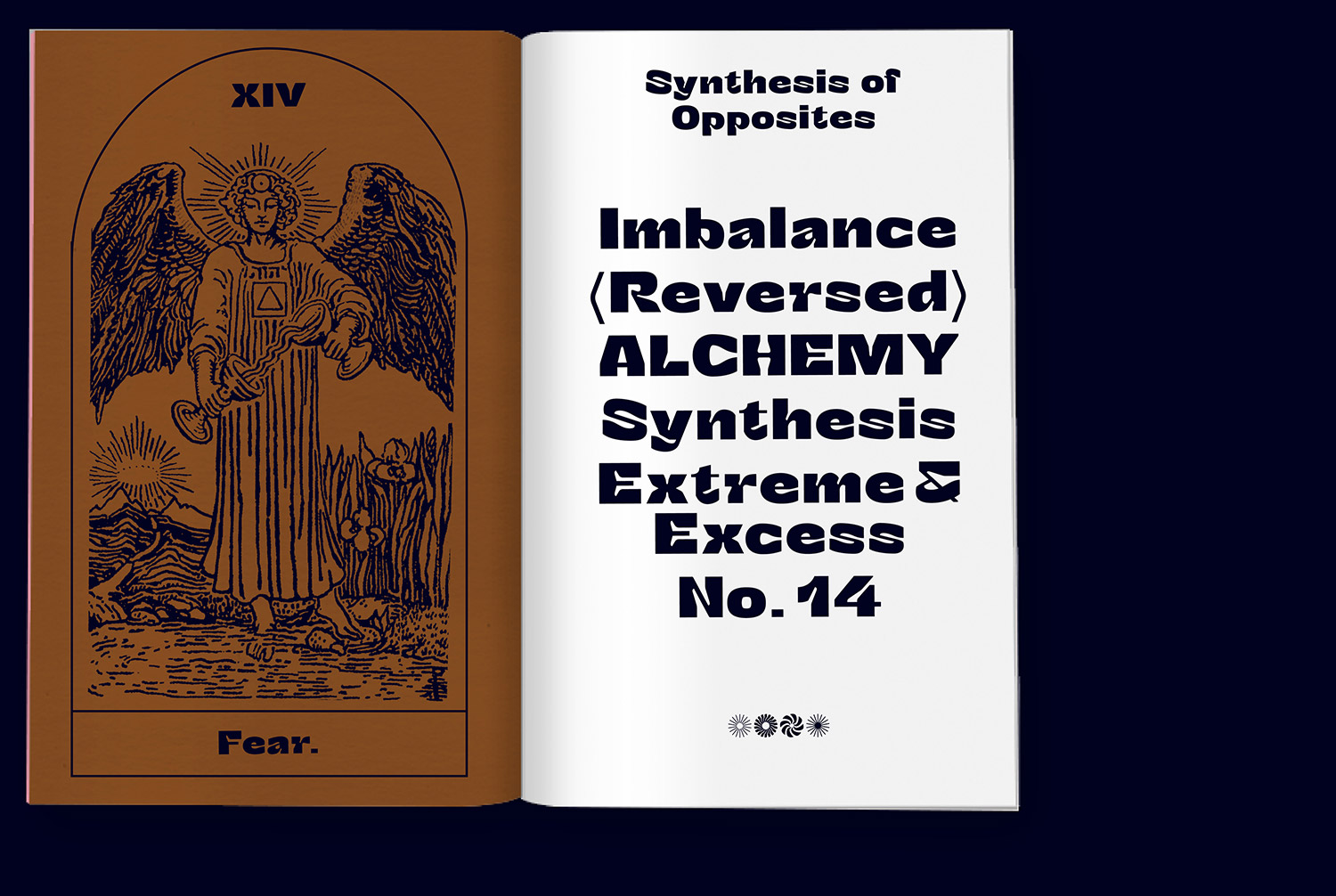
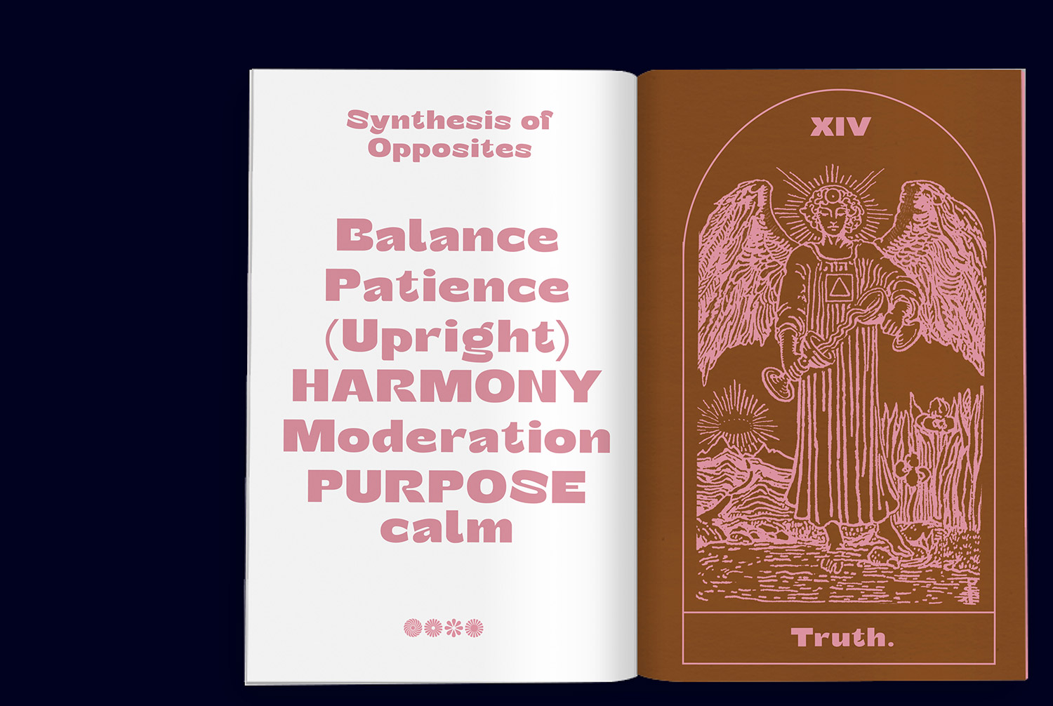
Armin Brenner & Markus John designed Kjell typeface - Synthesis of opposites. Kjell is a conceptual display typeface balancing between its two extremes. The typeface combining two different faces - the »Fear« and »Truth« weight, which are made out of one stem.
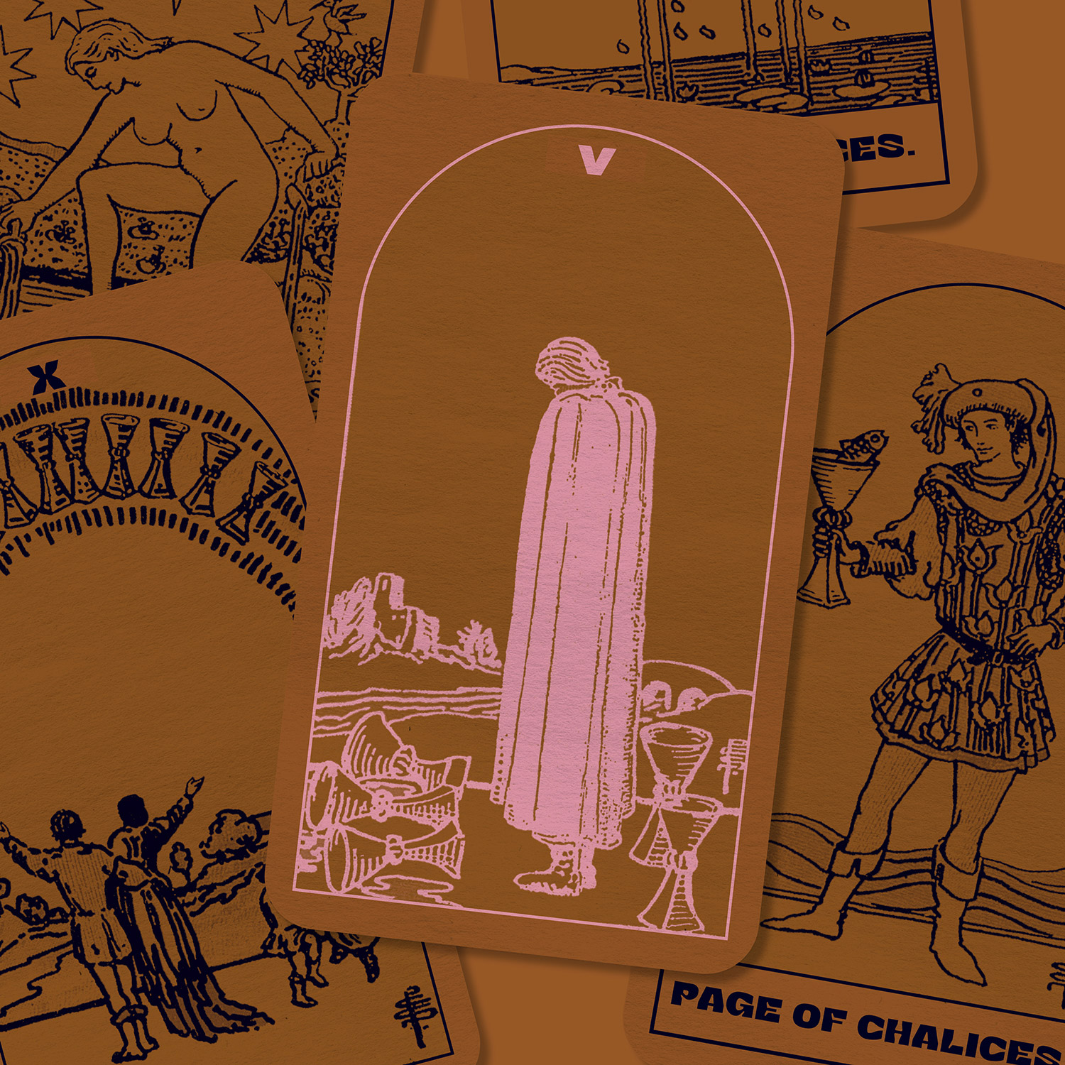
Inspired by the 14th tarot card of temperance, Kjell understands itself as a synthesis of its two opposites, which are representing a process of harmonization.
Both of the extremes have their details – while the »Fear« extreme is characterized through deep ink traps, the »Truth« extreme appears more softly with its rounded edges. Both extremes are characterized by their details and are duel each other. Referring to its architecture and appearance, Kjell is intended as a display font. With its extensive set of glyphs, it is multilingual and contains a large number of accents, punctuation, symbols and special characters.
Credits: Armin Brenner & Markus John


