 Plus
Plus

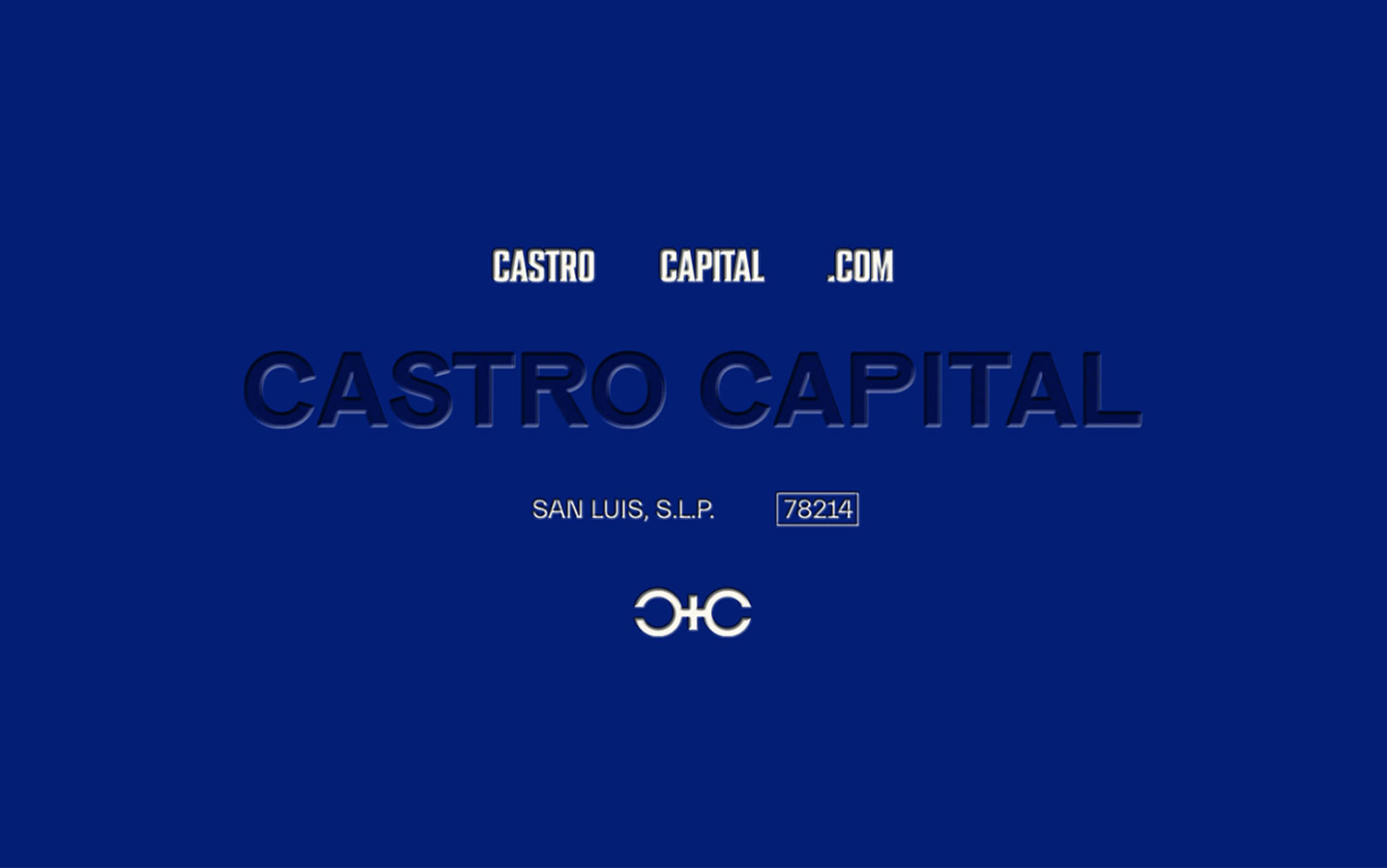
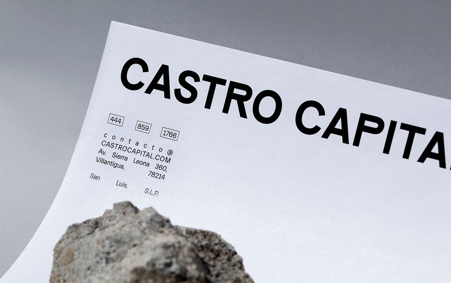
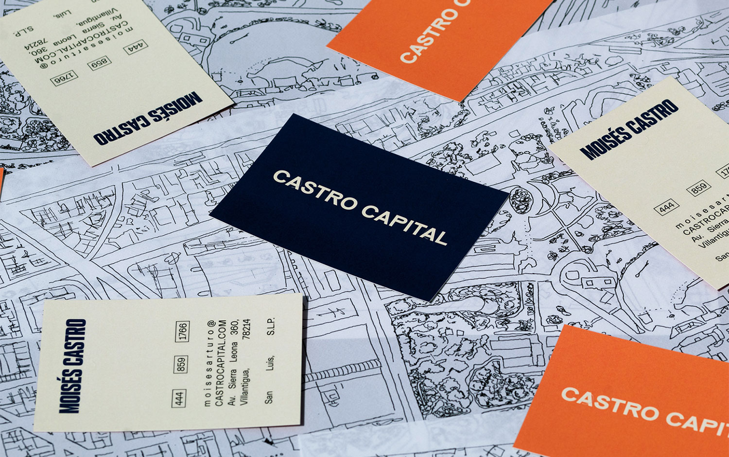
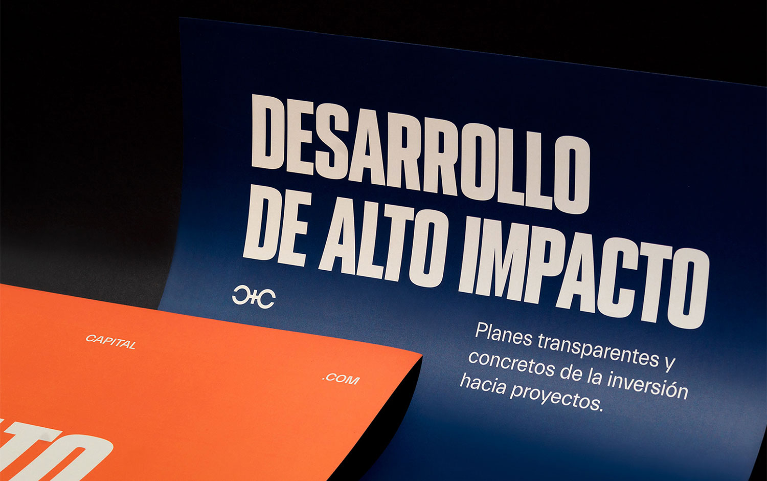
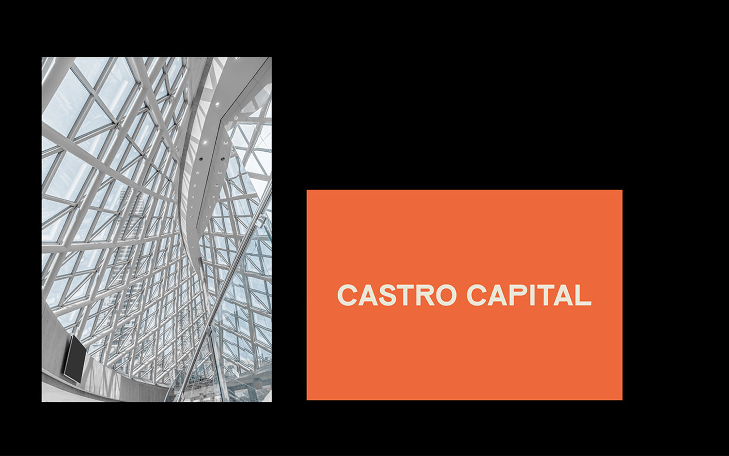
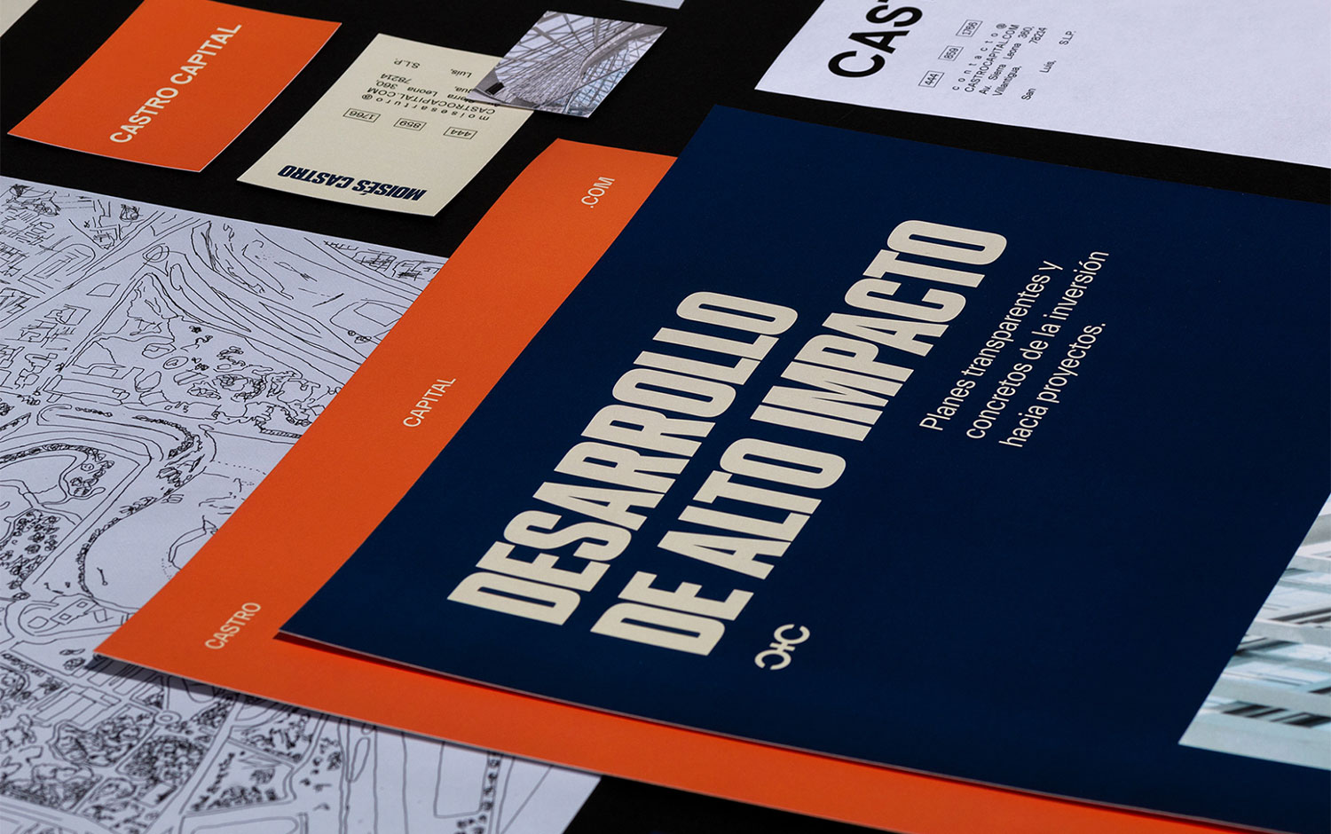
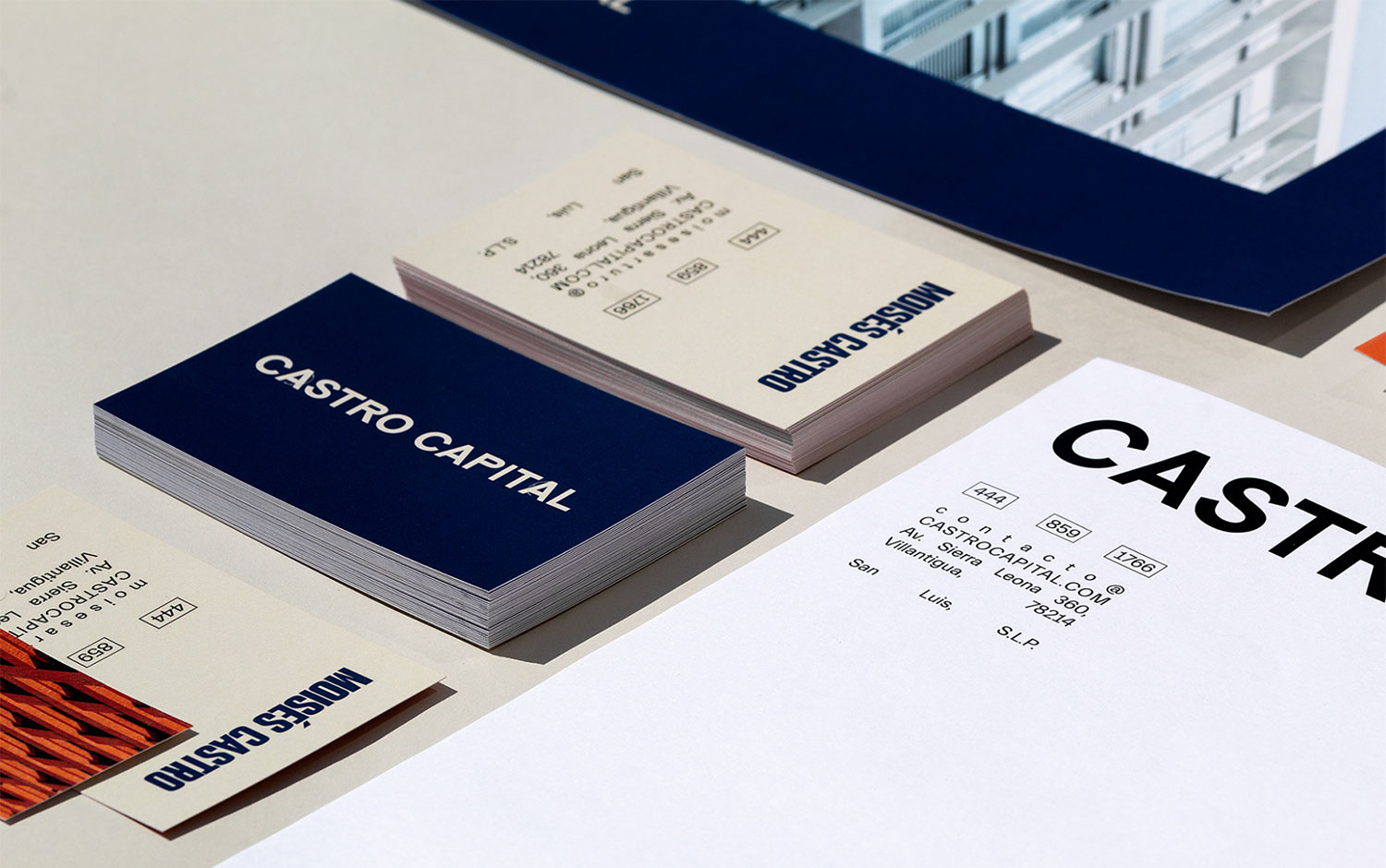
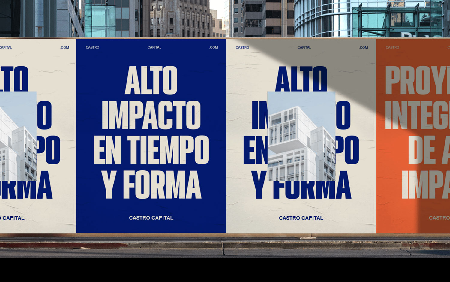
Castro Capital is a project that aspires to be an ally for its clients in the real estate world. In order to represent this vision, MK+2 created a modern, minimalist brand that showcases a feeling of elegance for the future.
Designed as a straightforward yet elegant logo. The letter "R" and "P" stand out due to their style, positioning a high-quality concept. Simple details that help distinguish Castro Capital from the competition.
Inspired by luxury, the monogram represents the two "C's," portraying them in an asymmetrical and elegant design. They are joined together by the "+" symbol, speaking for the contributions they make to their projects and investors. More than textures, the brand uses a unique way to distribute its visual elements based on geometric shapes, highlighting typographic hierarchies and filling empty spaces with minimalist elements to complement the visual frame.
Credits: MK+2
