Plus
Plus

 Menu
Menu


Sheree Hannah
June 27, 2019
Mindsparkle Mag


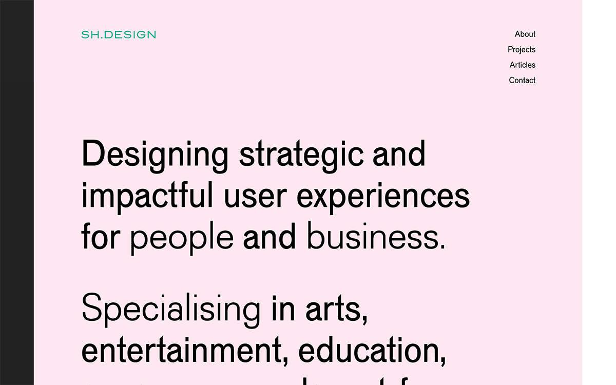
Sheree Hannah opens her portfolio on a soft blush-pink canvas, warmed further by a teal SH.DESIGN wordmark and a slim black margin. A large, plain-spoken headline — “Designing strategic and impactful user experiences for people and business” — states her focus with directness and calm. The restrained sans-serif type and gentle colour make the page feel considered and human rather than clinical. A simple menu of About, Projects, Articles and Contact keeps everything easy to navigate. It is a clean, assured showcase of ux design and thoughtful ui/ux thinking.
Credits: Sheree Hannah
More in Portfolio
Stay on top of this week's design. Insights, top picks & more.