Plus
Plus

 Menu
Menu


Satu Pelkonen
June 11, 2020
Mindsparkle Mag


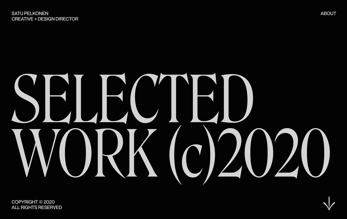
Satu Pelkonen, a creative and design director, introduces her portfolio with a single, beautifully confident gesture. A black screen carries the words Selected Work (c)2020 in an enormous light-grey serif with tall, condensed letters and sharp, flared details. Small uppercase sans-serif labels sit in the corners for her name, title, About and copyright, with a thin arrow pointing down to the work below. The contrast between the dramatic display face and the tiny supporting text gives the page an editorial, almost cinematic feeling. The Satu Pelkonen portfolio shows how much typography alone can say about a designer's art direction.
Credits: Satu Pelkonen
More in Portfolio
Stay on top of this week's design. Insights, top picks & more.