Plus
Plus

 Menu
Menu


Pierrick Calvez
August 14, 2020
Mindsparkle Mag


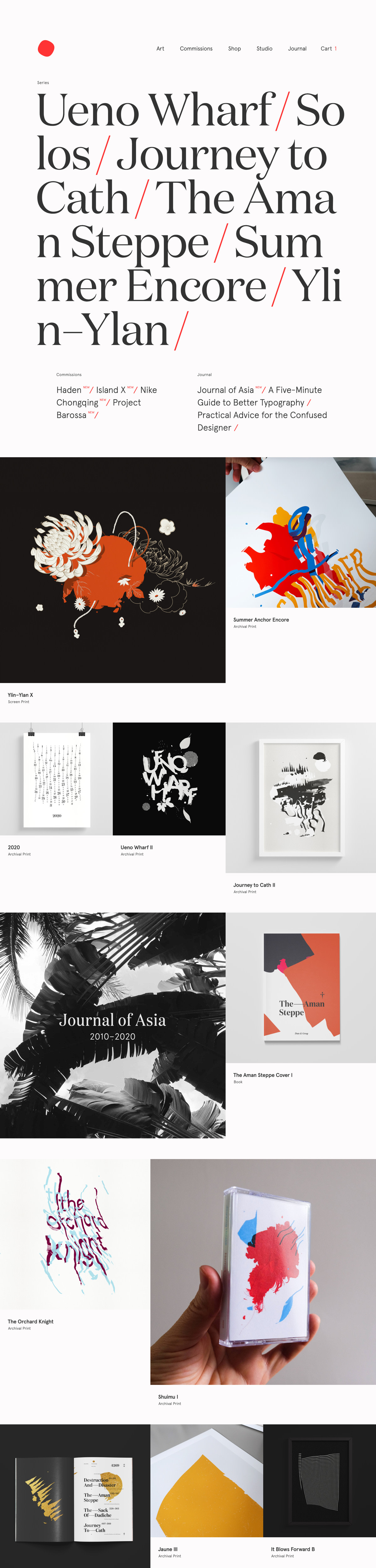
Pierrick Calvez presents his studio with the poise of a fine-art catalogue, opening on a crisp white page where project titles — Ueno Wharf, Solos, Journey to Cath, The Aman Steppe — cascade in a large, graceful serif punctuated by bright red slashes. A single red dot serves as the logo above a tidy navigation of Art, Commissions, Shop and Journal, setting an unhurried, editorial tone. Below, a generous grid reveals the work itself: expressive floral illustrations, gestural screen prints, considered book covers and even a printed cassette, all photographed with care. The restraint of the framing lets each colourful piece sing. It is an elegant showcase where illustration and confident typography share equal billing.
Credits: Pierrick Calvez
More in Design Agency
Stay on top of this week's design. Insights, top picks & more.