Plus
Plus

 Menu
Menu


Pillars Brewery
September 03, 2022
Mindsparkle Mag


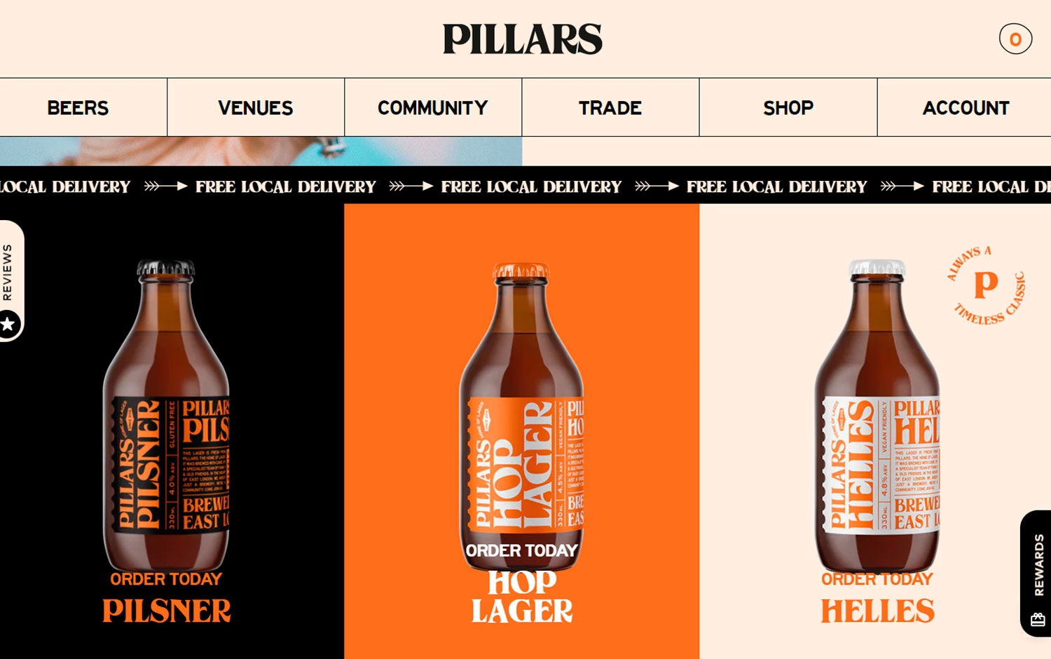
Pillars Brewery presents its East London lagers through a bright, well-branded storefront that feels both premium and approachable. An elegant serif ‘Pillars’ wordmark sits above a tidy navigation, with a scrolling ‘Free Local Delivery’ marquee threading arrows across the page. Below, three colour-blocked panels — black, orange and cream — each spotlight a single amber bottle for the Pilsner, Hop Lager and Helles, their bold striped labels reading clearly against the flat backgrounds. Circular badges and stacked serif callouts add a timeless, craft-shop charm. It is clean, confident branding and product-led web design.
Credits: Pillars Brewery
More in Alcohol & Spirits Packaging
Includes freebie bundle, unseen BTS insights and more.