



 Plus





Black Friday 50% off Plus
Unlock InsightsBlack Friday 50% off Plus
Unlock Insights Menu


Shoreditch Design
November 22, 2026
Mindsparkle Mag


Stablecoins have spent years dressed in the visual language of casinos, with neon gradients, rocket ships and the promise of fast money. OpenTrade, which builds the infrastructure that lets fintechs offer stablecoin yield to their customers, wanted the opposite: a brand that earns trust before it asks for anything. London studio Shoreditch Design began with in-depth discovery workshops to define OpenTrade's market position and anchored the whole project on one line, “Make every balance count.”
That line shapes a visual identity that feels crafted, modern and distinctly human. The symbol is a hexagonal cube with one corner pulled away, sketched by hand and tested against dozens of geometric forms on a dot grid before it was resolved. In motion it assembles from a field of dots, and the same isometric language extends into diagrams that show capital moving from vaults into growth.

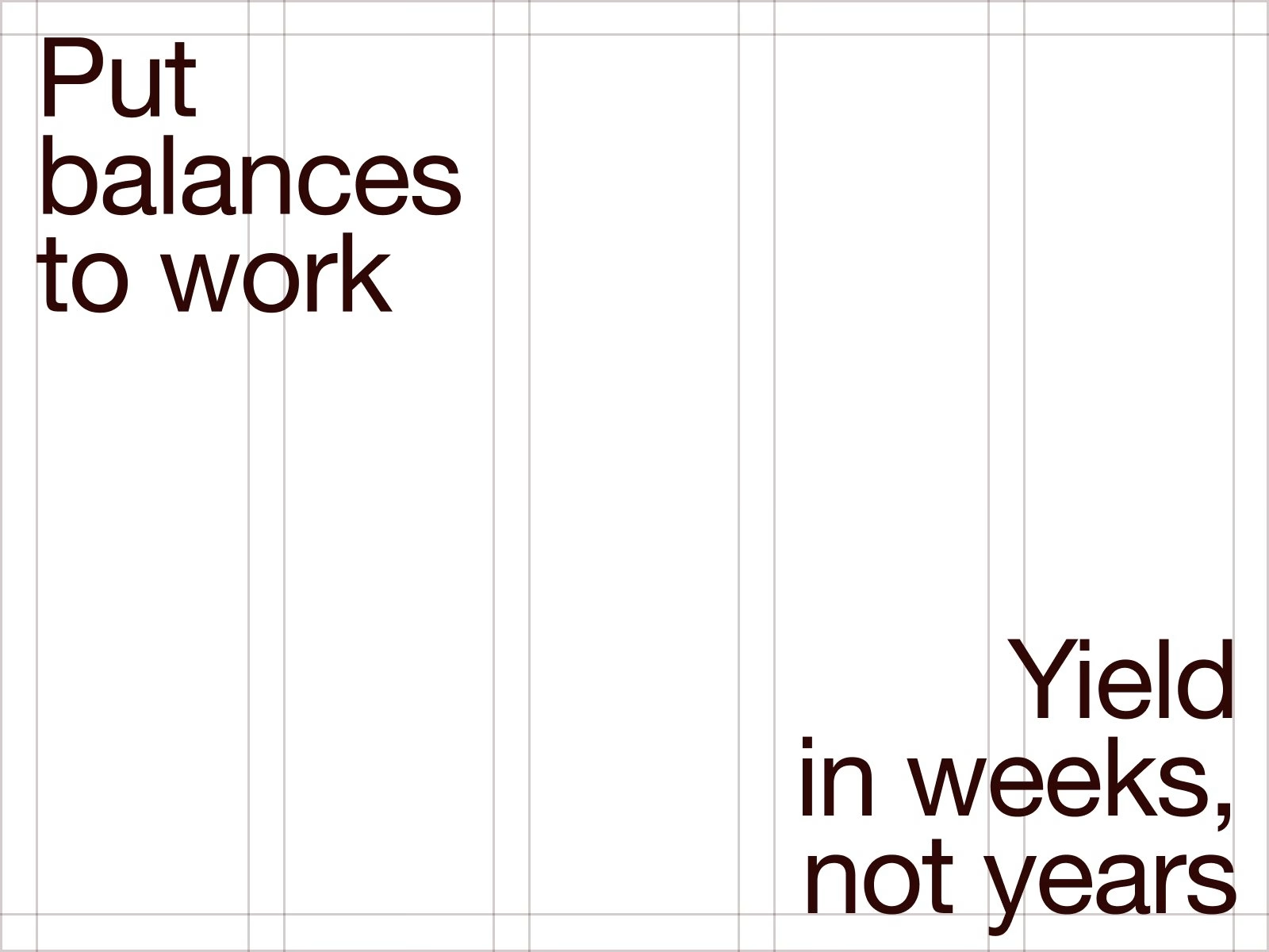
Typography is set in Helvetica Neue across a wide range of weights, from thin outlines to a heavy bold, with italics kept for emphasis. The copy leans on short, repeated statements such as “more transparency, more control, more growth”, which roll past in animated stacks. Large figures for yields and total value locked stand in for charts, so the numbers do the persuading on their own.
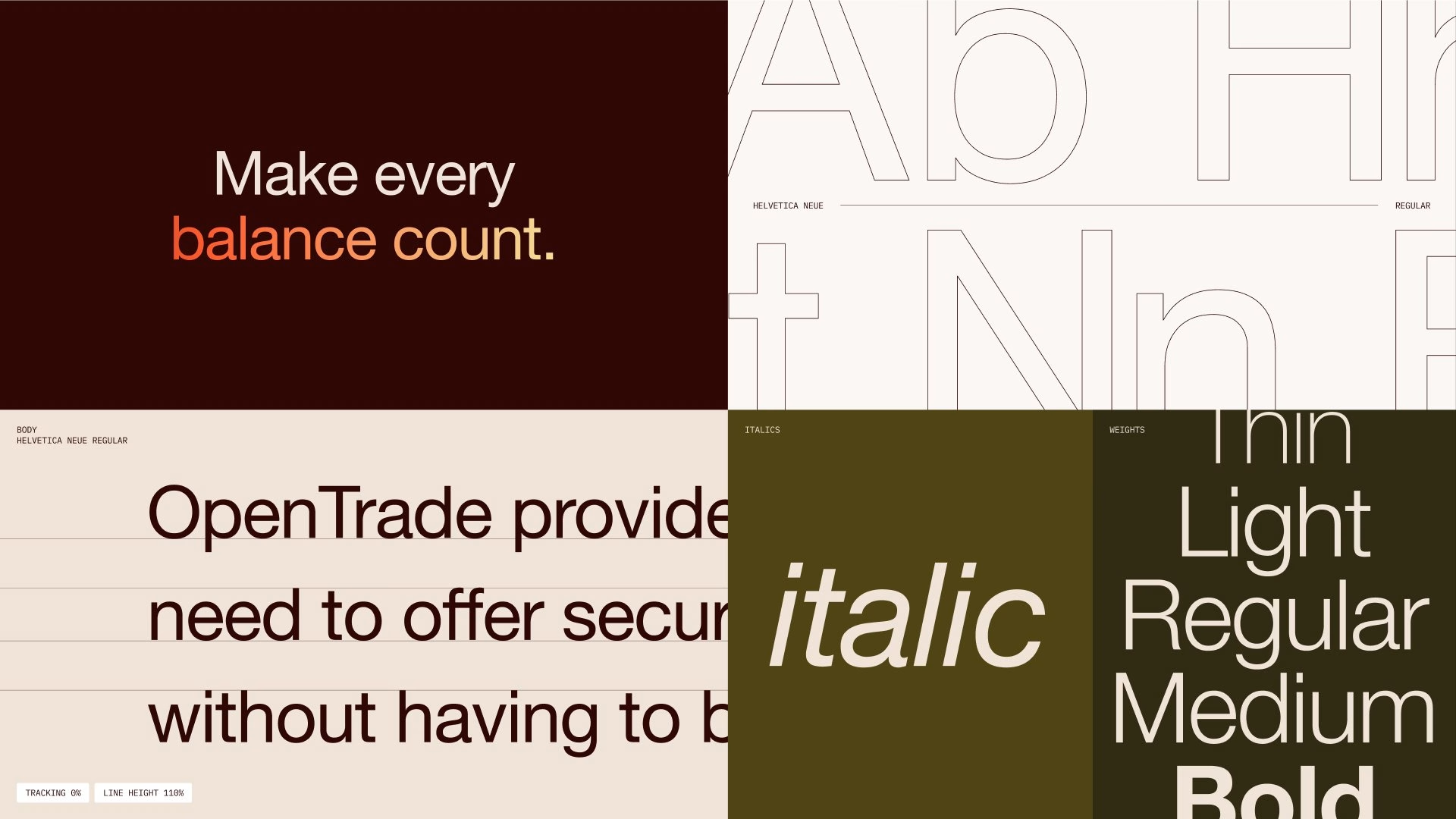
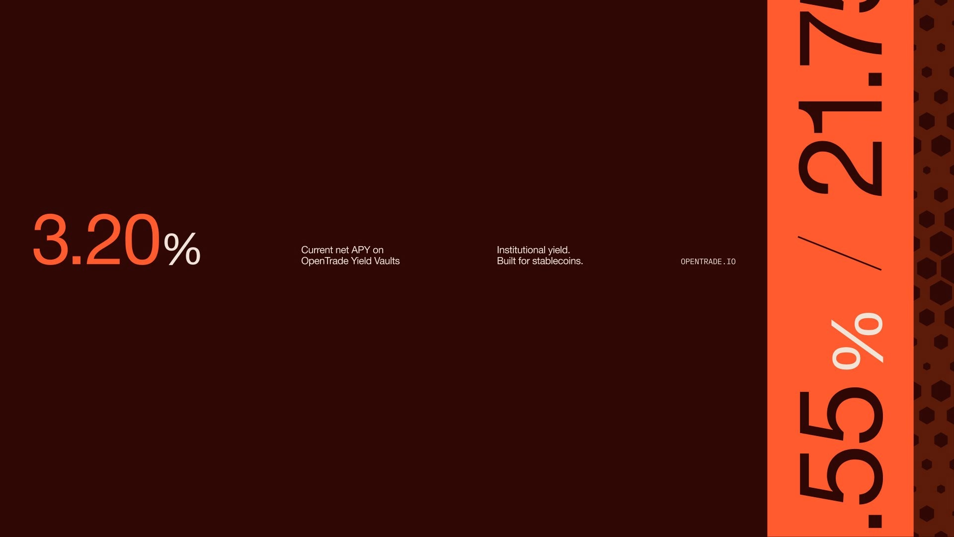
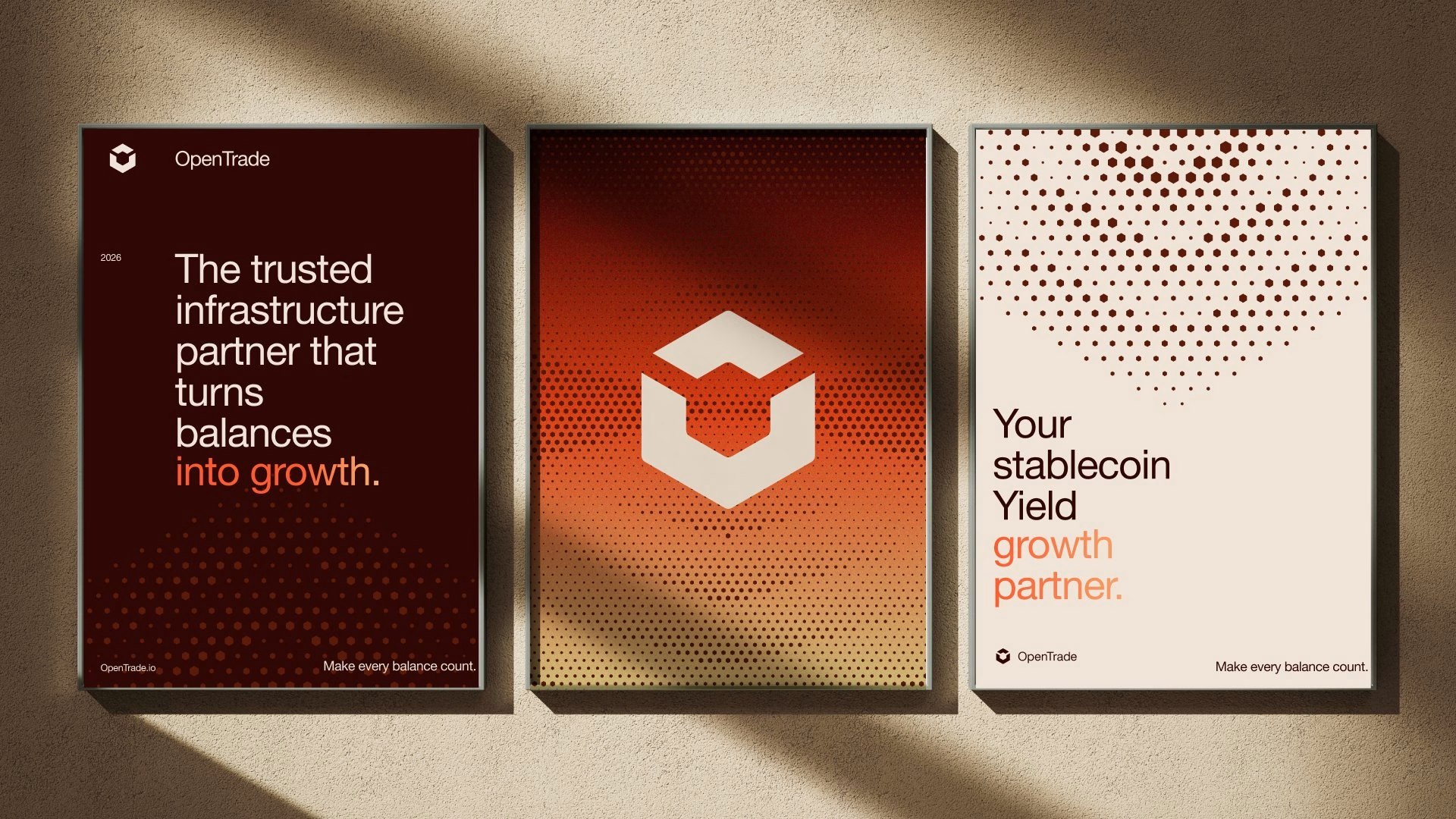
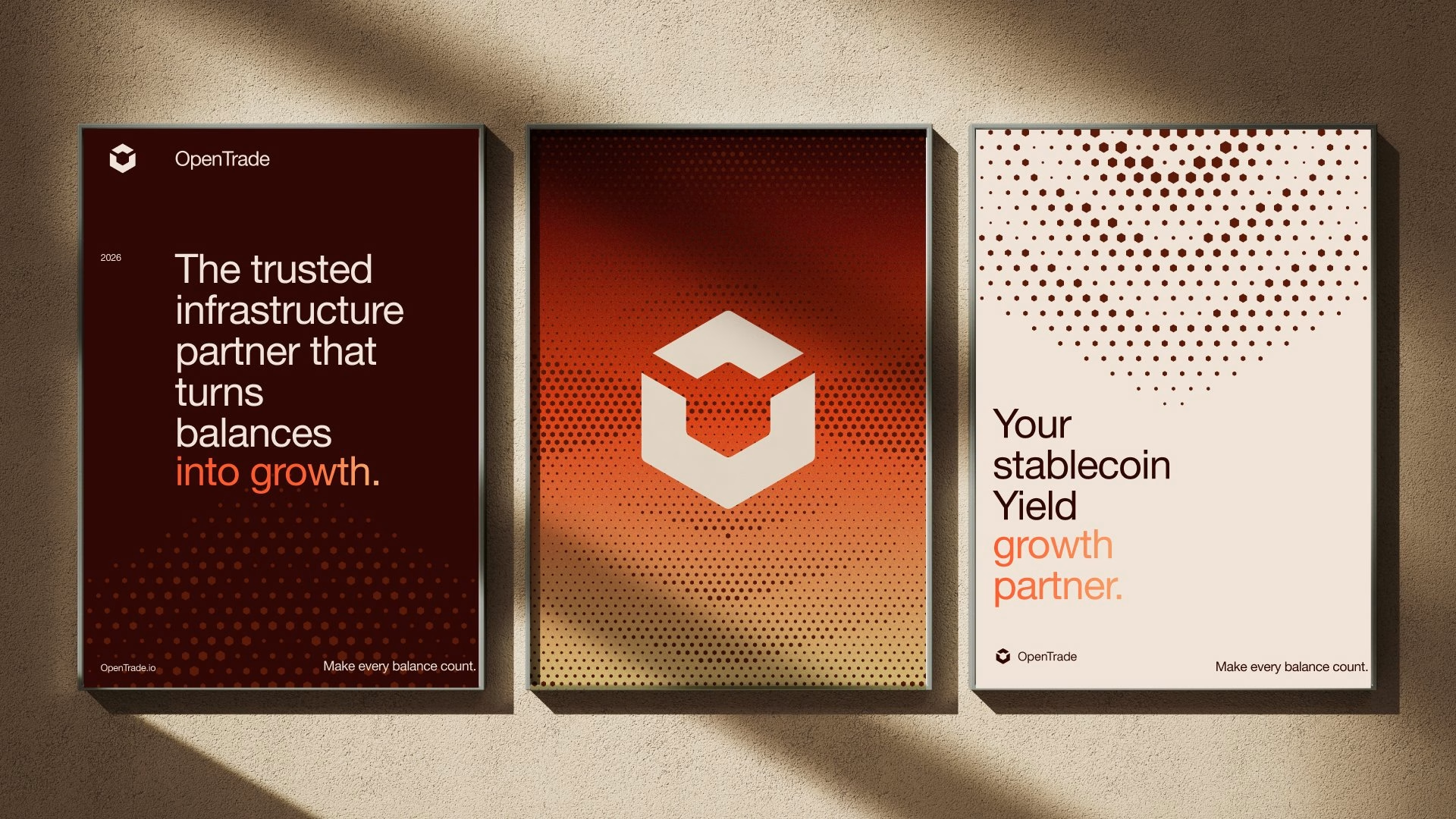
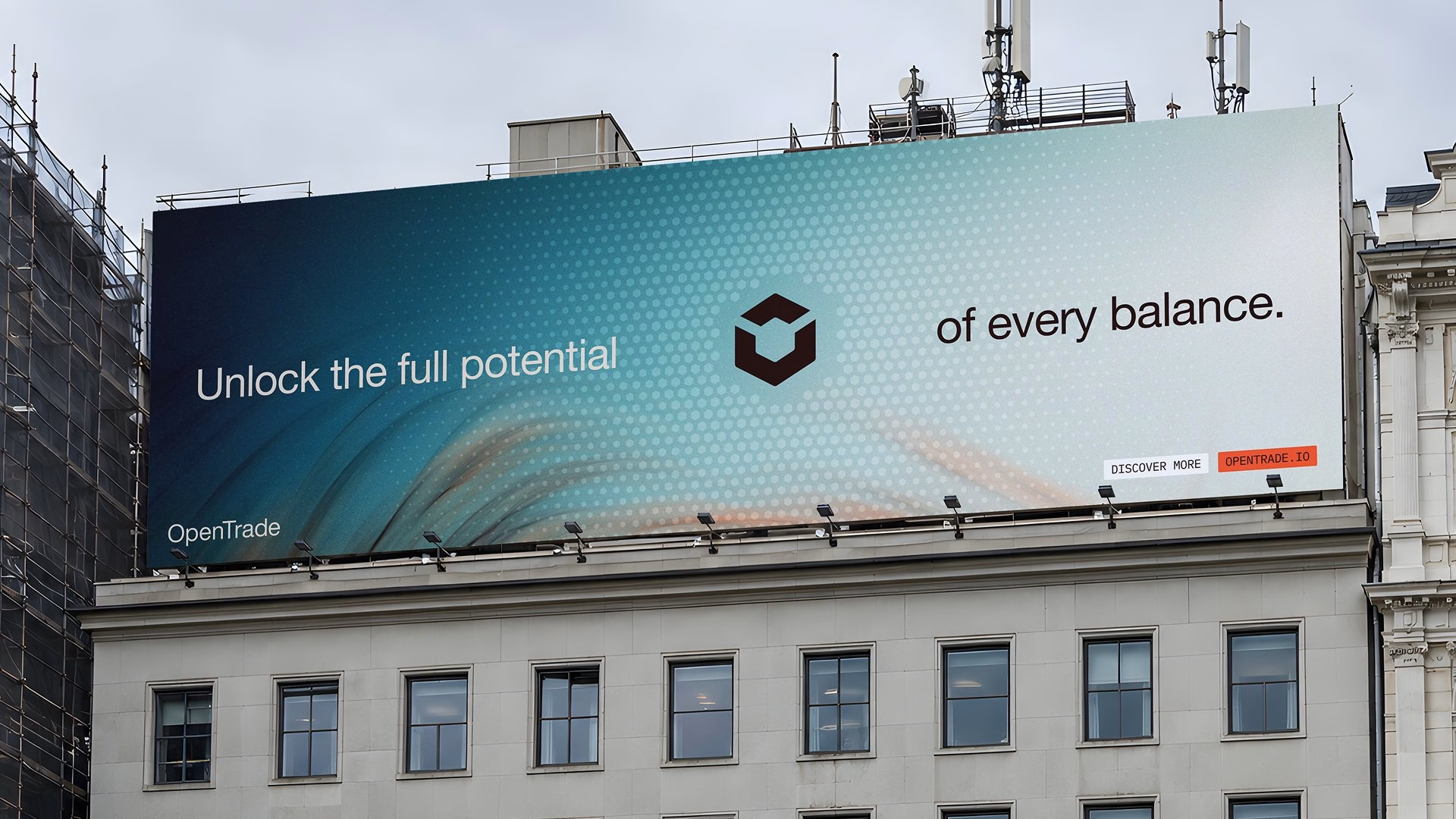
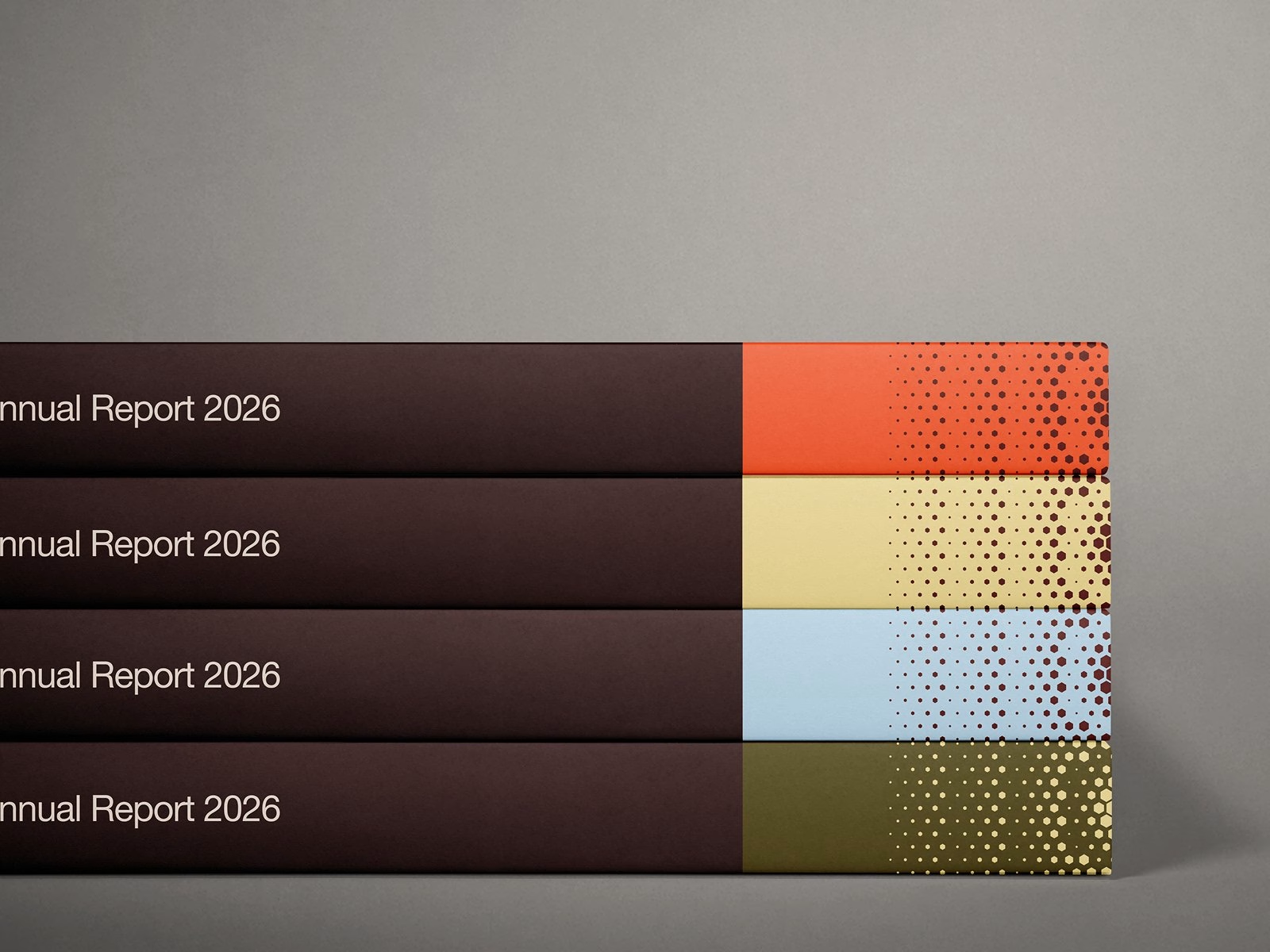
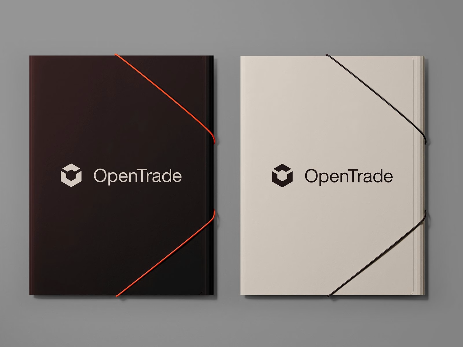
The palette moves between deep oxblood, warm cream, olive and a sharp orange accent, a deliberate step away from the blues and neons of most crypto brands. Posters, framed lobby displays, annual reports and a city billboard all carry the same halftone gradients, in which tiny dots gather into a glowing centre. The system scales from a folder on a desk to a summit stage without losing its quiet, editorial tone.
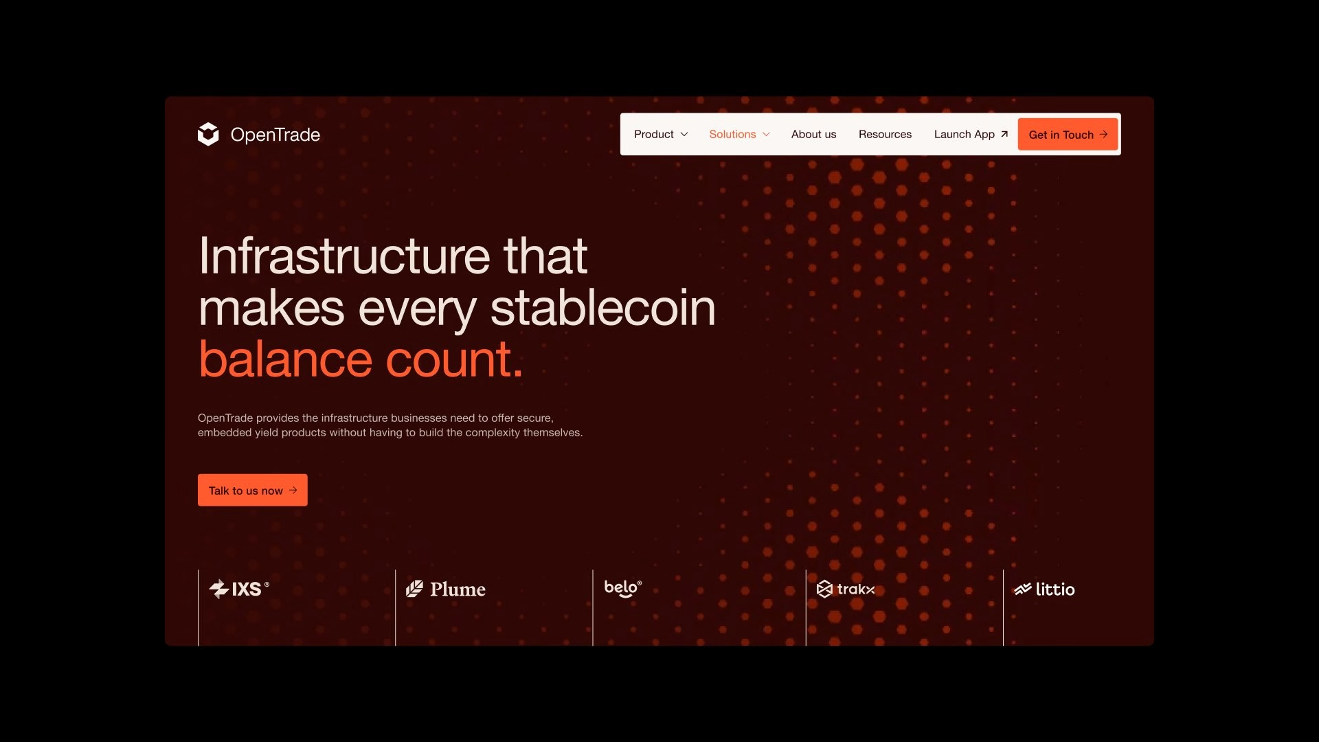
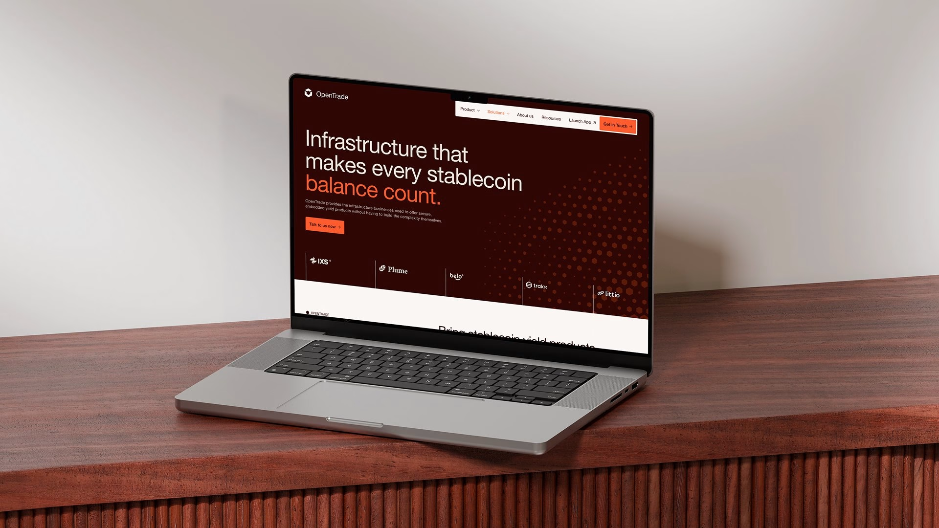
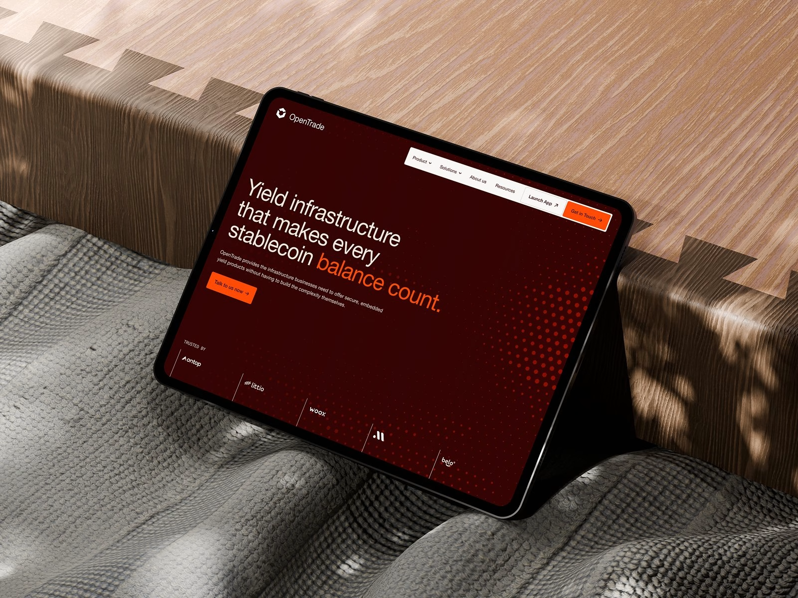
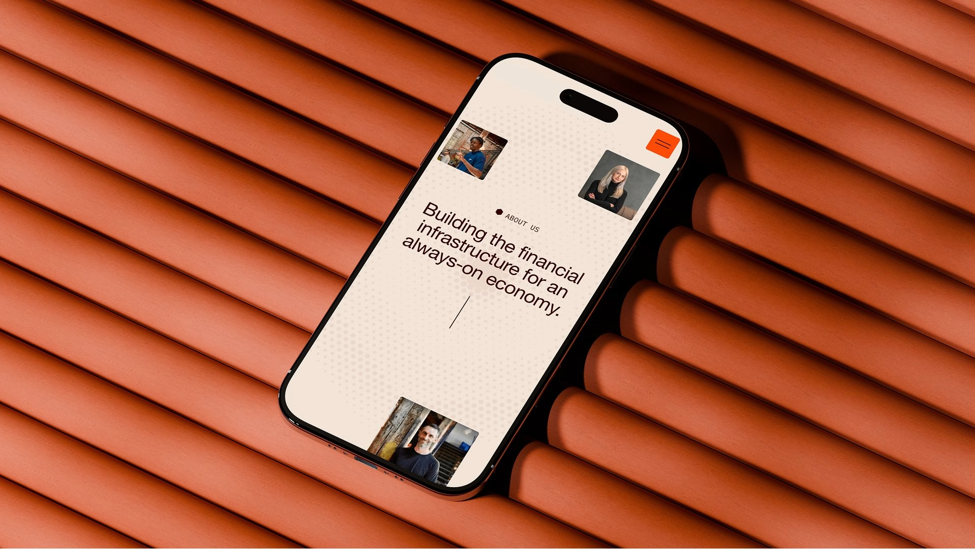
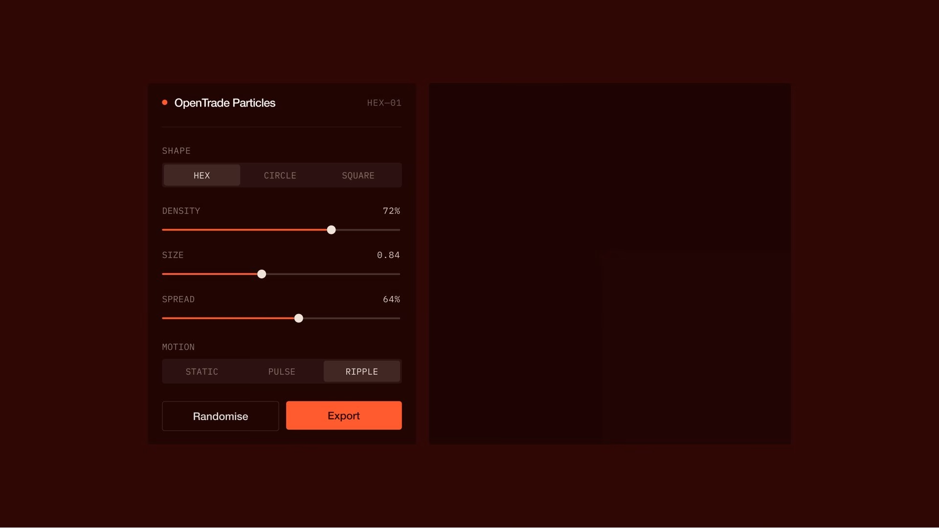
The new website brings everything together under a hero line about infrastructure that makes every stablecoin balance count. Mobile screens, product cards and app views break complex yield strategies into simple modules, while a custom particle tool generates the halftone textures used across the system. It is a digital experience designed to build trust from the very first scroll.


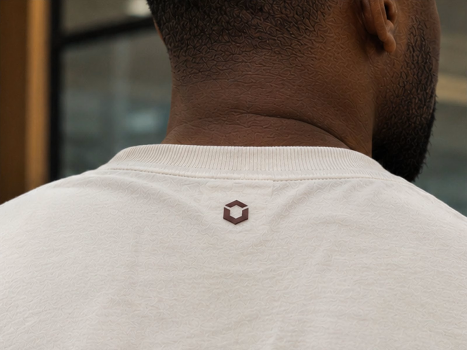
The identity also reaches the people behind the platform, with the cube appearing on caps, jackets, tees and water bottles. These pieces stay small and tonal, so the symbol reads as a quiet badge rather than a logo shouting for attention. Together they round out a brand that feels less like a crypto product and more like a financial partner built for the long run.


Unlock everything with Mindsparkle Mag Plus.
Get exclusive access to Premium features:
Credits: Shoreditch Design
Brand Identity & Web Design Studio: Shoreditch Design
Lead Designer: Edward Gray
Designer: Shaina Patel
Designer: Daria Forsiuk
Motion Designer: Matt Birkinshaw
Project Manager: Simon Patel
More in Tech & Software Branding
Stay on top of this week's design. Insights, top picks & more.