Plus

 Menu


Rhombus Studio
February 25, 2021
Mindsparkle Mag


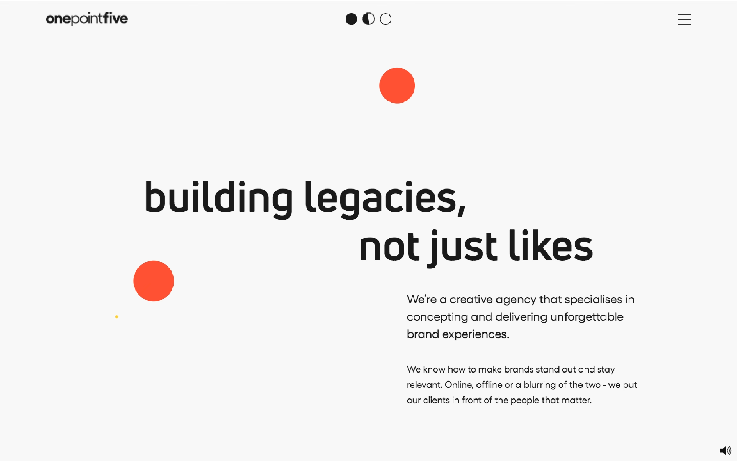
Rhombus Studio keeps the onepointfive homepage refreshingly minimal, setting the rounded, lowercase declaration “building legacies, not just likes” in bold black against clean off-white. A pair of bright orange-red circles drift into the composition as the page’s only real ornament, lending a playful, kinetic energy to all that calm space. Concise supporting copy introduces the creative agency without fuss, and small mode toggles and a tidy logo keep the interface quietly self-assured. The restraint is the point: confidence expressed through white space, strong type and one punchy accent colour. It is a clean, characterful piece of branding and web design, live at weareonepointfive.com.
Credits: Rhombus Studio
More in Design Agency
Stay on top of this week's design. Insights, top picks & more.