Plus

 Menu


Funs Kurstjens & Jonas Pelzer
January 20, 2021
Mindsparkle Mag


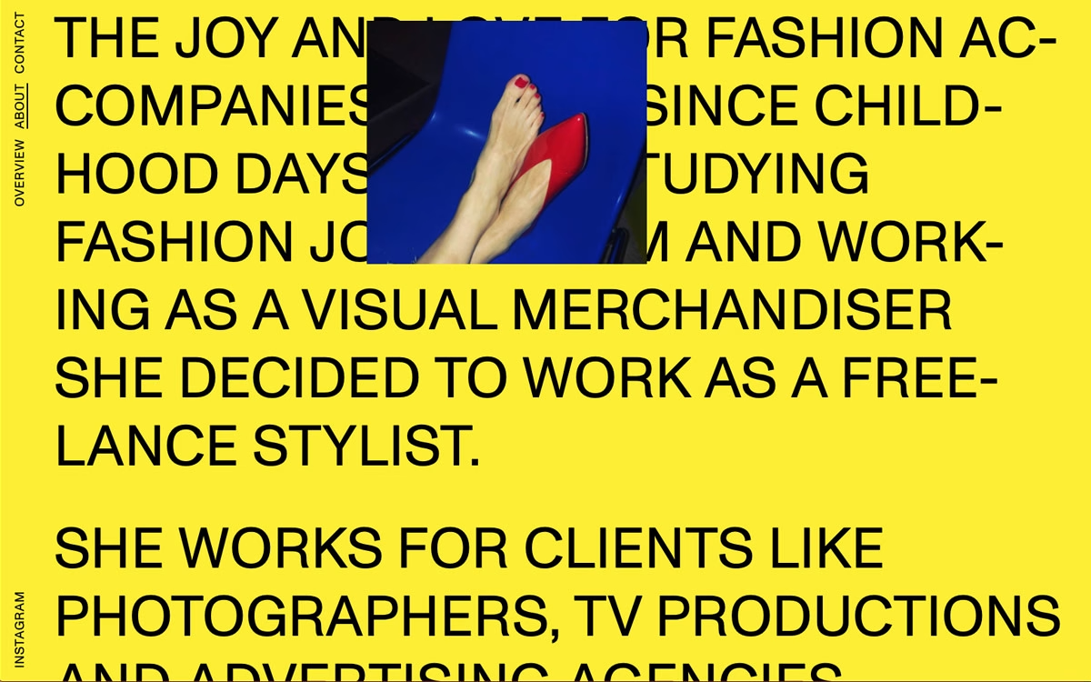
Designed by Funs Kurstjens & Jonas Pelzer, this portfolio for stylist Natalie Schneider turns an introduction into a bold visual statement. A vivid yellow field is packed edge to edge with oversized black uppercase type, its confident grid interrupted only by a small cropped photograph of a red heel resting on a blue seat. The tension between the loud, brutalist typography and the intimate fashion imagery captures the energy of styling work with real personality. Vertical navigation labels run quietly up the margins, leaving the words themselves to fill the screen. It is a spirited, editorial take for Natalie Schneider Styling that feels fresh and unafraid.
Credits: Funs Kurstjens & Jonas Pelzer
More in Design Agency
Includes freebie bundle, unseen BTS insights and more.