Plus
Plus

 Menu
Menu


Master & Master
August 10, 2017
Mindsparkle Mag


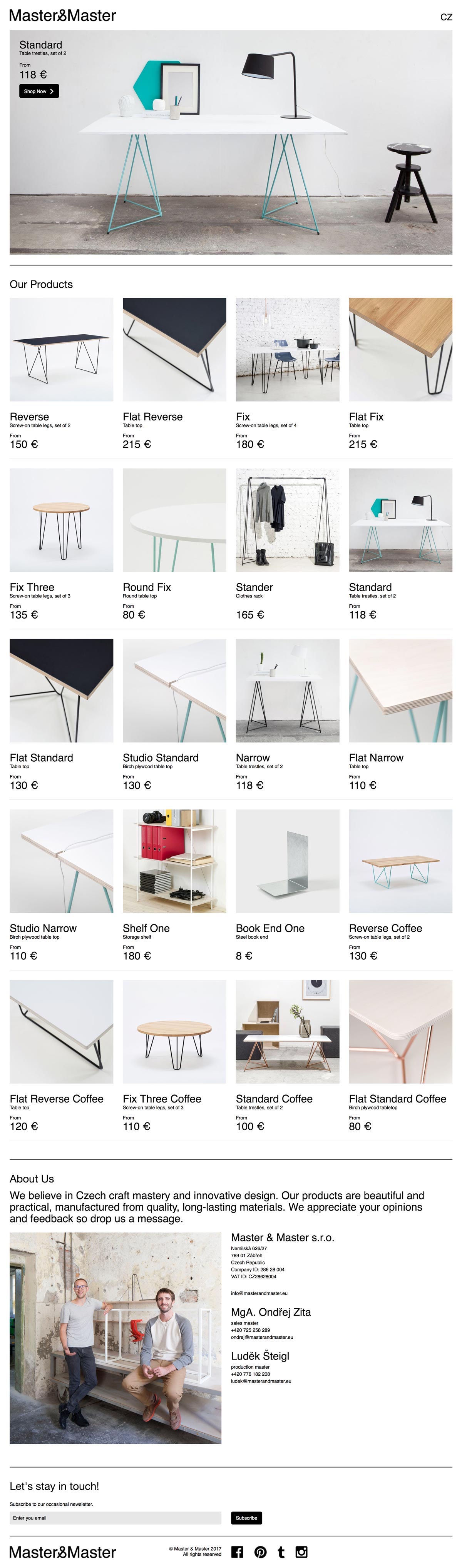
Master & Master presents its Czech-made furniture through a bright, minimal storefront that lets the products speak for themselves. Crisp product photography — white tabletops perched on slender mint-and-black trestle legs — sits on an airy white background, organised into a neat, price-tagged grid beneath a bold hero. The stripped-back navigation, restrained sans-serif type and generous margins echo the clean, functional spirit of the furniture itself. A warm About section and a portrait of the two makers add a human, workshop-honest touch. It is a confident, considered piece of web design that treats an online catalogue like a gallery, and you can browse the full range on masterandmaster.eu.
Credits: Master & Master
More in Product
Includes freebie bundle, unseen BTS insights and more.