Plus
Plus

 Menu
Menu


INFINI
September 04, 2018
Mindsparkle Mag


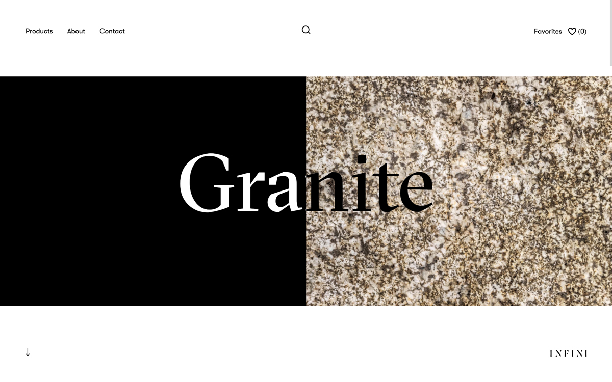
INFINI opens with a beautifully restrained split-screen hero that lets a single material do the talking. On the left, a slab of pure black; on the right, a richly detailed granite texture, with the word Granite set large in an elegant serif that straddles the divide in crisp black and white. The generous negative space, minimal navigation and quiet INFINI wordmark in the corner give the page a gallery-like poise. It is the kind of confident, material-first presentation that trusts good photography and typography to carry the whole first impression. The result is a refined exercise in art direction and considered web design.
Stay on top of this week's design. Insights, top picks & more.