Plus

 Menu


Benjamin Hanus
April 02, 2022
Mindsparkle Mag


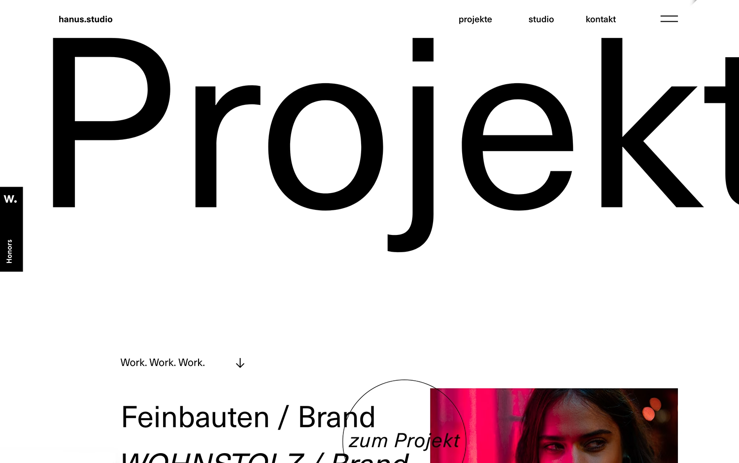
Benjamin Hanus brings a calm, editorial clarity to Hanus Studio, opening on a crisp white page where an oversized grotesque headline simply reads “Projekt.” The German-language navigation and the understated “Work. Work. Work.” prompt guide the eye downward to a tidy list of branding projects, each paired with a circular “zum Projekt” cursor that hovers over warm, magenta-lit imagery. Generous whitespace and confident type give the whole layout a quietly premium feel. It is a polished example of restrained web design where typography and rhythm do the heavy lifting, and Benjamin Hanus makes the studio’s work feel effortlessly considered.
Credits: Benjamin Hanus
More in Portfolio
Includes freebie bundle, unseen BTS insights and more.