Plus
Plus

 Menu
Menu


Fortnum & Fox
July 02, 2018
Mindsparkle Mag


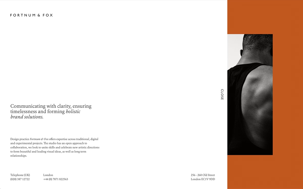
Fortnum & Fox introduces itself with the poise of a design practice that values restraint. The layout is mostly clean white, broken by a single confident block of burnt orange along the right edge and a cropped black-and-white photograph that lends the page a quiet, editorial gravity. Elegant serif typography carries the studio's message — "Communicating with clarity, ensuring timelessness and forming holistic brand solutions" — set in a comfortable measure with an italic flourish. The London studio describes an open, collaborative approach across traditional, digital and experimental projects, and the design reflects that measured, timeless sensibility. It is a beautifully understated study in branding and art direction where every element earns its place.
Credits: Fortnum & Fox
More in Design Agency
Includes freebie bundle, unseen BTS insights and more.