Plus

 Menu


Design: Kenna & Development: Fiona.codes
April 30, 2019
Mindsparkle Mag


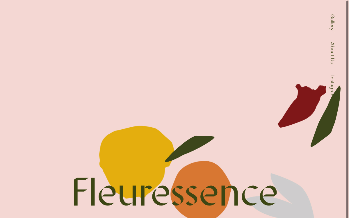
Soft, hand-made and full of charm, Fleuressence pairs design by Kenna with development by Fiona.codes for a florist identity that feels freshly picked from a garden. A dusty-pink backdrop is scattered with loosely painted botanical shapes — a lemon-yellow bloom, a burnt-orange fruit, deep-green leaves — while an elegant forest-green serif spells out the name across the foot of the screen. A slim vertical menu (Gallery, About Us, Instagram) keeps the composition airy and unforced. The warm, earthy colour palette and playful illustration give it a handcrafted, boutique feel.
More in Design Agency
Includes freebie bundle, unseen BTS insights and more.