Plus
Plus

 Menu
Menu


CRENEO
August 27, 2021
Mindsparkle Mag


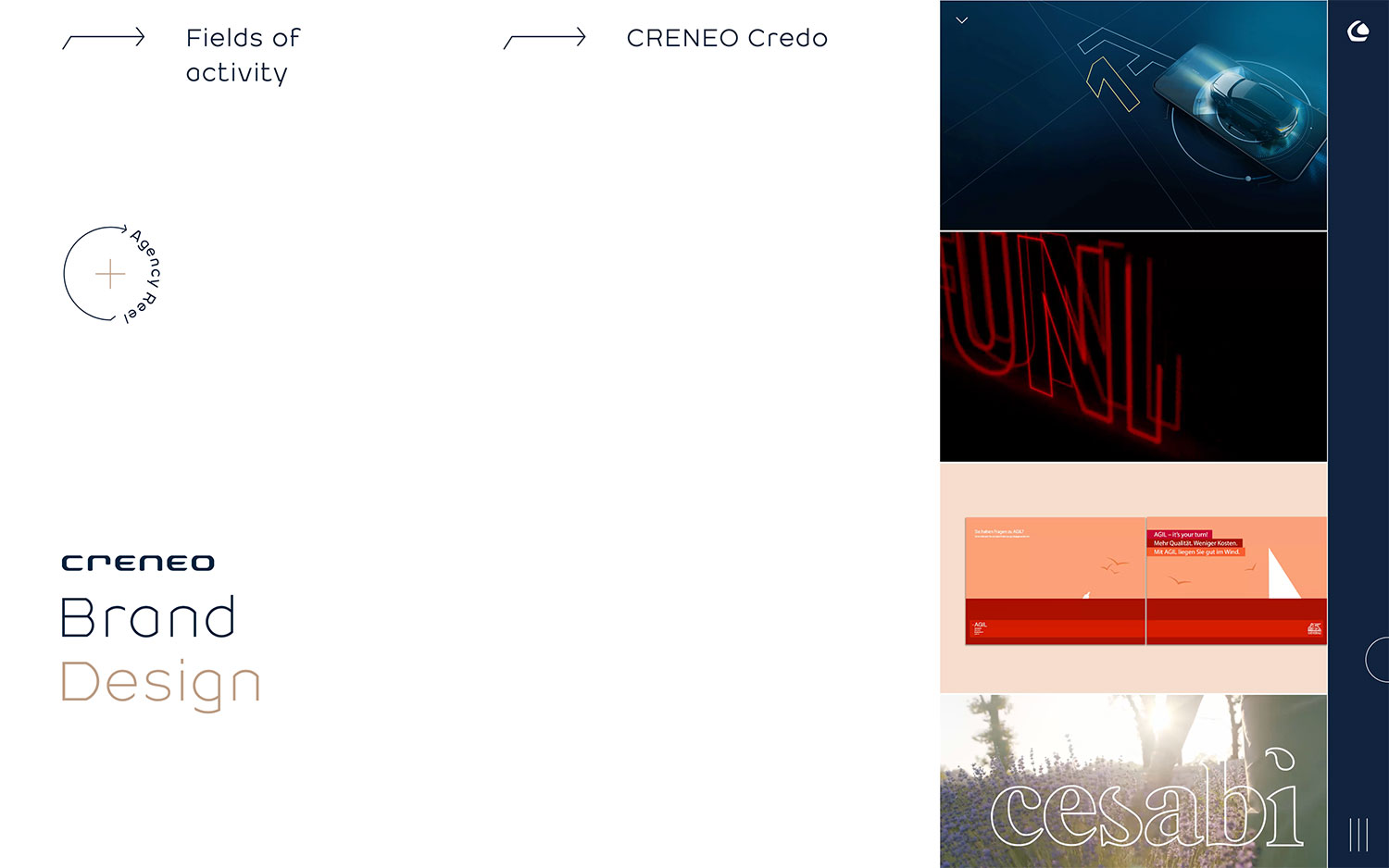
CRENEO presents itself as a brand design agency, and its homepage splits neatly between a calm editorial left column and a lively vertical reel of work on the right. Understated navigation — Fields of activity, CRENEO Credo and a circular “Agency Reel” play button — frames a bold two-tone headline that sets “Brand” in deep navy against “Design” in warm copper. The scrolling column of project thumbnails, from a sleek automotive render to red neon type and a sunlit lavender campaign, hints at a broad and confident portfolio. There is a real sense of storytelling and rhythm in the interplay between the fixed text and the moving imagery. It is a composed, grown-up piece of branding-led art direction translated into equally confident web design.
Credits: CRENEO
More in Business & Corporate
Stay on top of this week's design. Insights, top picks & more.