Plus
Plus

 Menu
Menu


Elke Bocksrucker
June 09, 2021
Mindsparkle Mag


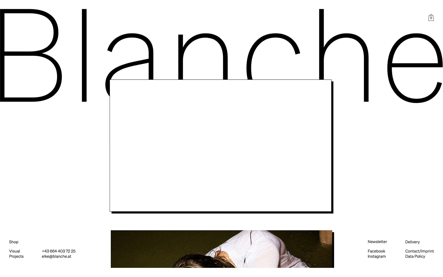
Elke Bocksrucker gives Blanche a strikingly spare, typographic identity that lets a single word do the heavy lifting. An enormous, feather-thin “Blanche” wordmark stretches the full width of a bright white page, interrupted only by a clean white panel and a glimpse of moody photography peeking from below. The interface stays almost invisible — a small cart, a discreet footer of Shop, Visual Projects and social links — so nothing competes with the negative space. It is confident, gallery-like editorial typography that feels closer to a printed art book than a shop. Elegant and quietly assured, it trusts restraint to carry the whole mood.
Credits: Elke Bocksrucker
More in Portfolio
Includes freebie bundle, unseen BTS insights and more.