Plus
Plus

 Menu
Menu


Ayaka B. Ito
October 07, 2020
Mindsparkle Mag


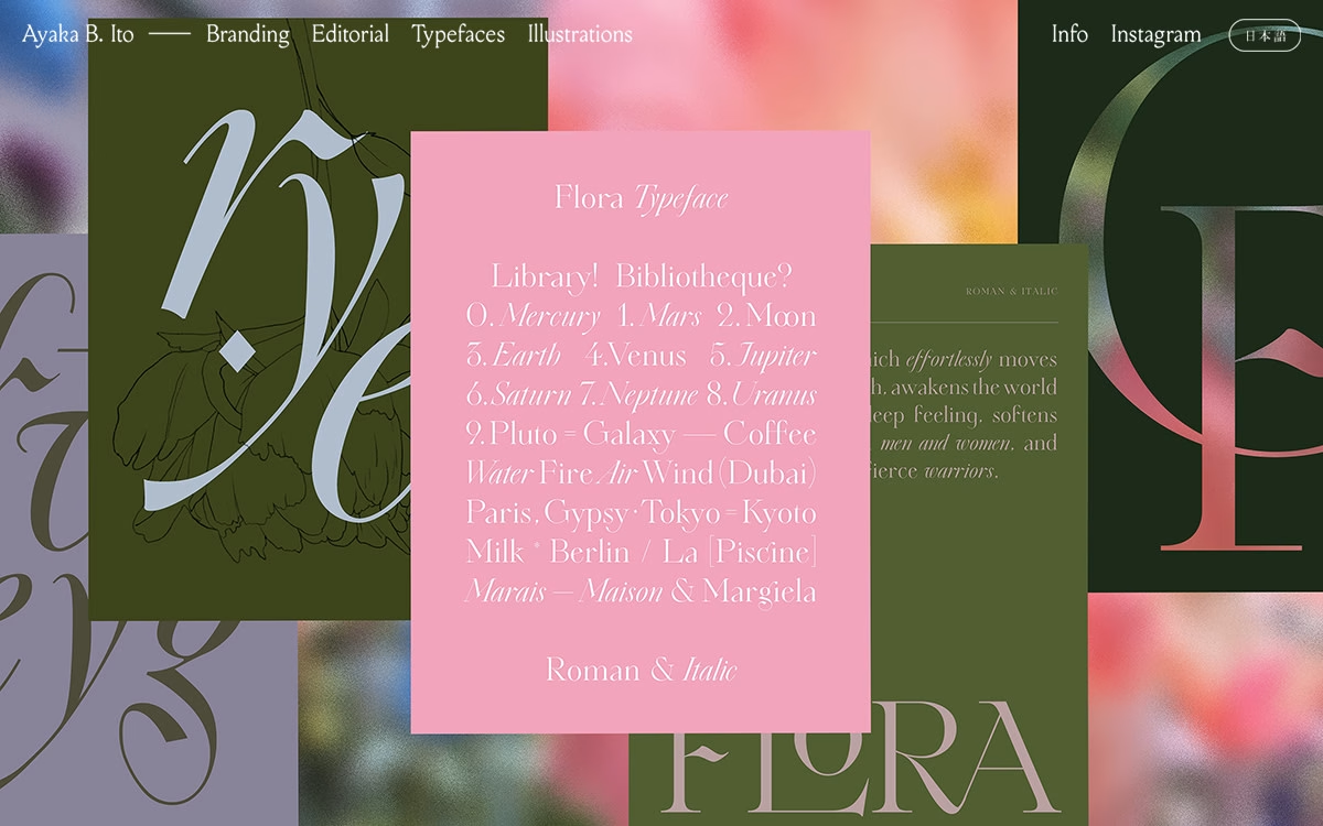
Ayaka B. Ito presents a portfolio that reads like a beautifully layered type specimen, stacking olive green, dusty pink and soft lilac panels into an editorial collage. Elegant serif and italic display letters drift across softly blurred florals, while a centred pink card lays out the ‘Flora’ typeface in a playful roll-call of planets, cities and moods. The palette is muted and romantic and the composition is confident yet delicate, giving the whole page the feel of a printed art book brought online. A tidy top navigation — Branding, Editorial, Typefaces, Illustrations and a Japanese-language toggle — keeps all that lyrical lettering easy to browse. It is a lovely showcase of considered type design and refined typography.
Credits: Ayaka B. Ito
More in Design Agency
Stay on top of this week's design. Insights, top picks & more.