Plus
Plus

 Menu
Menu


Geist Studio
October 02, 2026
Mindsparkle Mag


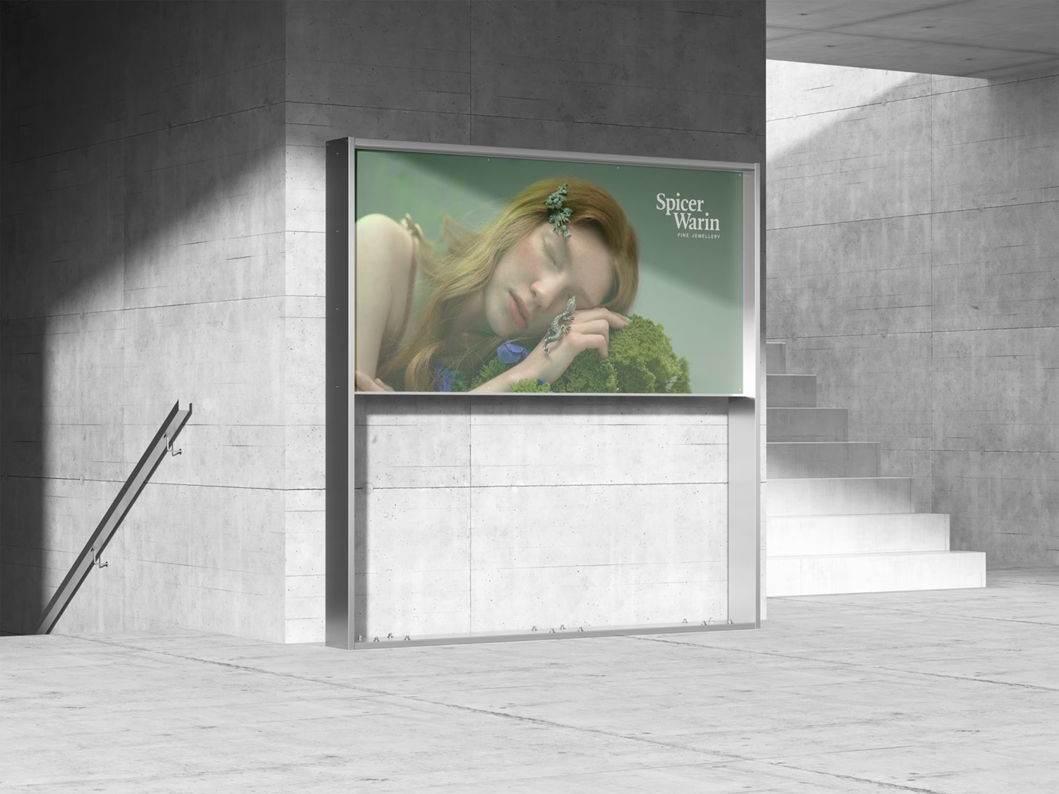
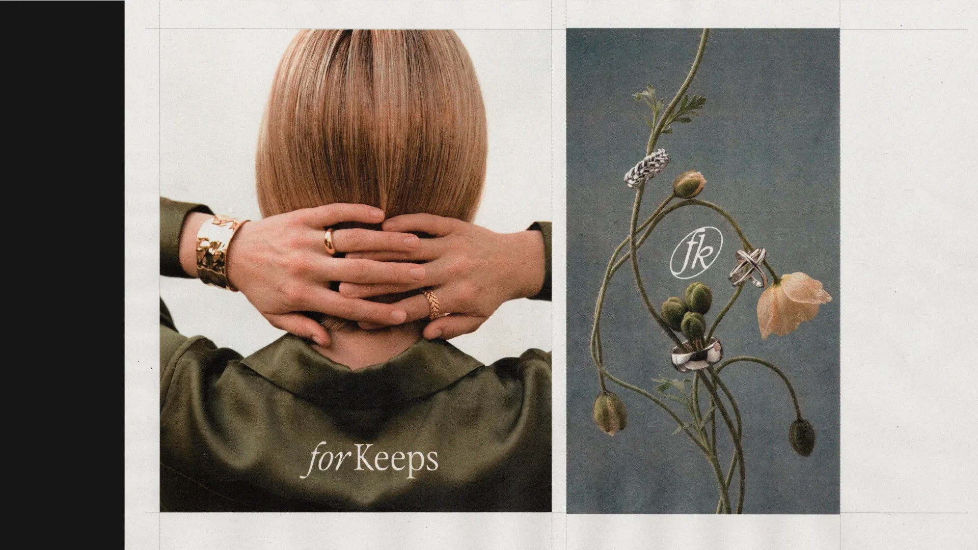
Geist*Studio has developed the brand positioning and visual identity for For Keeps, a jewellery label built around quality, longevity and the idea of pieces made to be lived in. Much of the category is organised around occasion — pieces bought to mark a moment, given as gifts, or carefully saved for somewhere special. For Keeps takes a different approach, making jewellery designed to be worn every day and to become part of real life.
The ambition was to build a brand that made jewellery feel less precious and more personal: pieces that travel with you, hold memories and become more meaningful through use. For Keeps was not simply the name — it became the whole brief. That thinking shaped both the positioning and the visual direction, producing an identity that balances contemporary form with a timeless sensibility.
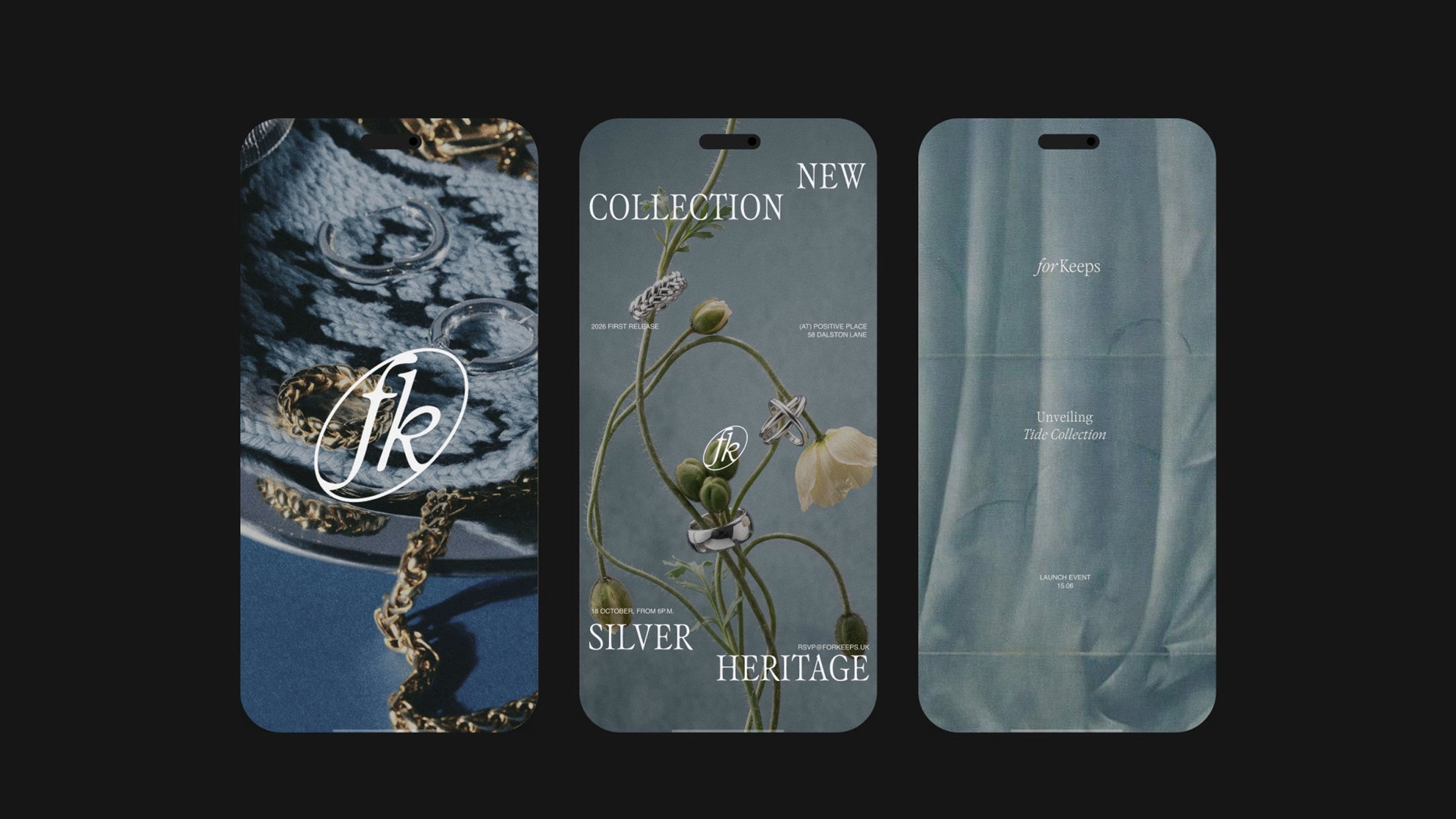
Rather than leaning into traditional jewellery codes, the studio built a visual language that reads as assured and cultured. It is organised around deliberate contrast, from type to colour, creating a sense of tension and personality while holding on to a core feeling of refinement. The wordmark sets a light italic ‘for’ against a firmer roman ‘Keeps’, a small typographic asymmetry that carries a lot of the character.
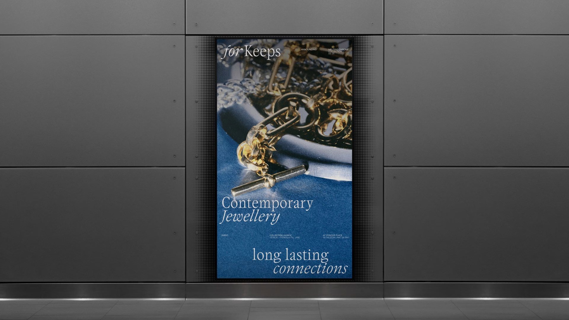
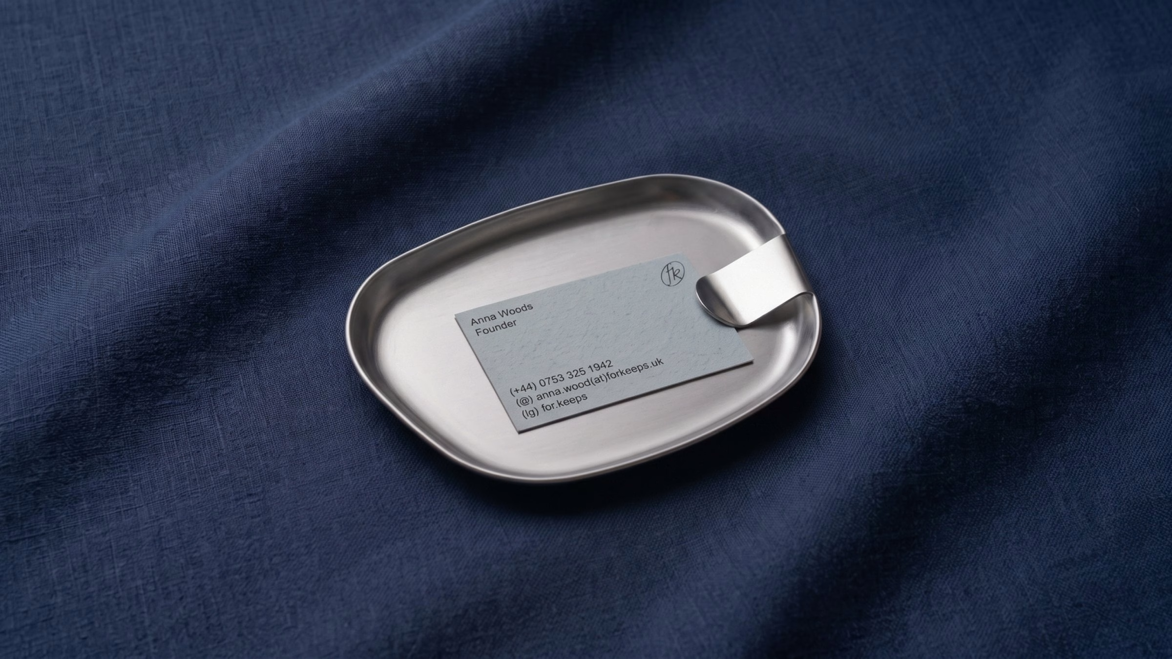
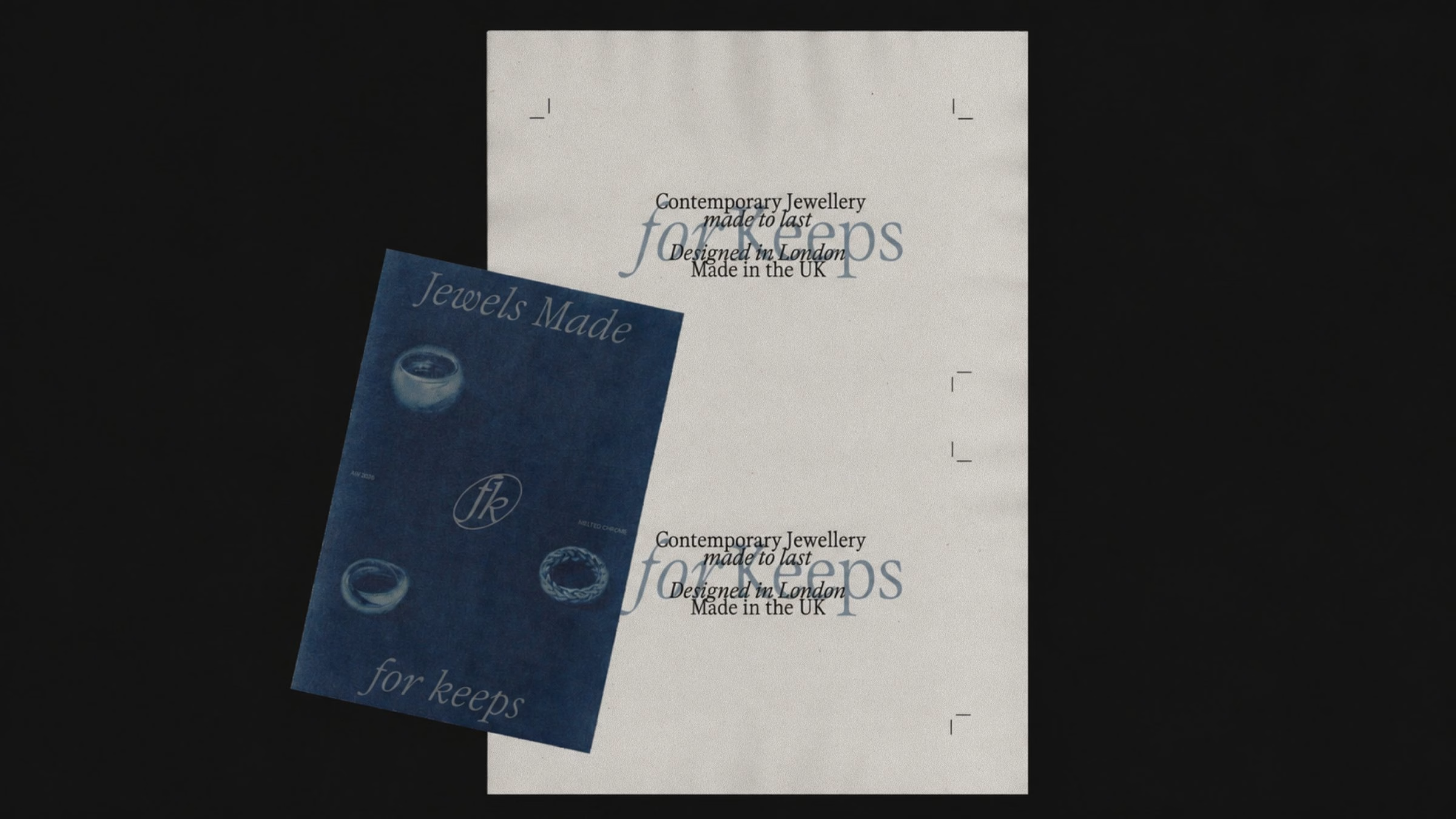
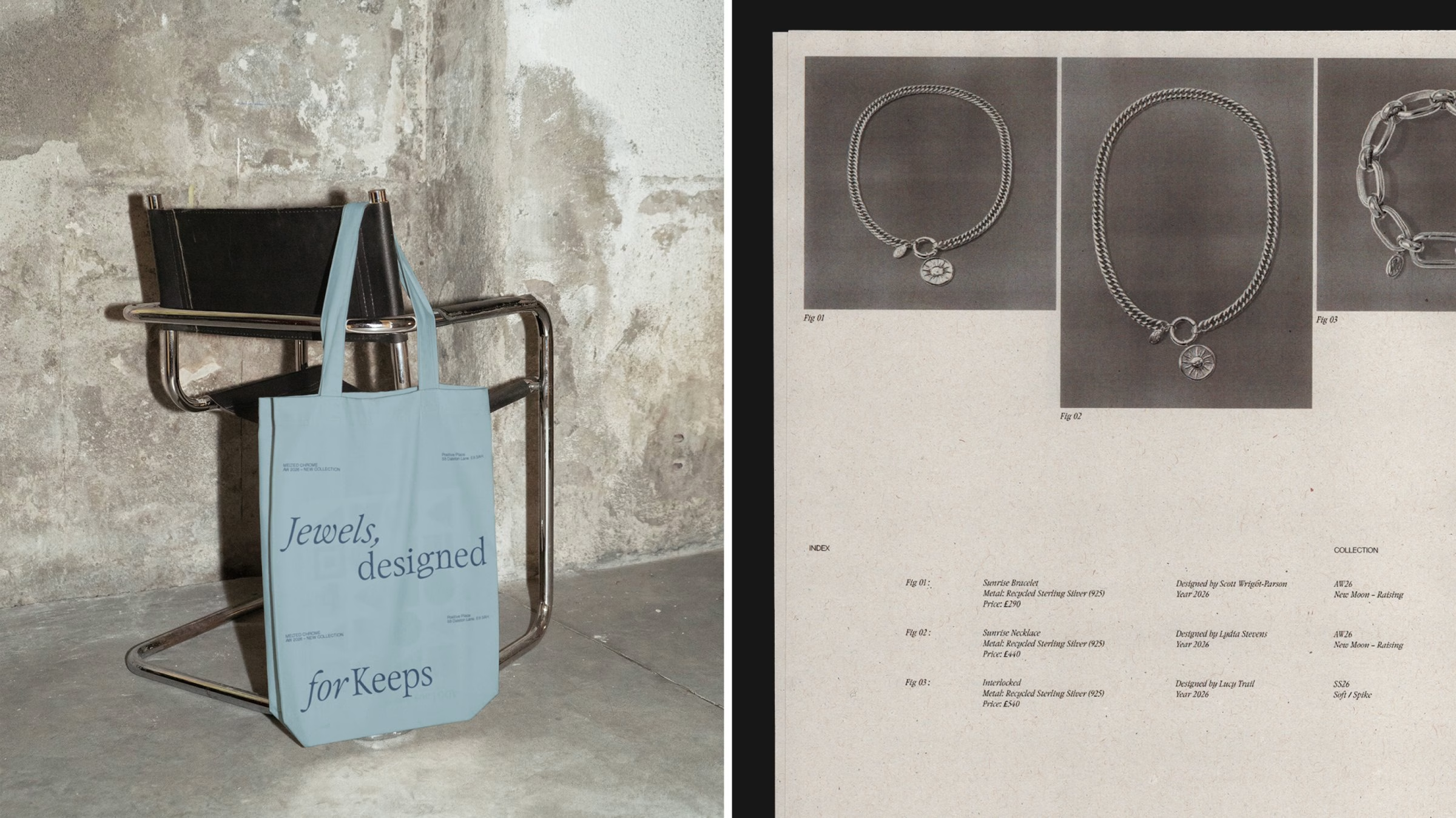
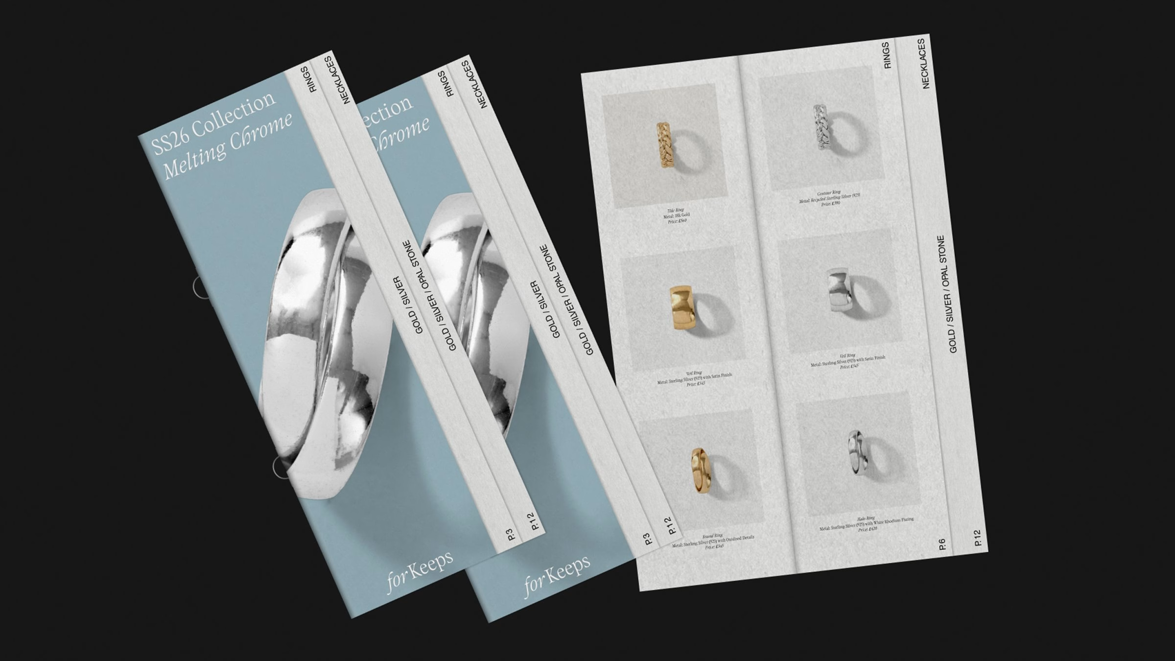
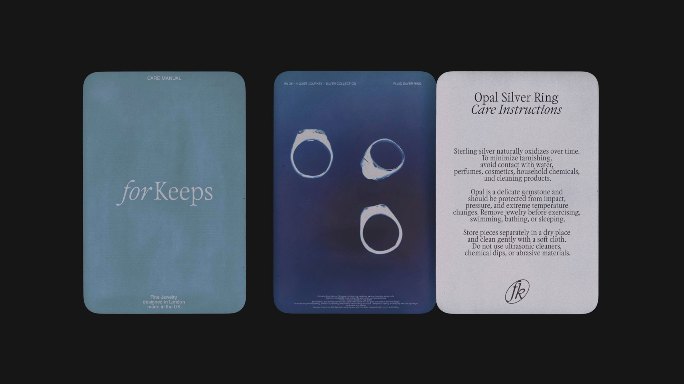
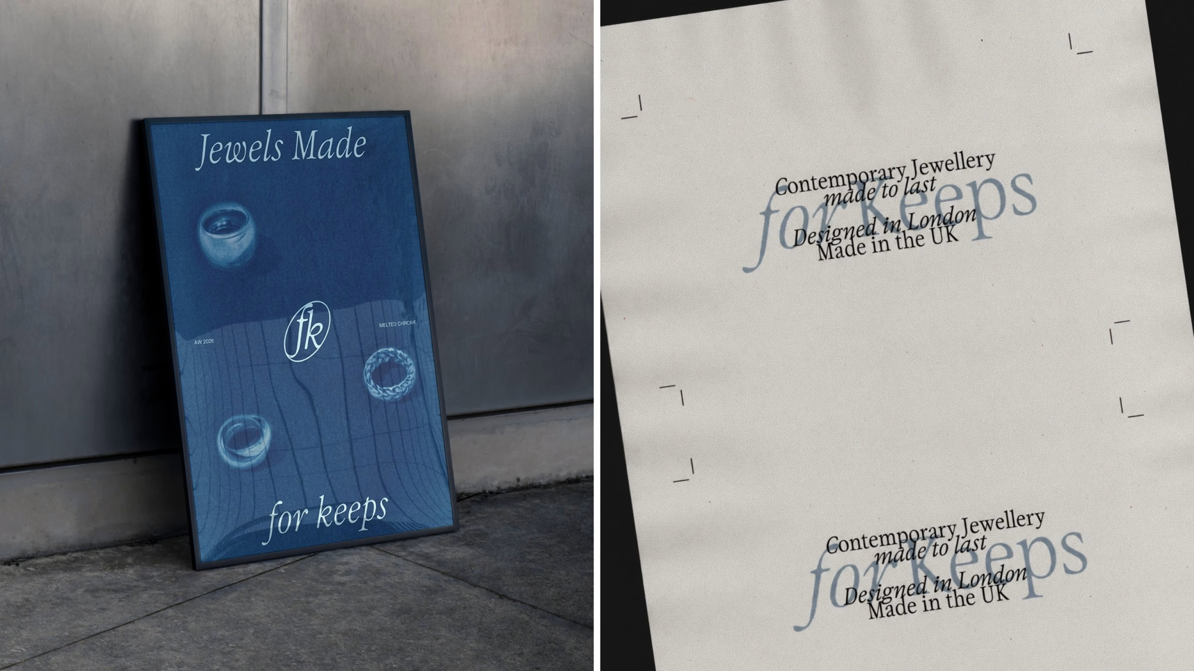
A distinctive blue forms the foundation of the colour system, moving from deep, declarative tones through to softer, almost weightless shades. Warm neutrals add depth while chrome introduces a contemporary edge, and the three register differently across print, packaging and screen. Generous space, considered composition and tactile imagery let the jewellery and the materials take centre stage.
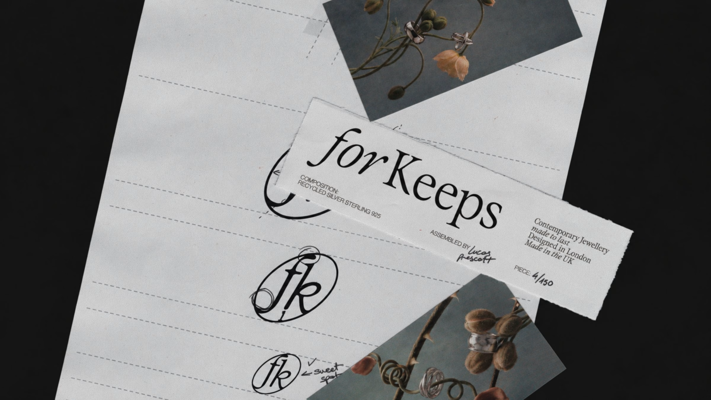
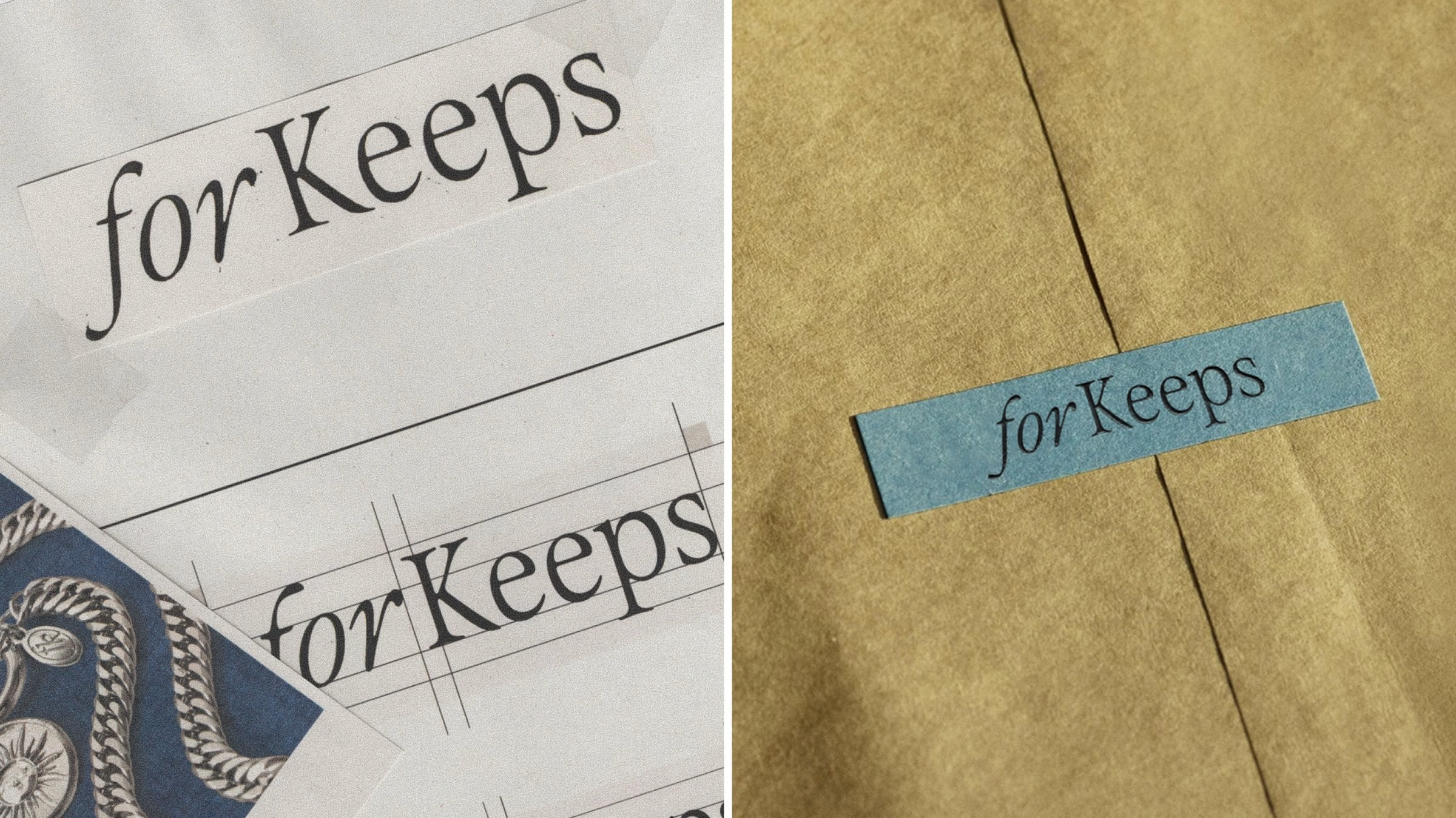
Across the system every element is designed to feel elegant without effort — structured but never stiff, contemporary without feeling disposable. Care instructions, swing tags and packaging carry the same restraint as the campaign imagery, so the brand holds together from a shop window down to a folded paper insert. The result is an identity designed to have the same longevity as the pieces themselves: distinctive on first look, with enough depth to become more familiar over time.
Credits: Geist Studio
Brand Positioning & Visual Identity: Geist*Studio
Creative Director: Mat Moses
More in Brand Identity
Stay on top of this week's design. Insights, top picks & more.