Plus

 Menu


House of Ta Studio
October 31, 2026
Mindsparkle Mag


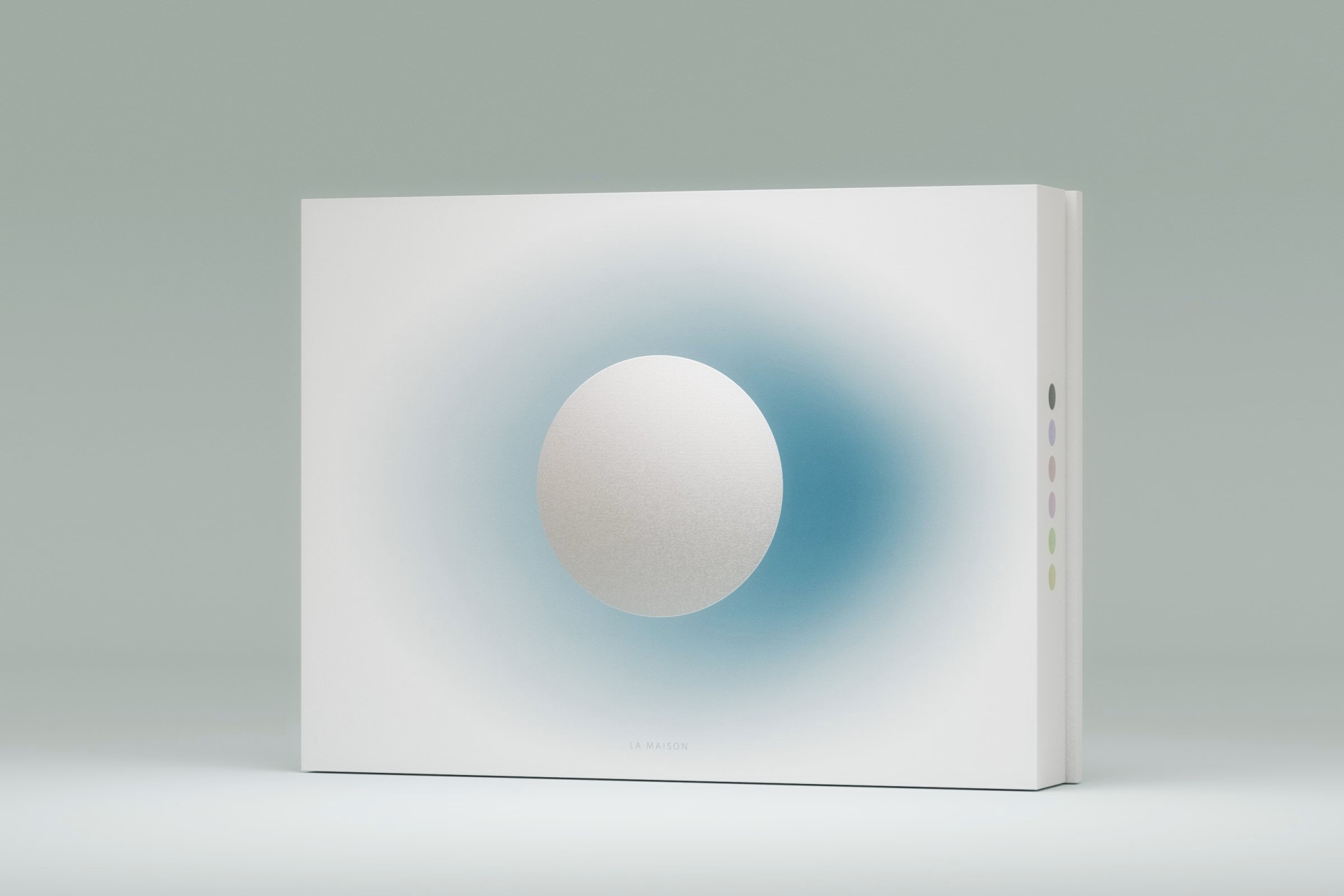
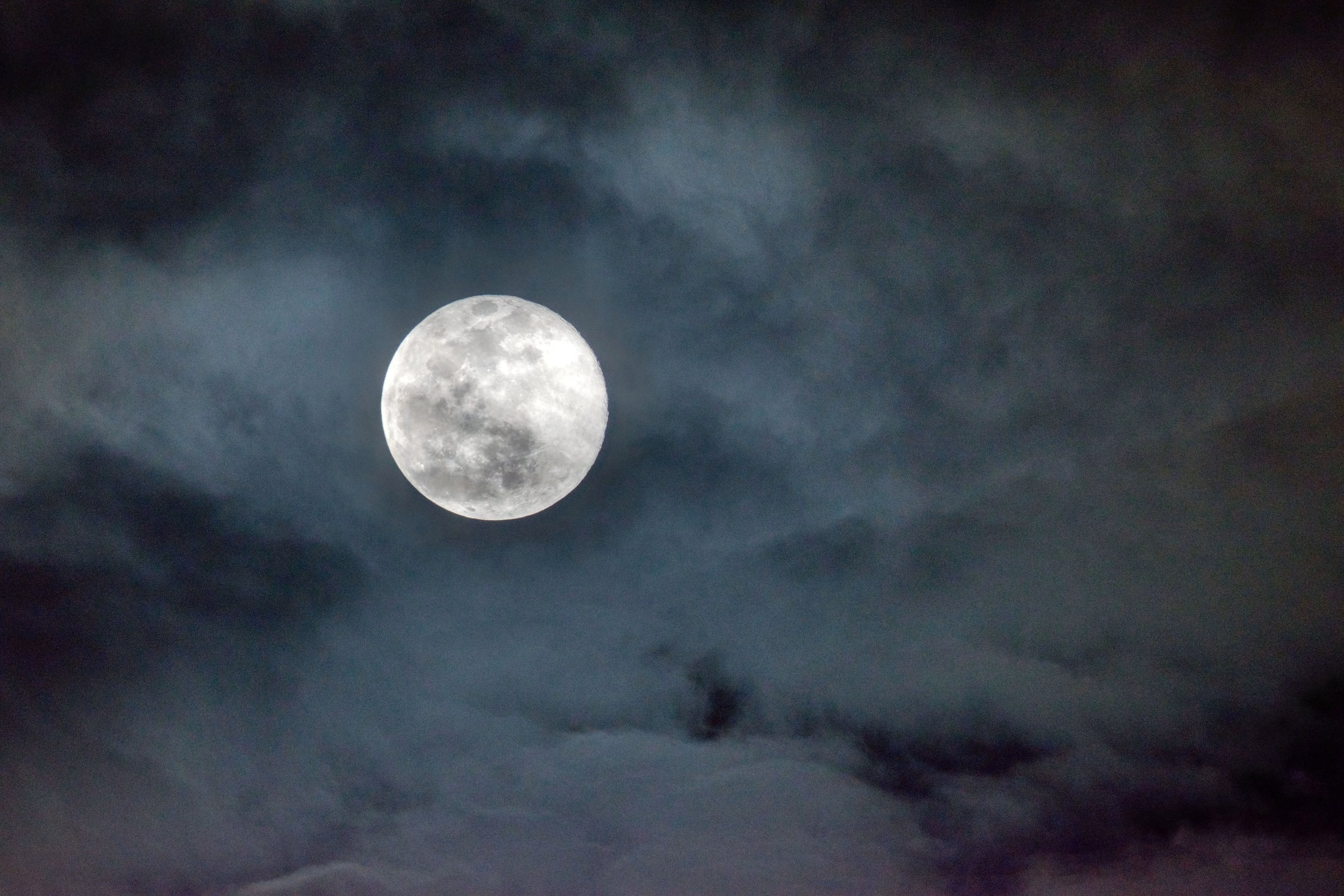
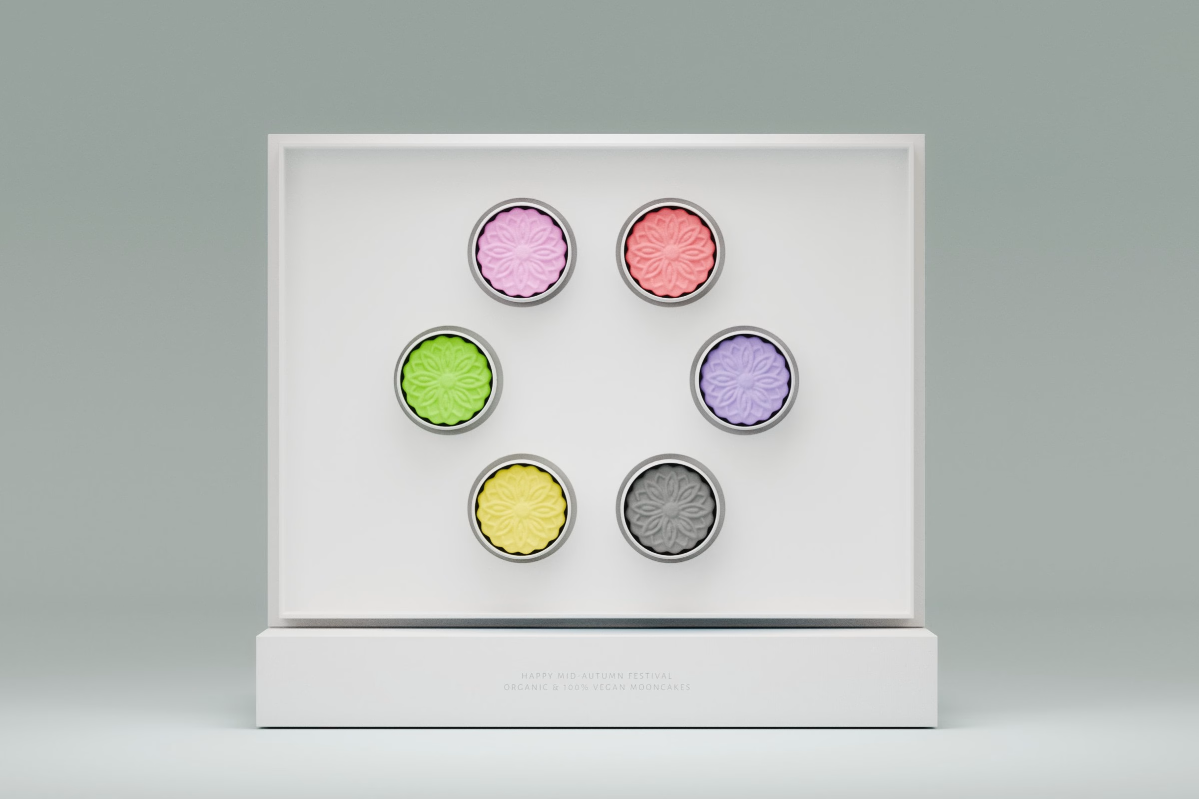
For the Mid-Autumn Festival, LA MAISON presents a collection of vegan mooncakes as a thank-you to its guests and loyal customers. The box announces organic and 100% vegan mooncakes, and the set is meant to feel like a gesture rather than a product launch. Instead of an elaborate concept, the design returns to the most familiar image of the season: the full moon in a night sky.
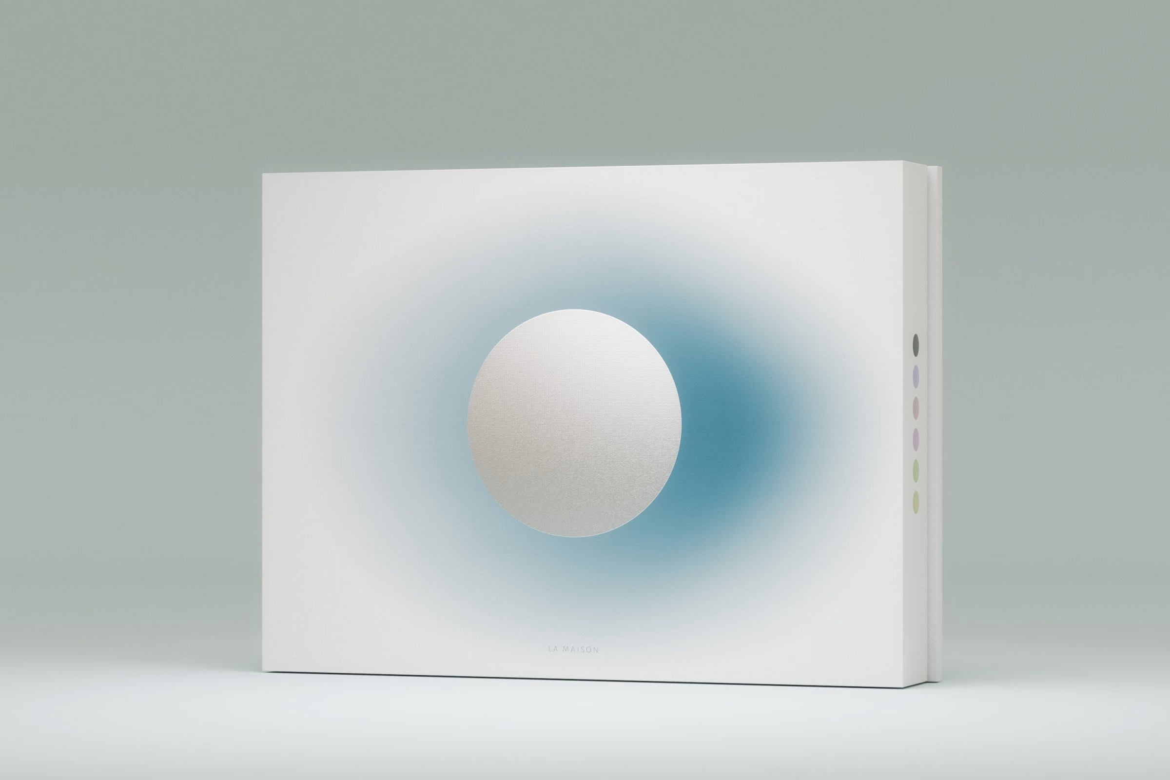
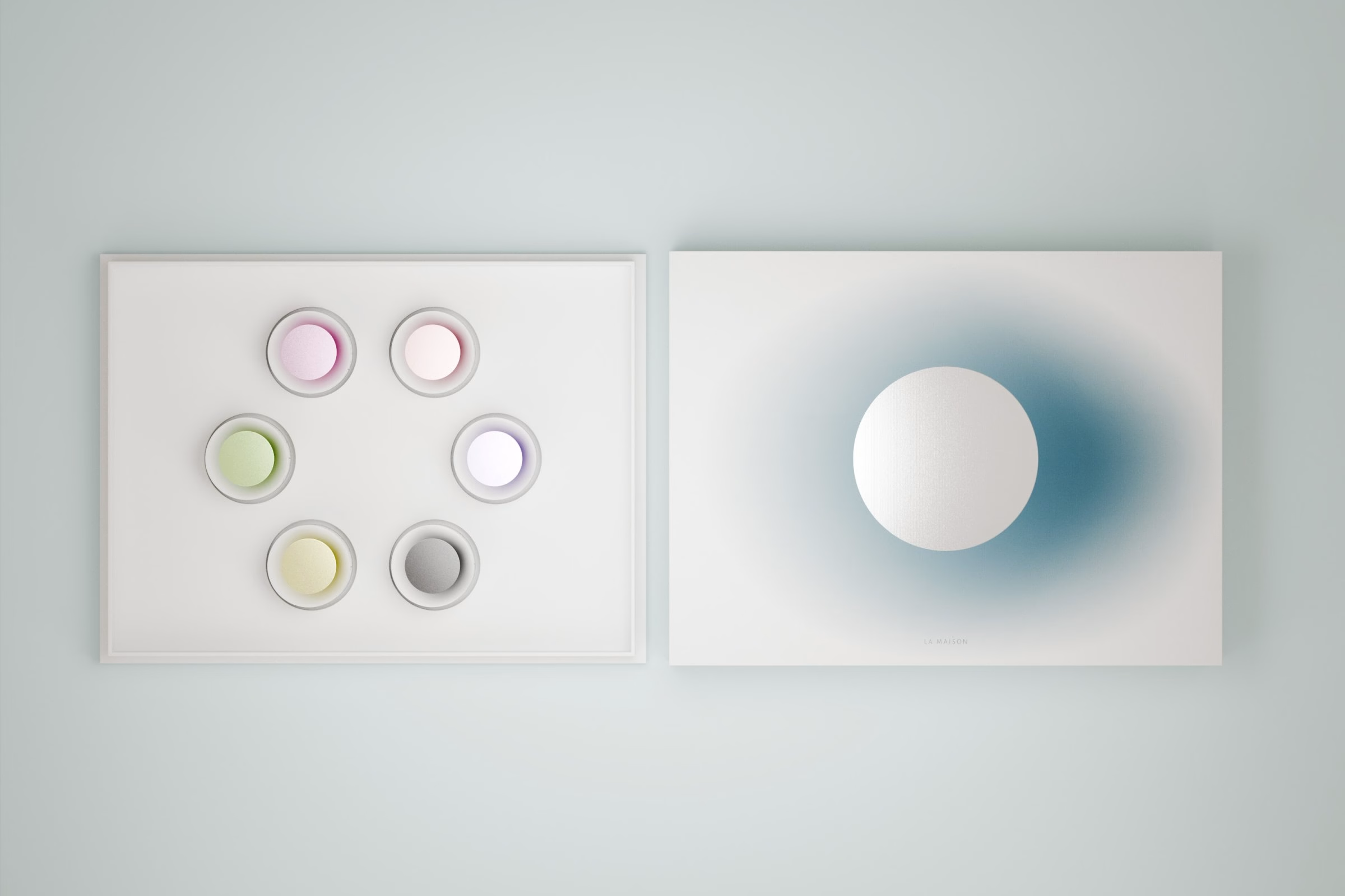
Ho Chi Minh City studio House of Ta Studio treats the moon as a quiet presence rather than a decorative motif. On the lid, the moon is formed through embossing and metallic foil, so it catches light the way moonlight does, while a deep gradient behind it fades into darkness. The studio describes the packaging as a gentle tap on the shoulder, an invitation to slow down and notice what is already in front of you.
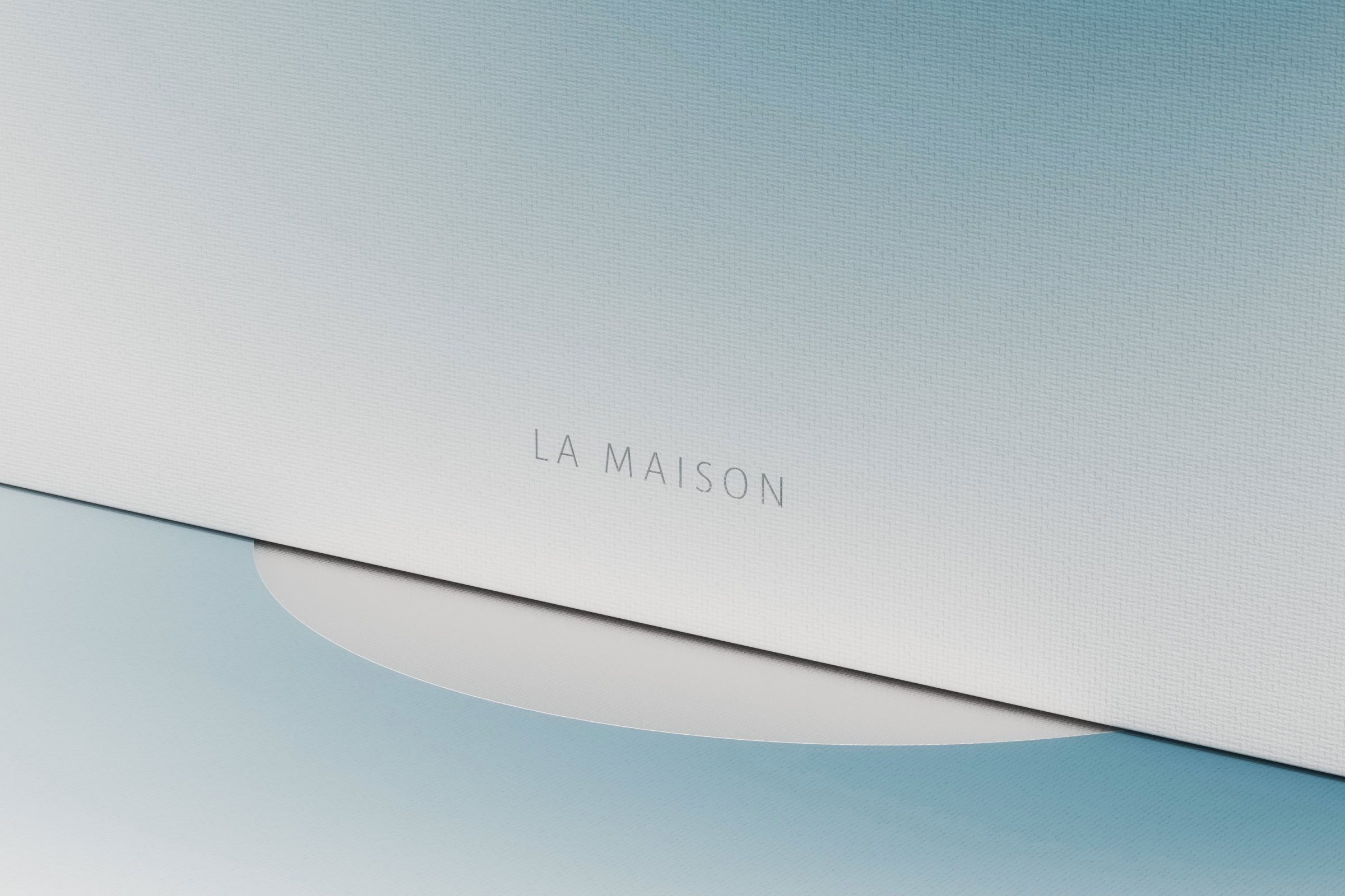
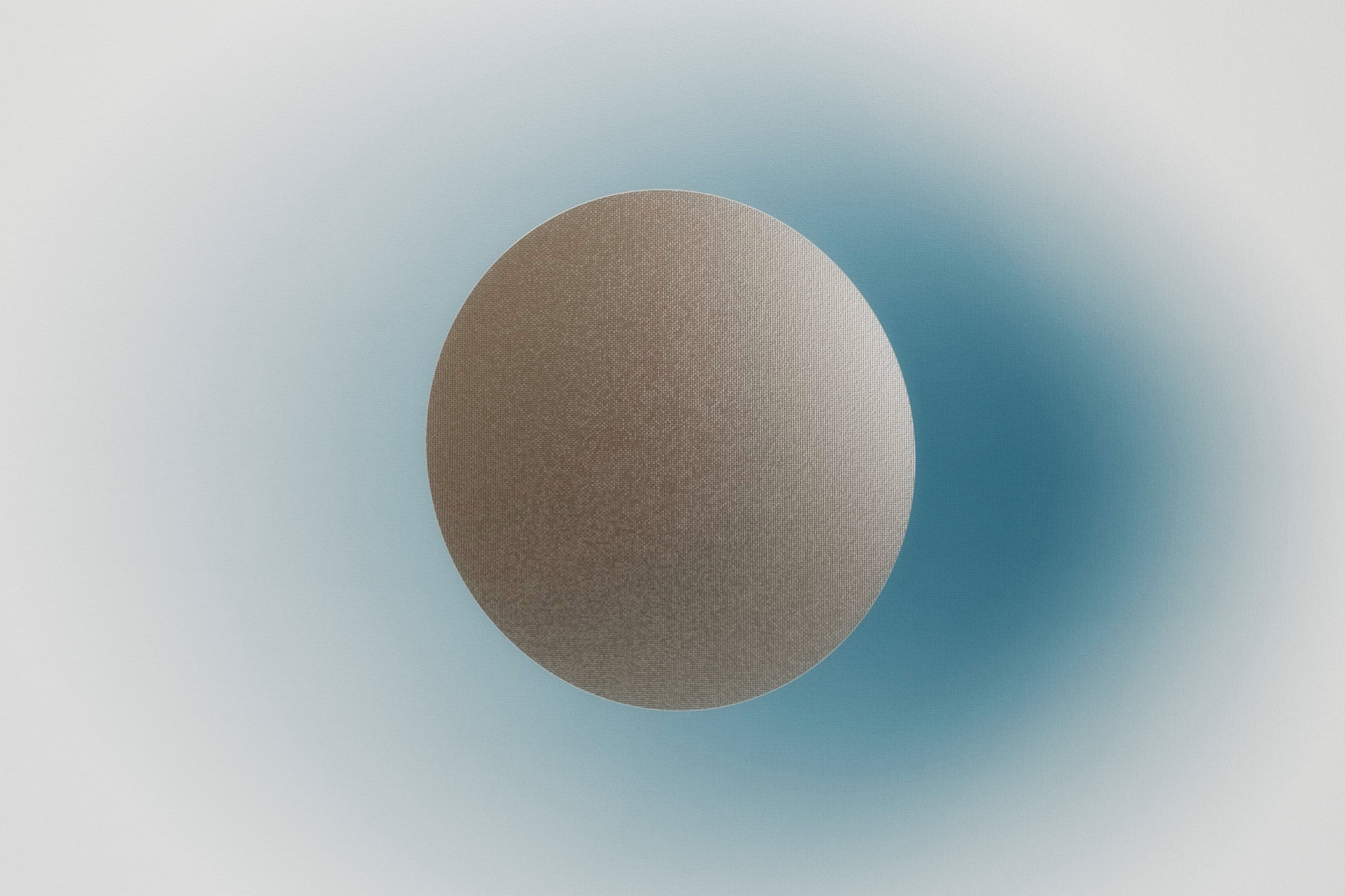
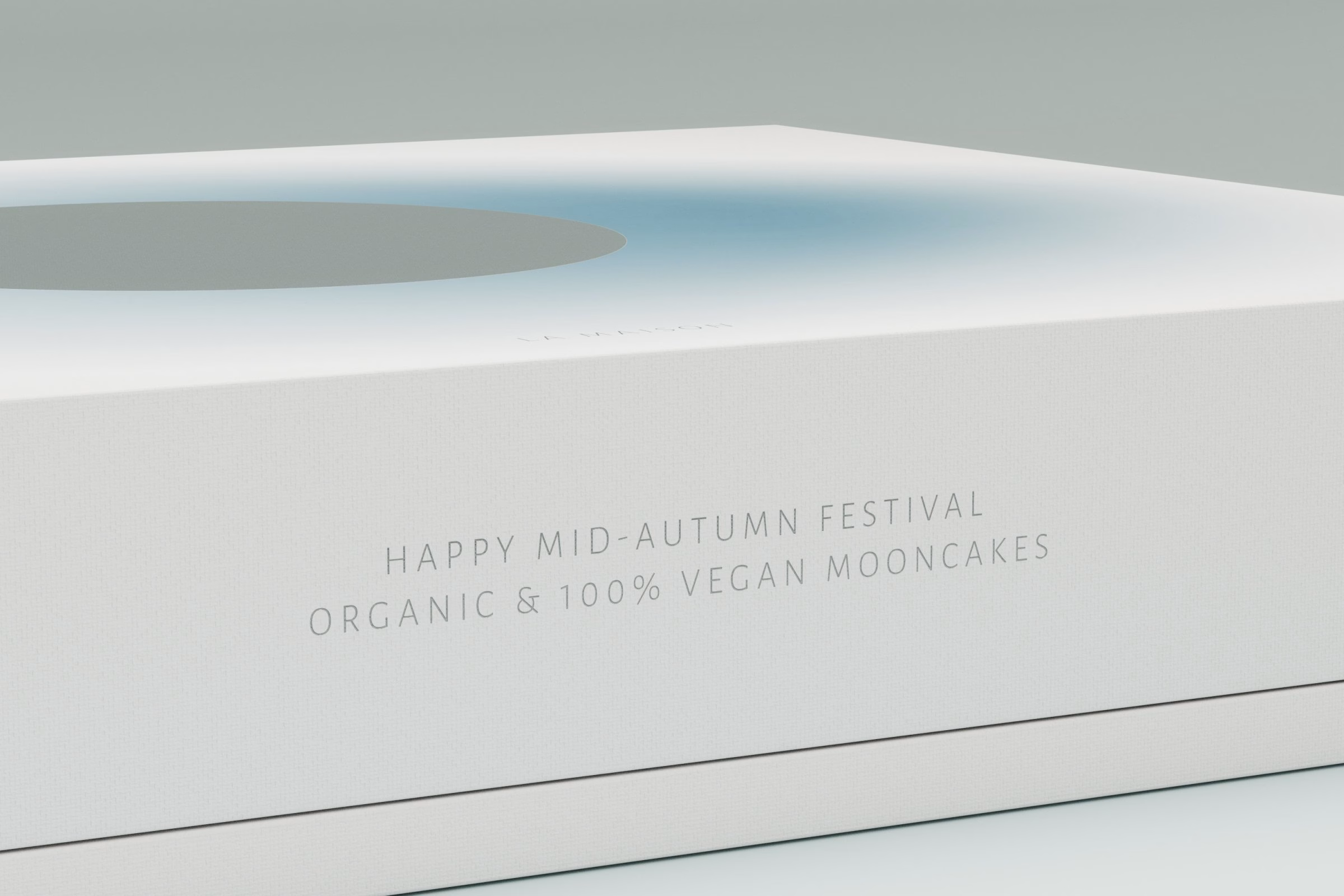
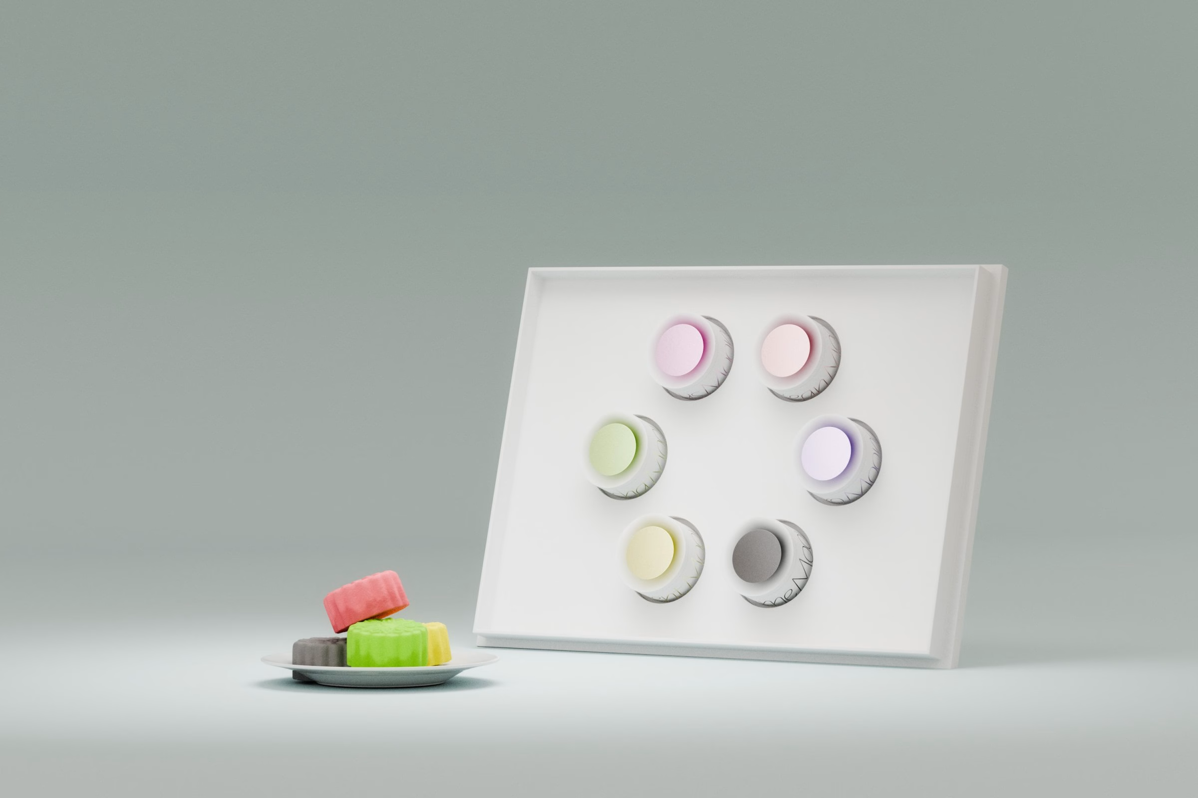
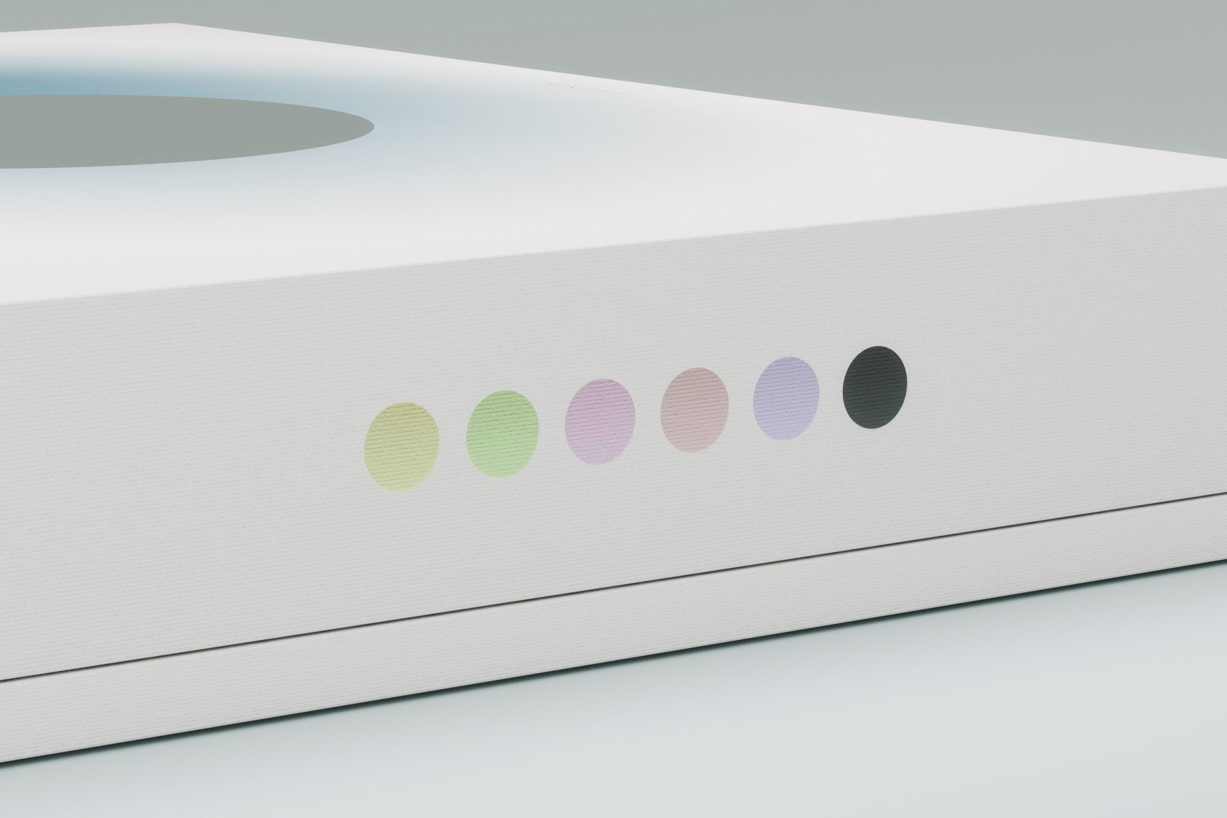
Negative space does most of the work in the packaging. The outer box stays almost entirely white, with the moon and its blue halo held at the centre and the brand name set small. Inside, six mooncakes sit in a ring of individual tins, and a row of coloured dots along the box edge previews the flavours before it is opened.
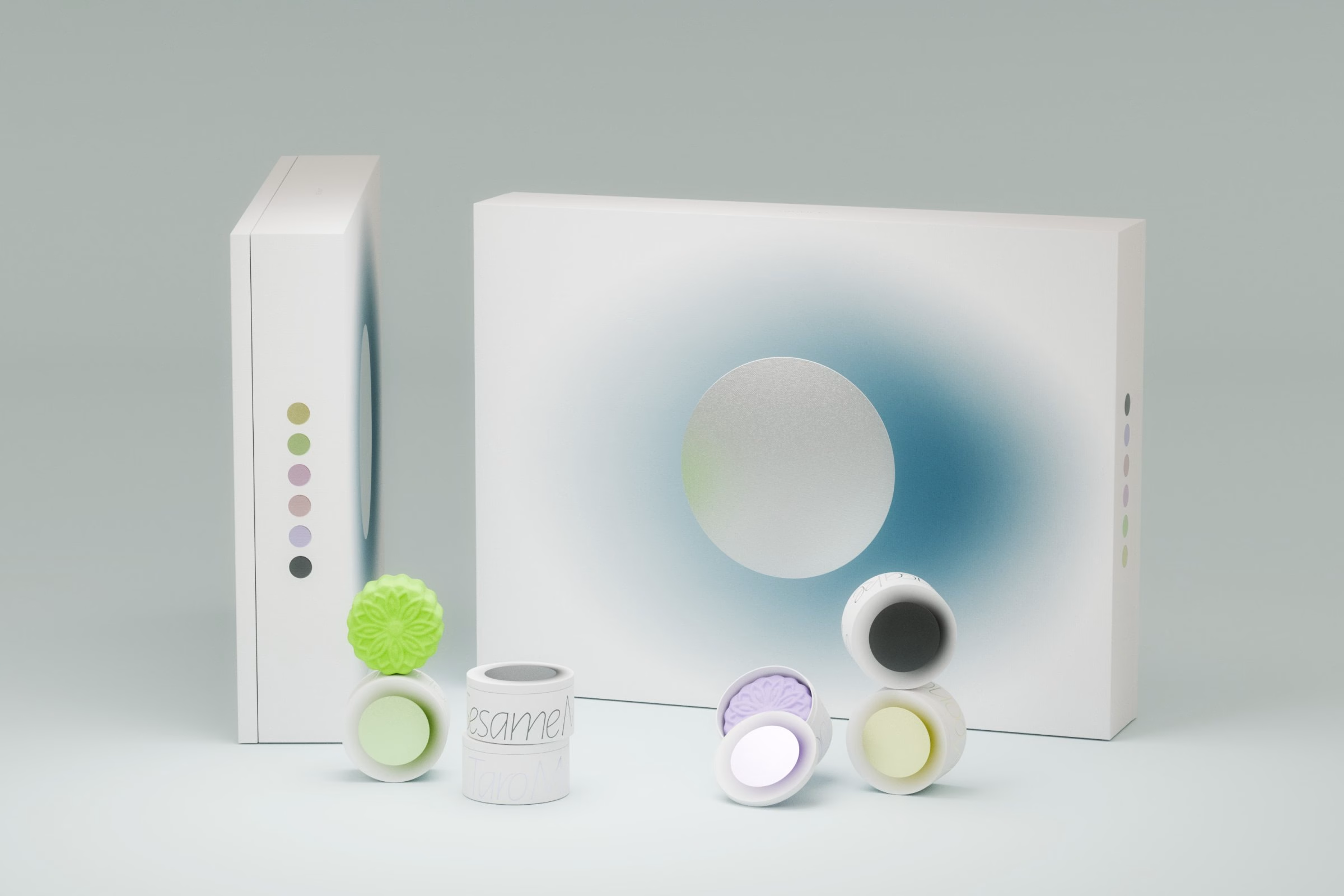
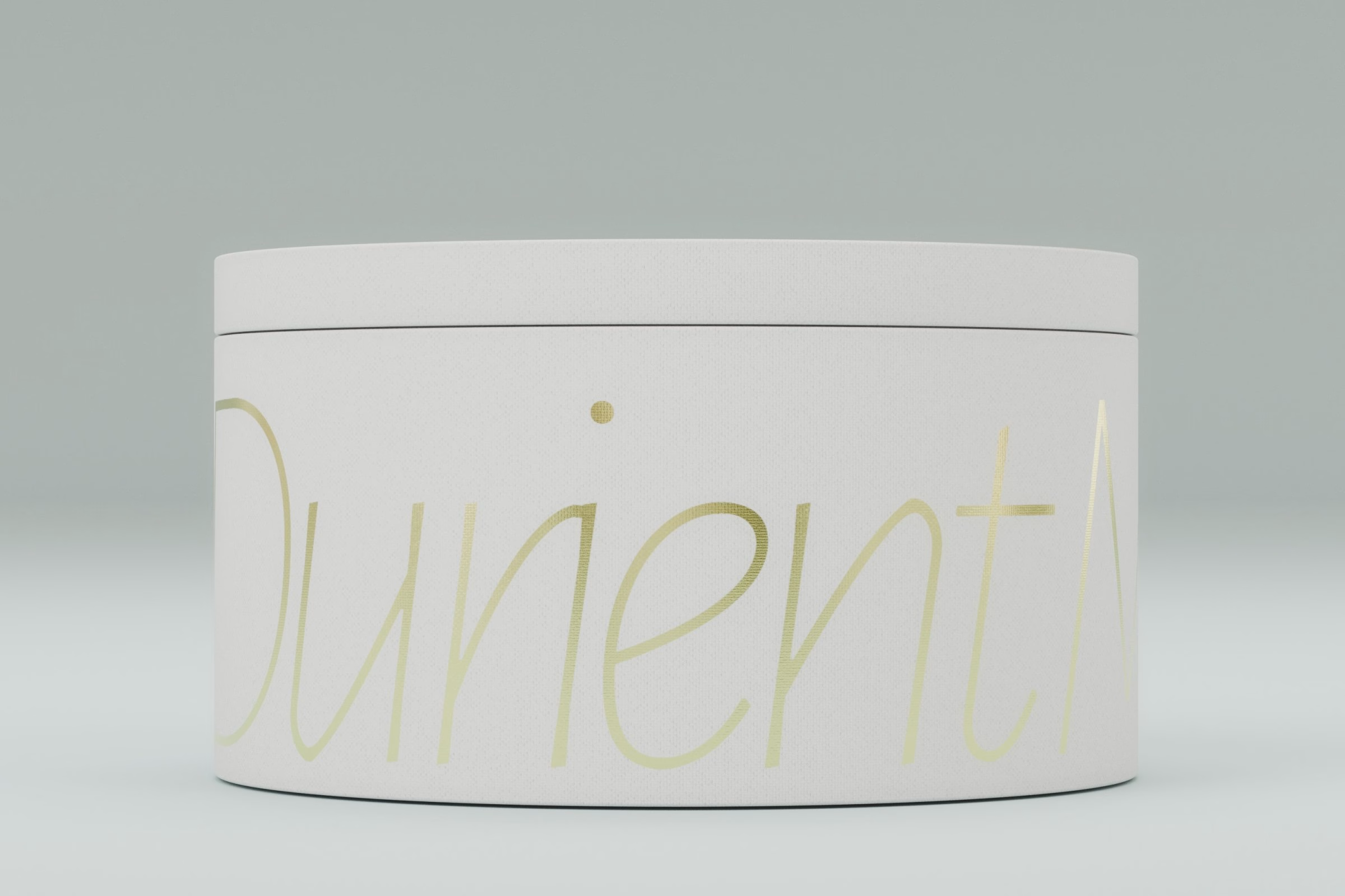
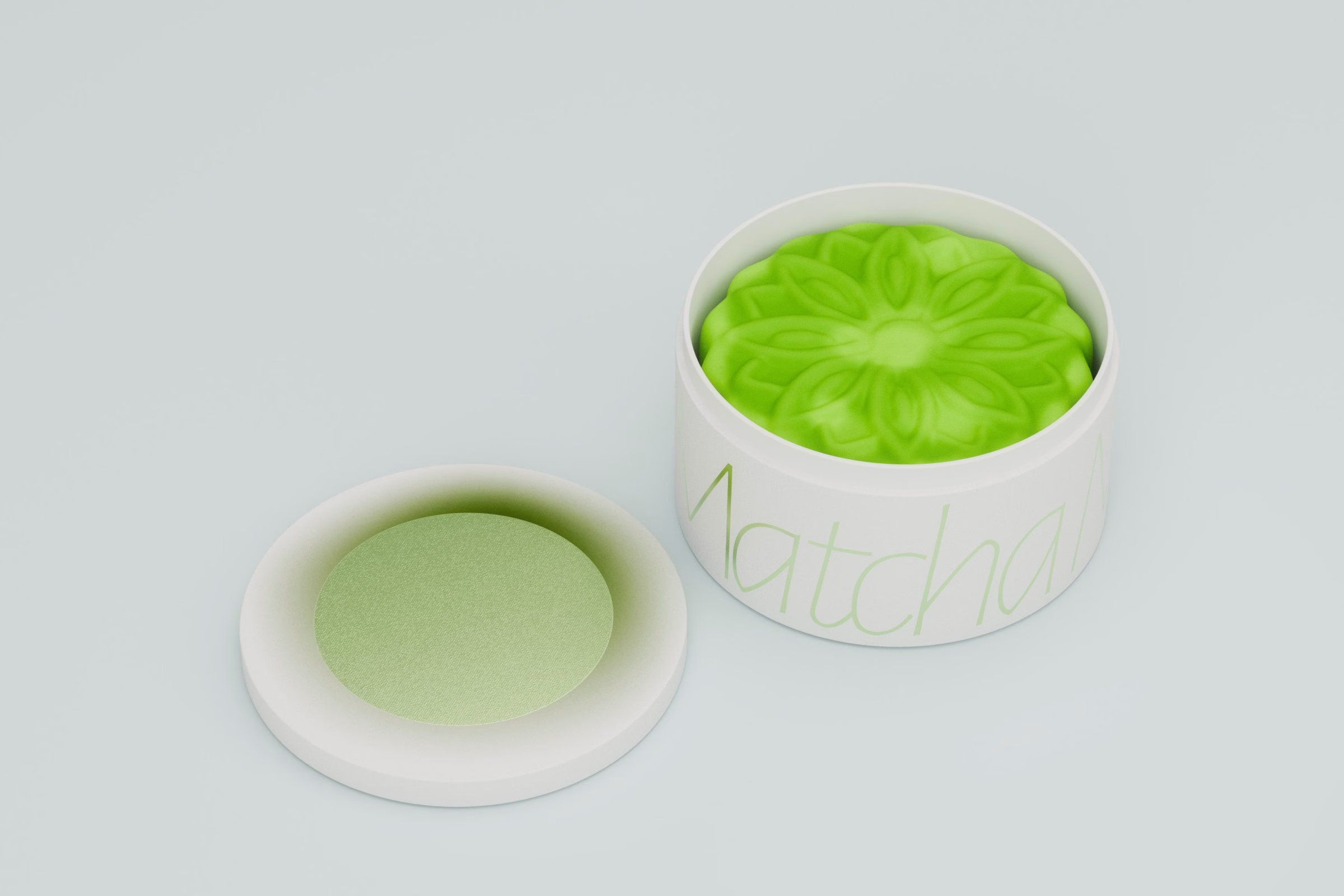
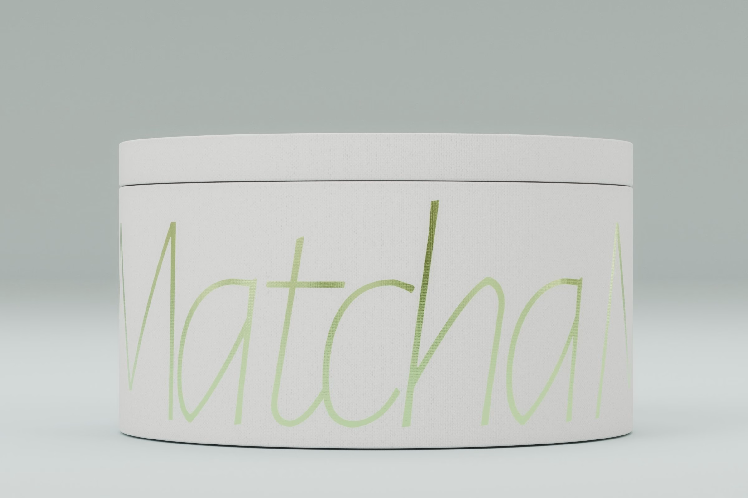
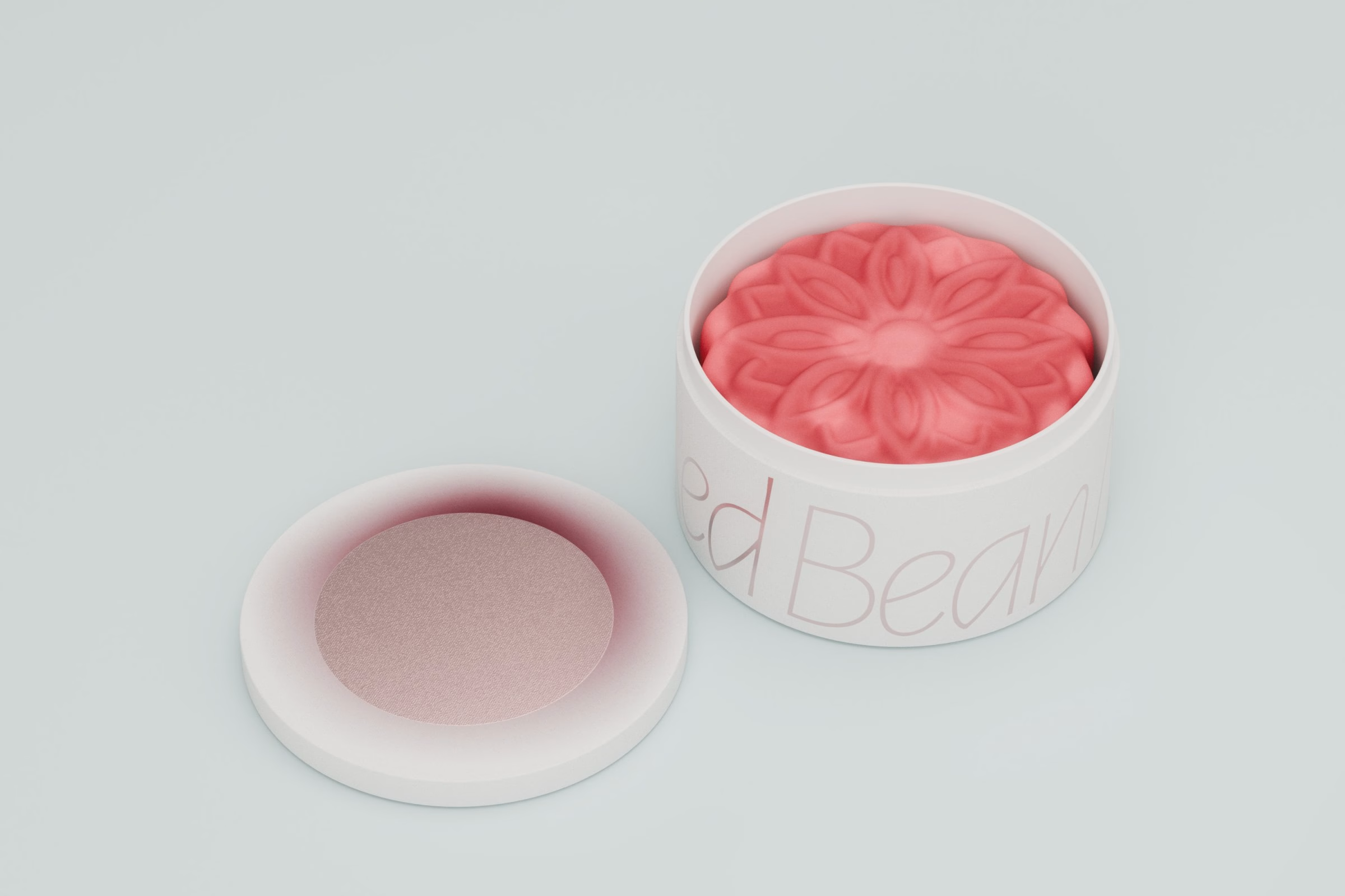
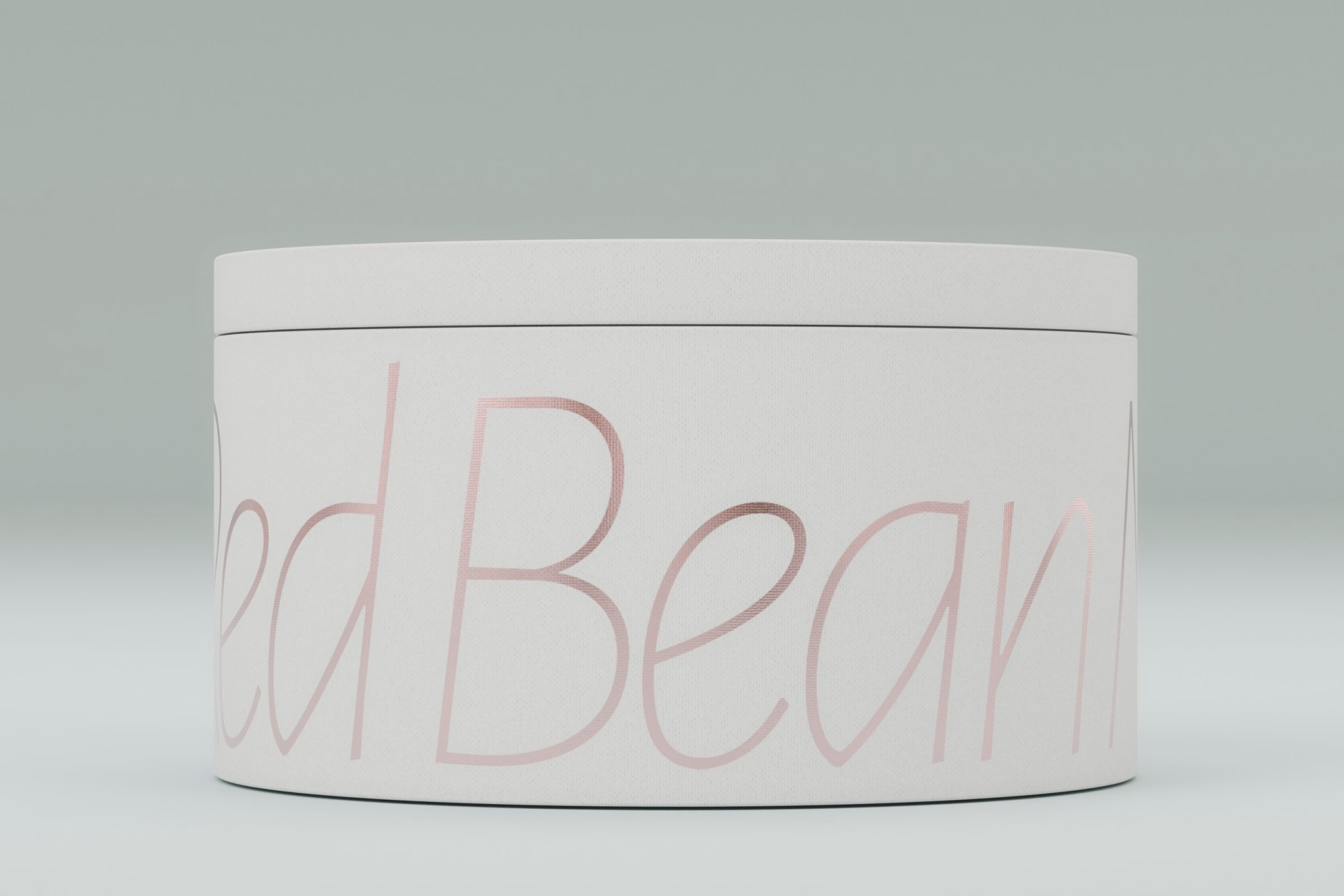
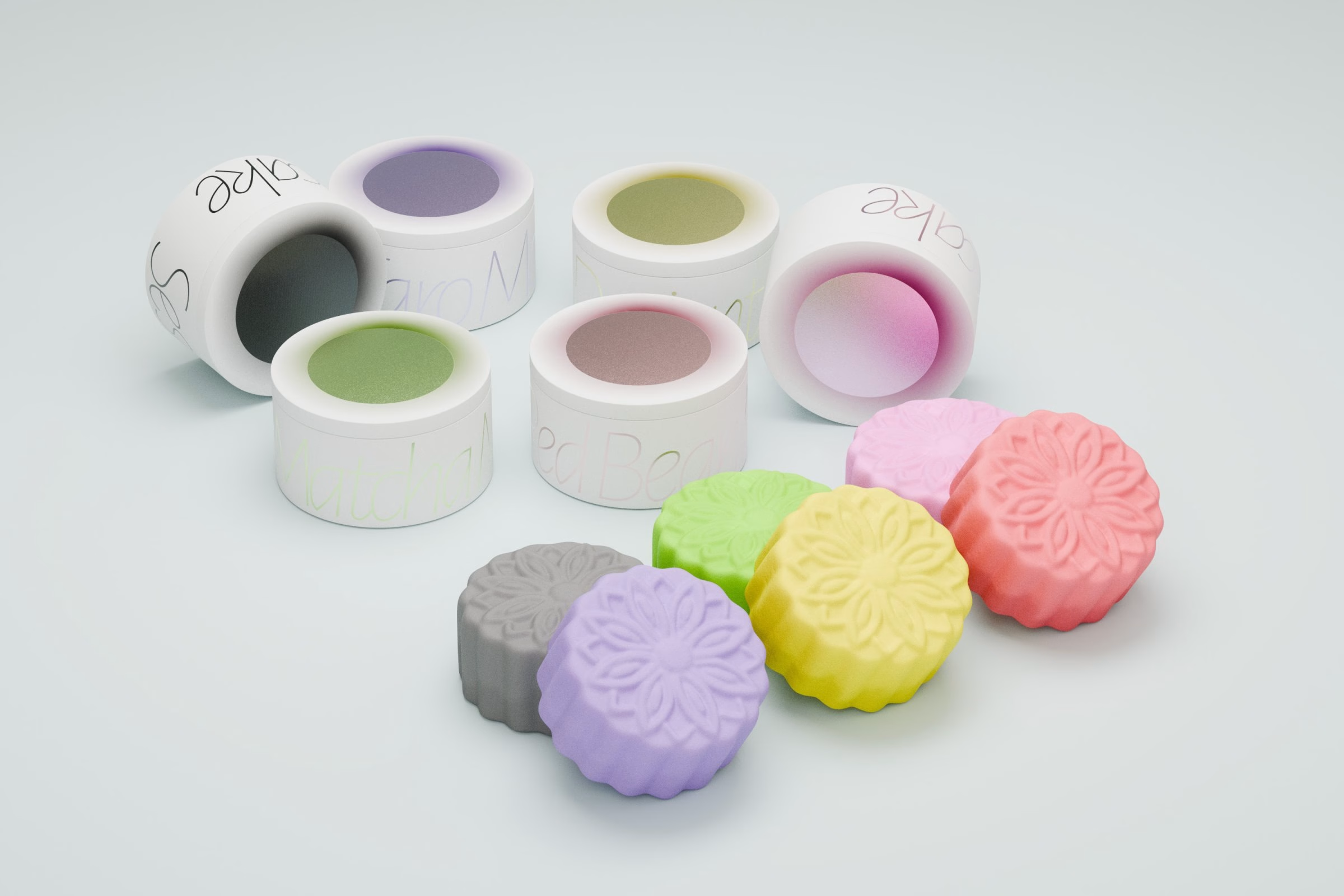
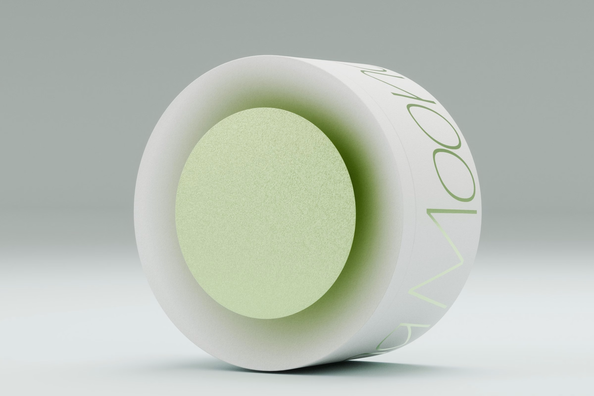
Each flavour gets its own round tin, named in a thin, flowing script that wraps around the side, with Lotus, Taro, Sesame, Matcha and Red Bean among them. The lettering runs off the edge of each tin, so the names read as a continuous ribbon rather than a label. Stacked, the tins form a small tower crowned by a single pink mooncake.
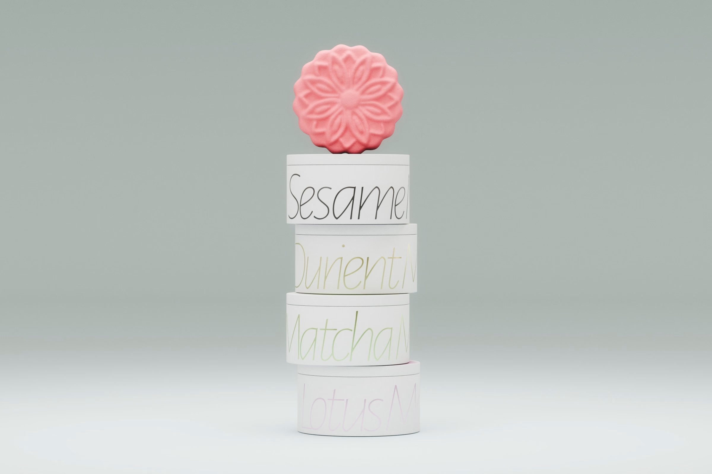
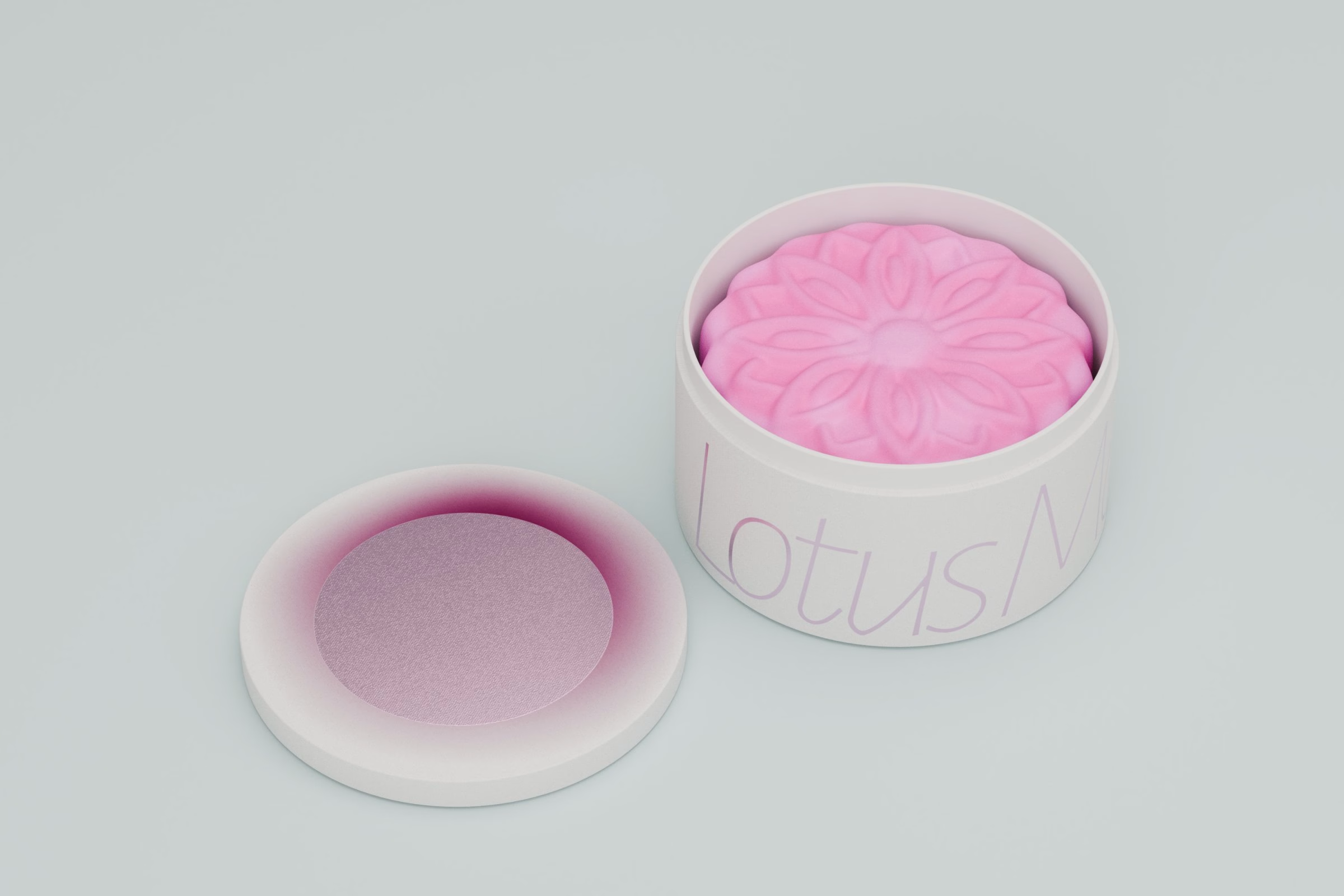
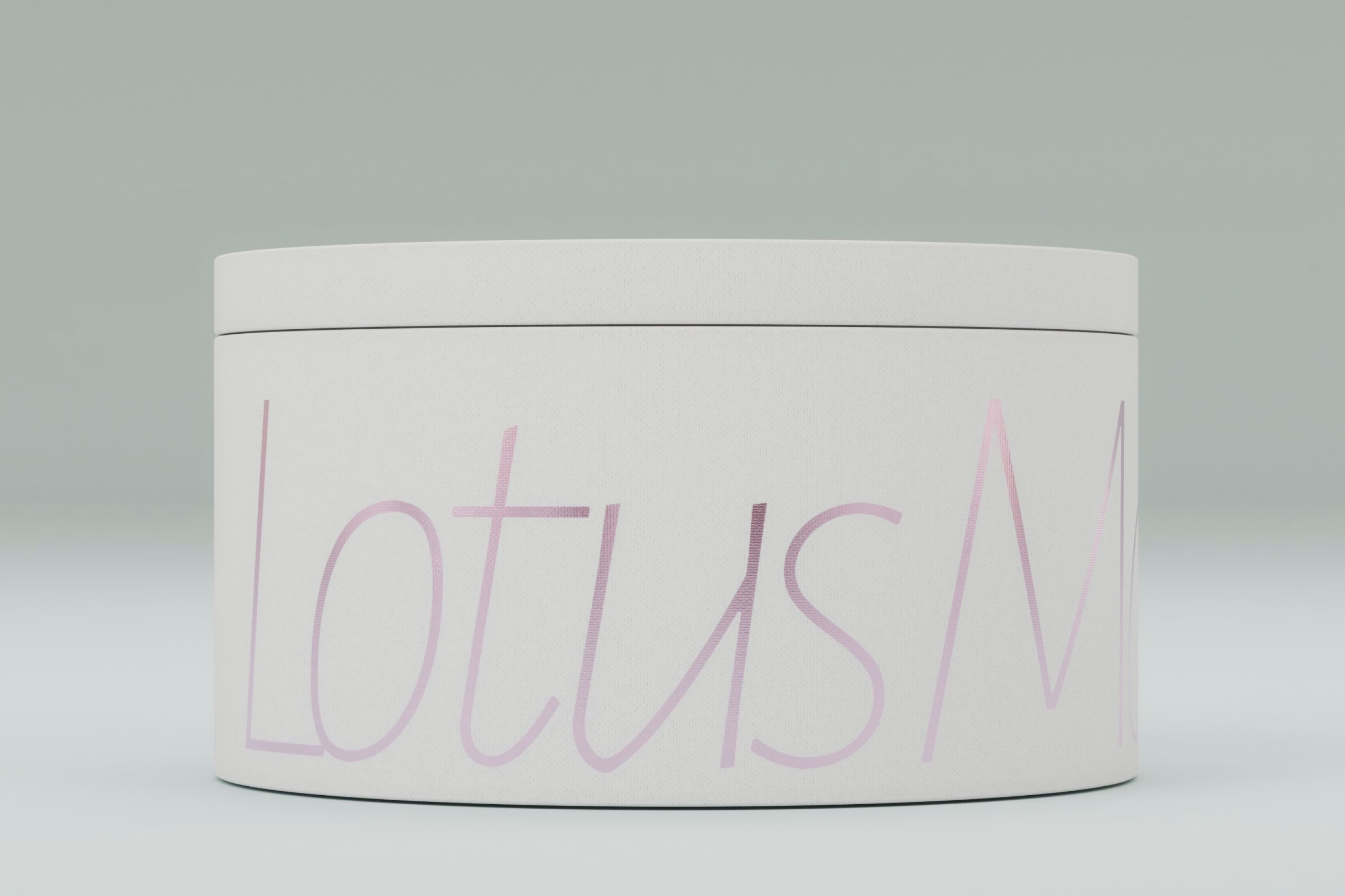
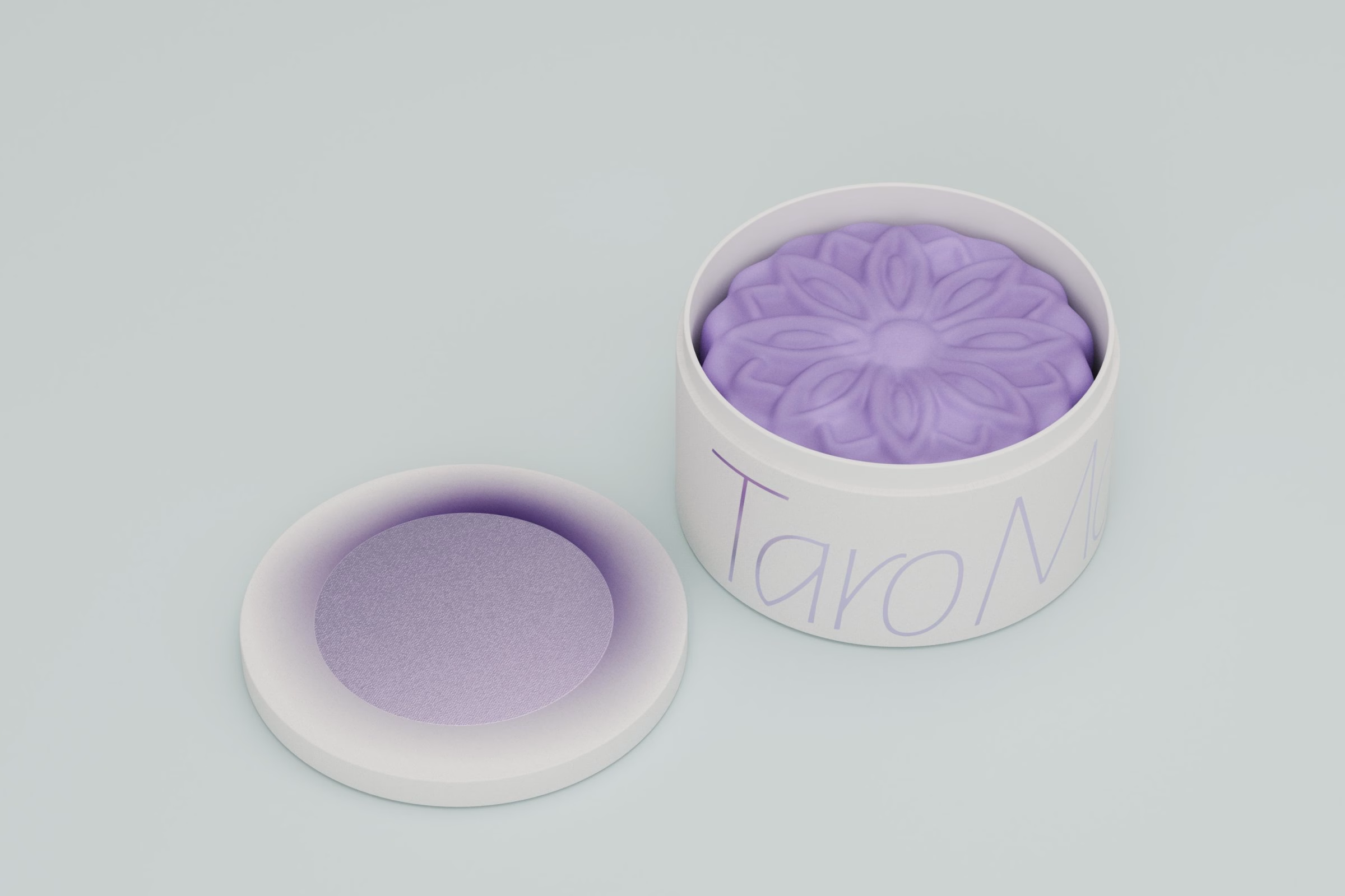
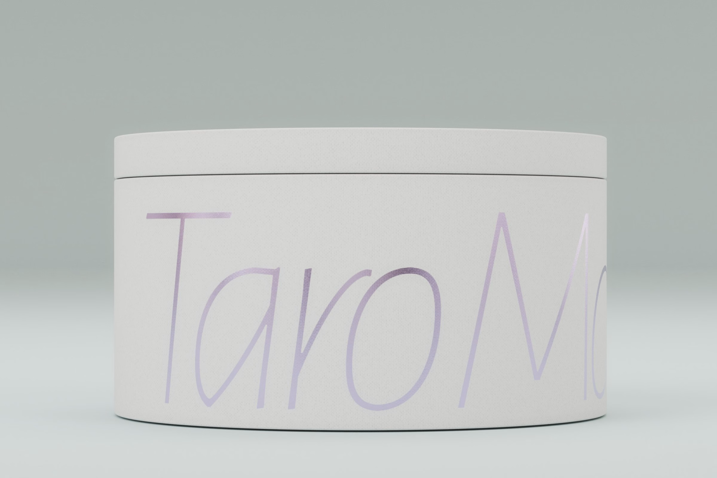
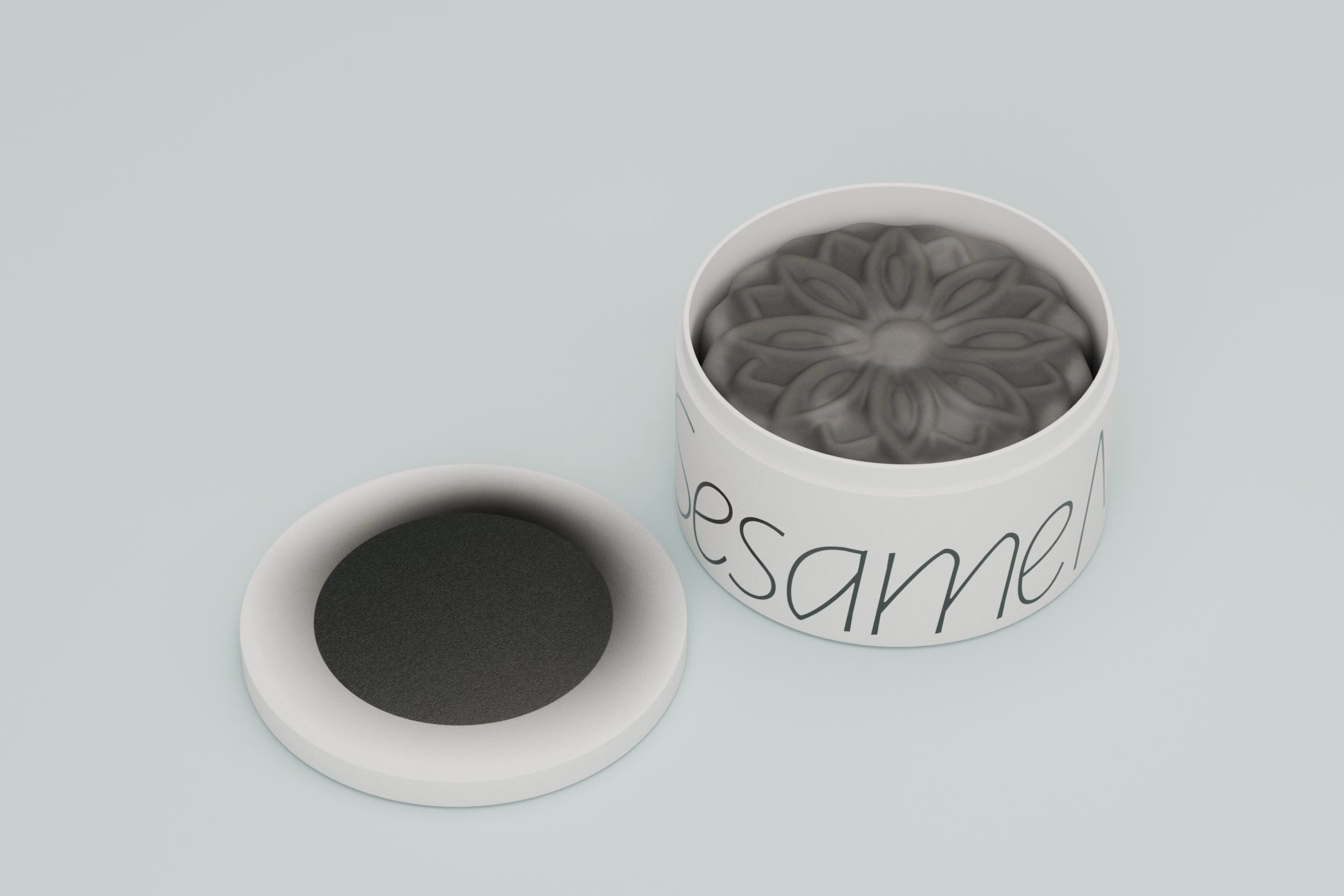
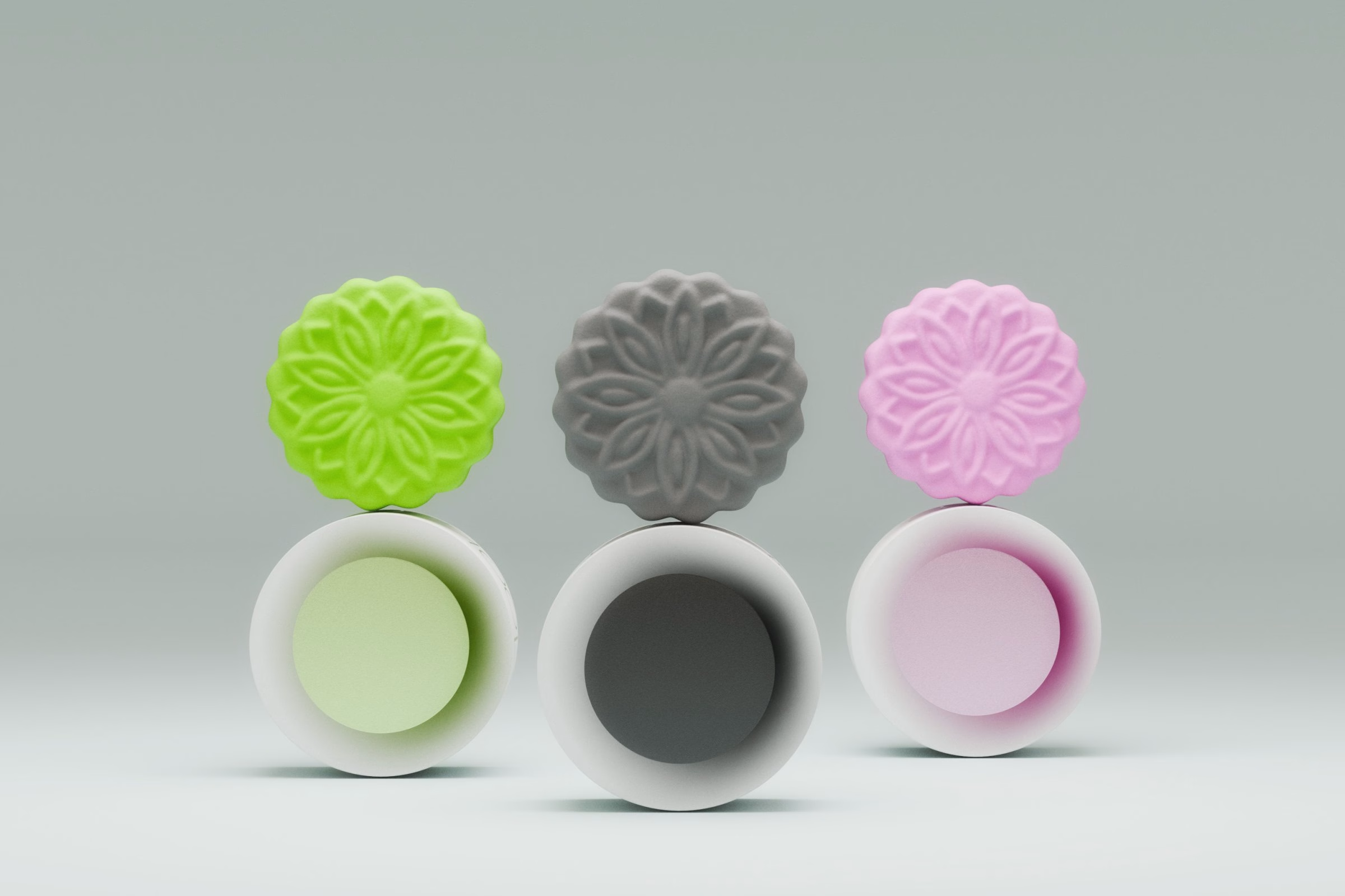
Colour enters only through the food. Pink, lilac, charcoal, yellow, green and coral mooncakes, each pressed with a flower pattern, sit inside white tins whose inner bases are tinted to match the filling. The script on each tin picks up the same hue in a soft gradient, so every flavour can be told apart without breaking the white exterior.
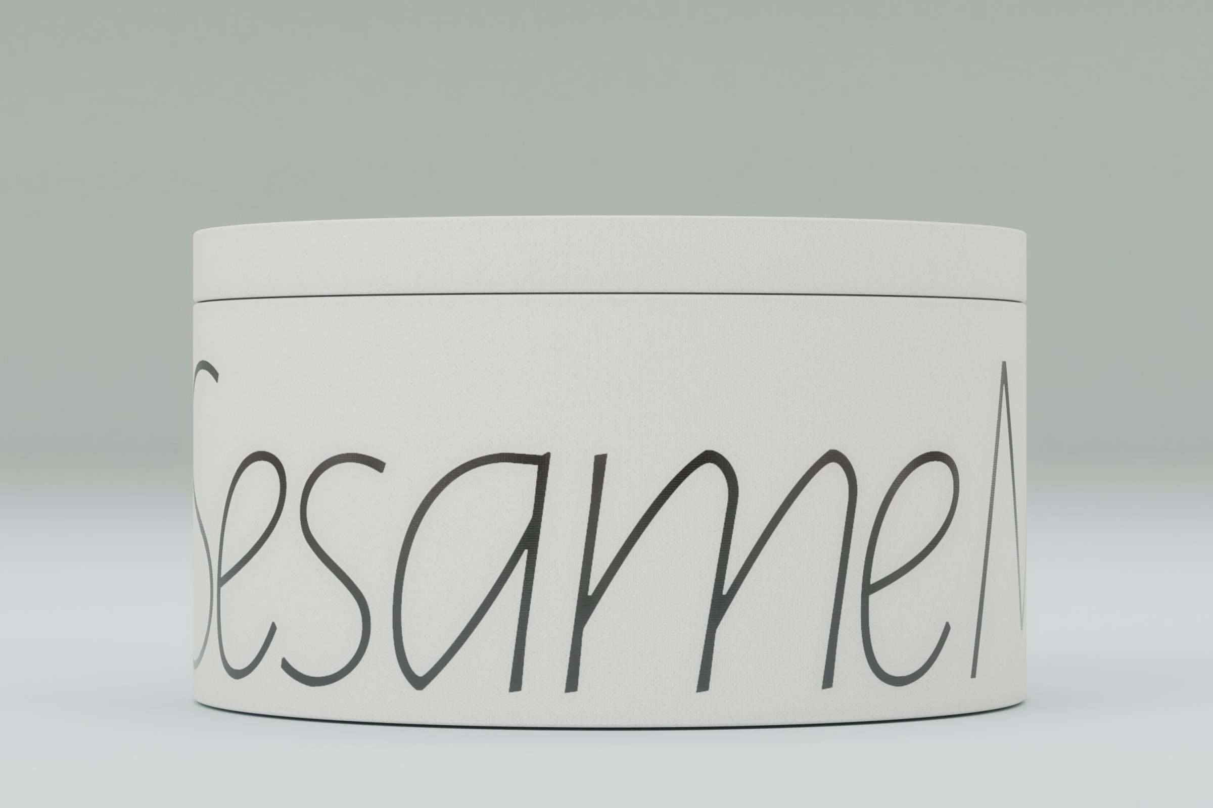
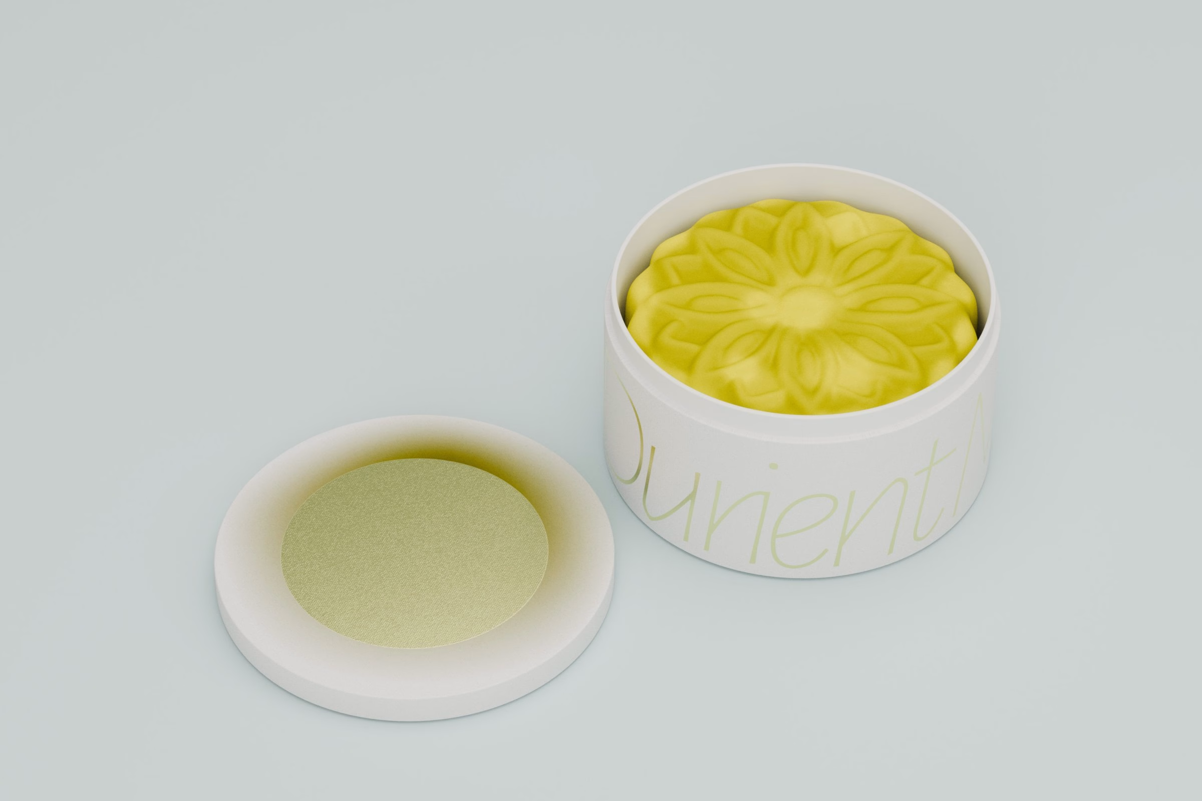
The result stays close to its brief. There is no lantern, rabbit or cloud pattern, only a moon, a night sky and a set of carefully coloured cakes. It is a restrained take on Mid-Autumn packaging that asks the recipient to look closer, which is exactly the point the studio set out to make.
More in Food & Beverage Branding
Stay on top of this week's design. Insights, top picks & more.