Re—Union
September 13, 2020
Mindsparkle Mag


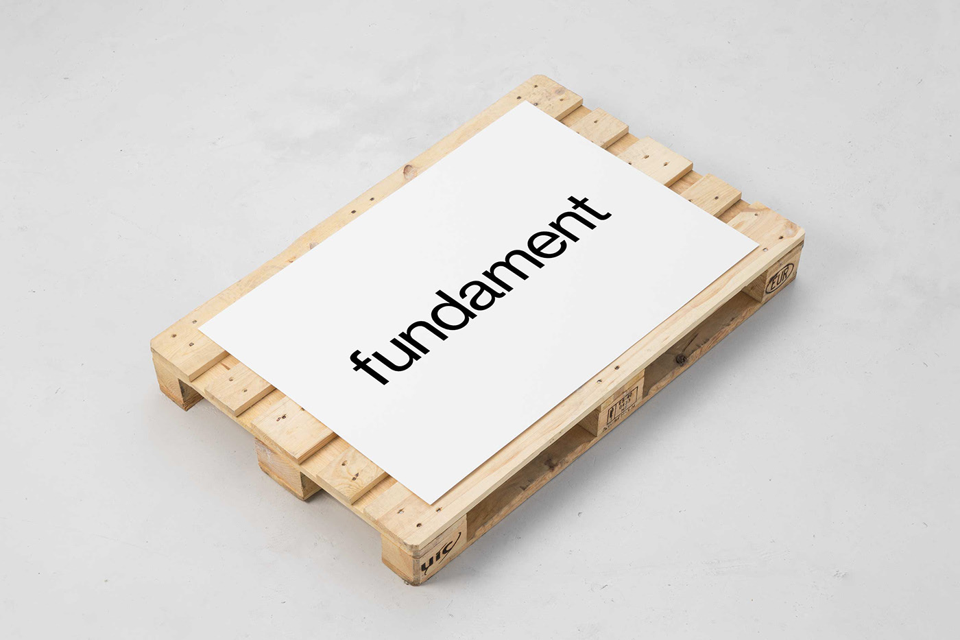
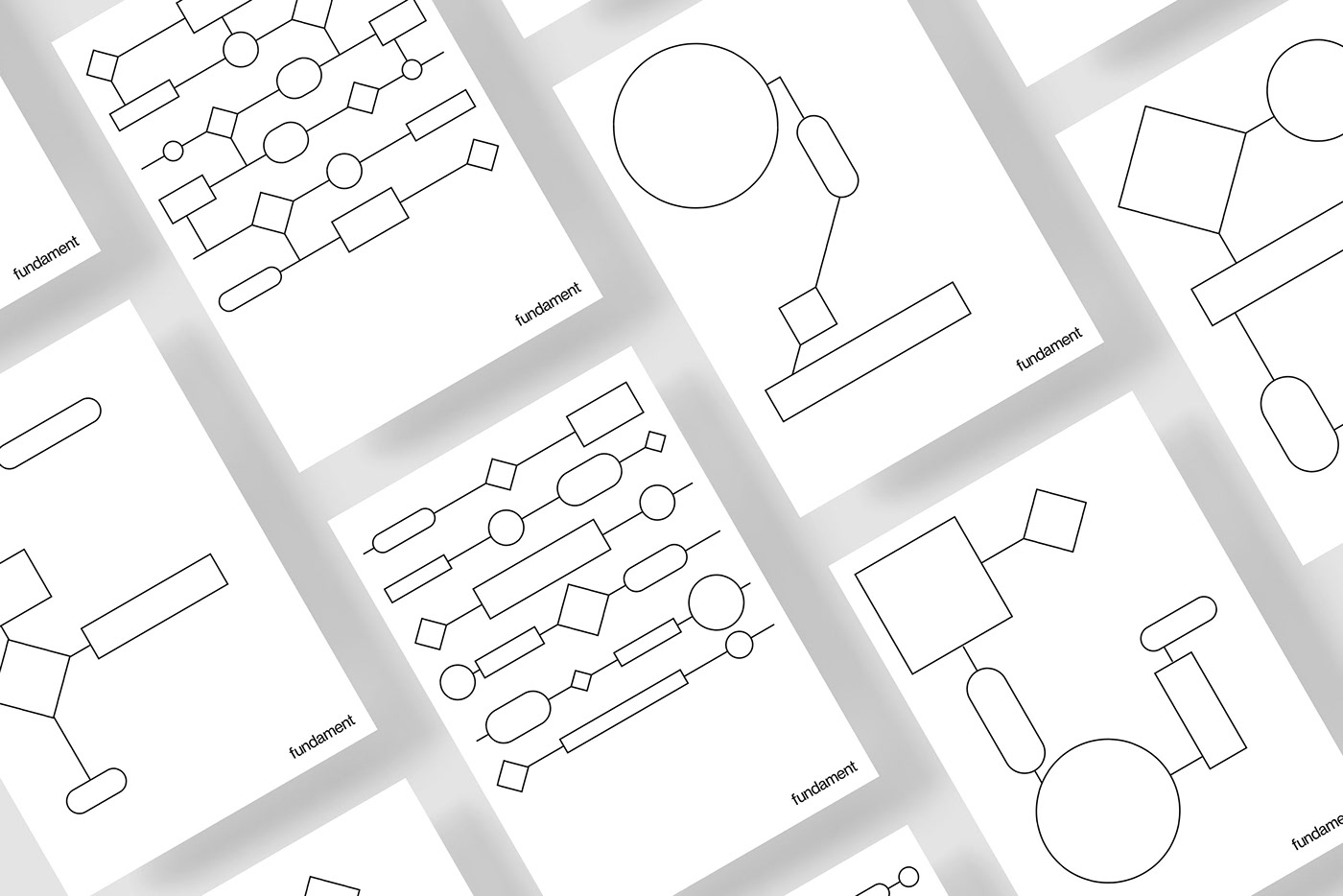
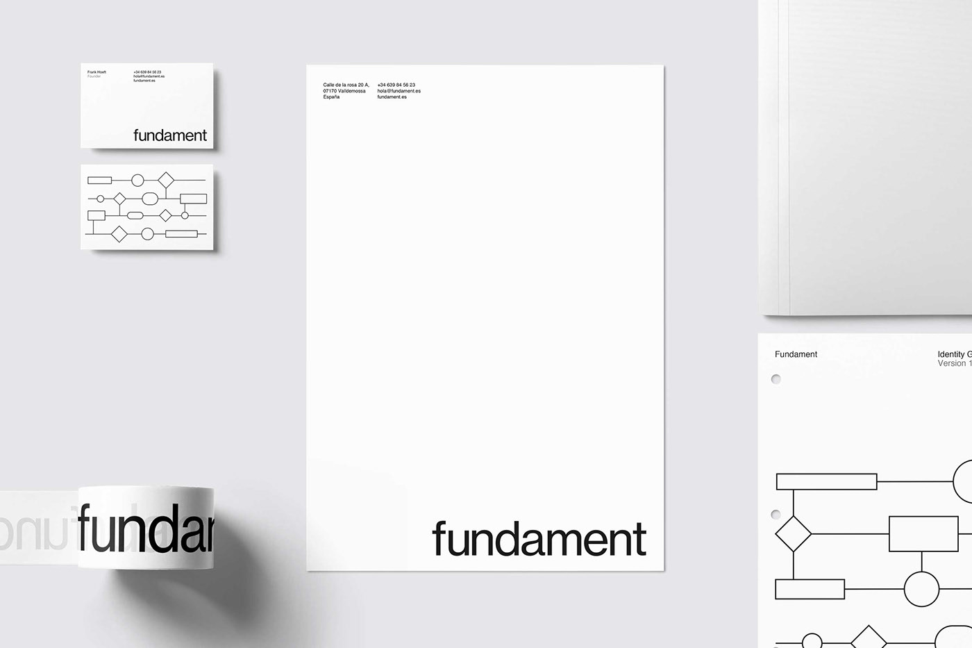
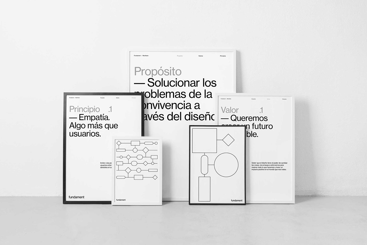
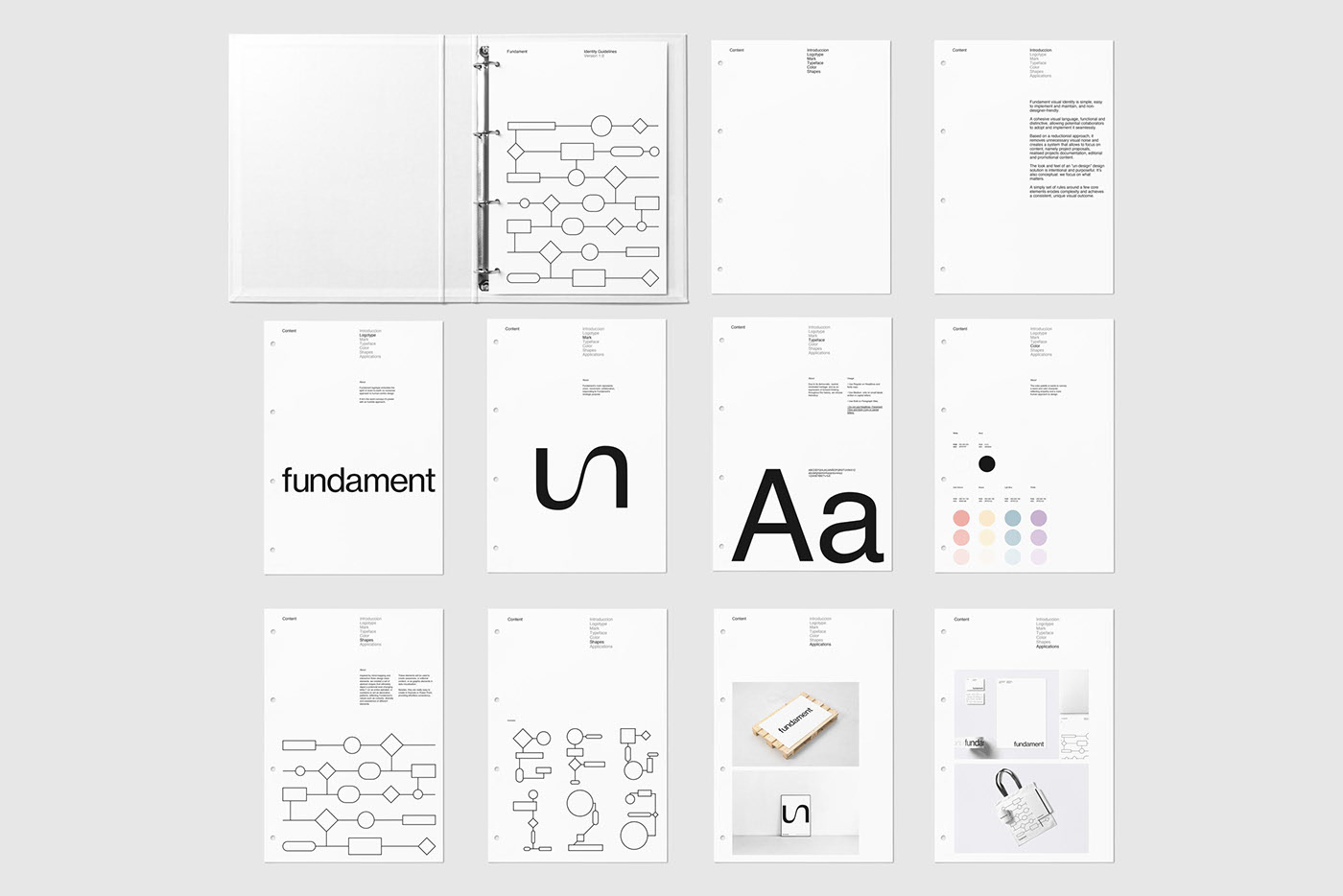
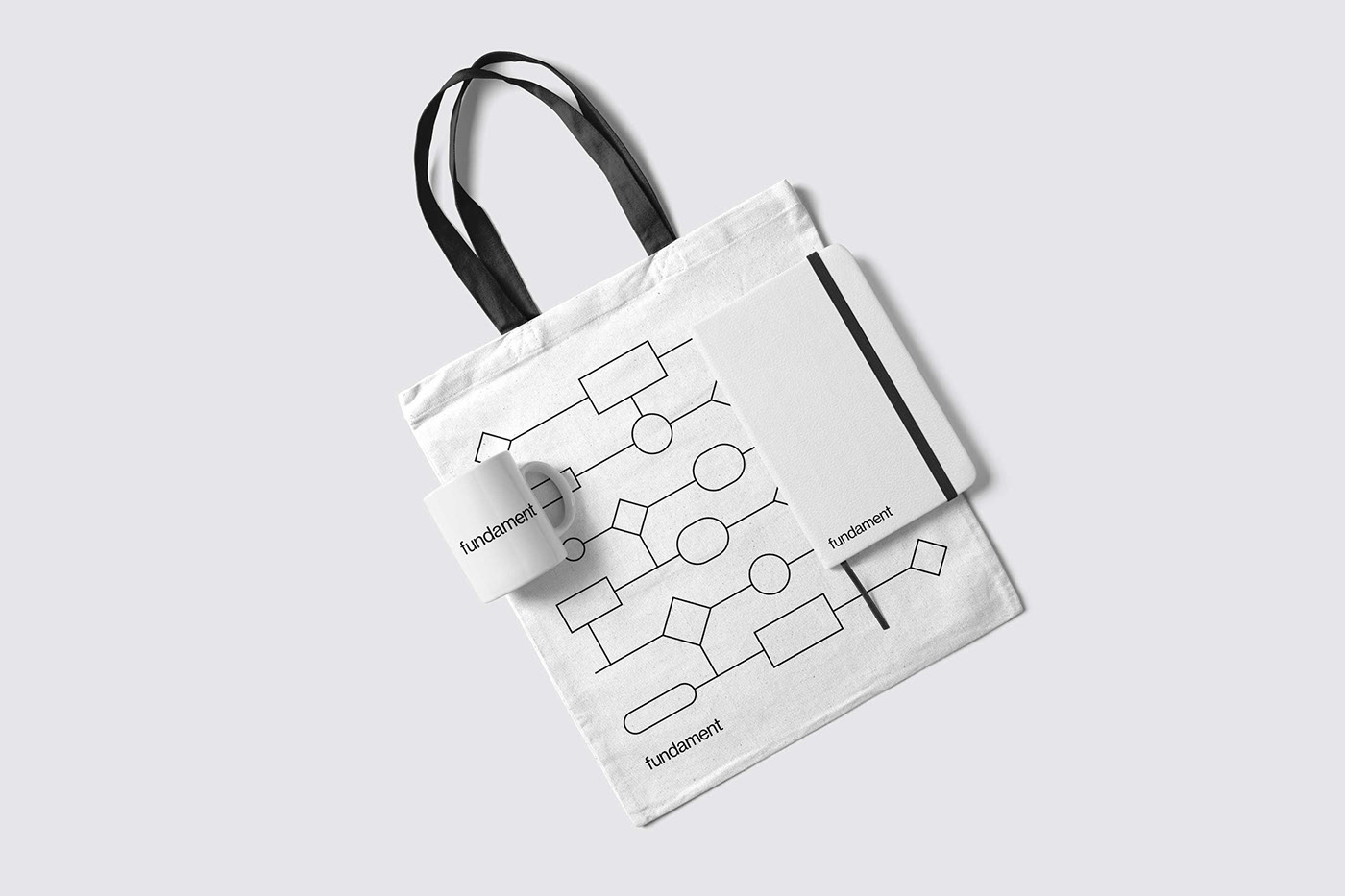
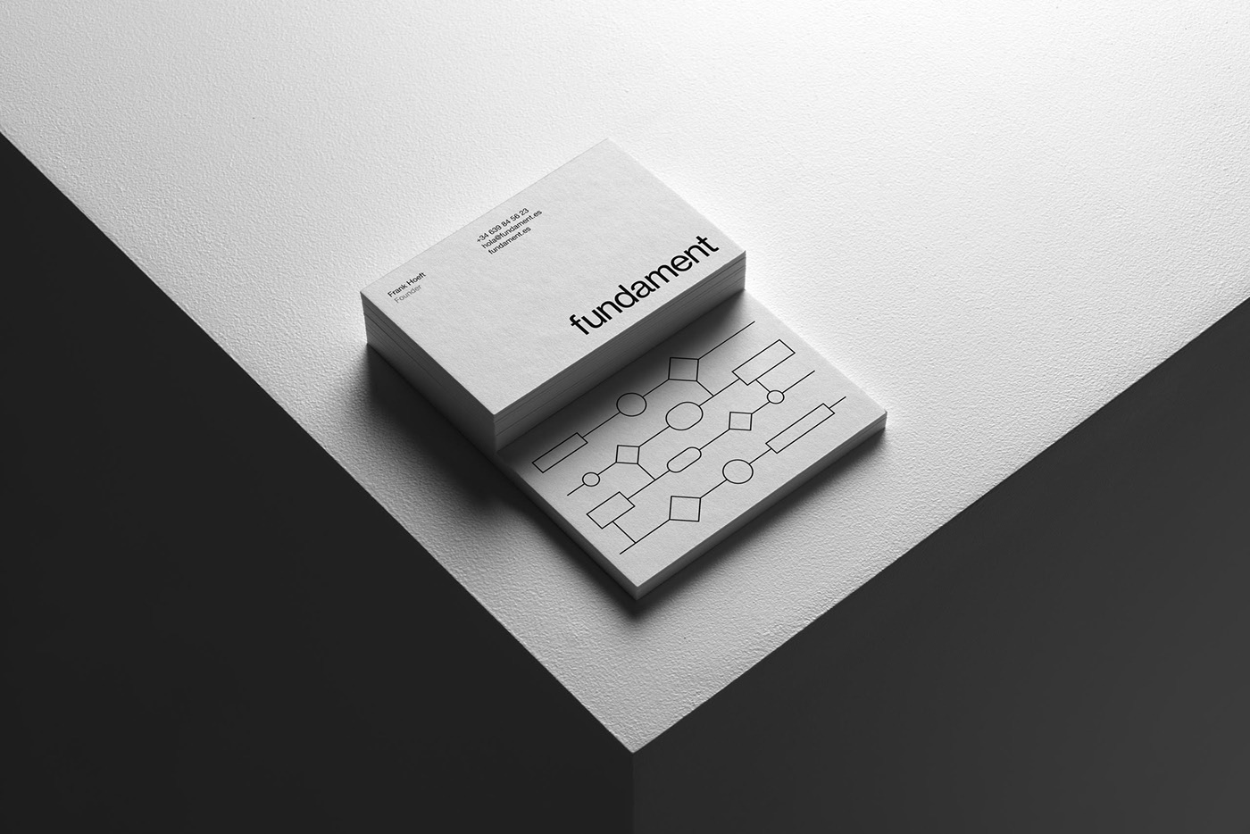
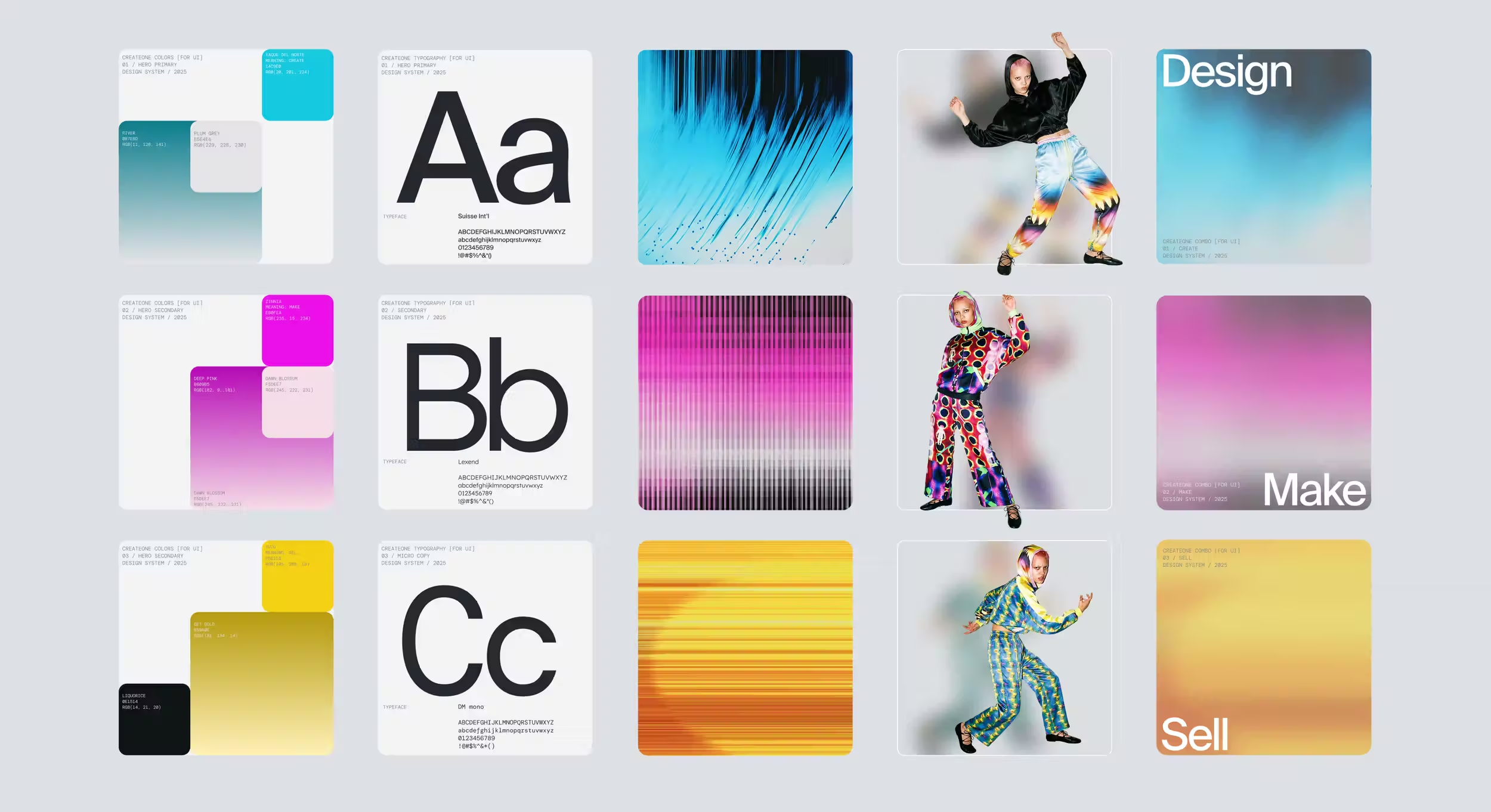
Re—Union designed Fundament - an NGO founded in Spain in 2019 to change coexistence paradigms through human-centered design methodologies. Fundament asked Re—Union to create a visual identity that had to be simple, easy to implement and maintain, and non-designer-friendly. A cohesive visual language that will be functional, distinctive, and allows a potential network of collaborators to adopt it and implement it seamlessly. Re—Union followed a reductionist approach, with a stripped-down design solution that removes unnecessary visual noise and creates a system that allows us to focus on content, namely project proposals and documentation, editorial, and promotional content. Using only a typeface, mostly in one type-weight, in combination with a grid-oriented layout, a symbol, and a few defined usages for an ever-changing set of shapes, Re—Union simplified implementation, design decision-making, and generates consistency.
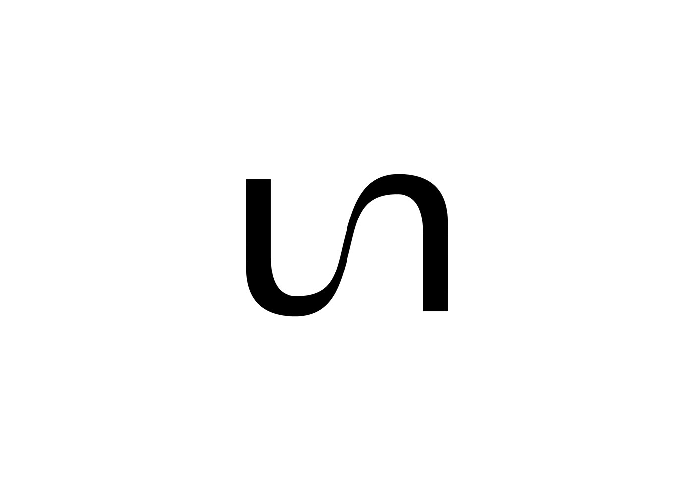
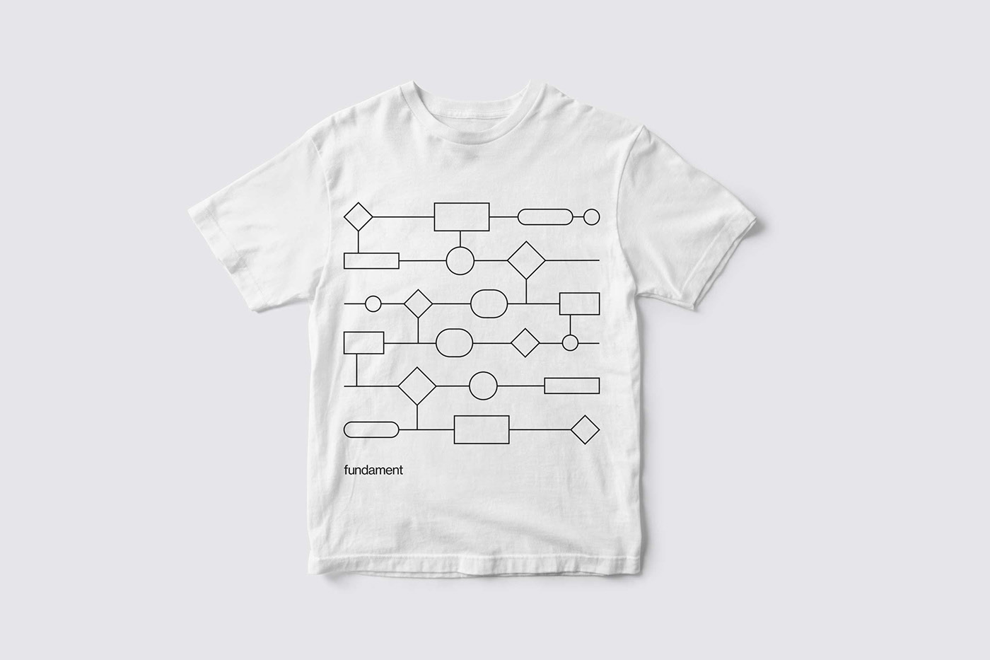
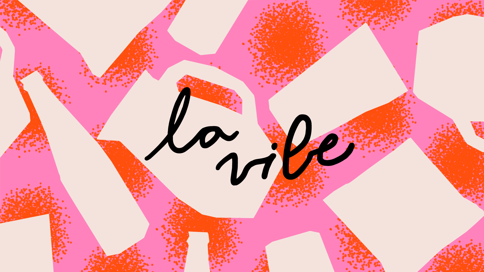
Inspired by mind-mapping and interaction flows design basic elements, the set of abstract shapes depict a potential ever-changing letter F —or an entire alphabet, or numbers— or can act as dynamic patterns, reflecting Fundament’s values such as curiosity, diversity, and coexistence of different elements.
Credits: Re—Union