Plus
Plus

 Menu
Menu


Rui Abreu
August 30, 2016
Mindsparkle Mag


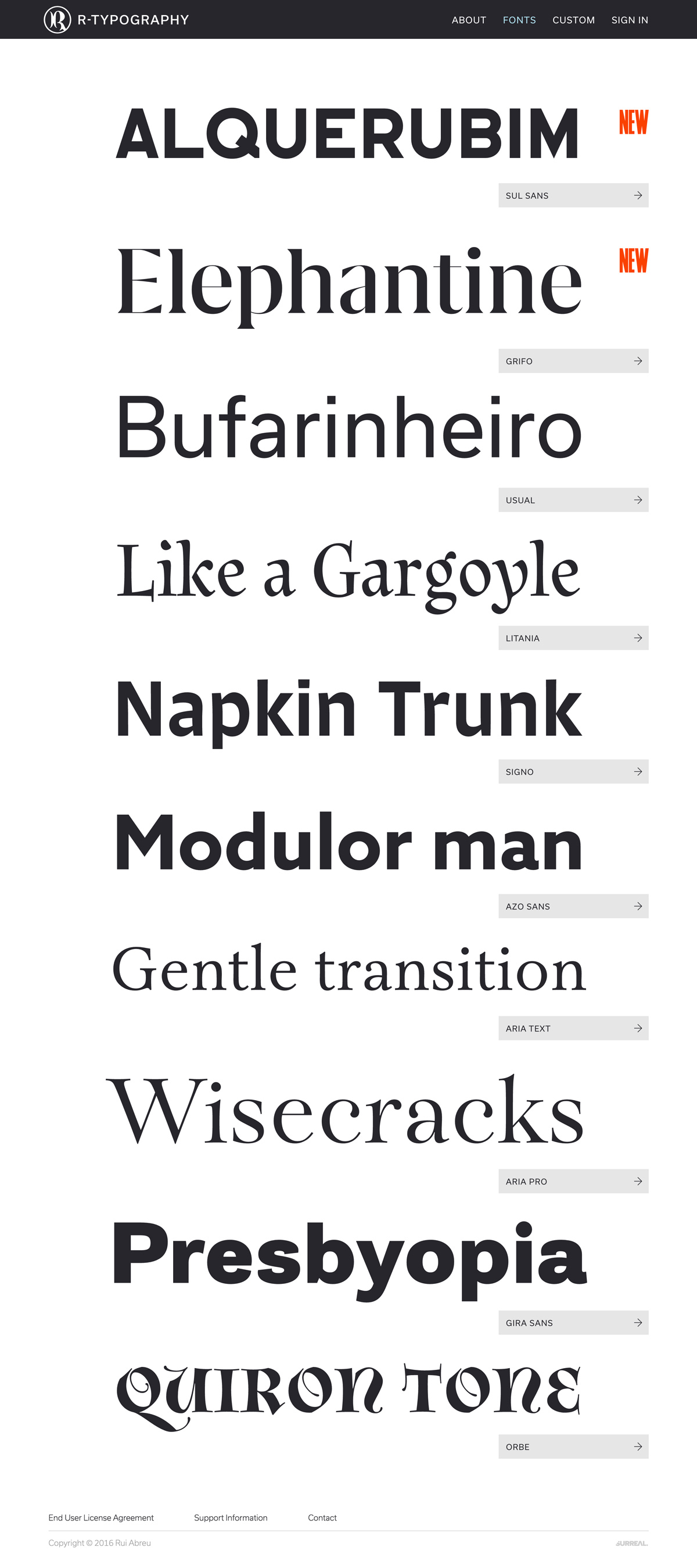
Rui Abreu built R-Typography as a clean, specimen-led showcase for his independent type foundry. The homepage lets the typefaces speak for themselves, stacking large playful words like ‘Elephantine’, ‘Bufarinheiro’ and ‘Wisecracks’ that flip between elegant serifs and sturdy sans. A crisp dark header, restrained grey labels and small orange ‘New’ markers keep the interface out of the way of the lettering. The generous scale makes browsing the catalogue feel immediate and tactile. It is a purposeful piece of type design and specimen typography.
Credits: Rui Abreu
More in Design Agency
Stay on top of this week's design. Insights, top picks & more.