Plus
Plus

 Menu
Menu


We are the Rebel
May 03, 2021
Mindsparkle Mag


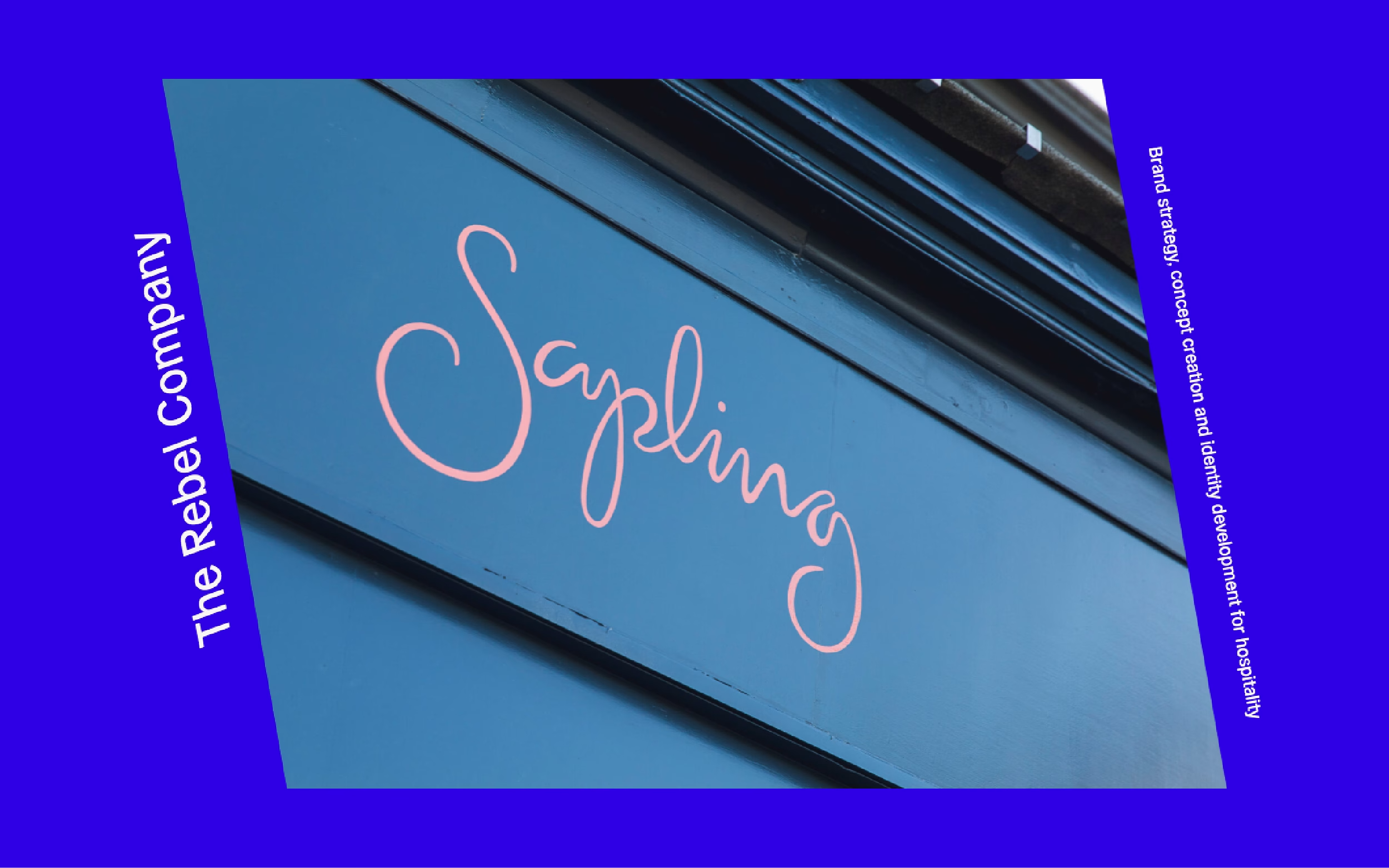
We are the Rebel frames its work in a punchy electric-blue border that immediately signals a brand studio with personality. The cover photograph captures hospitality signage, a teal shopfront fascia lettered "Sapling" in a warm pink handwritten script, set at a confident diagonal. Vertical labels read "The Rebel Company" alongside a line describing brand strategy, concept creation and identity development for hospitality. The pairing of real-world craft with bold digital colour makes the studio's focus clear at a glance. It is spirited branding and visual identity work.
Credits: We are the Rebel
More in Portfolio
Includes freebie bundle, unseen BTS insights and more.