Plus
Plus

 Menu
Menu


MCOO Studio
May 21, 2021
Mindsparkle Mag


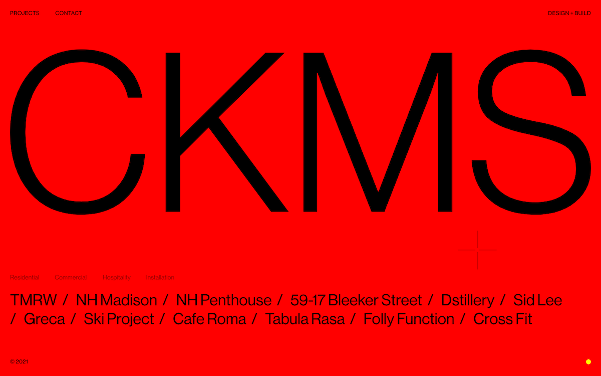
MCOO Studio go all-in on graphic boldness for CKMS, a design-and-build practice, filling the entire viewport with vivid red. The studio's initials are set in a colossal black sans-serif that stretches edge to edge, a piece of confident typography that instantly commands attention. Beneath it, a tidy row of categories — residential, commercial, hospitality, installation — sits above a running list of projects from NH Madison to Cafe Roma, keeping navigation refreshingly direct. The single scarlet-and-black colour scheme and stripped-back interface give the web design a fearless, poster-like quality. It is a striking, high-energy homepage that proves how far one strong colour and one big idea can carry a brand.
Credits: MCOO Studio
More in Portfolio
Stay on top of this week's design. Insights, top picks & more.