Plus
Plus

 Menu
Menu


Studio Up
January 27, 2023
Mindsparkle Mag


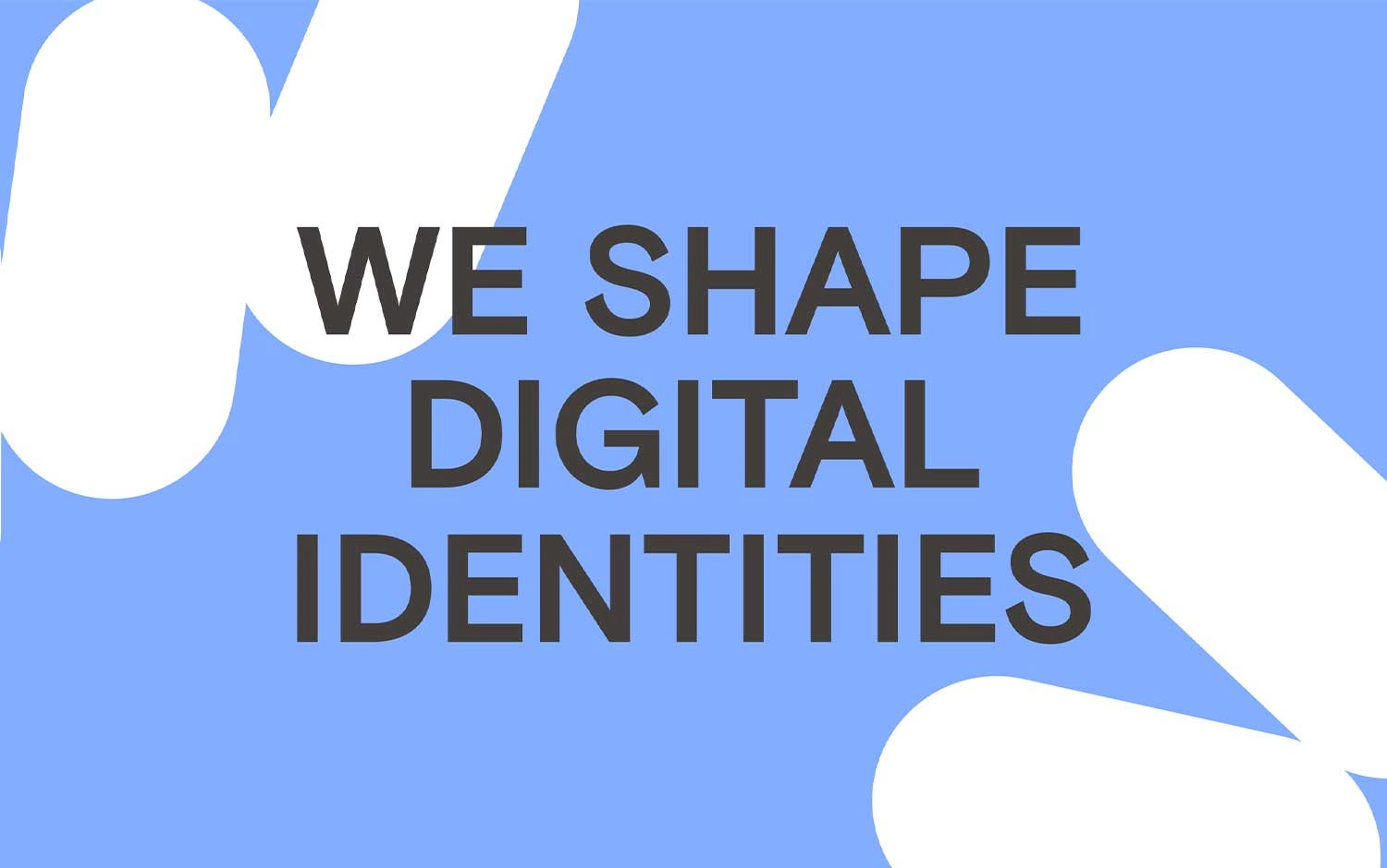
Studio Up opens its site with a statement as direct as its craft: "We shape digital identities," set in a bold charcoal sans across a soft periwinkle field. Rounded, capsule-like white shapes drift in from the corners, lending the otherwise minimal layout a friendly, tactile sense of motion. The restrained palette and generous negative space keep all the focus on that confident headline. It is a clean, self-assured piece of web design that signals the studio's focus on visual identity work without a single unnecessary flourish. Simple, warm and quietly modern.
Credits: Studio Up
More in Design Agency
Stay on top of this week's design. Insights, top picks & more.