
Black Friday 50% off Plus
Unlock InsightsBlack Friday 50% off Plus
Unlock Insights Menu


Mikha Makhoul
May 15, 2021
Mindsparkle Mag


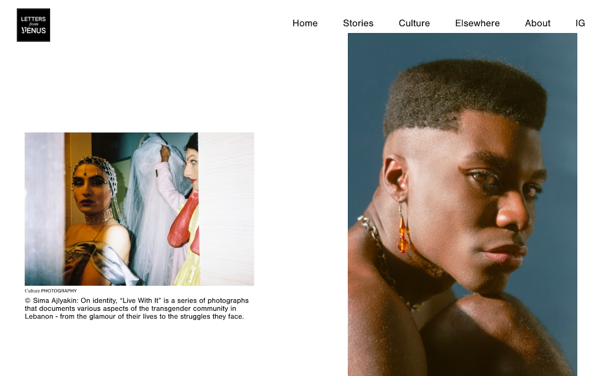
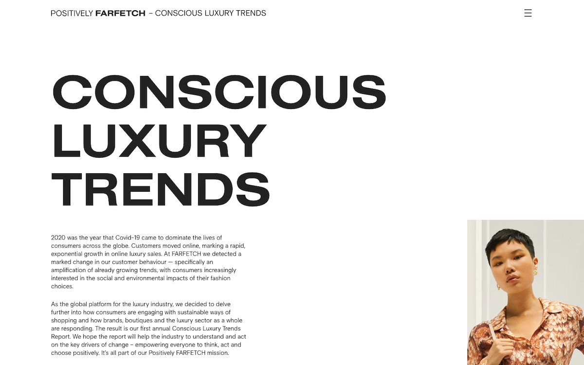
Mikha Makhoul shaped Letters From Venus as a calm, gallery-like home for culture and photography. The layout leans on generous white space, a quiet black serif logotype and a clean horizontal menu, letting the imagery do the talking. A two-part grid pairs a captioned photo essay with a striking full-bleed portrait, giving the page the rhythm of a printed magazine translated online. Explore Letters From Venus and the restraint feels intentional, keeping every story front and centre. It is refined, magazine-minded editorial work that treats photography with real care.
Credits: Mikha Makhoul
More in Portfolio
Stay on top of this week's design. Insights, top picks & more.
 Plus