Plus

 Menu


Robert Mayer
May 05, 2021
Mindsparkle Mag


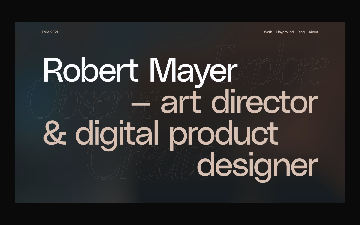
Robert Mayer introduces himself as an art director and digital product designer through a portfolio that puts type front and centre. Against a warm, dark gradient, an oversized headline mixes a bold sans with a lighter neutral face, while ghosted outline words, Explore, Observe and Create, drift quietly behind it. The navigation stays minimal, letting the confident lettering and soft glow set the mood. It feels editorial, self-assured and personable. Visit the portfolio for a smart lesson in typography and clean web design.
Credits: Robert Mayer
More in Portfolio
Includes freebie bundle, unseen BTS insights and more.