Plus

 Menu


Josephine Tan
May 05, 2017
Mindsparkle Mag


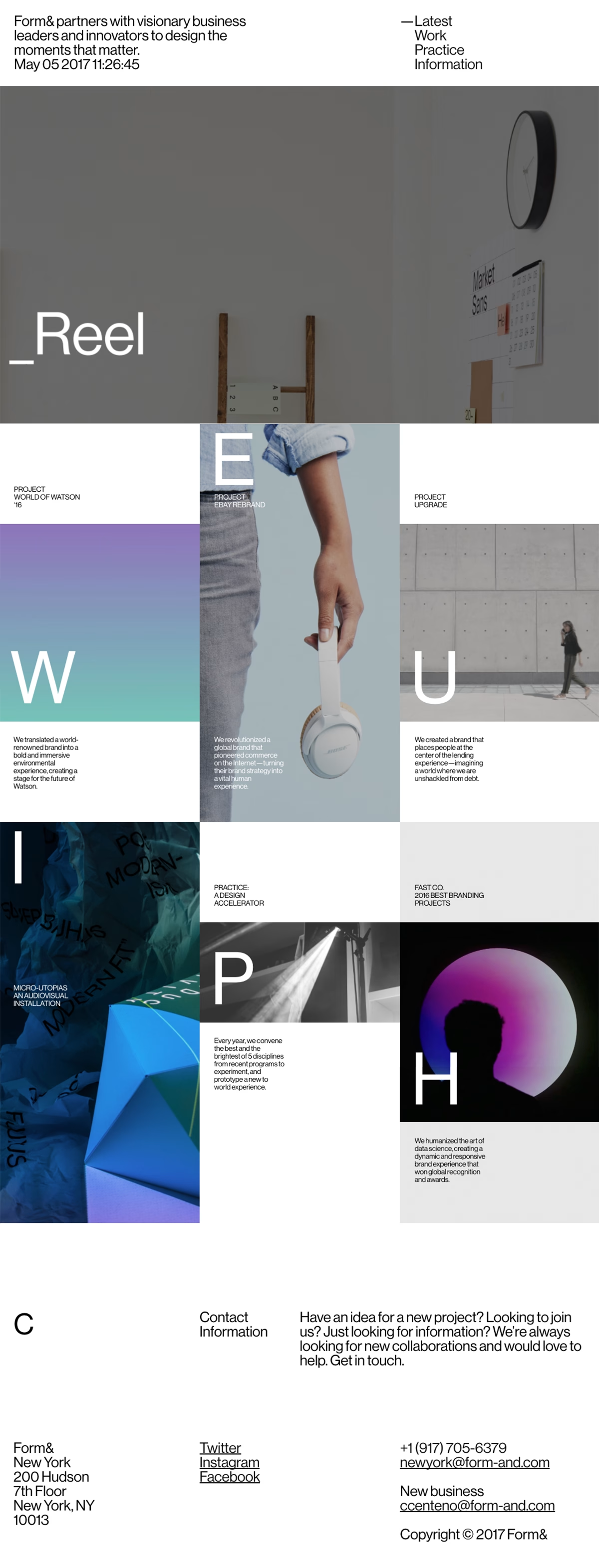
Josephine Tan channels a crisp modernist sensibility into Form&, the New York branding studio’s portfolio, where oversized single letters double as navigation and structure. Neat, Swiss-style copy sits alongside a grid of project tiles — a World of Watson stage, an eBay rebrand, an audiovisual installation — mixing glossy product shots with vivid gradient and 3D fragments. The strict typographic system and generous white margins give the work a poised, agency-grade authority. Splashes of iridescent colour keep the rigour from ever feeling cold. It is a confident showcase of branding and sharp art direction.
Credits: Josephine Tan
More in Business & Corporate
Stay on top of this week's design. Insights, top picks & more.