Plus
Plus

 Menu
Menu


Timo Kahl
May 16, 2021
Mindsparkle Mag


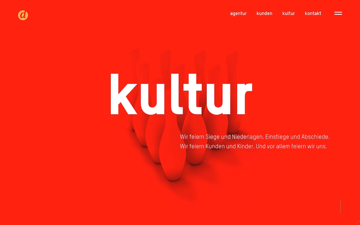
With dievision.de, Timo Kahl gives the German agency a reductive, high-confidence presence built almost entirely on colour and type. A saturated red field fills the screen, broken only by a huge lowercase "kultur" set in crisp white and a cluster of soft-shadowed bowling pins that add a playful, tactile note. The minimal navigation and small circular logo keep everything calm, letting a warm line of copy about celebrating wins and losses carry the personality. Visit dievision.de and the restraint reads as self-assurance rather than emptiness. It is a lovely study in bold typography and disciplined web design.
Includes freebie bundle, unseen BTS insights and more.