Plus
Plus

 Menu
Menu


Badesaison
March 18, 2017
Mindsparkle Mag


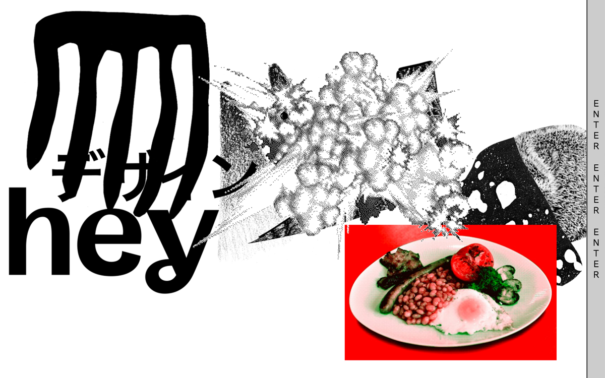
Badesaison, a Swiss visual design studio, uses its own landing page as a playground, and the result is gleefully anti-corporate. Oversized black lettering — a warped run of Japanese katakana colliding with a lowercase “hey” — shares the white stage with a gritty halftone explosion and, of all things, a lurid red plate of full English breakfast, while “ENTER ENTER ENTER” marches down the right edge. It is loud, collage-driven and a little absurd, trading polish for personality and daring visitors to click through. The experimental typography and playful art direction make it a memorable slice of web design that clearly enjoys breaking the rules.
Credits: Badesaison
More in Portfolio
Includes freebie bundle, unseen BTS insights and more.