Plus
Plus

 Menu
Menu


illo
Torino, ItalyAugust 19, 2026
Mindsparkle Mag


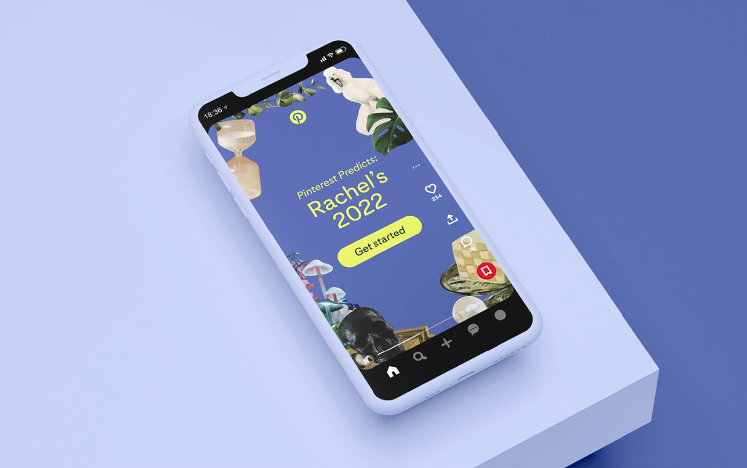
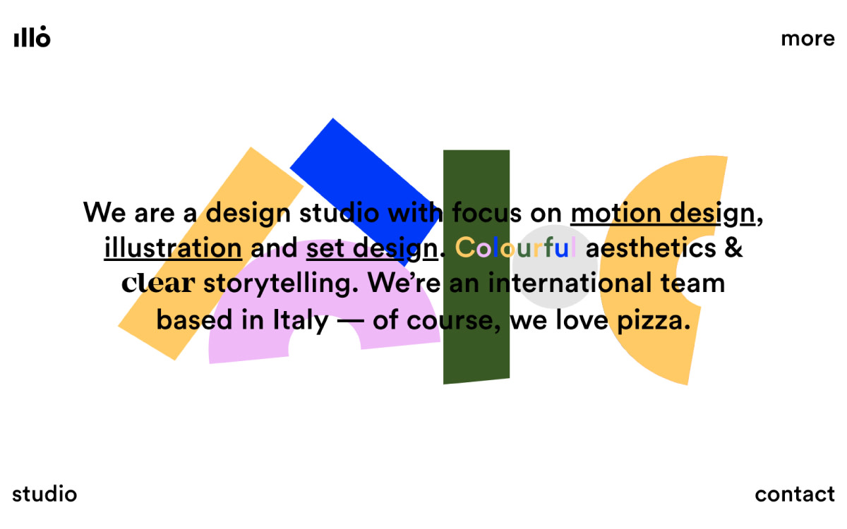
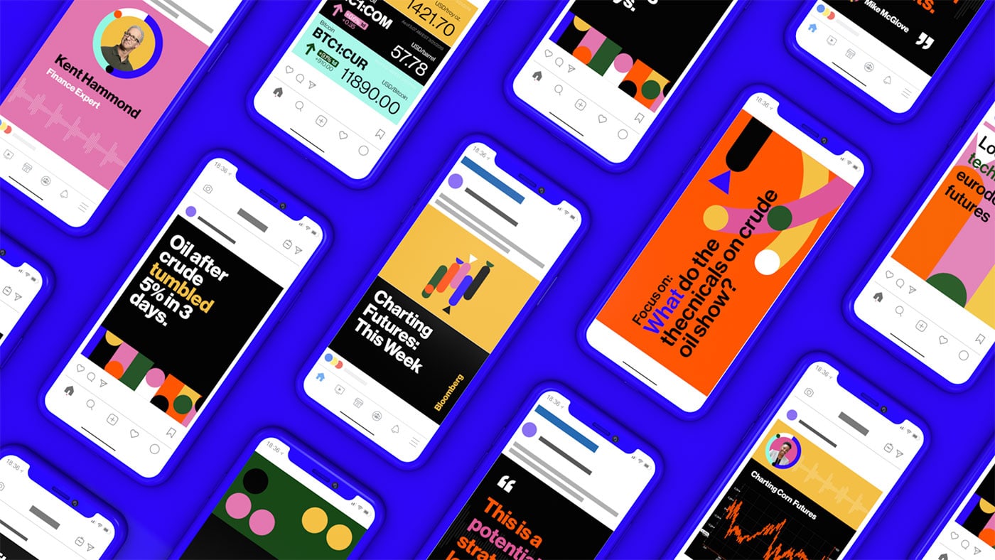
For thirteen years, illo has been turning complicated ideas into something you can feel at a glance. The Italian studio — motion, illustration and brand systems in equal measure — began in a kitchen under the gloriously unpronounceable name ilenoliukgo, and set out to be international from day one. Today its bright, geometric, unmistakably warm visual language runs across some of the world’s biggest brands.
But illo has never been only about how things look. The studio thinks in systems rather than styles, treats colour as narrative rather than decoration, and has spent years arguing — quietly, through the work — that motion is a design discipline, not a finishing touch. Along the way it spun off Algo, its data-driven animation branch (independent since 2015), and kept carving out room for self-initiated experiments like the beloved Tarot-o-bot.
We sat down with illo to talk pizza margherita and 24-hour fermentation, why a circle is just a circle until you give it intention, what clients still get wrong about motion — and the one part of the process they’ll never hand to a machine.
✜ You once compared your design approach to a pizza margherita — simple, iconic, limited ingredients. If illo were a different Italian dish today, what would it be?
→ We like to think that over the years we've held onto our core, made of mozzarella, tomato sauce, leavened dough, and a few basil leaves. Obviously in these 13 years we've grown, evolved, added new services and new team members, but we like to think we've kept that simplicity and clarity that always set us apart. Maybe the pizza is a little more refined now, the kind with 24h+ natural fermentation and carefully selected DOP tomatoes, but even as the structure gets more complex, the result is still super easy to enjoy :)
✜ illo started in a small kitchen and now works with some of the biggest brands in the world. What’s something about your early days that still shapes how you run the studio today?
→ From the very beginning, we set out to position ourselves as an international studio which meant never limiting ourselves to the Italian market and building a global presence from day one. We also placed a lot of value on studio culture, trying to create a work environment that respects the time and the people working with us. And no less important, our own brand identity (even though back in that kitchen we went by an unpronounceable name, ilenoliukgo). With time we've always carved out space to create something just for ourselves, like our Tarot-o-bot!
✜ Many studios talk about “style”. illo seems to talk more about systems. Do you see style as a by-product of thinking rather than the goal?
→ We believe that style and system aren't opposites, and honestly we don't think about them separately. Systems help us create the conditions to express ourselves freely, sometimes that means deliberately misreading a brief, building moodboards on pure instinct, then going back and figuring out what survived once we looked at reality. But probably the bigger point is that style for us is never just pure aesthetics. It's always tied to what needs to be said. The visual choices follow the meaning, not the other way around. So maybe the better word isn't even “style”, it's closer to visual voice or language. And that voice grows through the system, not despite it.

✜ Your work is unmistakably color-driven. When starting a project, does color come before motion, or does motion dictate color?
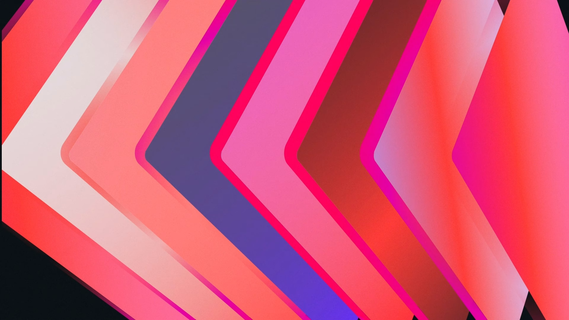
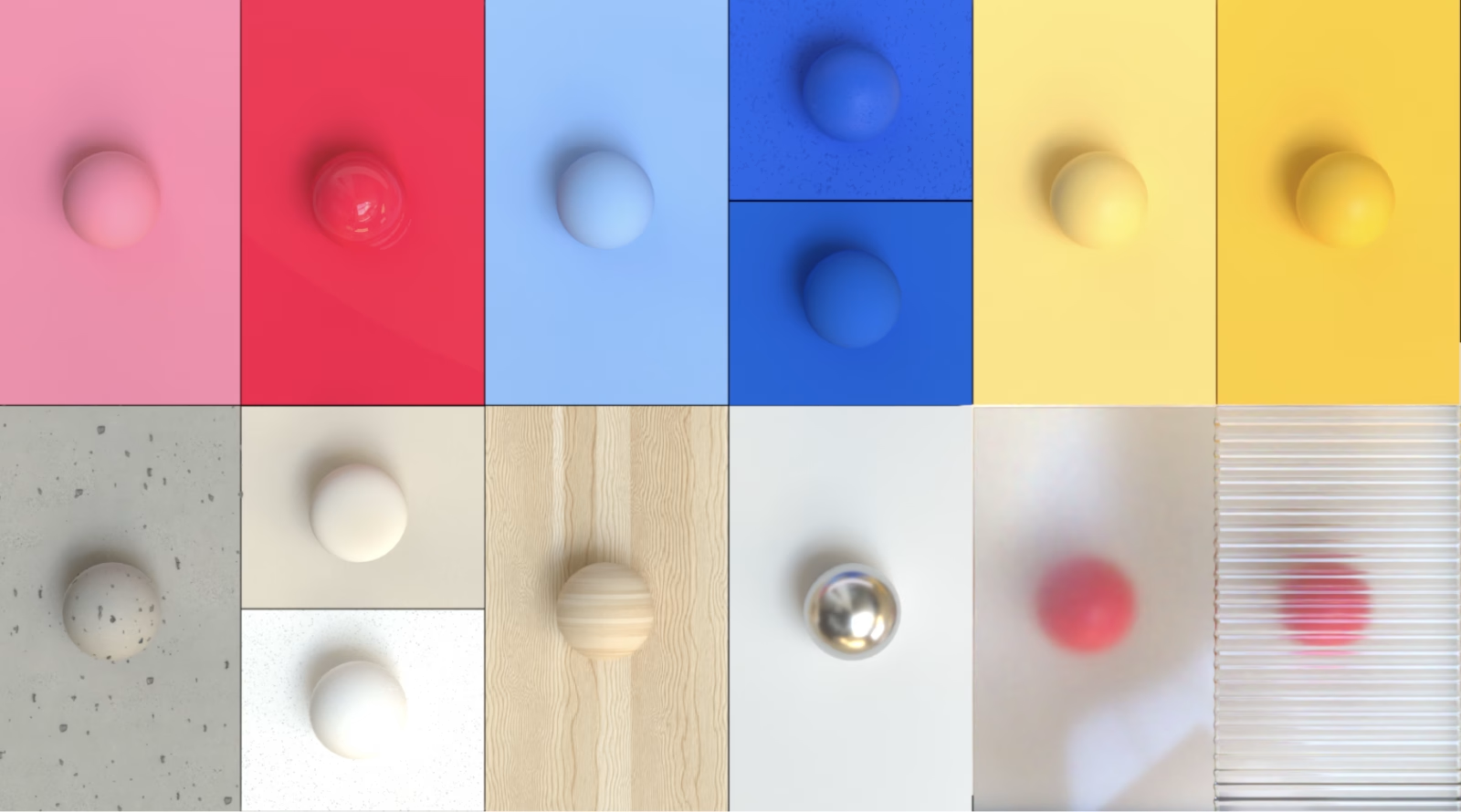
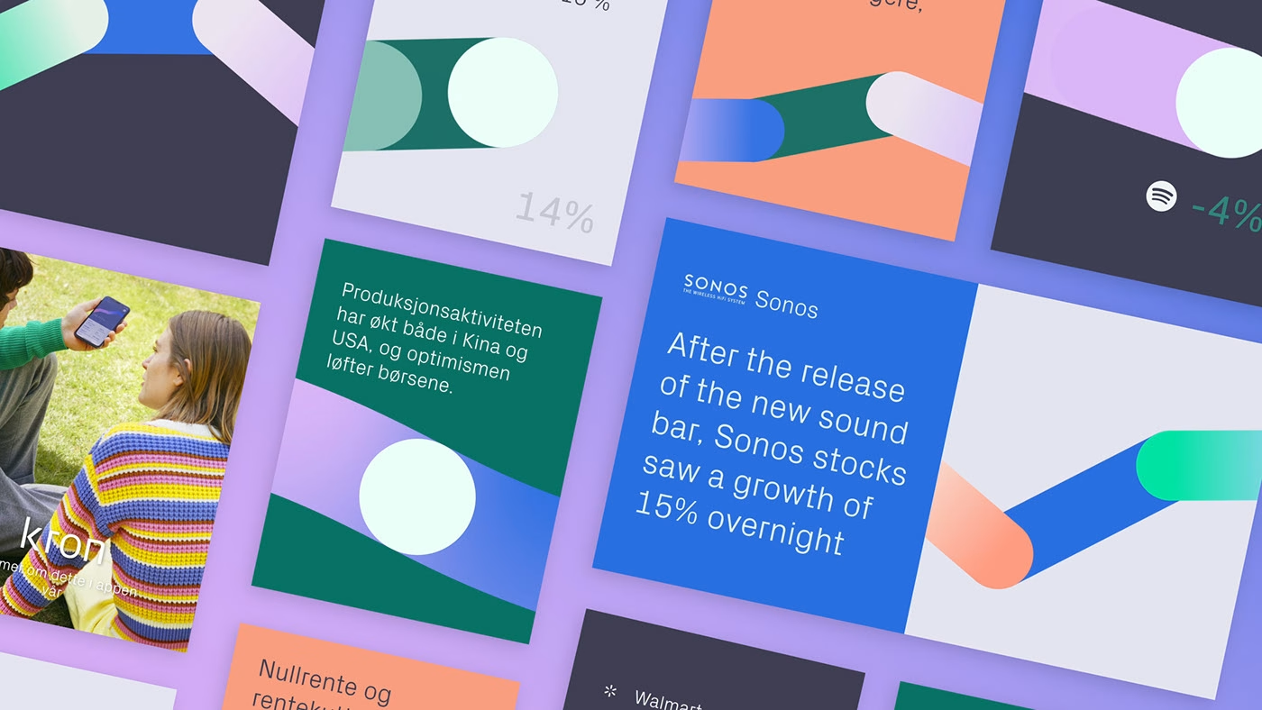
→ Color, for us, is not just a design choice, it's what makes everything feel alive. It sets the mood, shapes the story, and guides how people feel when they experience a visual language. We don't have the perfect recipe, but what we do have is a sharp, trained sensibility for color (hues, tones, contrasts, opacities and all the other ingredients). We also love an empty canvas: it's where we figure out how colors behave together and how they can best serve a narrative. That said, we never work in a vacuum. Most brands already have a palette, and whether we tweak it, expand it, or reinvent it entirely is something we decide together. Our goal is always the same: a palette that feels true to the client while carrying that unmistakable illo warmth, bright, bold, and balanced with a couple of thoughtful neutrals. But shhh, that last bit is still part of the secret recipe ;)
✜ A lot of illo visuals feel geometric but never sterile. How do you keep geometry expressive rather than rigid?
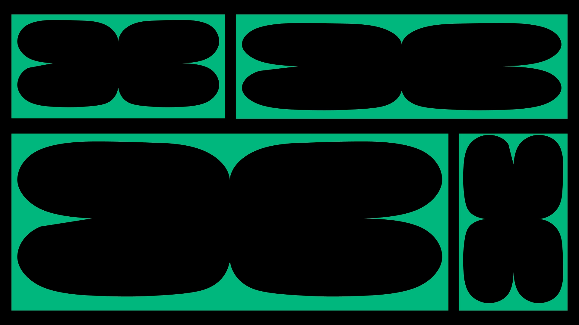
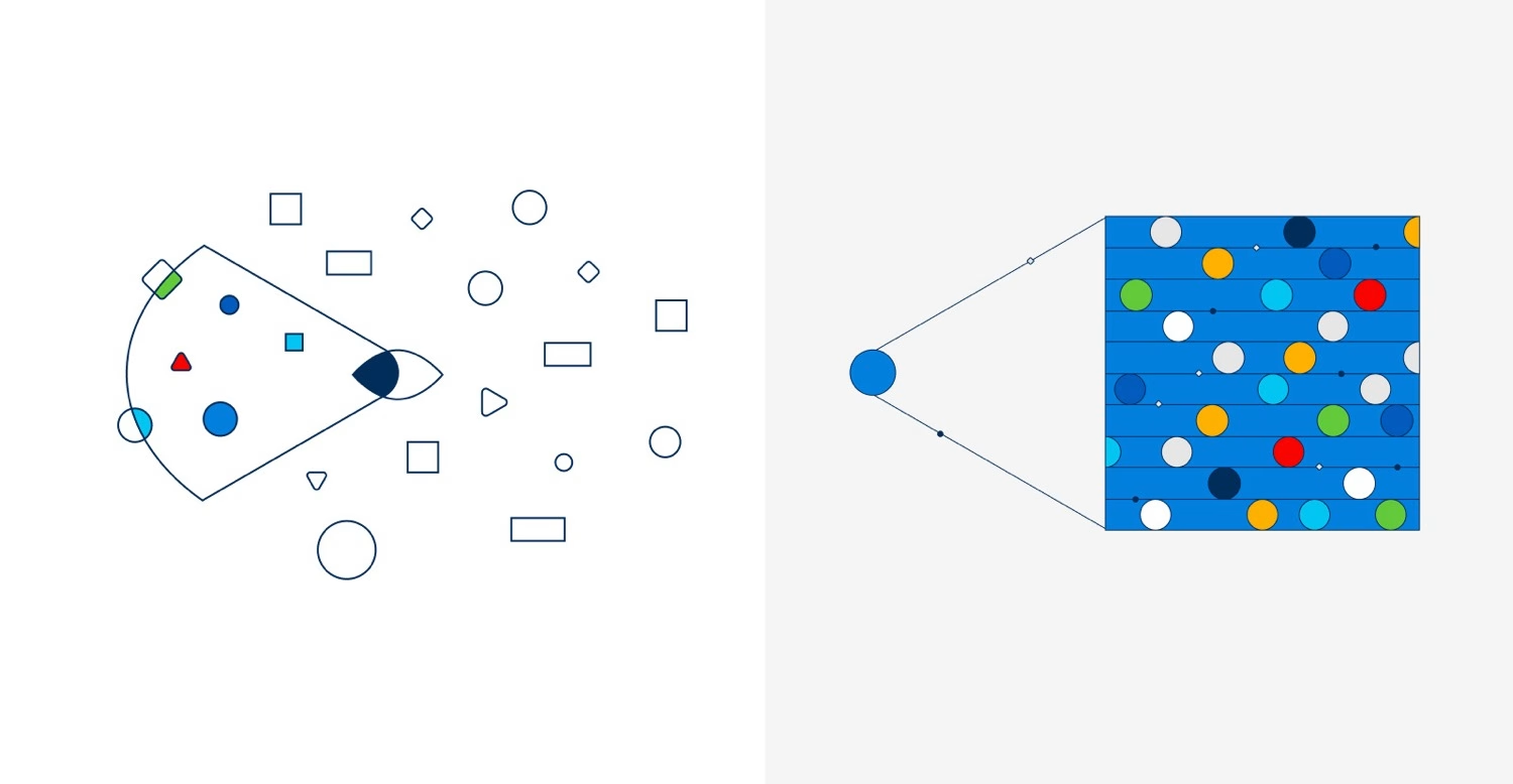
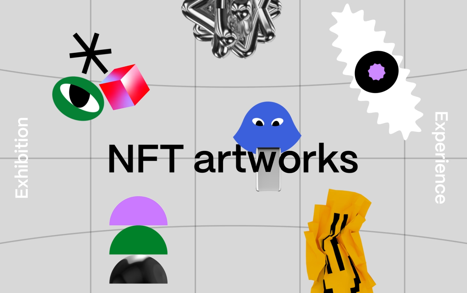
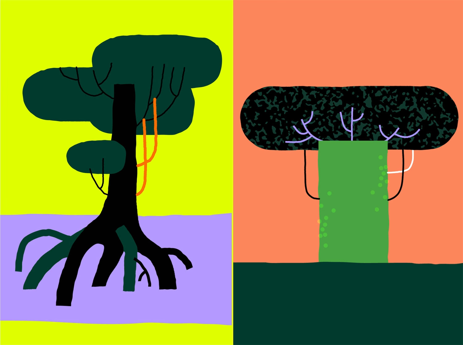
→ Geometry is a universal language, and that's exactly why we're drawn to it. It belongs to every culture or context, it travels. But a circle is just a circle until you give it intention. A good example is our work with Storytel: we designed a set of shapes that evoked specific book genres without ever pinning down a fixed meaning. Recognisable enough to feel familiar, open enough to let people project their own interpretation onto them. That balance is where abstraction stops being rigid. What keeps it expressive is never the shape itself, it's the thinking behind it. Add motion to the mix, and suddenly those shapes aren't static anymore: they breathe, they react, they carry a narrative. The expressiveness doesn't come from breaking the abstraction, it comes from trusting it enough to let it mean something.
✜ Motion design often lives in a fast-moving digital environment. How do you make something that still feels crafted and human?
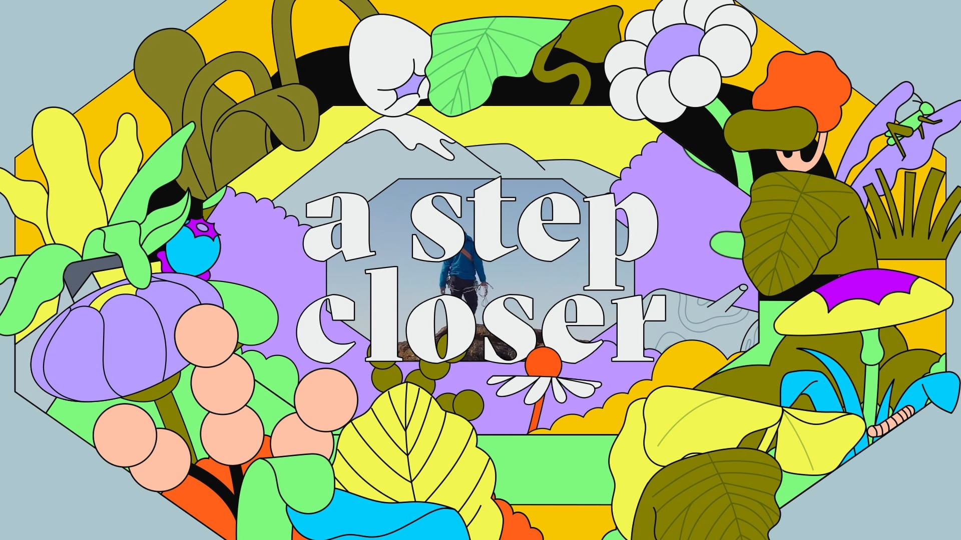
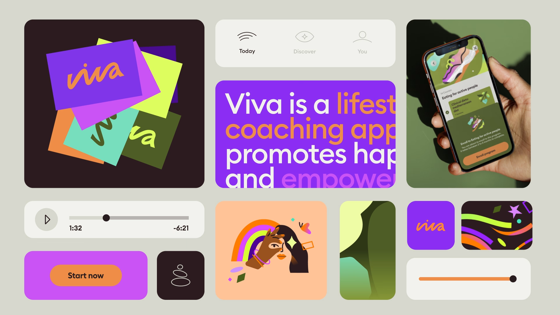
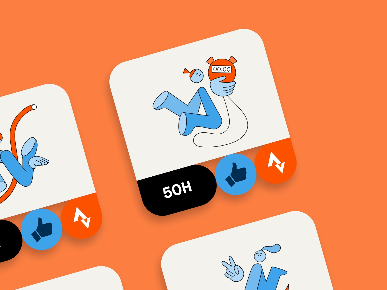
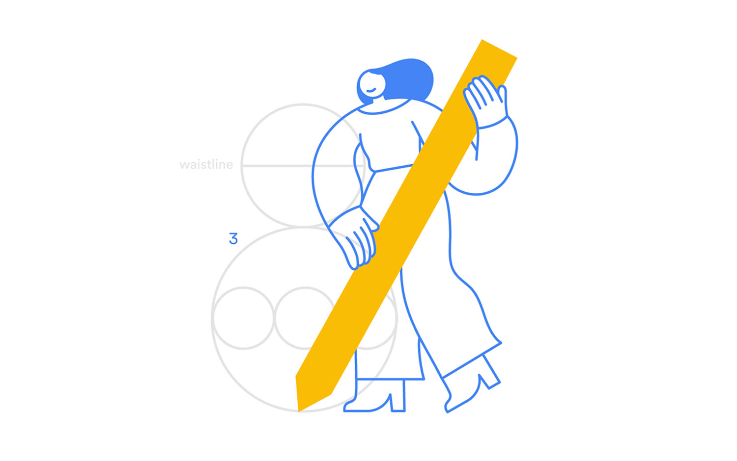
→ Motion design moves fast, but humans don’t change at the same speed. So for us it’s not about keeping up with the pace of the medium, it’s about deciding where to slow things down. A lot of digital motion today is designed for immediacy — quick feedback, fast transitions, instant clarity. And that’s important, because it prevents frustration. But if everything is optimised for speed, you end up with experiences that work… and feel completely empty. What we try to do instead is introduce intention into the system. We design motion not just to signal an action, but to shape how that moment feels. Sometimes that means slowing things down, softening transitions, giving space to understand what’s happening. Sometimes it means adding just enough character to make a functional step feel less mechanical. That’s where illustration systems, for example, become useful: they give you a structure where motion, visuals and narrative can stay consistent over time. Not just decorative moments, but a language that carries meaning across the whole product. Making something feel crafted is less about adding complexity, and more about making conscious decisions. Where to be invisible and where to be expressive. And how to make those two coexist without noise.

✜ illo often mixes illustration, 3D, textures and motion. When does a project tell you it wants to be hybrid?
→ Most of the time the client brings it up. But sometimes we're the ones pushing for it, because staying within one visual register can only take a project so far. When something feels a bit too flat or predictable, adding a layer of 3D, a touch of texture, or a shift in technique is often what gives it depth and surprise. Lexroom is a good example: a product video for an AI legal tool, where the challenge was giving visual body to something inherently abstract and intangible. By introducing a small dose of 3D, we managed to make the invisible feel concrete, without losing the clarity the context required.. In general, mixing styles and techniques is what allows us to create that sense of depth and surprise that gives a project a whole different flavour, making it richer, more detailed, and honestly just more fun to look at :)
✜ What’s something clients still misunderstand about motion design?
→ That it's optional. Motion is still treated by a lot of clients as the cherry on top, the last thing you add when the budget is still standing and the deadline is already yesterday. But screens are everywhere now: you wake up to one, you work on one, you walk past them on the street. The screen stopped being a neutral surface a long time ago. It's an environment that pulls your attention, shapes how you feel, tells you where to look. Designing motion badly, or not designing it at all, is not a neutral choice. It's just a missed one. What comes with that is a complexity that's easy to underestimate. Building a motion system starts with questions that sound technical but have massive creative implications: are we delivering Lottie, Rive, a GIF, a MOV? Because that decision changes everything, how we build the illustrations, how we approach the animation, what's even possible. By the time something looks effortlessly simple on screen, there's an entire invisible architecture behind it. The moment clients get a glimpse of that, the conversation gets a lot more interesting :)
✜ With your experiments in automated or data-driven animation, do you see motion design becoming more like product design?
→ Automated and adaptive animation stopped being an experiment for us a while ago. What started as exploration eventually became something bigger than a division: Algo started as illo's tech branch and has been a fully independent studio since 2015, focused on data visualisation and automated motion. As for motion design and product design converging: we think it's already happening, and we're very much in the middle of it. Motion is shaping digital product design and branding in ways that go well beyond the explainer video era. More than half of our work now lives in that space, and that shift didn't happen by accident. When motion stops being decoration and starts being part of how a product thinks and communicates, it becomes a design discipline in its own right.

✜ If motion graphics become increasingly generated or automated, where does the designer’s role become more important rather than less?...or What parts of your process should never be automated?
→ The designer's role doesn't shrink with automation, it sharpens. When the technical execution becomes faster or more assisted, what matters more is everything that sits before it: the vision, the aesthetic intentionality, the decision of what belongs and what doesn't. Consistency and surprise, knowing when to follow a system and when to break it deliberately. Those aren't things you can prompt your way into. The part of the process we'd never hand over is the concept sketch. Not because it's precious, but because it makes sense to keep that moment human. Even a rough pencil sketch, done quickly and imperfectly, carries an intention that travels through everything that comes after it. It might end up passing through thirteen nodes of an AI model before it becomes something final, but that initial human idea is what gives it direction. Same goes for the design process itself. Whether it includes AI or not, the thinking behind how you work, how you structure a project, what questions you ask before you start, that has to come from people. Automation can accelerate a lot of things. It can't decide what's worth making.
✜ illo often works on explainers or brand narratives. What makes a motion story memorable rather than just “informative”? And is there a moment in a project where you know: “this will stick in people’s heads”?
→ The difference between informative and memorable is rhythm. A story that only delivers information is like a system that only scales: it works, and it leaves no trace. We think about it as a pyramid. The base is systemic, clear, predictable. That's where consistency lives, and consistency matters. But if you only build from the base up, you end up with something perfectly coherent and completely forgettable. The top of the pyramid is where the authorial moments live, the ones that surprise, that feel slightly different, that break the pattern just enough to make you stop. You can't code those. You can only design for them intentionally. That's also why our guidelines are never too prescriptive. We'd rather give a set of principles that leave room to move than a 80-page document that answers every question before it's even asked. Because the most memorable moments in a project are usually the ones that couldn't have been planned from the start.
✜ Let’s talk briefly about studio culture: If someone joins the studio tomorrow, what mindset would you want them to bring?
→ We rarely hire on portfolio alone. Sure, a good illo-er needs to have an eye and instinct for design and motion, that's a given. But curiosity is probably the thing we look for the most. Not just curiosity towards new tools, but towards the world, towards roles and experiences that have nothing to do with what they usually do. And since we're a studio, we look for people who really put their head into the work, but are also open to dialogue and don't take themselves too seriously :)
✜ Motion design is everywhere now—from fintech apps to stadium screens. What’s one place you’d love to see illo visuals appear that hasn’t happened yet?
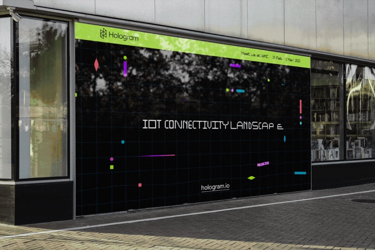
→ It's not that we've never done it, but we'd love to be more present in public spaces. Screens aren't just tools anymore, they're environments. They shape mood, attention, behaviour. Designing for public spaces means designing a collective experience, something that isn't for one user with headphones on, but for everyone at once. And honestly, there's something irreplaceable about seeing your work IRL, with real people reacting to it in real time. No analytics dashboard gives you that :)
✜ Many studios chase trends. How do you make sure illo stays recognizable five years from now?
→ Honestly, it's a question we ask ourselves every year or so. And the answer is always the same: there's a vision underneath everything we do that doesn't change depending on the moment, the trend, or the tools we're using. We could describe it as bringing visual simplicity to complex ideas through functional, optimistic, color-driven design. That's not a tagline, it's just what we keep coming back to. That said, we're not allergic to trends. Sometimes they're fun, sometimes they're useful, sometimes they just make sense for a project. But we never build on them. Because if your identity lives inside a trend, it leaves when the trend does :)
✜ If illo could collaborate with any designer from the past, who would it be—and what would you create together?
→ Our work is deeply influenced by some of the greatest Italian designers of the last century: Enzo Mari, Bruno Munari, Massimo Vignelli. If we had to pick just one, it would probably be Vignelli. His NYC subway identity has been showing up in our moodboards and studio conversations more than once lately, and it's easy to see why: the simplicity, the clarity, the unapologetic use of color. It feels like a conversation we'd want to be part of.
✜ What recent project surprised you the most while making it?
→ The one that surprised us most recently is under NDA, so we can't say much, only that it's for a very specific type of screen. What we can say is that the output was quite different from what we usually deliver: not assets or exports, but worlds and narratives. Visual atmospheres, sensations, directions. It started from data: trend research, forecasting, studies around where digital culture is heading, not just now but in the next few years. The brief required us to work at the very beginning of the process, which meant our work had to stay interesting and relevant long after we delivered it. From that research we didn't build moodboards. We built five distinct environments, each grounded in a concrete idea and then reinterpreted through our own lens. The kind of work where the distance between the spreadsheet you start with and the visual world you end up with is surprisingly vast.
✜ If someone studies illo’s work carefully, what hidden detail or philosophy would you hope they notice?
→ That we're not pixel-perfect ;) And we know that might be an unpopular opinion. But when we work, especially in the concept and sketch phase, we always prioritise the project as a whole and the effect it has when you see it all together. So yes, sometimes a pixel is slightly off. And honestly, we're fine with that.
Here’s our wrap-up: we loved talking to illo. What stays with you isn’t a signature look but a way of thinking — colour as feeling, geometry as language, systems built to make room for the moments you could never have planned. In a field racing to automate everything, illo makes a quietly radical case for keeping the concept sketch human, letting meaning lead the aesthetics, and being perfectly fine with a pixel that’s slightly off.
Thirteen years in, the recipe is more refined — but it’s still that same margherita: simple, generous, and impossible not to enjoy.
Stay on top of this week's design. Insights, top picks & more.
 Available
Profile
Available
Profile