Plus
Plus

 Menu
Menu


YARCHE
October 05, 2021
Mindsparkle Mag


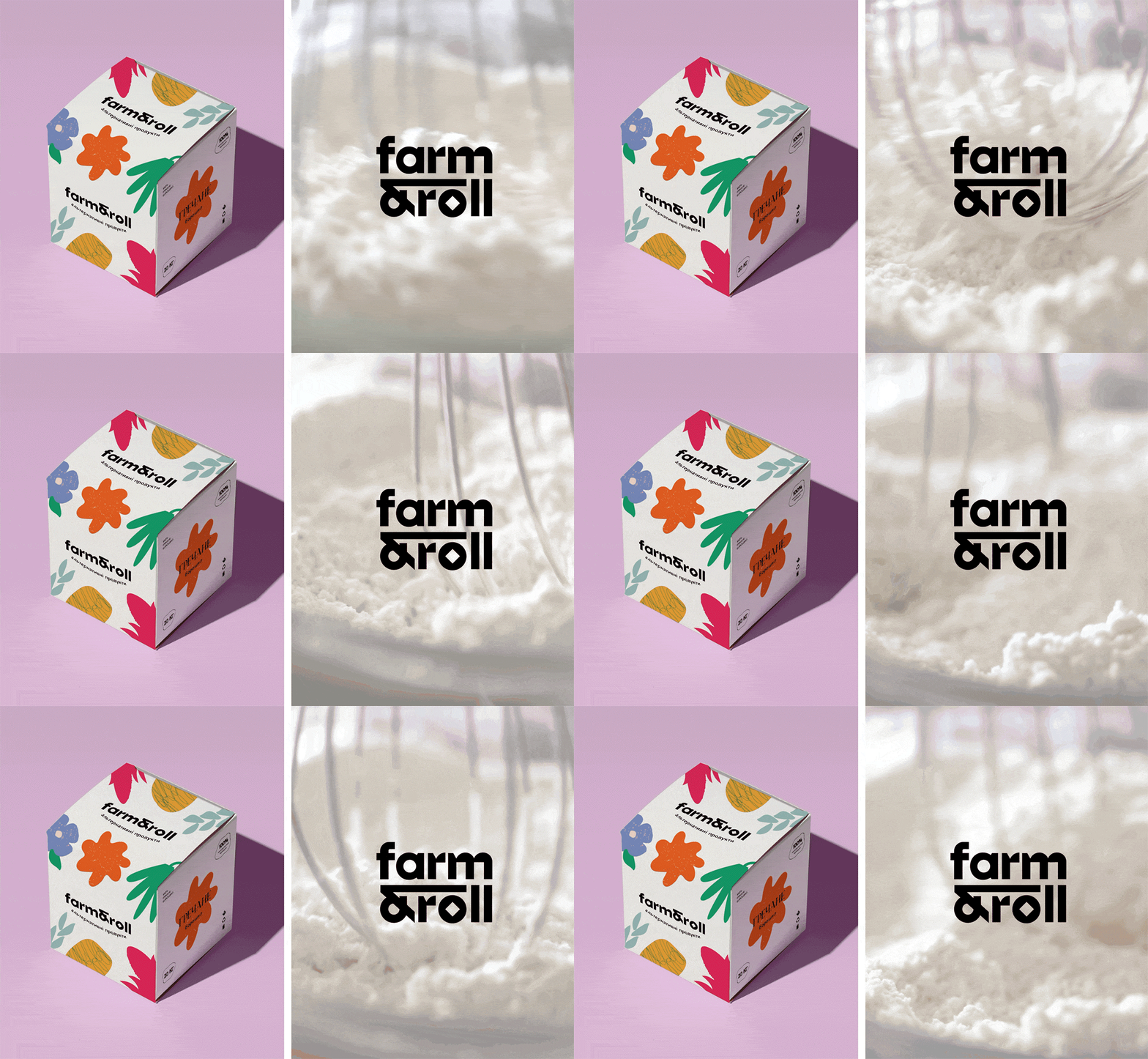
Today, we're baking with high spirits! Farm&Roll is an alternative flour brand, which its visual identity was in charge of YARCHE creative studio. They have created a brand for new premium and organic alternative flour products. The main task for the agency was to develop a brand from scratch: naming, strategy, logo, and design concept.
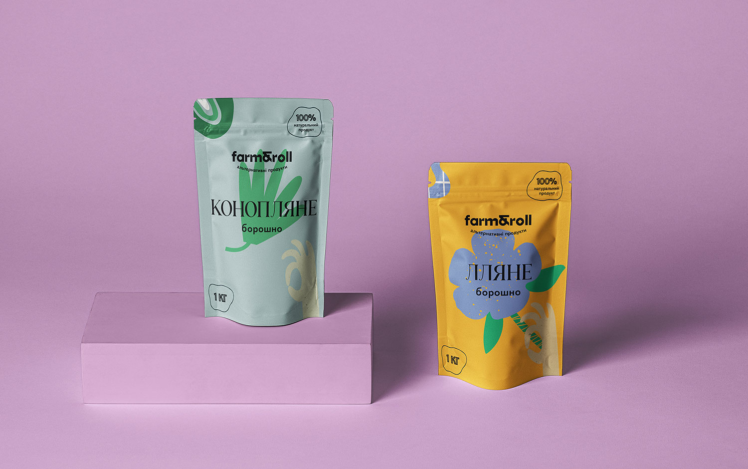
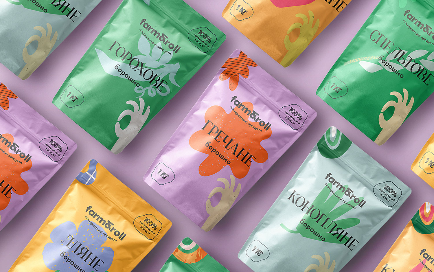
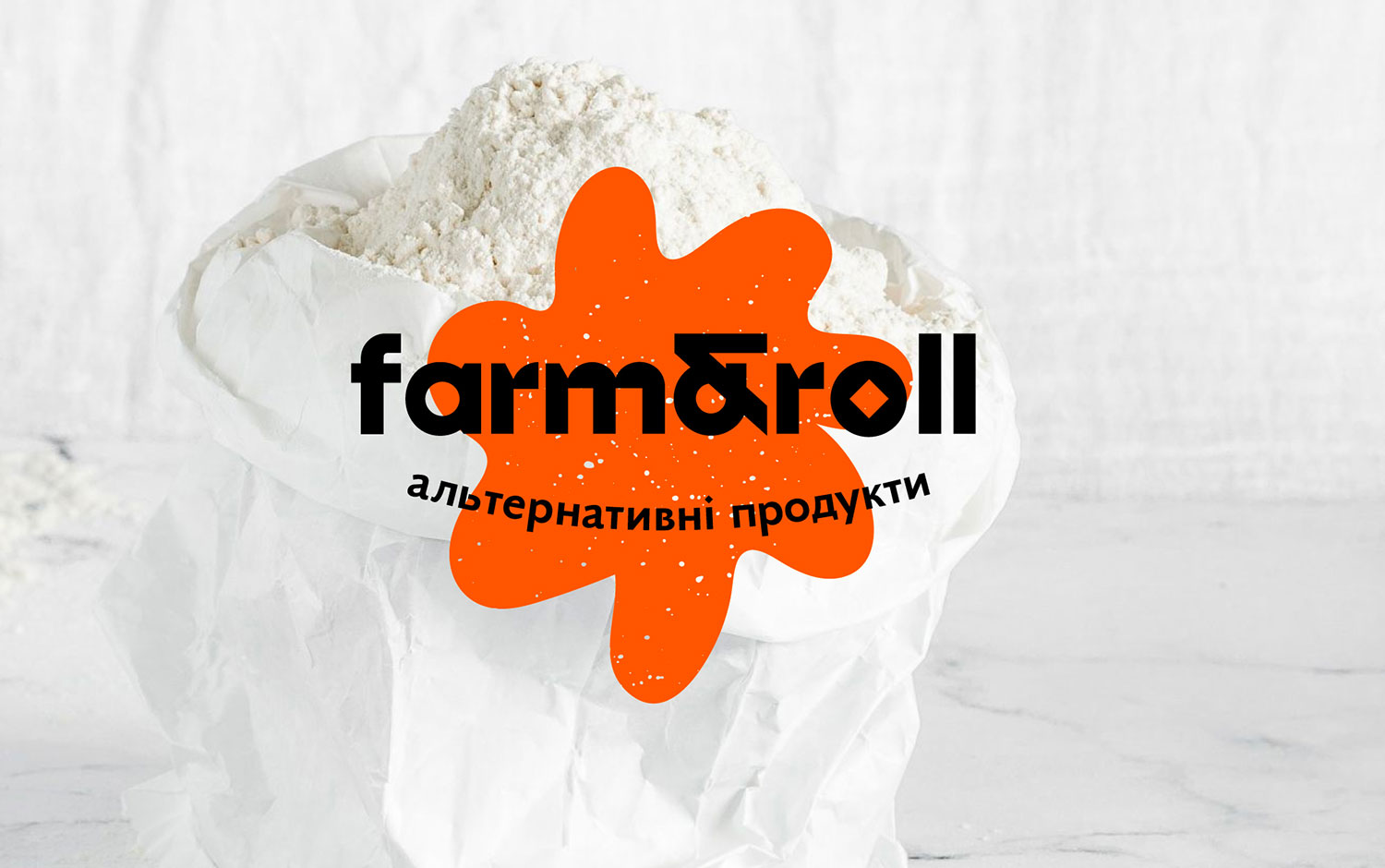
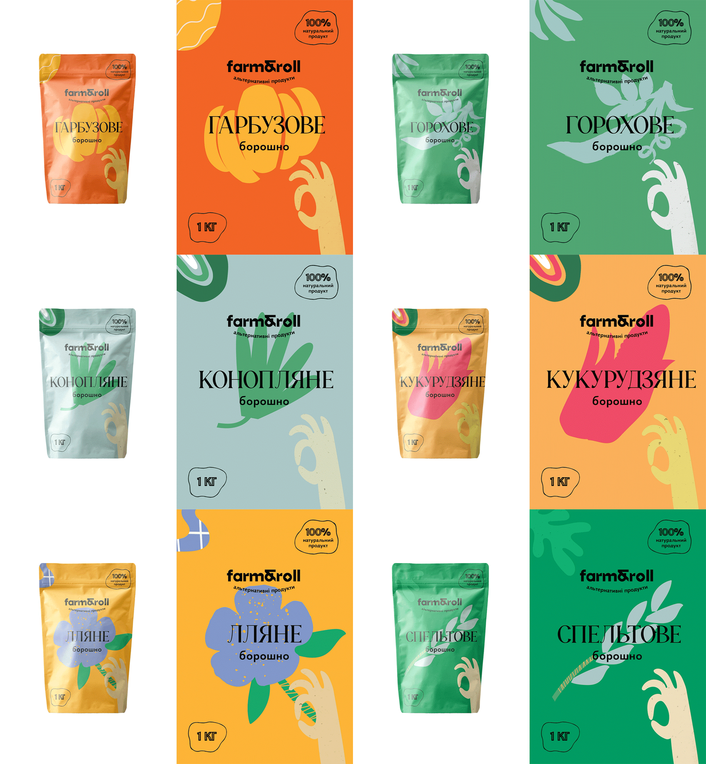
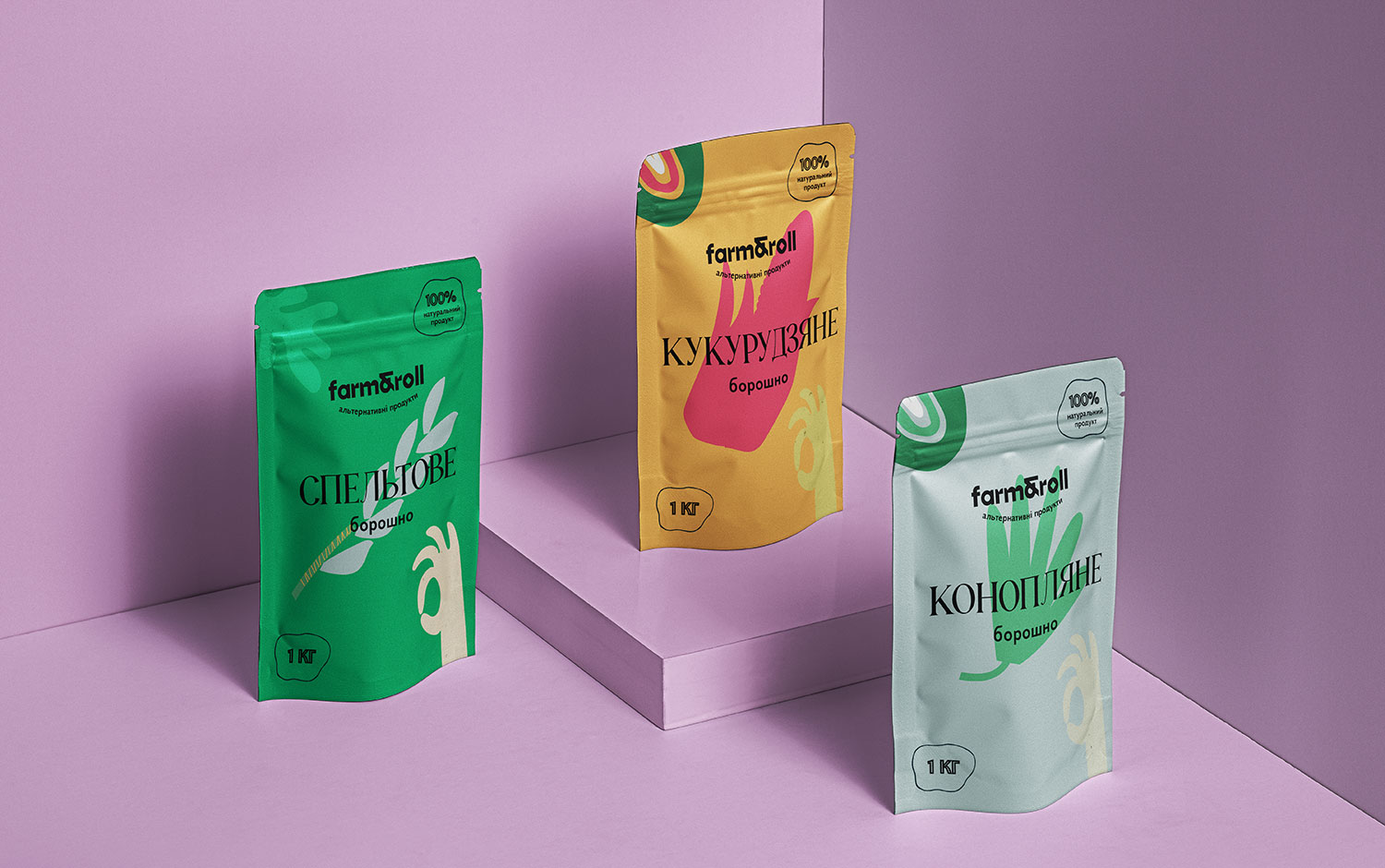
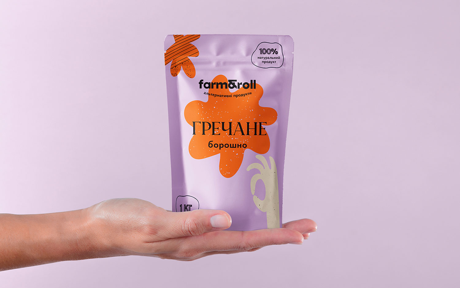
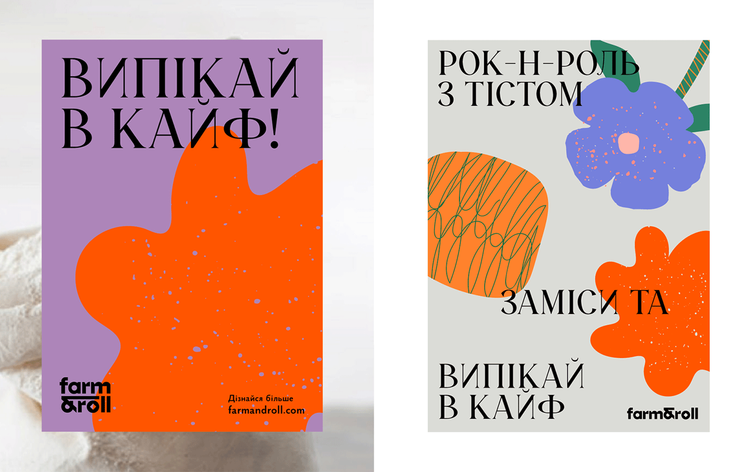
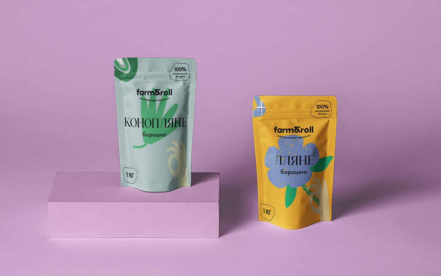
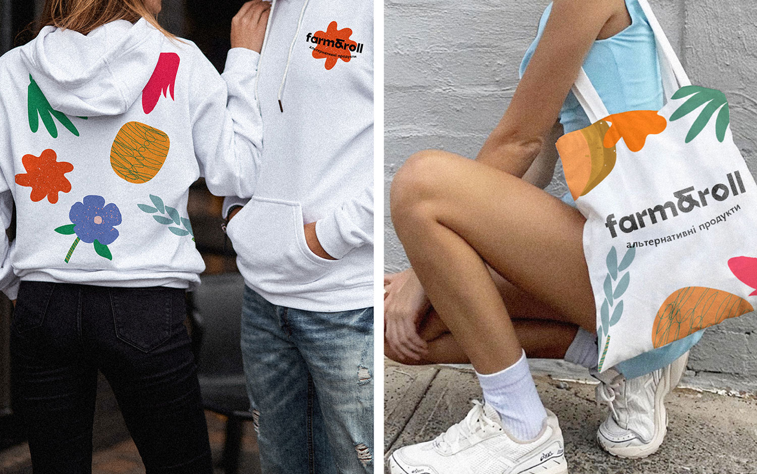
The Farm & Roll logo involves geometric, grotesque letterforms in which the letter "O" depicts a stylized millstone for grinding flour. In creating the design concept, creatives adhered to craft and environmental aesthetics. Plus, designers came up with a bright color palette featuring some hand-drawn textures. The graphic elements of the packaging are abstract illustrations of cereals from which the brand produces different flours. In combination, they form a pattern that is the basis of a design system. It applies to aprons, rocking chairs, and other merch items. A unique packaging feature is a transparent window with a "Bon appetite" gesture, through which you can see the quality and the milling of the product.
The overall Farm&Roll's appearance has a fresh and lively style. And the typography choice is super bold and adds a little bit of spice to the branding design.
Additional credits CEO – Danylo Martynov Strategist – Stanislav Raksha Copywriter – Mariia Karmanna Senior Designer – Yaroslav Kryzhanivsky Graphic Designer – Vlada Orel Photo credits by Sporty & Rich, With Jean
Credits: YARCHE
More in Brand Identity
Stay on top of this week's design. Insights, top picks & more.