Plus
Plus

 Menu
Menu


Design & Practice
June 10, 2021
Mindsparkle Mag


Nowadays, having a skin-care routine became common currency. And one of the most important things to do before 9 am. So, as everybody has a daily skin-care routine incorporated, the branding and packaging business got more competitive. And as we all know, the outer layer is the one that makes the first impression and turns a potential buyer into a client. That's why Bellekin asked for Design & Practice to help them create an empowering design reflecting the brand's principles.
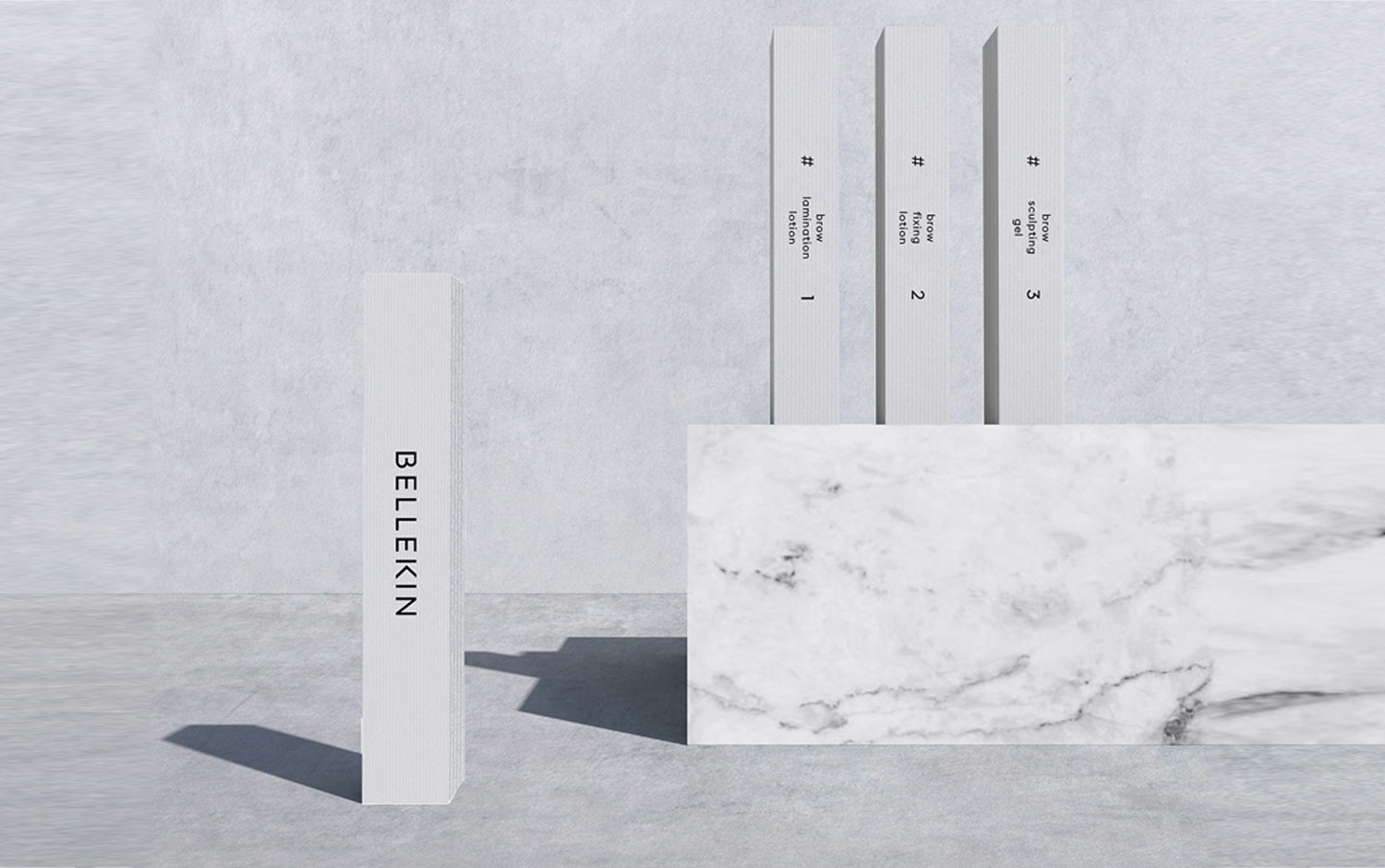
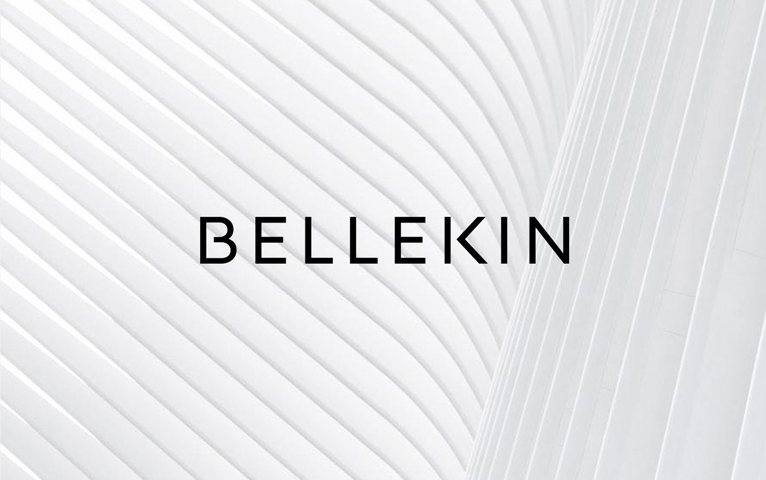
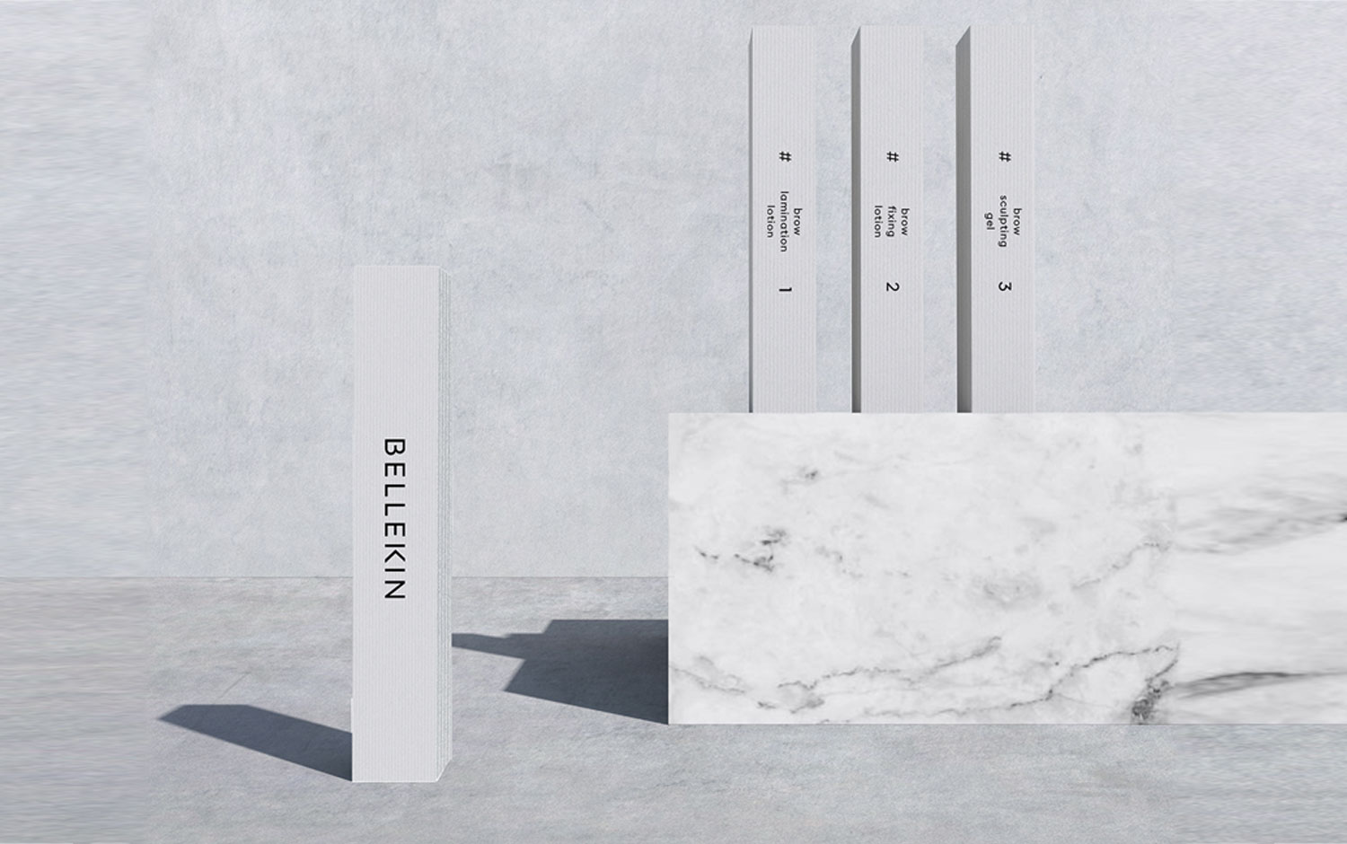
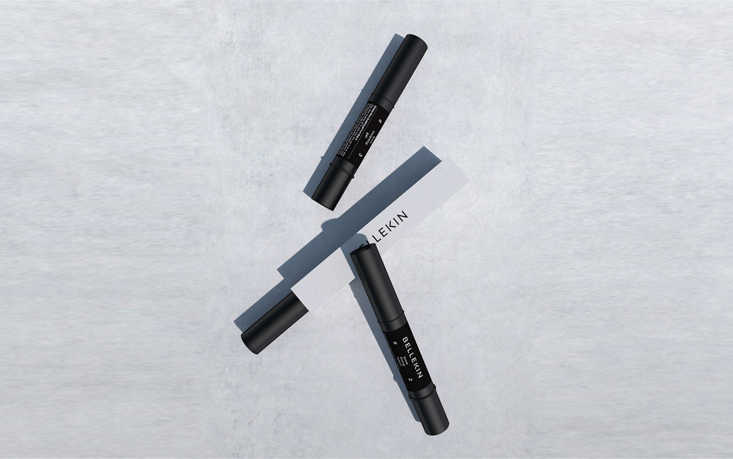
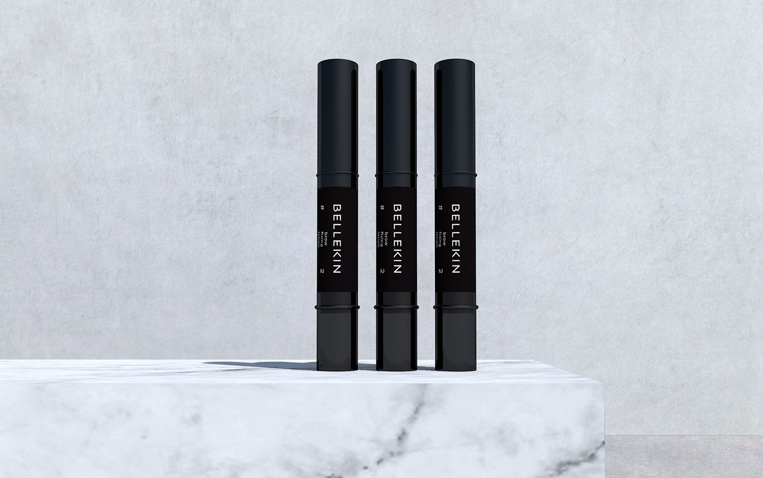
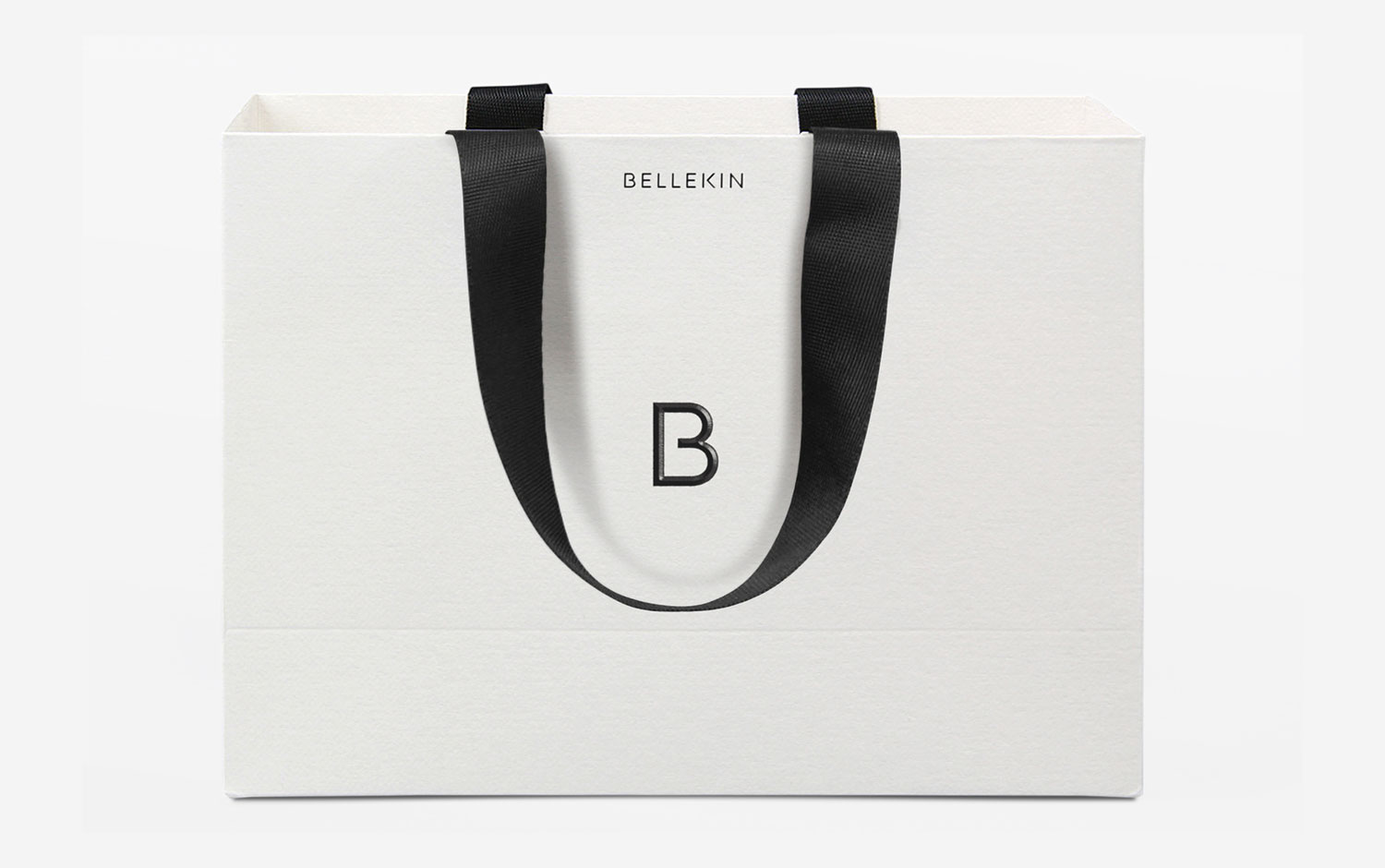
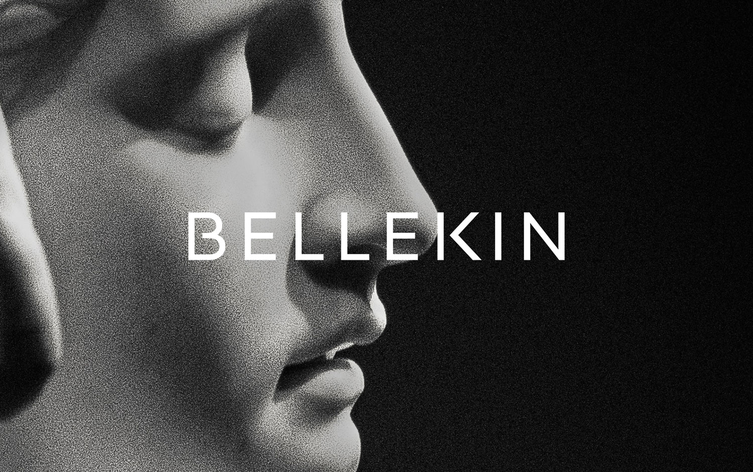
Design & Practice developed the concept for the name, the visual identity, and packaging guidelines for Bellekin – a new personal care brand, that focuses on empowering women to practice beauty treatments at home that were previously only available at salons. Bellekin stands for a community of like-minded women that search for their version of beauty - a combination of the word Belle and Kin as a synonym for family. The logo is a minimalist typographic design, with the capital B forming a simple and bold monogram based on the logo, to feature small cosmetic packaging, a nice detail that makes it a distinctive feature. A small typographic intervention references the drawing of a love heart. The packaging concept features stark black for the product itself, contrasted with textural white for the outer packaging, which's mindblown, and adds extra value and a high-quality look.
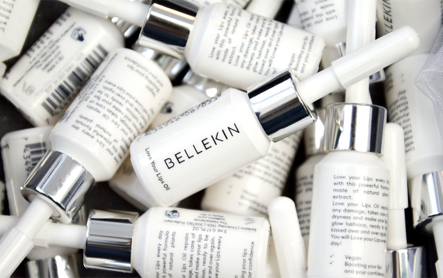
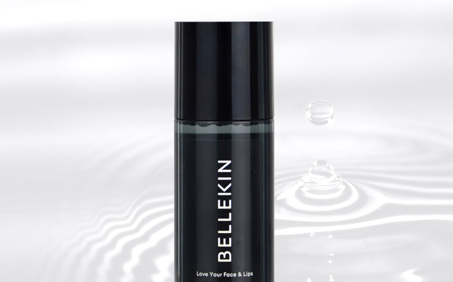
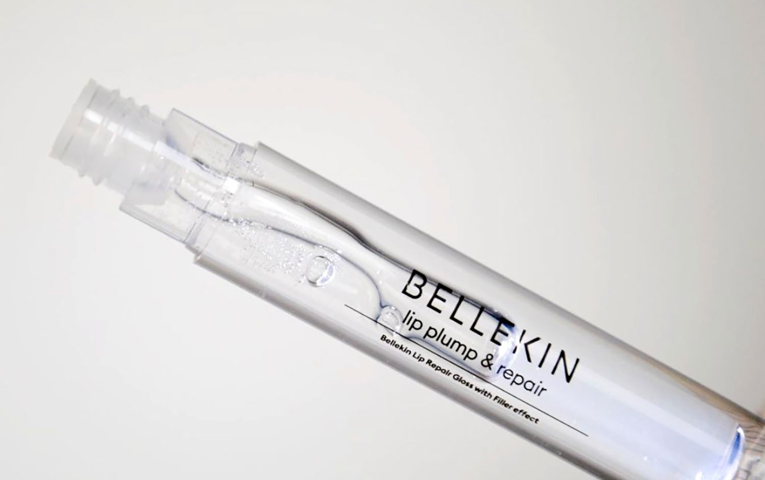
Credits: Design & Practice
More in Beauty Branding
Stay on top of this week's design. Insights, top picks & more.