 Plus
Plus

Summer has just started in the Northern Hemisphere. And who doesn't enjoy a refreshing cone of creamy happiness after a warm day under the sun? Melting through your fingers. Cooling every cell of your body. However, we believe that there isn't a specific time of the year to have delicious ice cream. Bacio di Latte by Studio Rebu is a packaging project for one of the main gelato brands in Brazil featuring a soft pastel color we love.
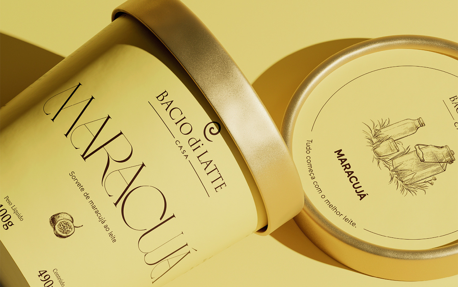
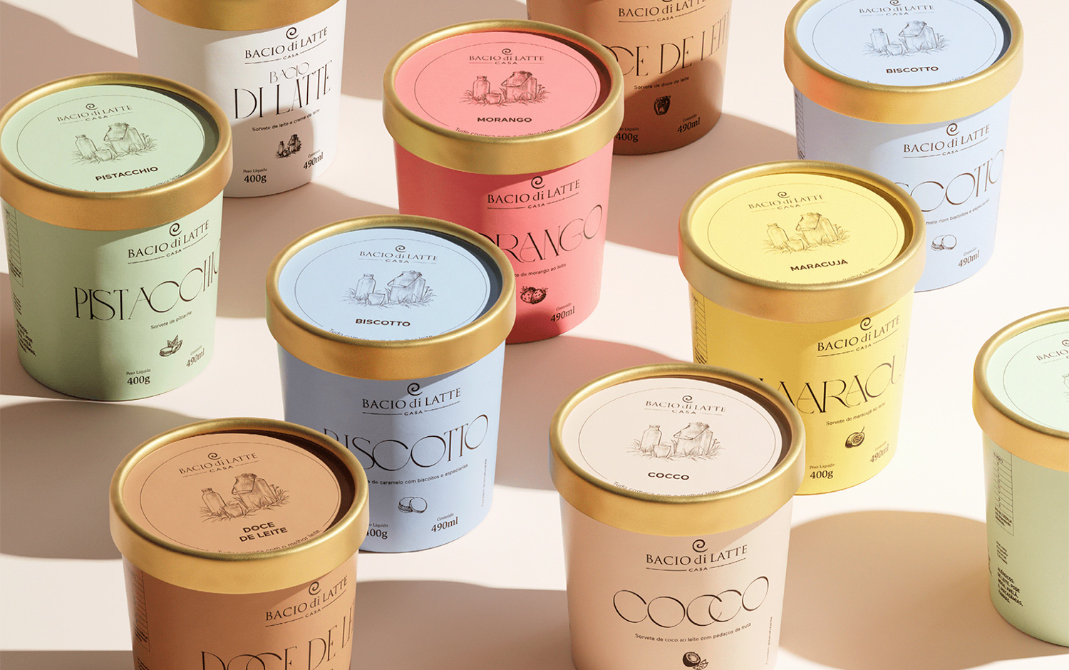
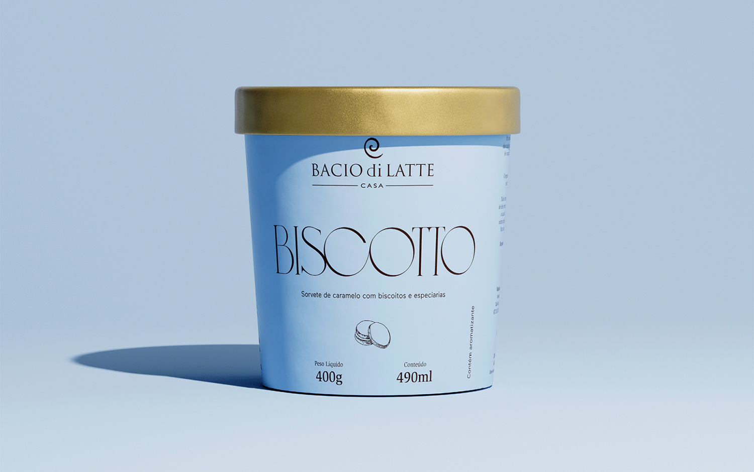
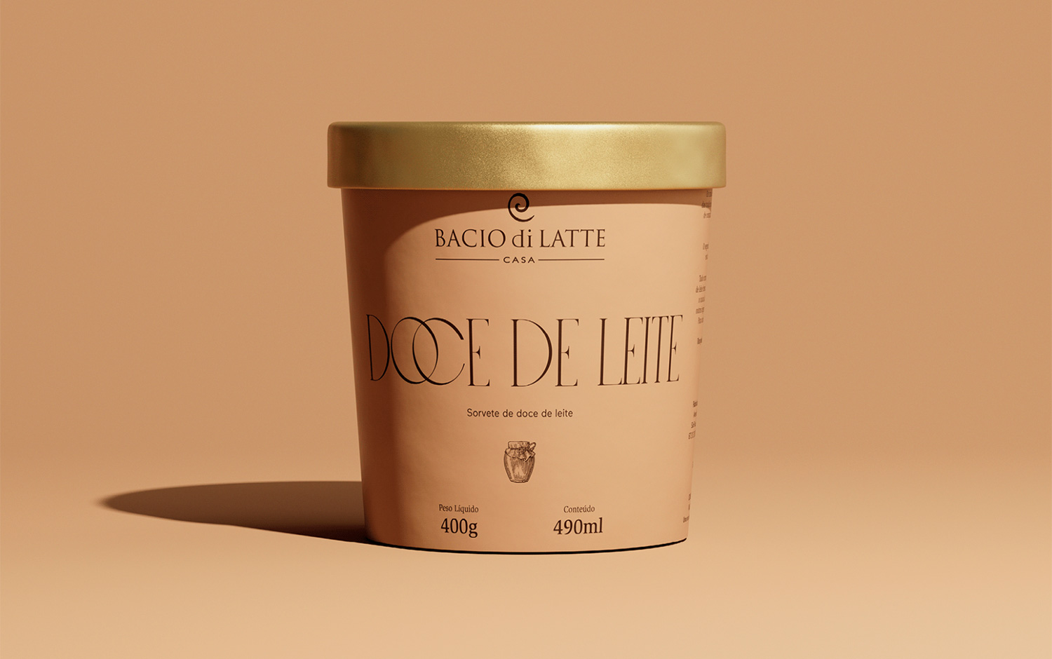
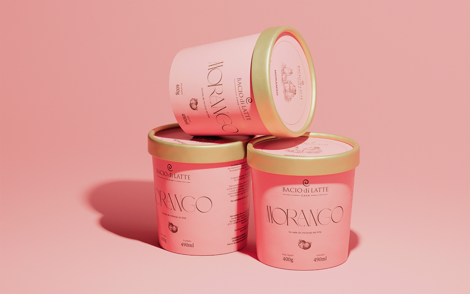
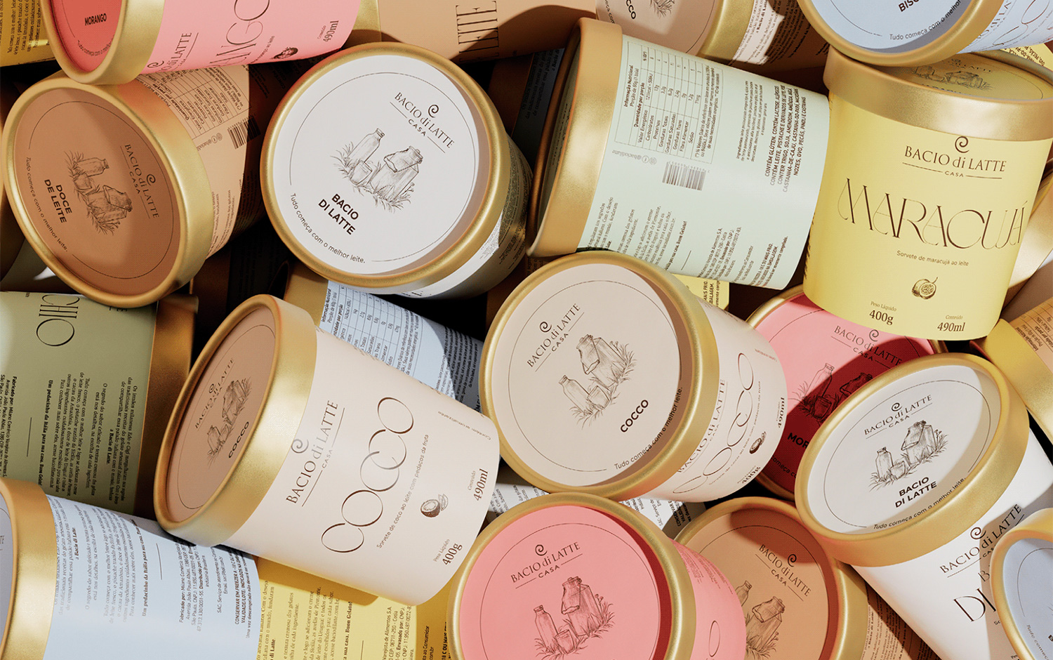
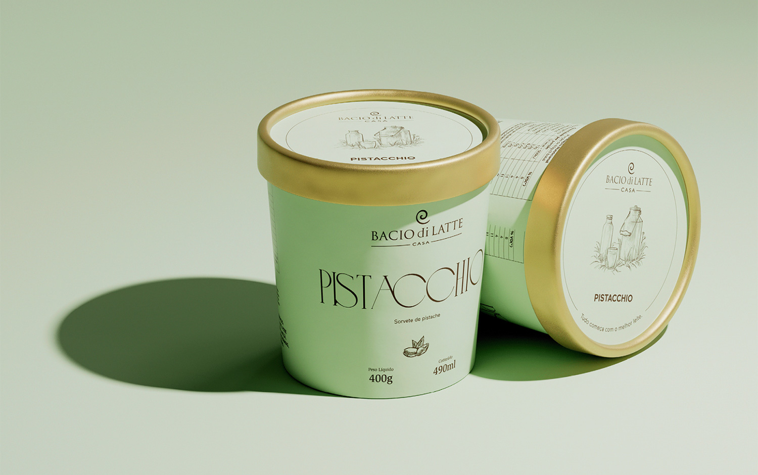
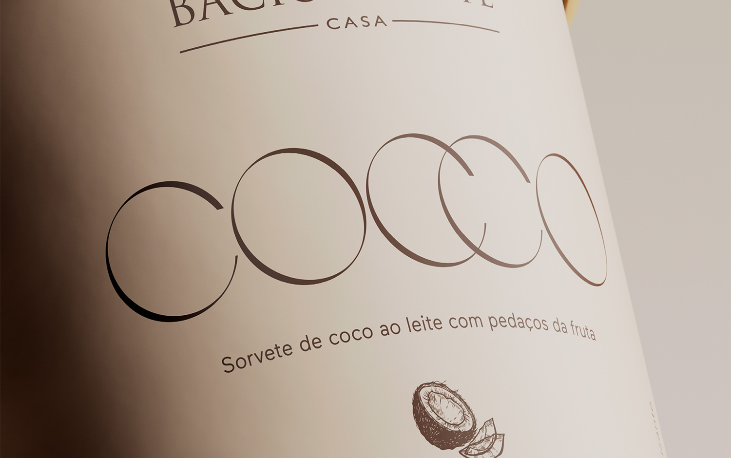
Today's design project is about Bacio di Latte's elegant ice cream pints. Its color varies according to the flavor inside. With a subtle tone, designers managed to create a beautiful color palette. Also, we must talk about the main serif typography decision. Just perfect. Elegantly representing a vintage gelateria with a small illustration in the front communicating principal ingredient. And another one on the lid illustrating the dairies, every creamy ice cream's basis. We are enchanted with the full-color presentation showcasing the ice cream pints with a matching background color. Creating an elegant scenery with a minimalistic approach, differentiating from most ice cream brands. Fascinated by the branding project and already salivating, we encourage this kind of design which makes us see some different perspectives to face a new identity work.
Rebu is an acronym for revolutionary, elegant, Brazilian, and unique. They make their living through strategic thinking and experimental expression. They partner with non-conforming brands and people and create things they/u2019d create for themselves and their loved ones.
Additional Credits Creative Directors: Pedro Mattos and Fernando Andreazi Designers: Camilla Mattos, Pedro Mattos and Bruno Faiotto 3D: Bruno Faiotto Copywriters: Fernando Andreazi, Giovanna Marques and Fernanda Damas/u200b/u200b/u200b/u200b/u200b/u200b/u200b
Creator: Studio Rebu
