Plus
Plus

 Menu
Menu


tens
August 09, 2020
Mindsparkle Mag


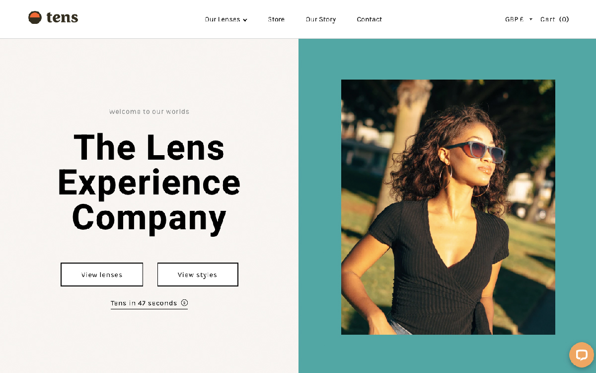
tens introduces its tinted-lens sunglasses with breezy, sun-soaked confidence, billing itself as “The Lens Experience Company” in bold black type. The layout splits cleanly in two: a calm off-white column holds the headline and a pair of outlined “View lenses” and “View styles” buttons, while a warm teal block frames a golden-hour photograph of a woman wearing the brand’s coloured shades. A small orange semicircle in the logo nods to the warm, filtered world tens promises, echoed in the neat navigation of Our Lenses, Store and Our Story. The balance of generous space, friendly type and lifestyle imagery makes the product feel instantly desirable. It is a polished, upbeat exercise in retail branding and web design.
Credits: tens
More in Design Agency
Includes freebie bundle, unseen BTS insights and more.