Plus

 Menu


Jan Patawa
May 07, 2020
Mindsparkle Mag


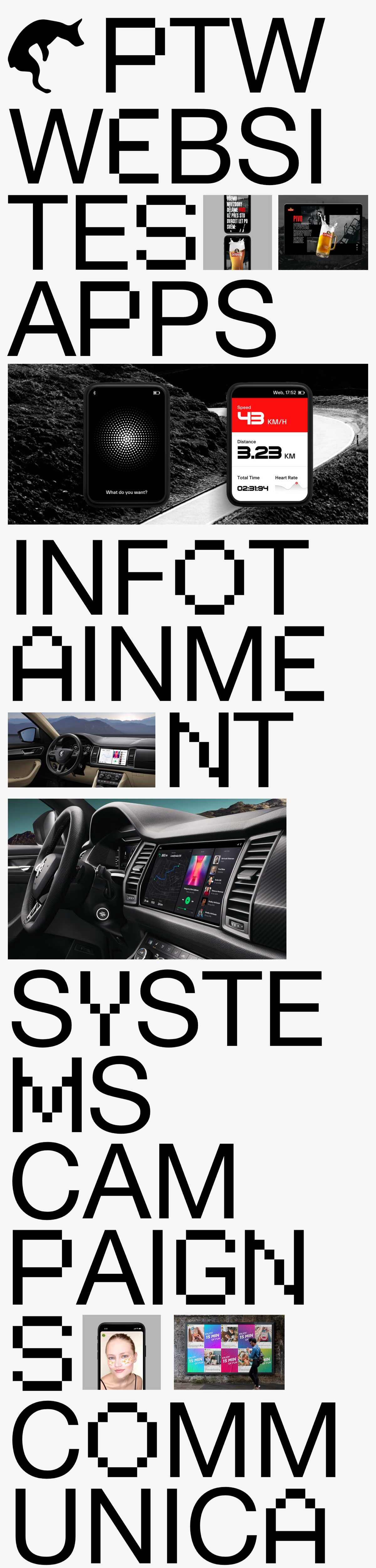
Jan Patawa built his portfolio as a bold typographic statement that is impossible to scroll past. Huge, pixel-inspired display letters break across the screen, spelling out PTW, websites, apps, infotainment systems, campaigns and communication in giant stacked fragments. Project images slot directly into the gaps between the letters, from mobile screens and a fitness tracker interface to in-car infotainment dashboards and a colourful billboard campaign. A small black animal silhouette sits next to the PTW mark at the top, adding a quirky personal touch to the stark black and white palette. It is a brave, energetic take on typography and web design that makes PTW truly memorable.
Credits: Jan Patawa
More in Portfolio
Stay on top of this week's design. Insights, top picks & more.