Plus

 Menu


BETTY + BETTY
June 24, 2020
Mindsparkle Mag


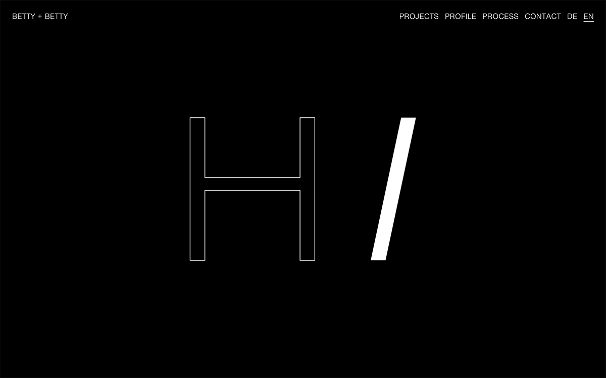
BETTY + BETTY greet visitors to their studio website with a simple, charming “Hi” on a deep black background. The H is drawn as a fine white outline, while the i is reduced to a single solid white slash, a clever play between line and mass. A light sans serif navigation for Projects, Profile, Process and Contact, plus a DE and EN switch, runs along the top without distracting from the greeting. It is a confident, reduced piece of web design that shows how much personality a little typography can carry.
Credits: BETTY + BETTY
More in Design Agency
Stay on top of this week's design. Insights, top picks & more.