

 Plus

 Menu


Shivangi Chopra
November 10, 2026
Mindsparkle Mag


Shivangi Chopra is a graphic designer, art director and occasional illustrator who grew up in India, studied at CalArts and now works as a designer at Wieden+Kennedy in Portland, Oregon. Her work is dense, layered and loud, built from repetition, sudden shifts in scale and expressive type rather than the generous white space many design schools treat as the default. She started out as a fine artist, and she still reaches for paint, paper and screen-printing ink whenever she can get away from a screen.
Before joining Wieden+Kennedy in Portland, she designed at Apple, at Day Job in Los Angeles and at Wieden+Kennedy in New Delhi. Her BFA thesis at CalArts, Second Natures, brought together a typographic poster, a Bollywood archive, an interview magazine and a map of her hometown, Chandigarh, to explore the friction between the culture she grew up in and the design canon she was taught. It is graphic design that keeps asking whose rules it is following, and it has already earned recognition from D&AD New Blood, Graphis and the Indigo Design Award.
We spoke with Shivangi about unlearning the Western canon, what it means to be told your work is too much, and carrying a creative voice from Apple to Wieden+Kennedy. She also explains why she hand-painted and tore hundreds of frames for a stop-motion trailer, and why a Chandigarh chair only became a treasure once it left Chandigarh. And she tells us about the kind of project she hasn't made yet.
✜ Hey Shivangi, happy to have you! You started out painting in Jaipur, and now you’re working across graphic design, art direction and digital. What’s something from those early days that still shows up in your work?
→ Hi! Thank you so much for having me :) I started my creative practice as a fine artist and pivoted to graphic design purely out of curiosity and a sense of job security. Early on, I don’t think I fully understood the difference between art and design, but now they feel almost like opposite ends of the same creative instinct.
There’s a sense of purpose and fulfilment I get from both, but art feels much more self-serving to me, while design is usually made in conversation with other people. I think that’s part of why I gravitated toward design. The collaboration and sense of community felt much more natural to me than the isolation I sometimes felt while painting.
I still come back to art when I need to slow down, though. It gives me a way to make something without overthinking its purpose or trying to perfect every decision, which is a nice escape from the way I can sometimes approach design.
✜ You once wrote that growing up in India shaped how you see, while studying in the US shaped how you make. What was the hardest thing to unlearn when those two worlds met?
→ I think the hardest thing to wrap my head around was realizing that there is no “correct” way for design to look.
So much of design education everywhere around the world begins with Swiss design, an understanding of the grid system, the Bauhaus, and the general Western canon. What’s always been strange to me is that visual communication has always existed everywhere in the world. People have always made signs, books, posters, textiles, packaging, symbols, and systems for communicating information long before graphic design was formalized as a discipline.
Studying in the US made me much more aware of how easily one particular history of design can become treated as the history of design. I think I was beginning to absorb that framework without really questioning it. I started seeing restraint, order, and certain kinds of modernist thinking as more “correct,” while a lot of the visual language I had grown up around in India was often described as chaotic, decorative, or excessive.
The thing I had to unlearn was that hierarchy. I still value everything I learned from Western design history, but I don’t see it as the neutral standard anymore. I’m much more interested now in asking whose rules I’m following, where those rules came from, and what gets left out when we treat one visual tradition as universal.
✜ There’s something quite distinctive about your work. It’s bold, layered, playful, and doesn’t necessarily follow the usual rules of graphic design. Has that visual language always come naturally to you, or did it take time to find your own style?
→ I don’t think I ever knew what I wanted my “style” to look like, or if I even wanted one. At CalArts, a lot of my classmates had very distinct personal styles, and I remember wondering if I had one at all, or if I was ever going to.
It didn’t come naturally in the sense that I always knew what my work should look like. It took a while to stop designing toward what I believed was good design and start paying attention to what I was actually drawn to. In school, I was always very conscious of the references I was pulling from and whether the work felt “resolved.” Over time, I started trusting my own instincts more and feeling less pressure to make every decision feel validated by something I had already seen before.
I also don’t really think of it as having found a fixed style. I think I’d get bored if everything I made looked the same. What feels consistent is more the way I approach things. I like building visual worlds, layering references, mixing systems, and leaving room for occasional happy accidents. The surface can change a lot from project to project, but I think that instinct stays pretty consistent.
✜ You also turned the tables and interviewed other South Asian designers for Awaaz. Was there something someone said that really stuck with you or made you rethink your own practice?
→ Yes! That was a really special project to work on. I approached that part of my thesis as a way to reach out to my own community and see whether other South Asian designers were experiencing the same sense of duality that I was feeling.
I felt very seen in terms of how everyone I spoke to felt that tension as a part of the Indian diaspora, even though they lived and practiced design in very different parts of the world. The one thing we all had in common was the fact that we’ve all grown up in high-context Eastern cultures like India, Dubai, and Singapore, and studied in low-context Western cultures like the US and the UK.
I interviewed one of my friends, Sejal Gupta, who mentioned in her interview: “There is an expectation from Indian designers to create work that looks ‘Indian’, whatever that means.” She spoke about countering that assumption while still staying true to the design and references that have actually influenced us.
I think that really resonated with me because I don’t want to make something look Indian simply because I’m making it. At the same time, my work will inevitably carry traces of where I’m from because those references, habits, colors, visual languages, and ways of seeing are already part of me. I don’t have to force that into the work for it to be present.
That conversation made me less interested in defining what “Indian design” should look like and more interested in allowing identity to show up naturally, without feeling like it has to be performed in any kind of way.

✜ Your designs often embrace things other designers might try to clean up or simplify. Have you ever been told something was “too much” — and decided that was exactly the point?
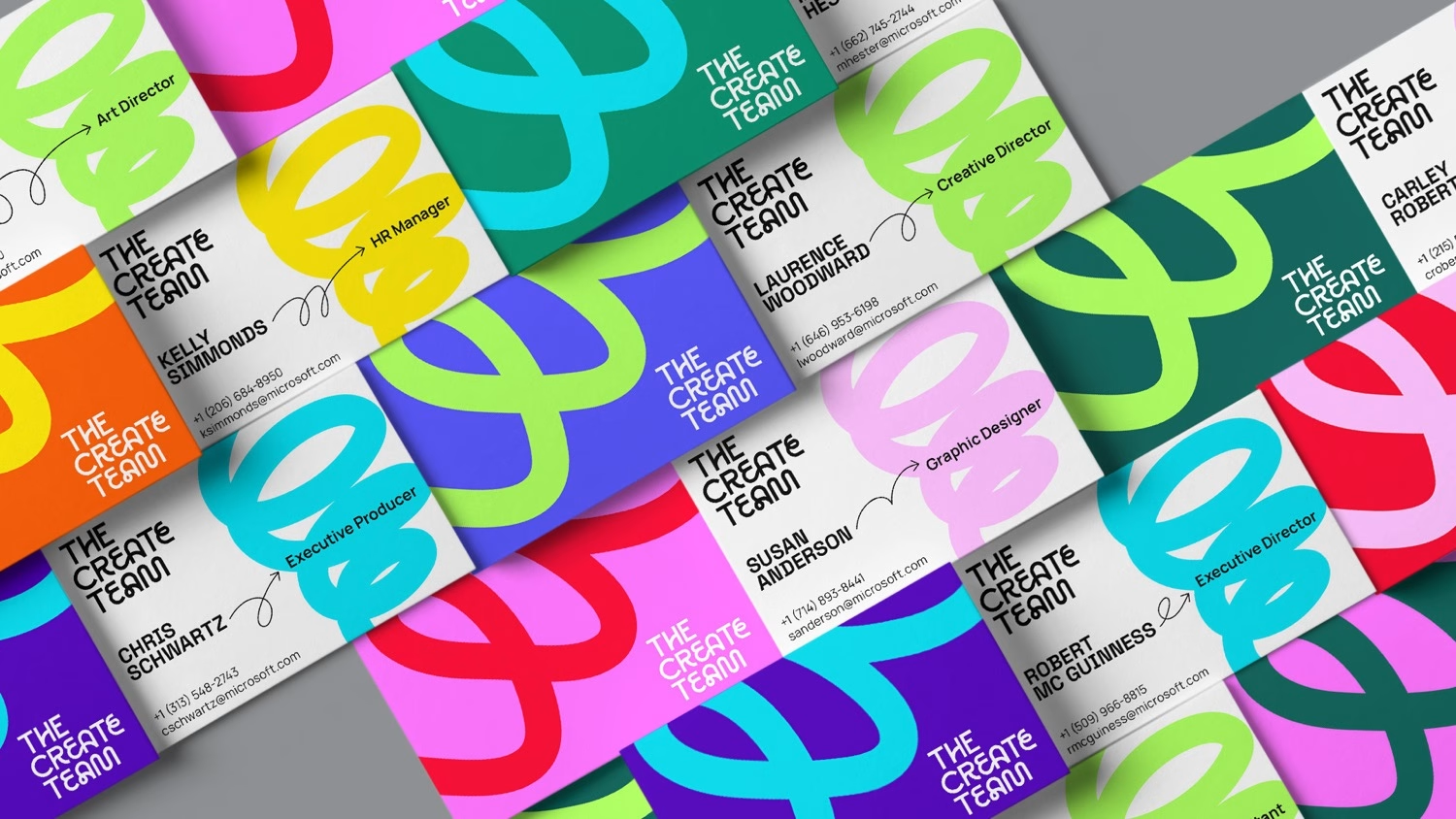
→ Definitely. I think “too much” is where I find design to be the most exciting. There are always projects that require minimalism, simplification, adding more space, or making the hierarchy more obvious, and sometimes that’s absolutely the right move. But other times the density is the idea. I feel personally drawn to the feeling of excess, repetition, layering, or visual noise to add character to my work wherever possible. I love when a piece asks you to spend a little more time with it and rewards you for noticing the smaller details. That’s something I try to bring into my own work too.
✜ You’ve worked with Apple, Day Job, and now Wieden+Kennedy. What has surprised you most about bringing your own creative voice into these very different teams?
→ I think I learned over time that having a distinct creative voice isn’t necessarily just visual style. It’s also how you think, what you notice, and what you bring into a room, especially when the environment around you changes.
At a smaller agency like Day Job, I learned to wear a lot of different hats and juggle various different projects at the same time. At Apple, I learned to work within a much larger and considered system. And at Wieden+Kennedy, I learned to think beyond design and consider strategy and the bigger picture.
Being adaptable without losing your sense of individuality was definitely a learning curve for me. Each place has such a different culture, and I’ve had to figure out how to meet those environments where they are while still holding onto the instincts and perspective that feel like my own.
✜ Design can become a bit of an echo chamber, with everyone looking at the same references. Where do you go when you want to get completely away from the design world?
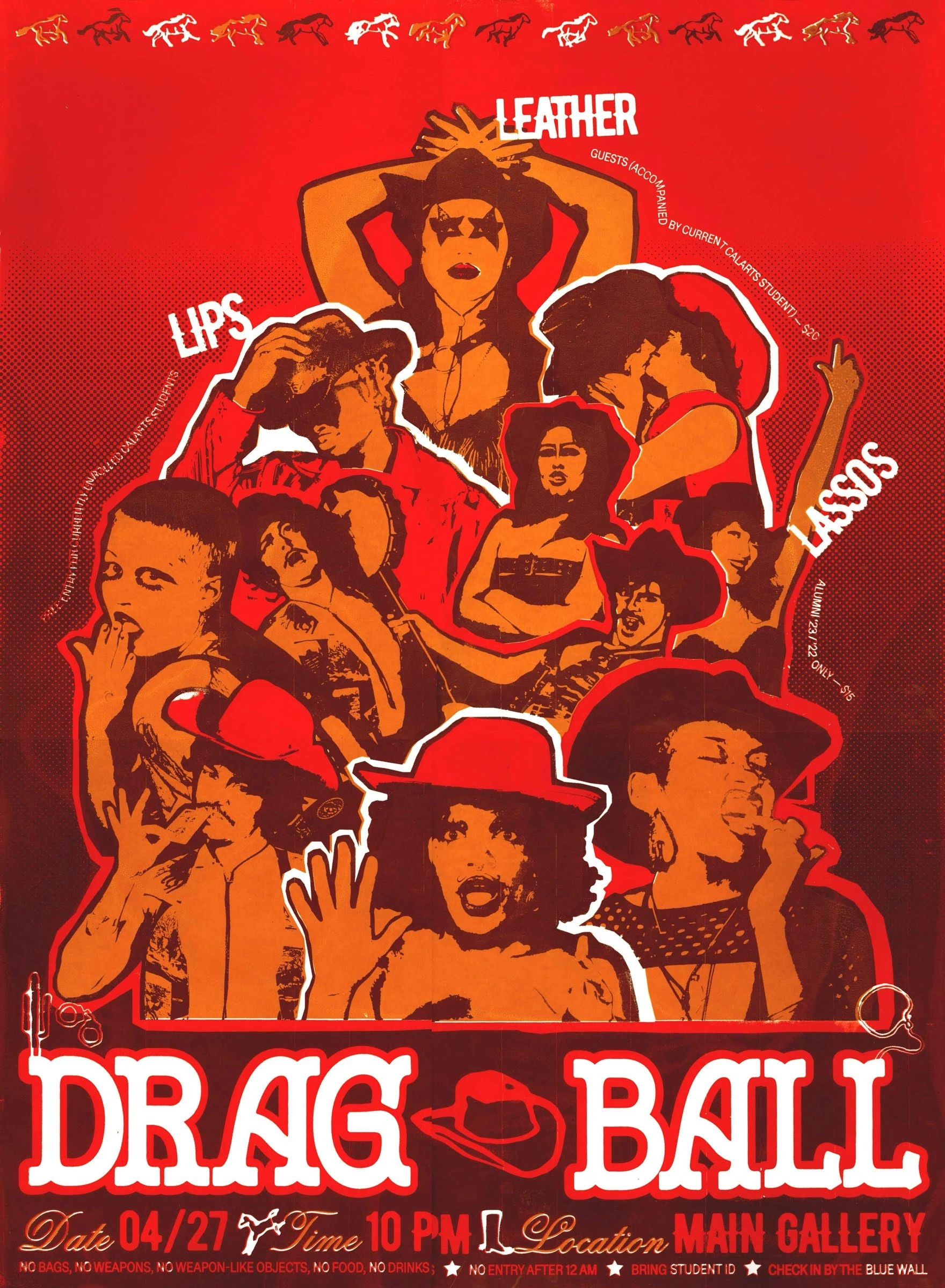
→ I usually try to get away from design by doing things that don’t ask me to have an opinion about design at all! I try to actively move away from screens, going on walks, cooking, making pottery, watching a movie, and also just engaging with people who aren’t designers haha.
I also like wandering through markets, people-watching, and just paying attention to how people arrange and use things in everyday life. I think it brings me inspiration in a much more authentic way rather than looking through perfectly curated moodboards. A lot of the references that end up meaning the most to me aren’t things I went looking for as “design inspiration”. They’re usually something I noticed while I was doing something else entirely.
✜ You’ve moved between Jaipur, California and now Portland. Has living in different places changed your taste, or has it actually made you more attached to where you come from?
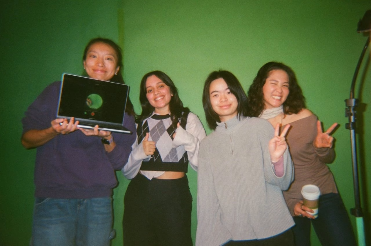
→ I feel like it’s definitely a bit of both! Moving between places has changed my taste in the sense that every city has its own pace, visual language, and way of living, and it’s very inevitable to absorb some of that.
At the same time, being so far away from India made me much more aware of the things I had taken for granted growing up. Distance made certain references, colors, textures, objects, and ways of seeing feel much more specific to me than they did when I was surrounded by them every day.
I think that’s become one of my greatest strengths in a way. You’re such a culmination of the places you’ve lived, the people you surround yourself with, and the experiences you’ve had, and I feel really grateful to have collected so many different points of reference. They all overlap in ways that make my perspective feel very specific to me.
So I don’t think moving replaced one influence with another. If anything, it made my taste more layered and made me more aware of where all those instincts are coming from.
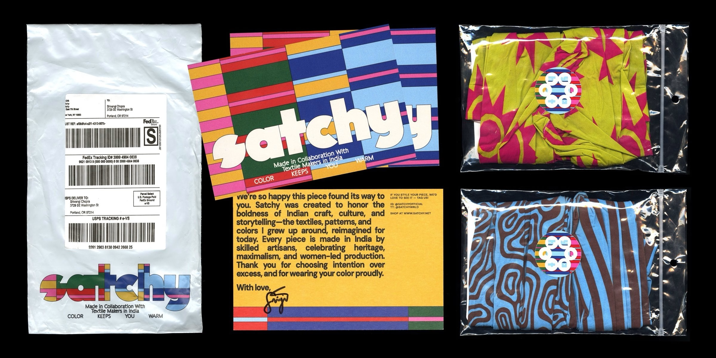
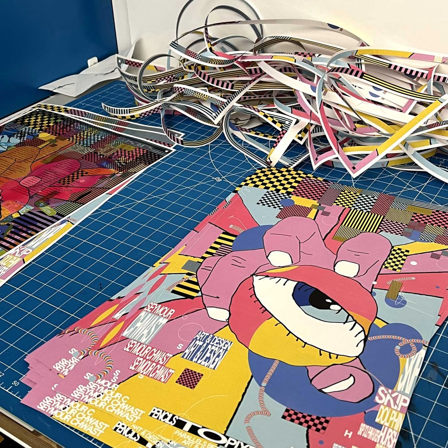
✜ With Broke Box, you created hundreds of hand-painted and torn frames for a stop-motion piece. Why go through all that trouble when there are much faster ways to make things today?
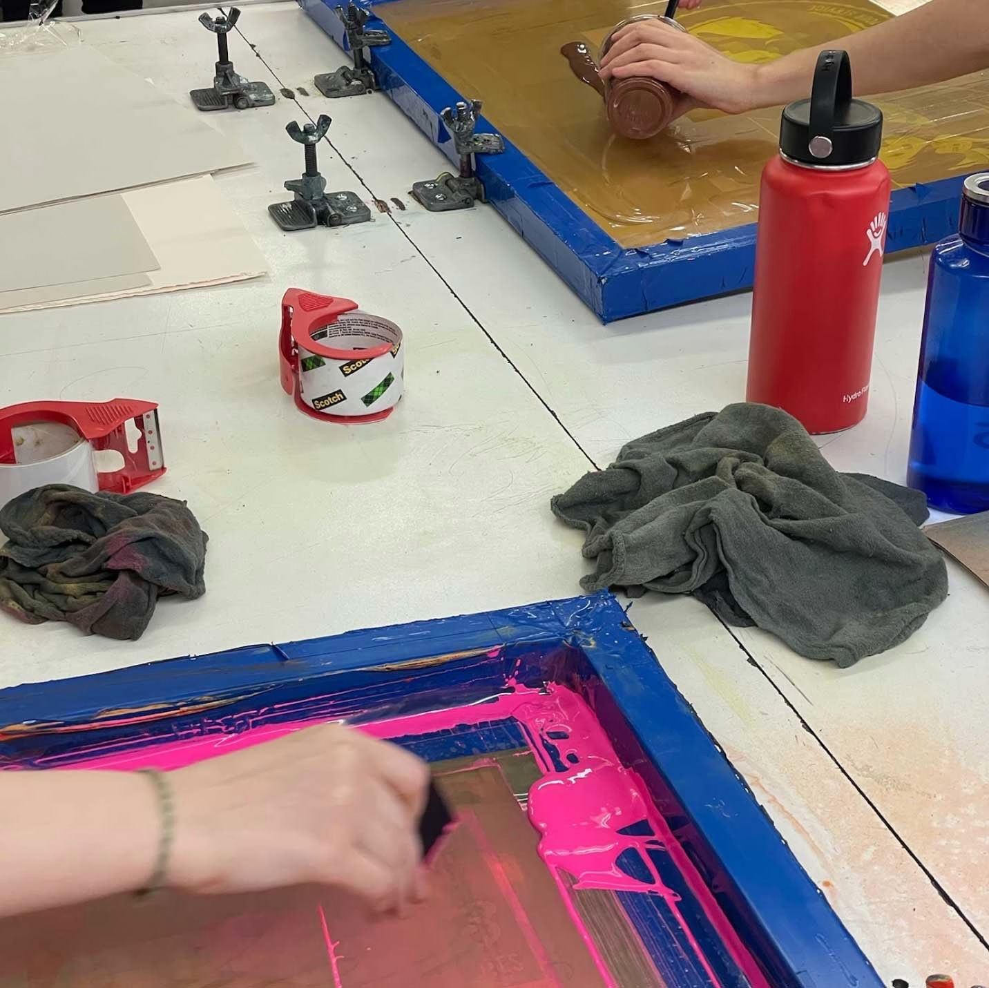
→ Oh yeah! Broke Box was one of my favorite projects to work on. I generally lean toward more analog ways of making because I love the unpredictability of them, and I’ll take any excuse to move away from a screen and think with my hands. It’s easy to get caught up in the things you already know how to do in software, but working physically tends to push me toward outcomes I wouldn’t have planned otherwise.
I really enjoy the variation and inconsistencies of doing something handmade. Especially for Broke Box, which was a branding project for a speculative soap box derby race, that human, DIY quality felt essential to the idea. The inconsistent torn edges and uneven paint textures helped bring that energy to life. I also feel like recently, with the use of AI becoming a lot more common in design, it feels a lot more important than ever to want to feel like there’s a sense of a human touch and a person behind the work.
The process was definitely tedious, but I think that was also part of why I loved it. I’m really drawn to the warmth and personality that comes from something being slightly unpredictable and visibly handmade.
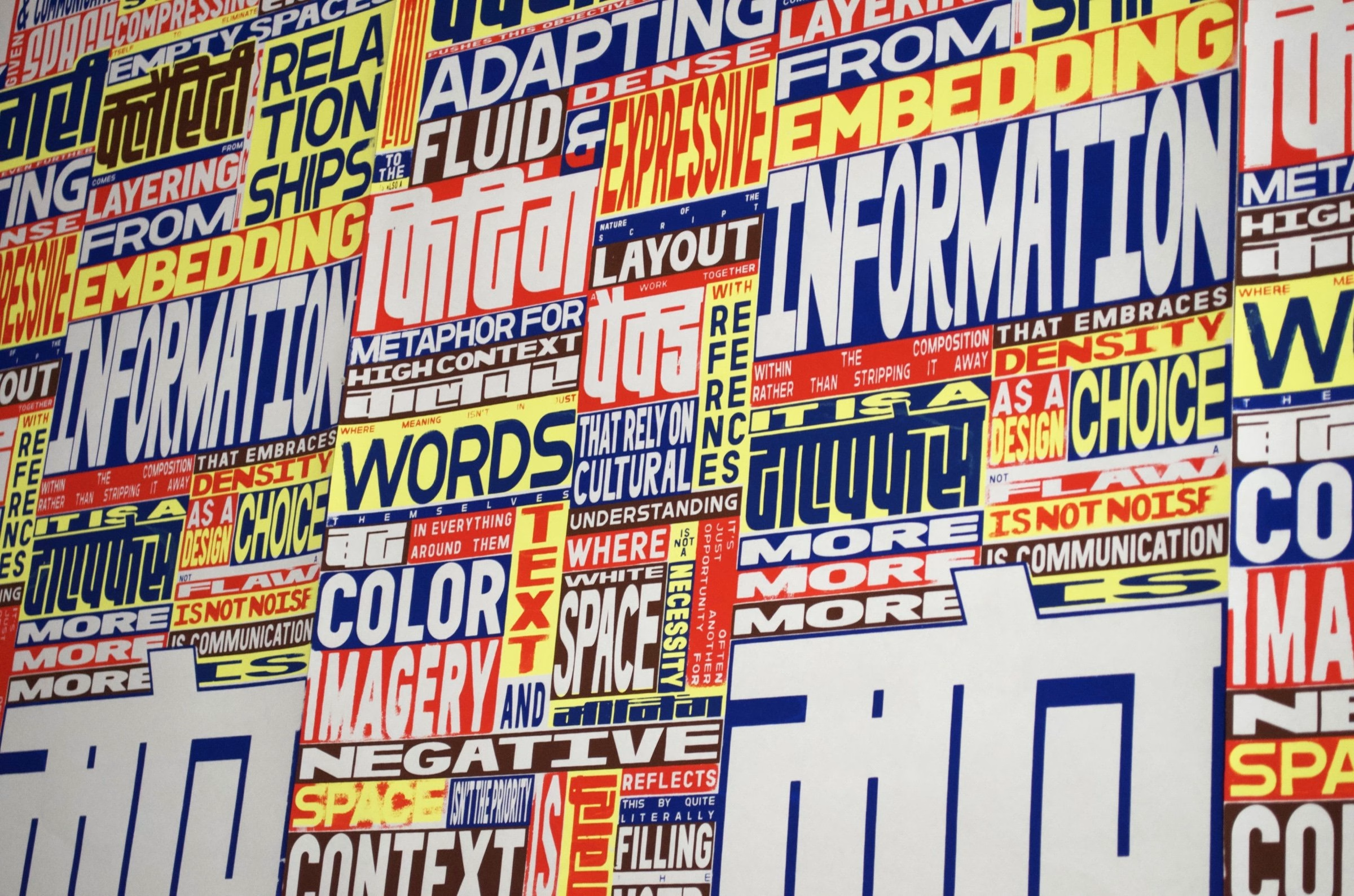
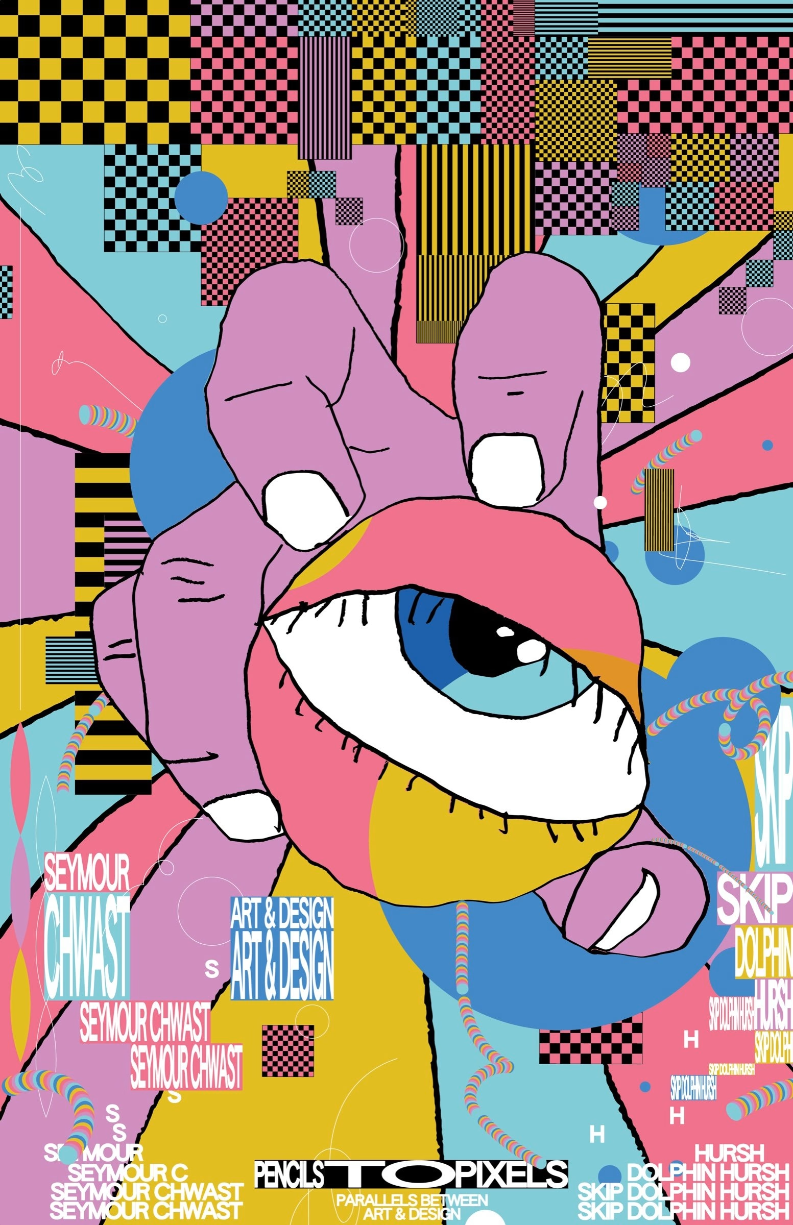
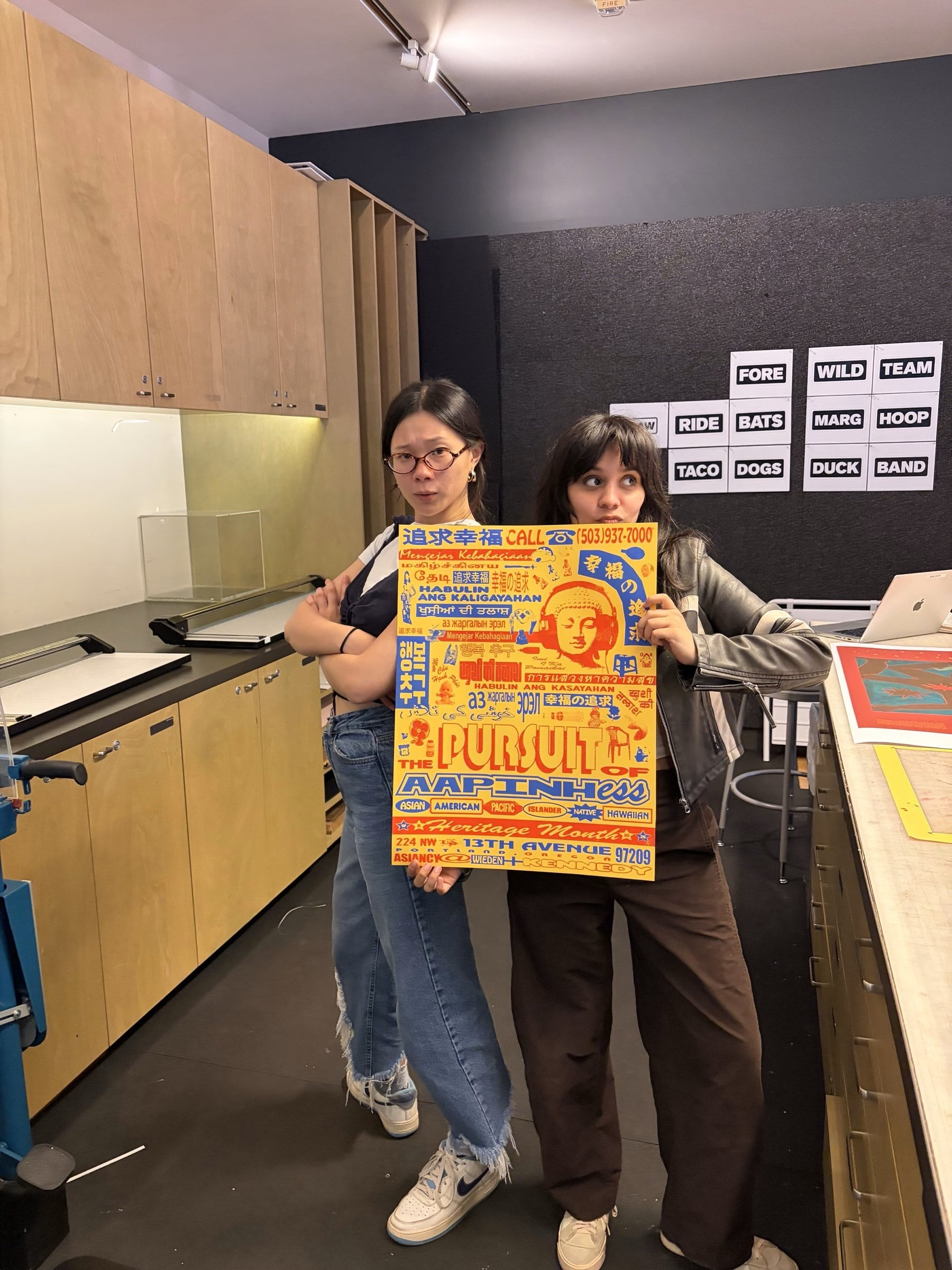
✜ Your More Is More poster challenges the idea that good design needs plenty of white space. Is there a design rule you now happily ignore?
→ I think the only rule I truly believe in is that there aren’t any set rules that apply to all design.
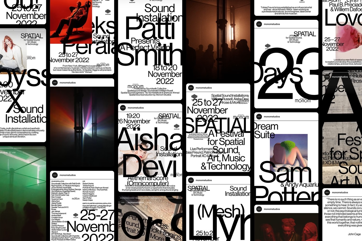
More Is More was a poster exploring the relationship between Indian visual culture and the Western idea of “good design,” especially the assumption that it comes from restraint, minimalism, and white space. I wanted to push in the opposite direction and see what happened when density, repetition, and excess became the structure rather than something to correct.
Good design is so contextual. Something that feels like the right move in one project can make no sense in another. I think about it in the same way that I believe that there are no bad typefaces, only bad uses of them! Almost any choice can work if it makes sense for the idea, the context, and the feeling you’re trying to create. I’m much more interested in asking why a decision works than whether it follows a rule I was taught.
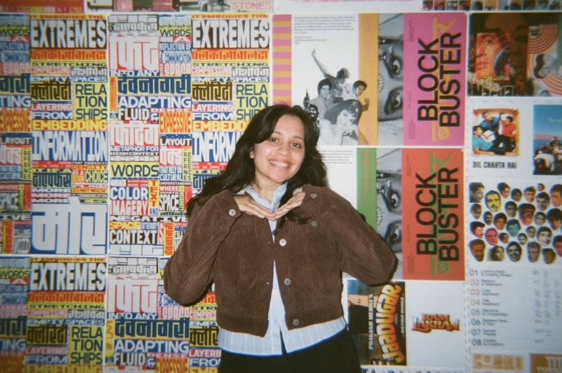
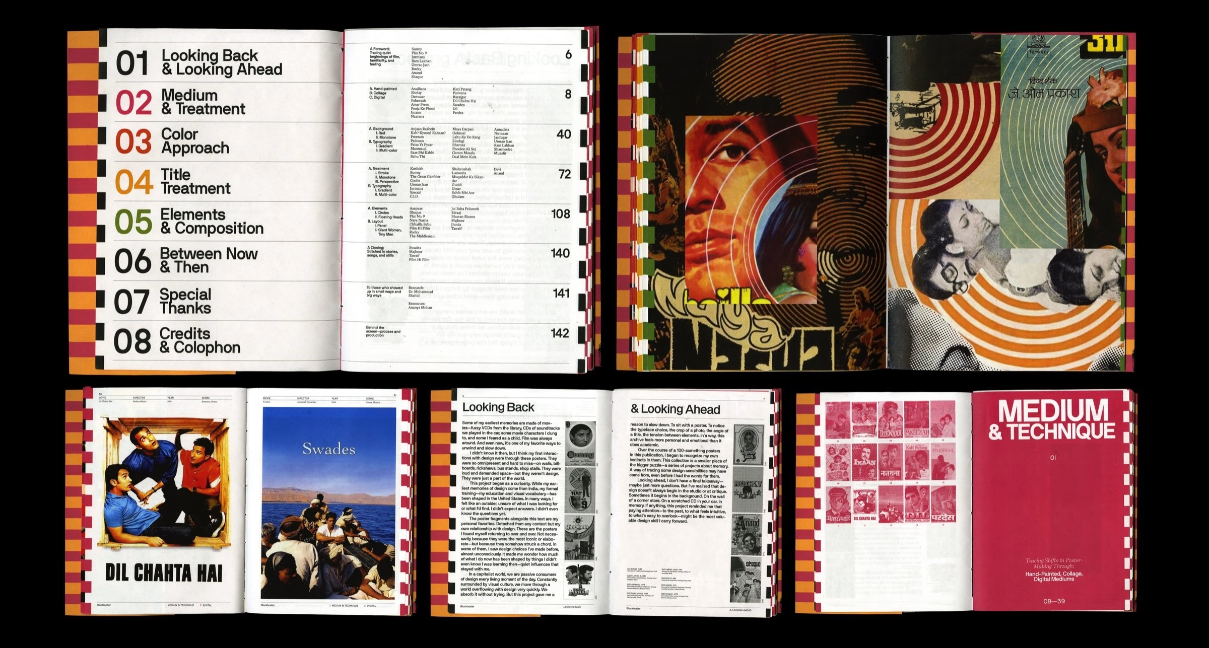
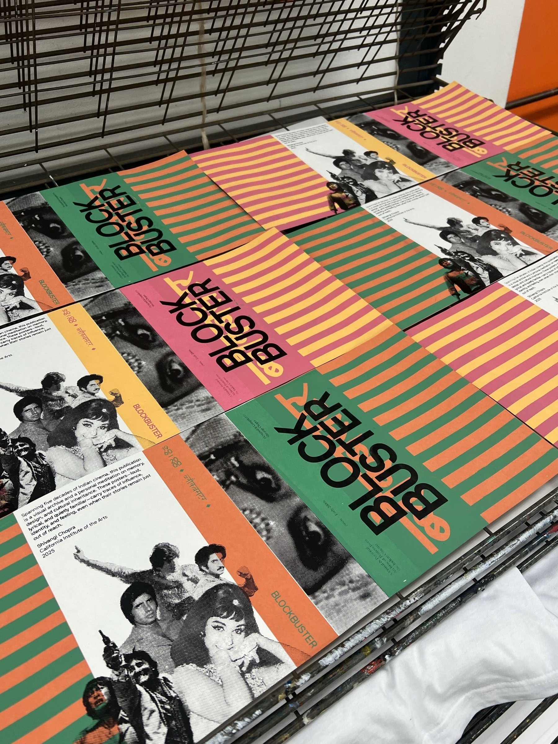
✜ For Blockbuster, you went through more than a hundred Bollywood posters. Did you discover something in them that you suddenly recognised in your own work?
→ Definitely. Going through that many Bollywood posters made me realize how much I had already absorbed without consciously knowing it.
I kept noticing things I’m naturally drawn to in my own work. The dense compositions, dramatic shifts in scale, expressive typography, and lots of imagery competing for attention are all things I’ve definitely replicated in my work. I just don’t think I had previously connected those instincts back to the visual culture I grew up around.
That was probably the most interesting part of the project for me. It made me realize that your taste is shaped long before you have the vocabulary to explain it. There wasn’t any particular moment where I decided to design like that, but I suppose those images had still been sitting somewhere in the back of my head the whole time.
✜ I love that your Chandigarh project became so personal, from conversations with your parents to the story of a chair becoming a luxury object in the West. What surprised you most while working on it?
→ The Chandigarh project, Grass Between the Stones, was one of the most personal projects I’ve ever worked on. It was a research-driven project about my hometown, Chandigarh, looking at the city through its architecture, design history, and my parents’ memories of living there.
I think the project completely pivoted at a point where I came across Chandigarh chairs in my research. I grew up seeing those chairs everywhere, especially in government buildings, so they always felt very ordinary to me. But I started reading about how those same chairs were being auctioned in the West for thousands of dollars and framed as collectible design objects.
It really made me think about who gets to decide when an object becomes valuable, and how easily that value can be separated from the people and place it originally belonged to. Much of the conversation around the chairs centered on the French designers who made them, while omitting the Indian designers who helped create them, and making Chandigarh itself almost secondary. I remember coming across the New York Times headline “A City Sat on Its Treasures, but Didn’t See Them,” and feeling frustrated by the framing of it. To me, the irony was that they weren’t treated like “treasures” until they had been removed from their original context and given value somewhere else.
That completely changed the project for me. It stopped being just about Chandigarh and became much more about ownership, extraction, and the way value gets reassigned once an object leaves the place it comes from. It reminded me a lot of colonial patterns of taking something, reframing it elsewhere, and then deciding that it matters.
✜ You’ve achieved quite a lot early in your career. But forget the big studios and impressive clients for a second — what’s something you haven’t made yet that you’d absolutely love to try?
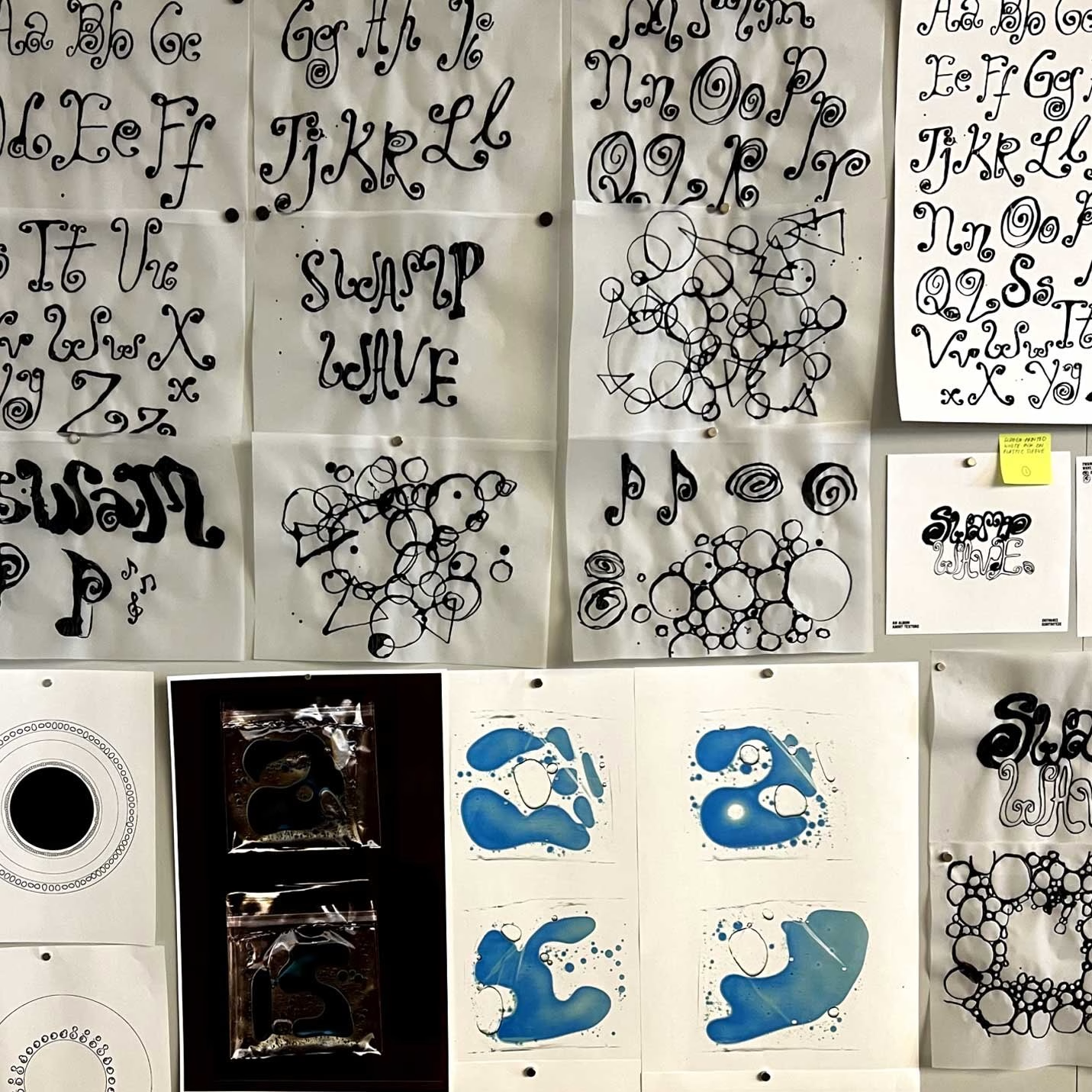
→ I’d really love to work on something that exists alongside another creative medium. The idea of designing title cards or title sequences for film, vinyl packaging, or visuals for music feels really exciting to me.
A lot of what I’ve done so far falls more squarely within graphic design, so I think it would be fun to step outside of that a little and make something where design is responding to someone else’s world!
What connects Shivangi’s work, from the More Is More poster to Blockbuster and Grass Between the Stones, is a refusal to treat one visual tradition as the neutral standard. She doesn’t force India into her work, and she doesn’t scrub it out either. Instead, the density, repetition and visual noise of the places she grew up in sit right next to everything CalArts, Apple and Wieden+Kennedy taught her.
Early in her career, she is already asking better questions than most: whose rules, where they came from, and what gets left out. Next, she wants to design for film titles, vinyl and music, work that responds to someone else’s world. Given how much she finds in a market stall or a stack of Bollywood posters, that next chapter is worth watching.
Credits: Shivangi Chopra
Graphic Designer & Art Director: Shivangi Chopra
More in Interview
Stay on top of this week's design. Insights, top picks & more.