Plus
Plus

 Menu
Menu


Lex & Turner
April 22, 2021
Mindsparkle Mag


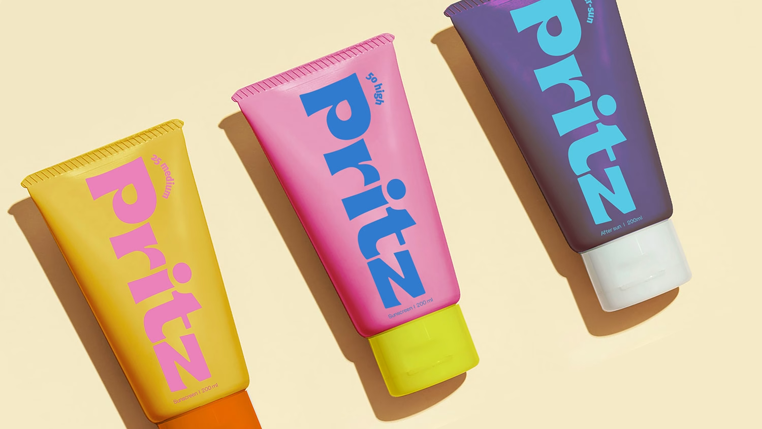
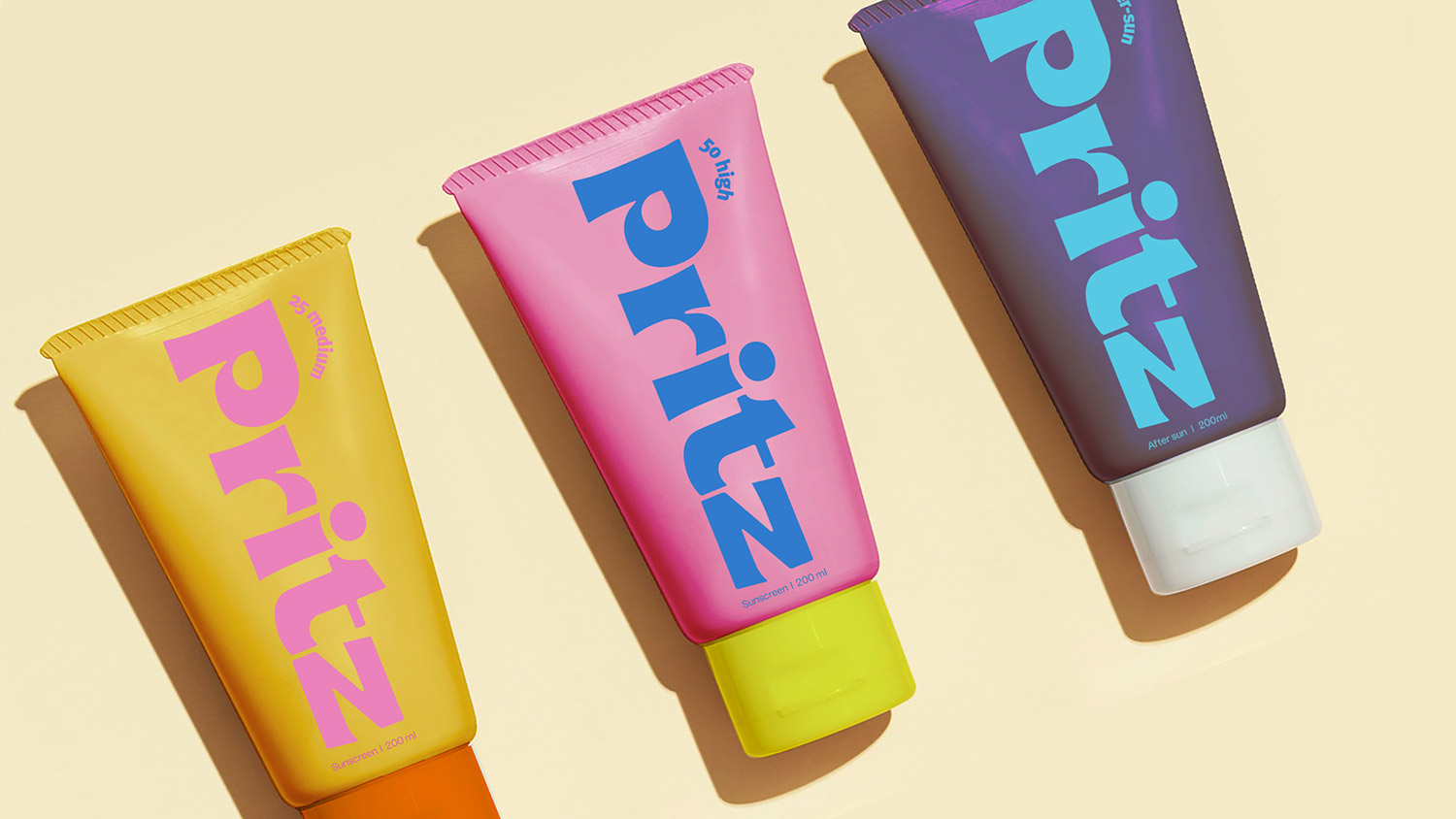
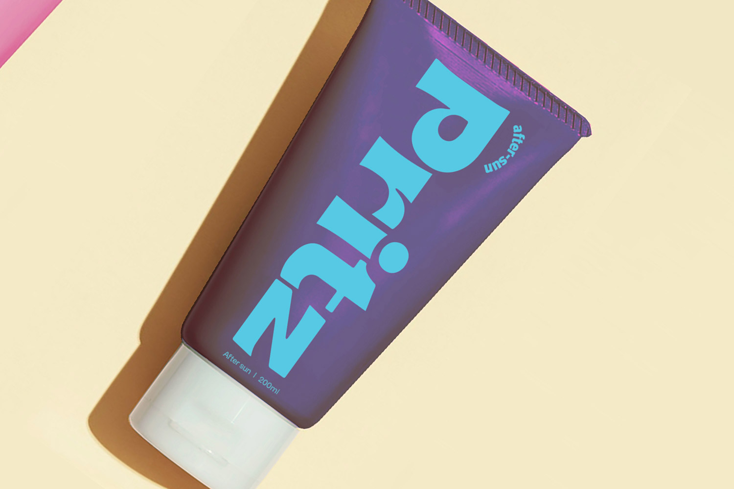
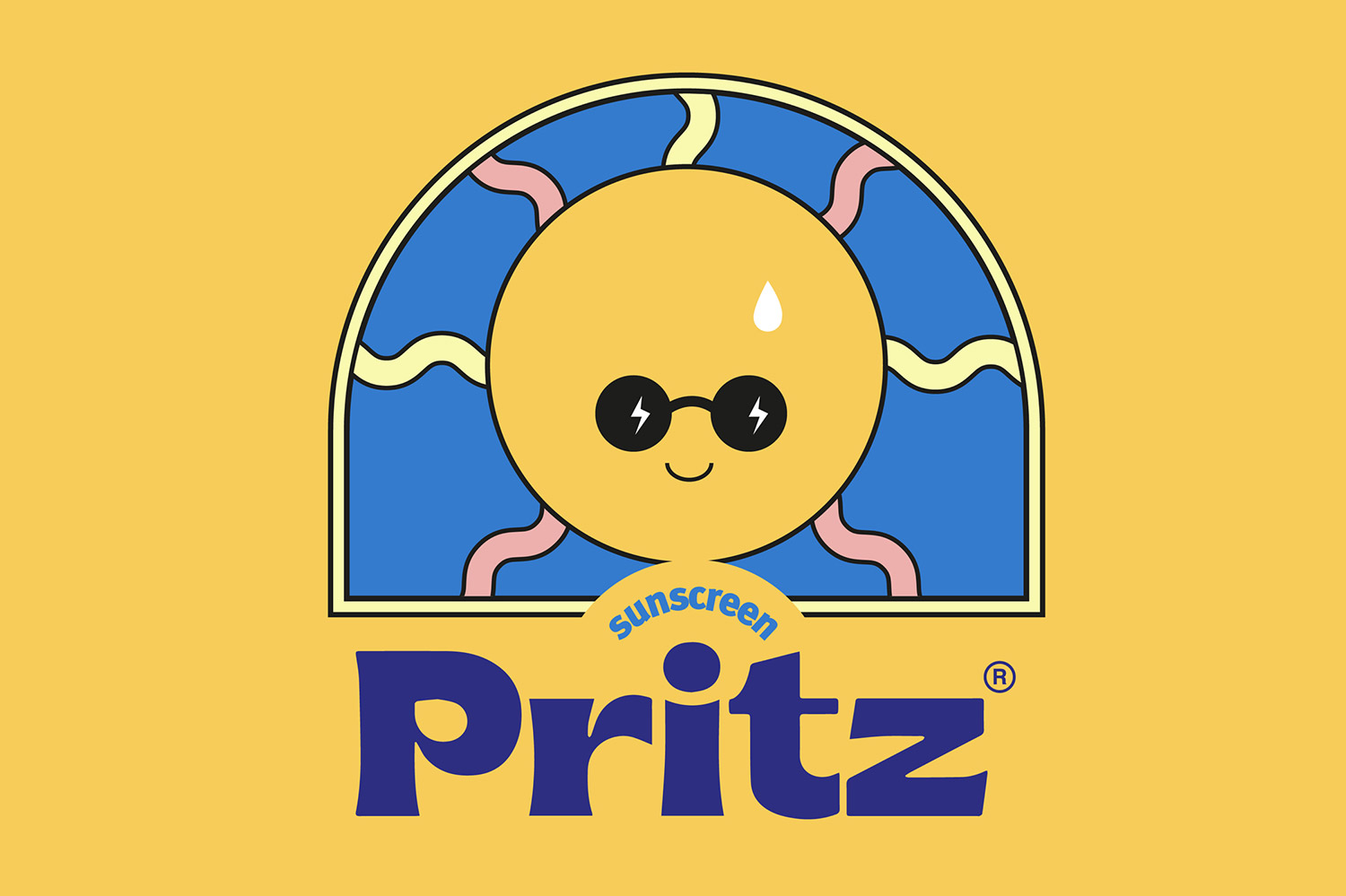
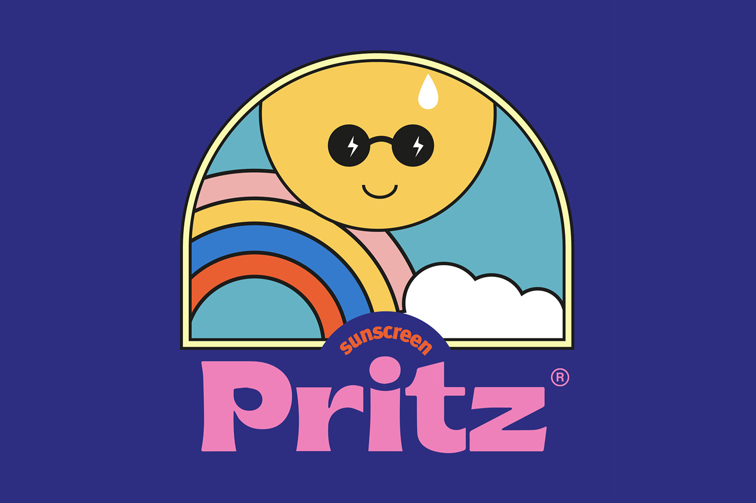
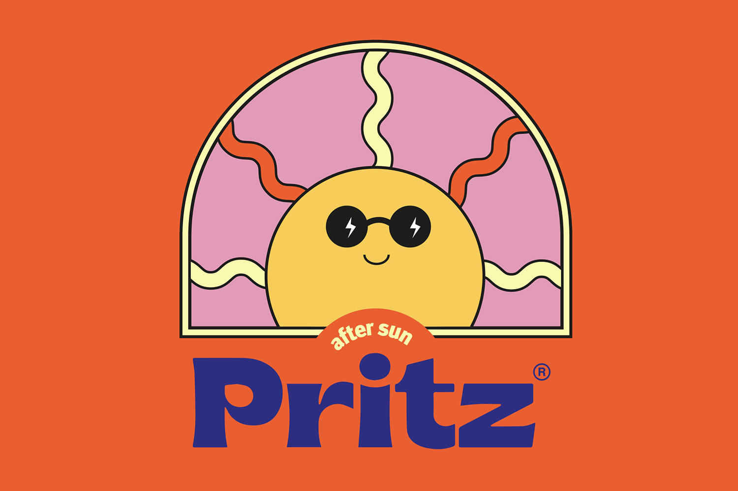
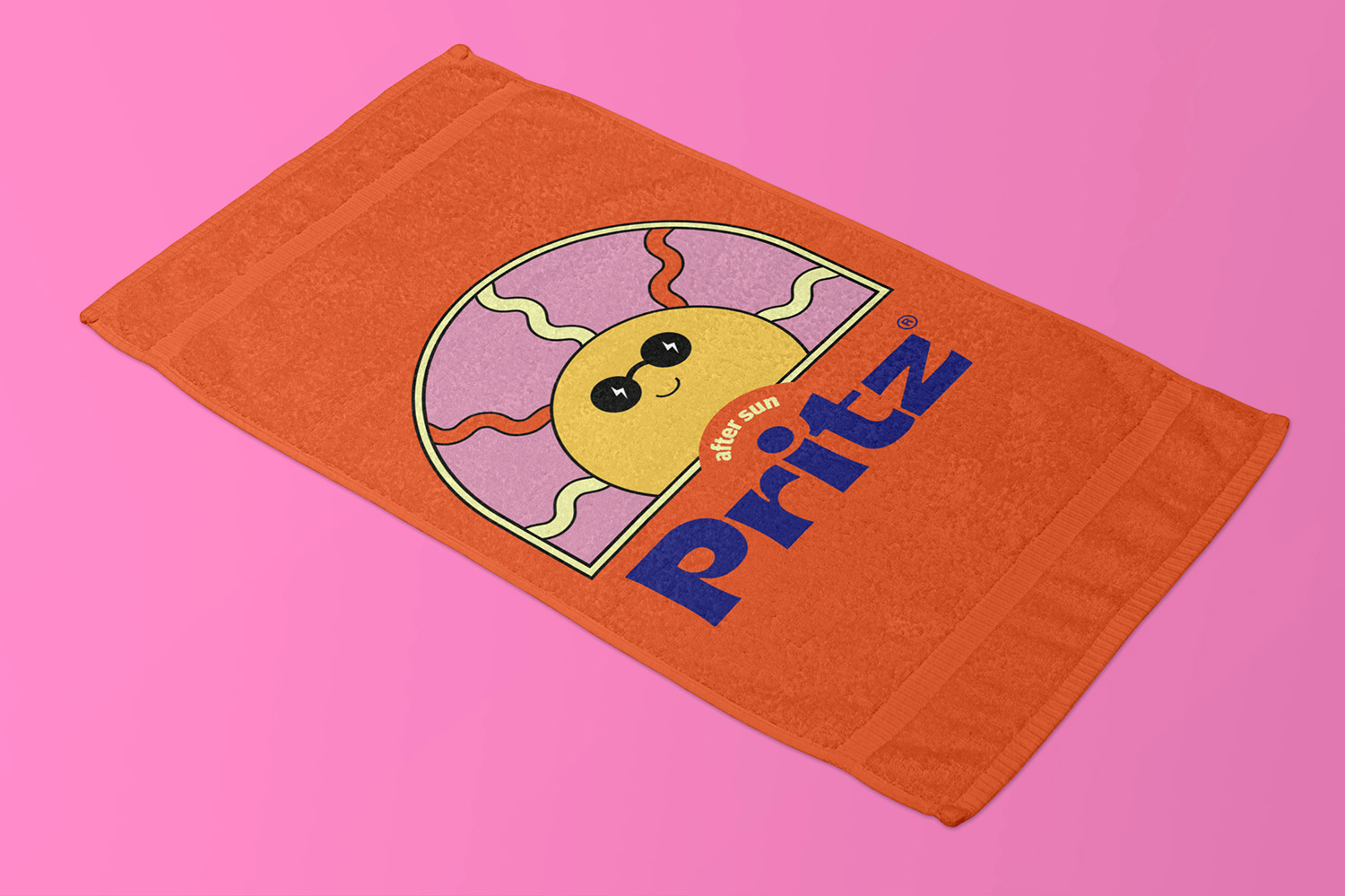
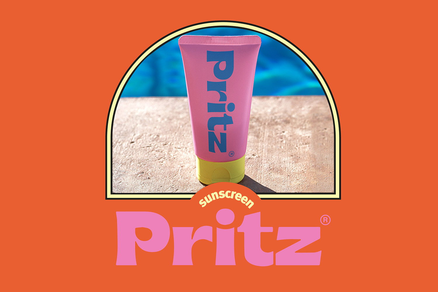
Sun & Fun. Two things we need now, even more then ever. For sunscreen PritZ, Boutique Branding Agency Lex & Turner develops a colorful brand identity that evokes an instant holiday feel.
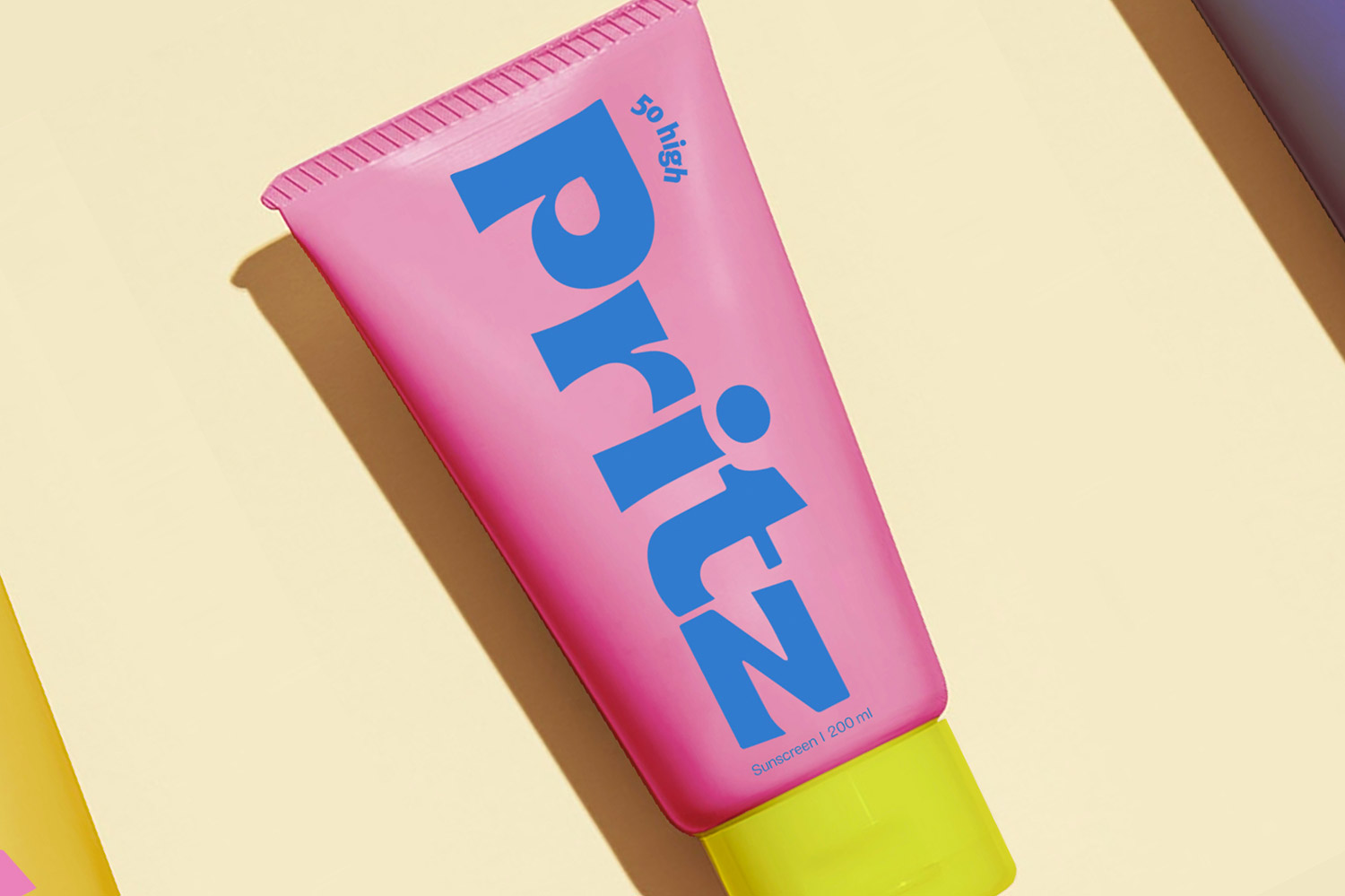
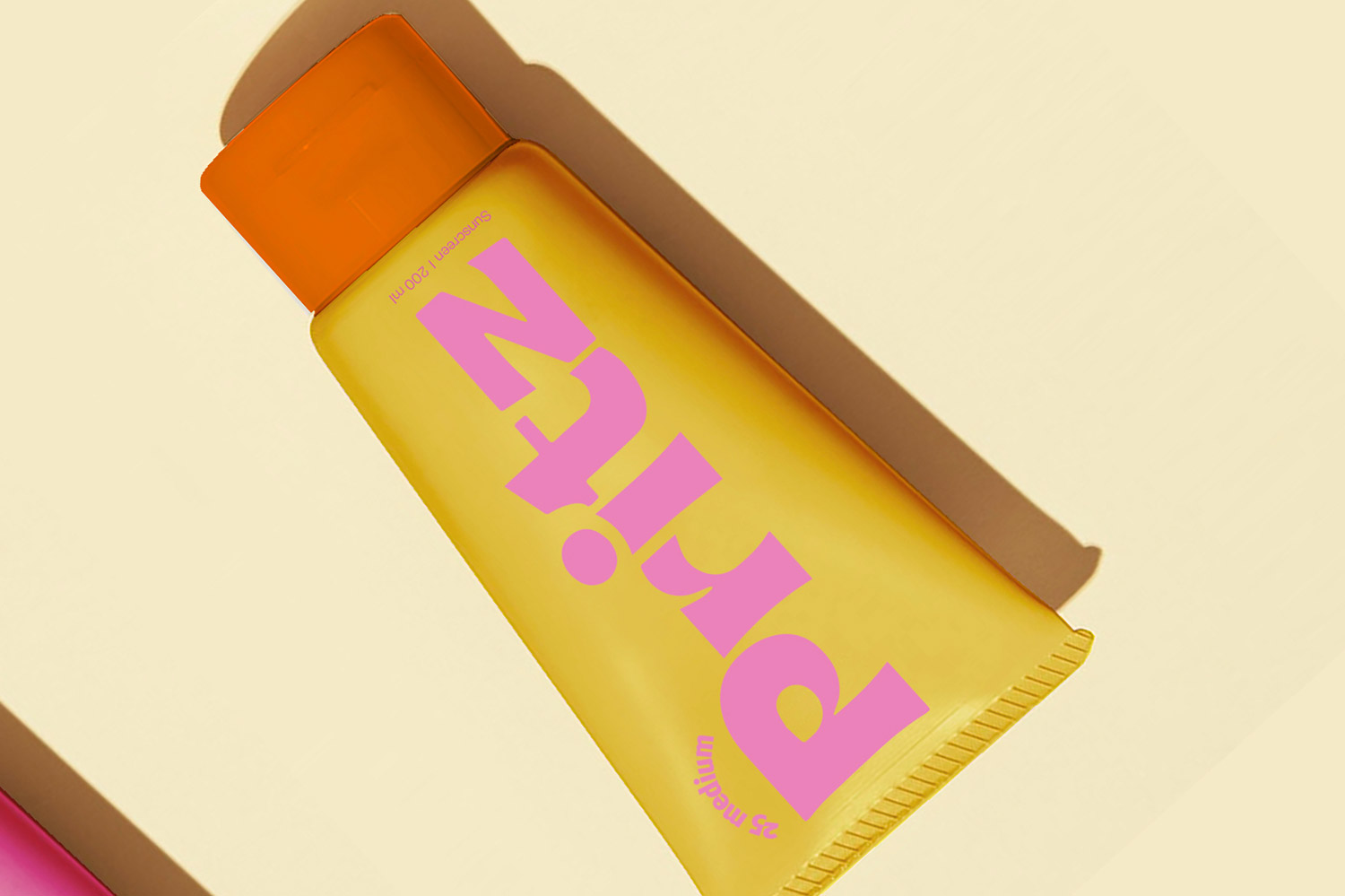
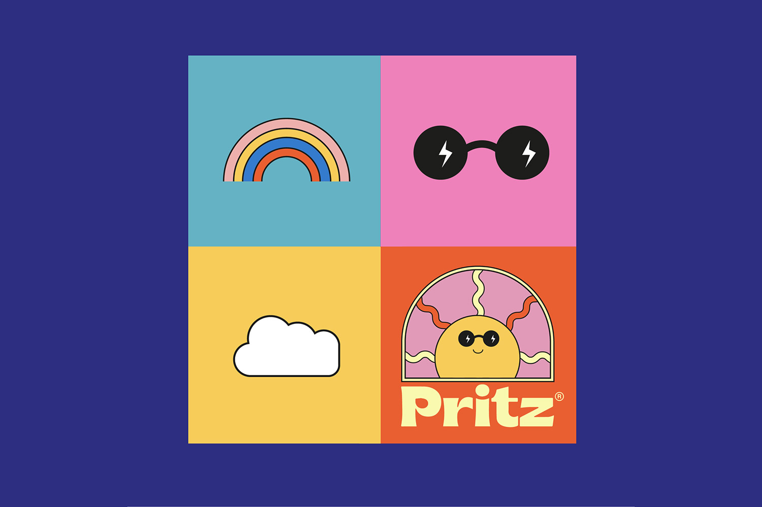
The vibrant colors and ‘Brice’ font type are a big fat nod to the 1970s and gives the sunscreen brand that ‘retro feel good’-look.
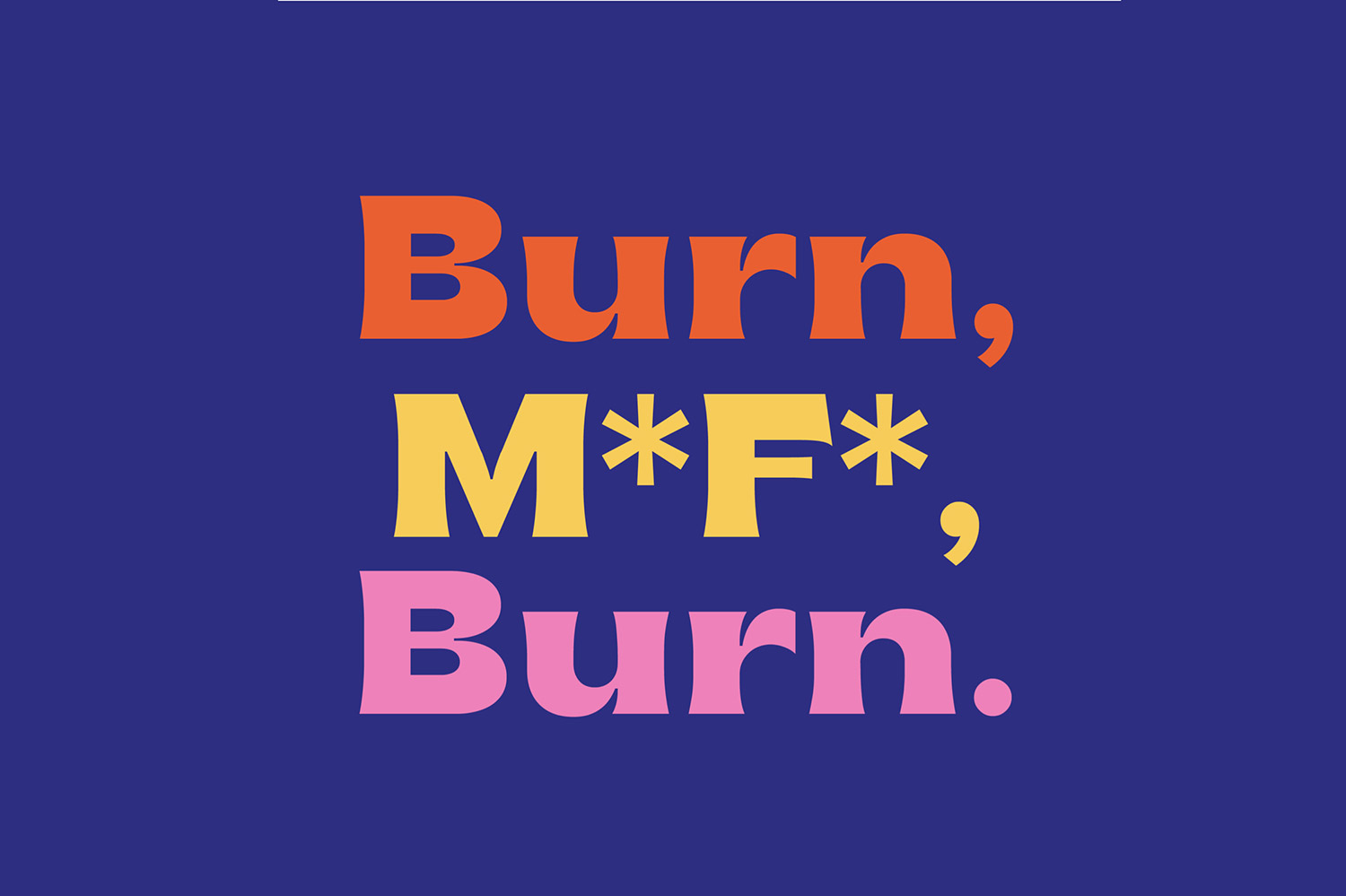
The quirky copy (“Burn, M*F*, Burn") and animated sunshine character reinforce the playful nature of PritZ. The goal? Brighten the lives of sunbathers and stand out on store shelves.
PritZ is an Onomatopoeia: a word that phonetically imitates the sound that is describes. ‘PritZ’ is the sound a sunscreen tube makes when you squeeze it. Hard.
Happy Pritzing, boys & girls!


Credits: Lex & Turner
More in Brand Identity
Stay on top of this week's design. Insights, top picks & more.