




Black Friday 50% off Plus
Unlock InsightsBlack Friday 50% off Plus
Unlock Insights Menu


Ragged Edge
November 20, 2026
Mindsparkle Mag


Founded in 2015, the design-led stationery brand Papier picked up its first million customers quickly. The ambition was always much bigger than a successful online shop: Papier wanted to become a category-defining brand, or in the words of founder Taymoor Atighetchi, for “a piece of Papier to touch everyone’s lives.” That meant launching in the US and moving beyond direct-to-consumer into physical retail.
London studio Ragged Edge led the full rebrand, from research and strategy through identity and delivery, and co-created a new website with the Papier team. The stationery market, as the studio saw it, is full of nicely designed products but has very few strong brands. The job was to frame Papier as something bigger than the notebooks it sells.
Customer interviews gave the strategy its footing. Buying a notebook, a planner or a diary turned out to be a small promise to yourself, an invitation to change, so the brand was built on the transformational power of the blank page. That idea became “Invite Magic,” a short, actionable line with plenty of creative room in it.
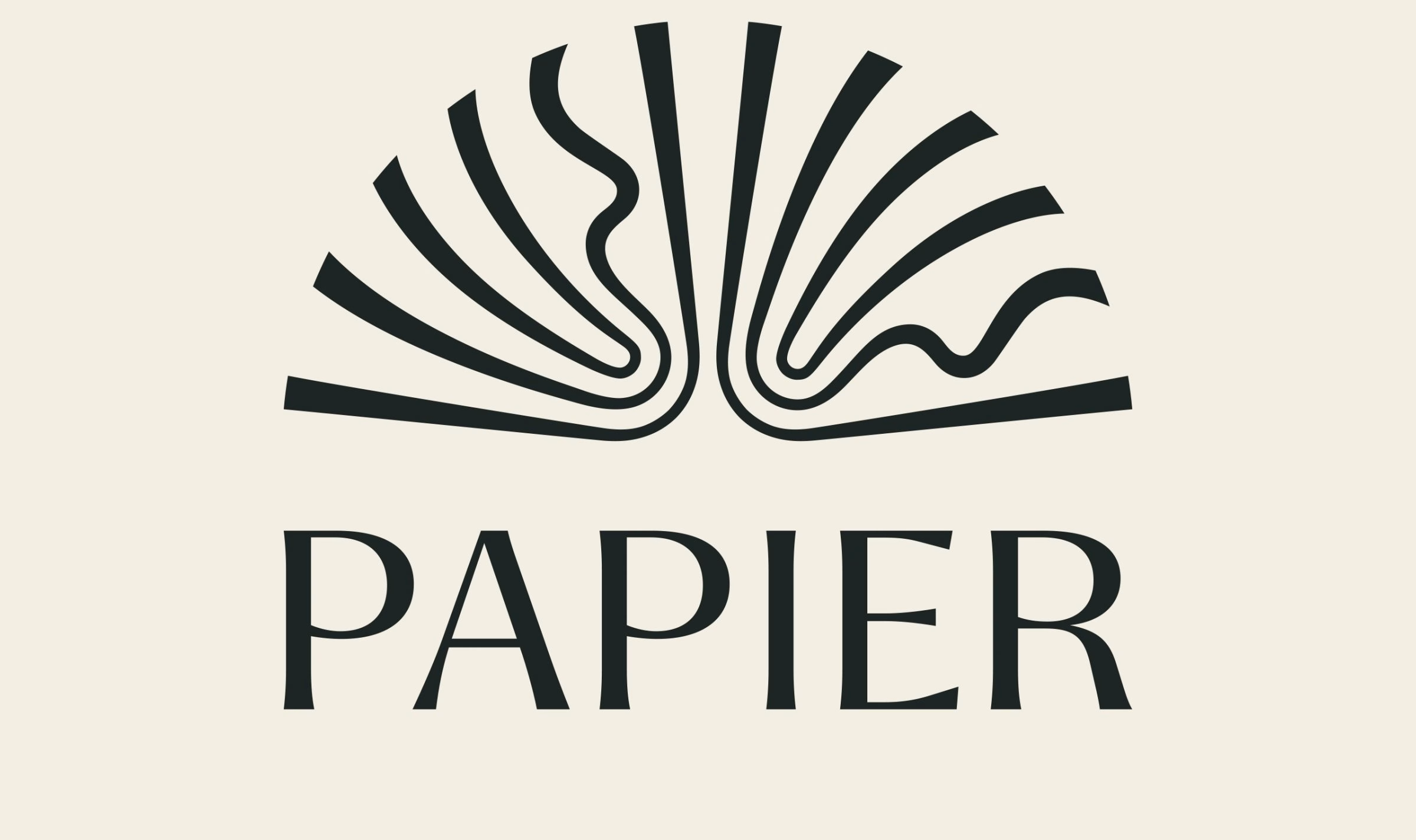
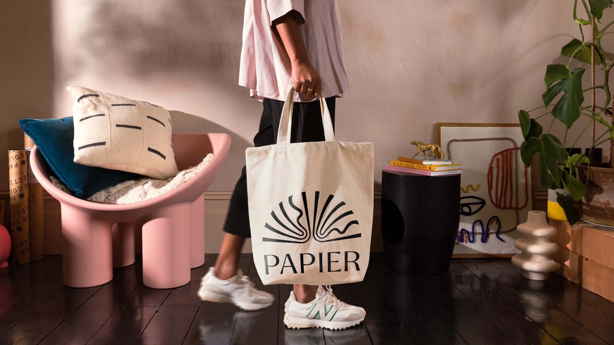
The identity imagines Papier as an emporium of magic objects brimming with untapped potential, born of paper and ink. Its logo is the clearest expression of that concept: an open book whose pages fan out into rays, some straight and some rippling like a pen stroke. Set above a high-contrast serif wordmark, it reads as a book, a sunrise and a burst of possibility all at once.
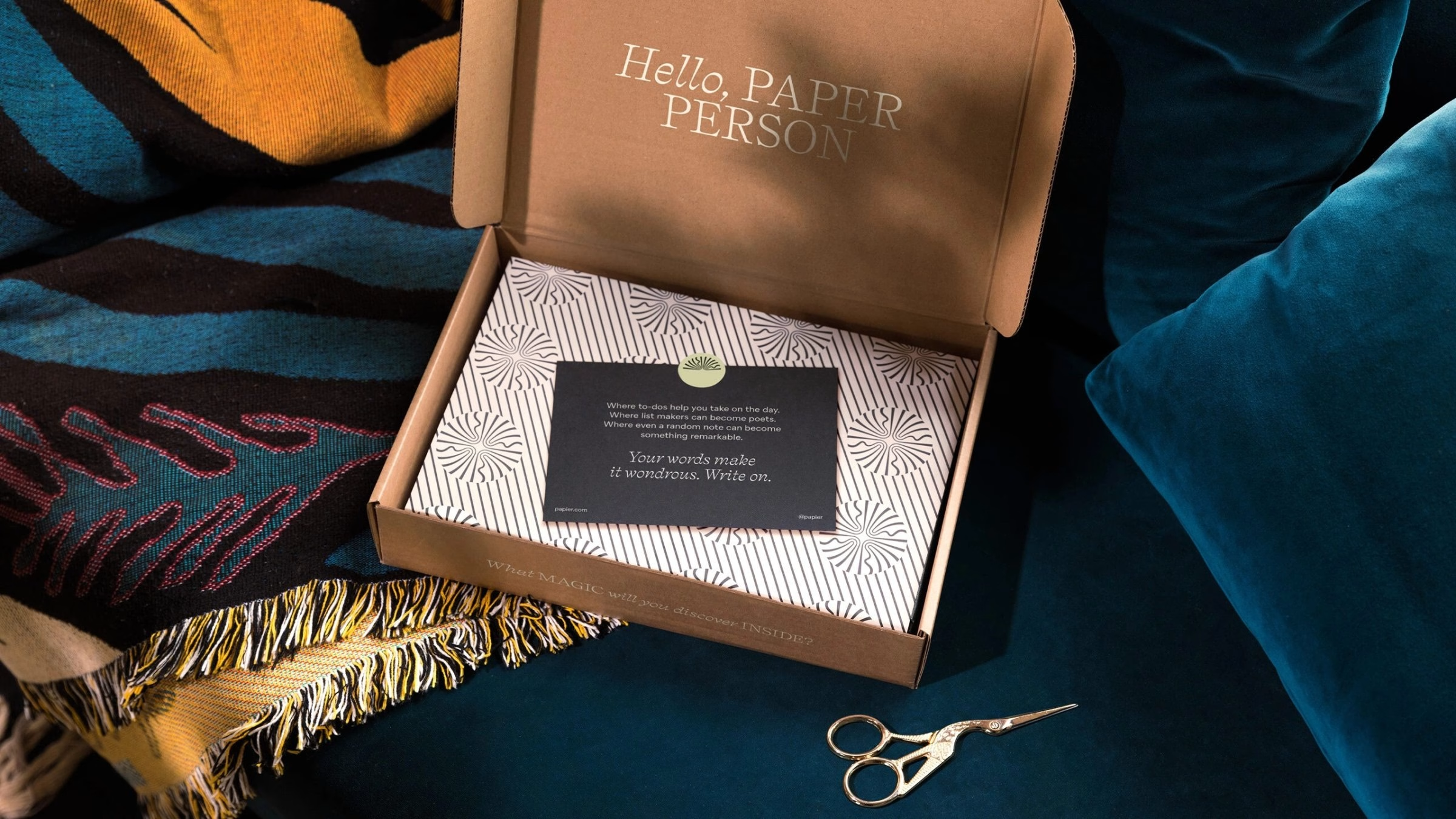
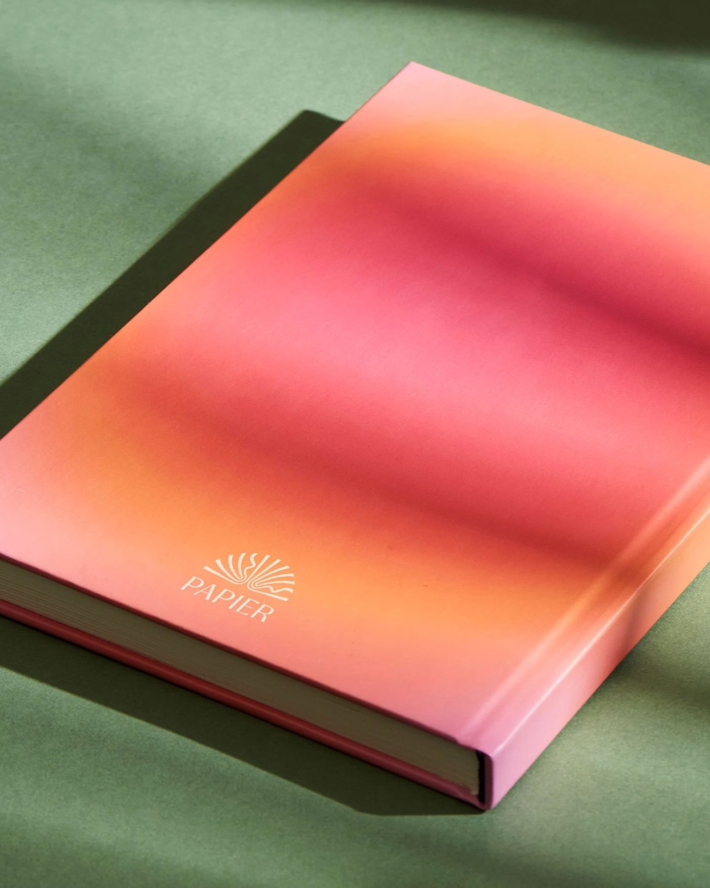
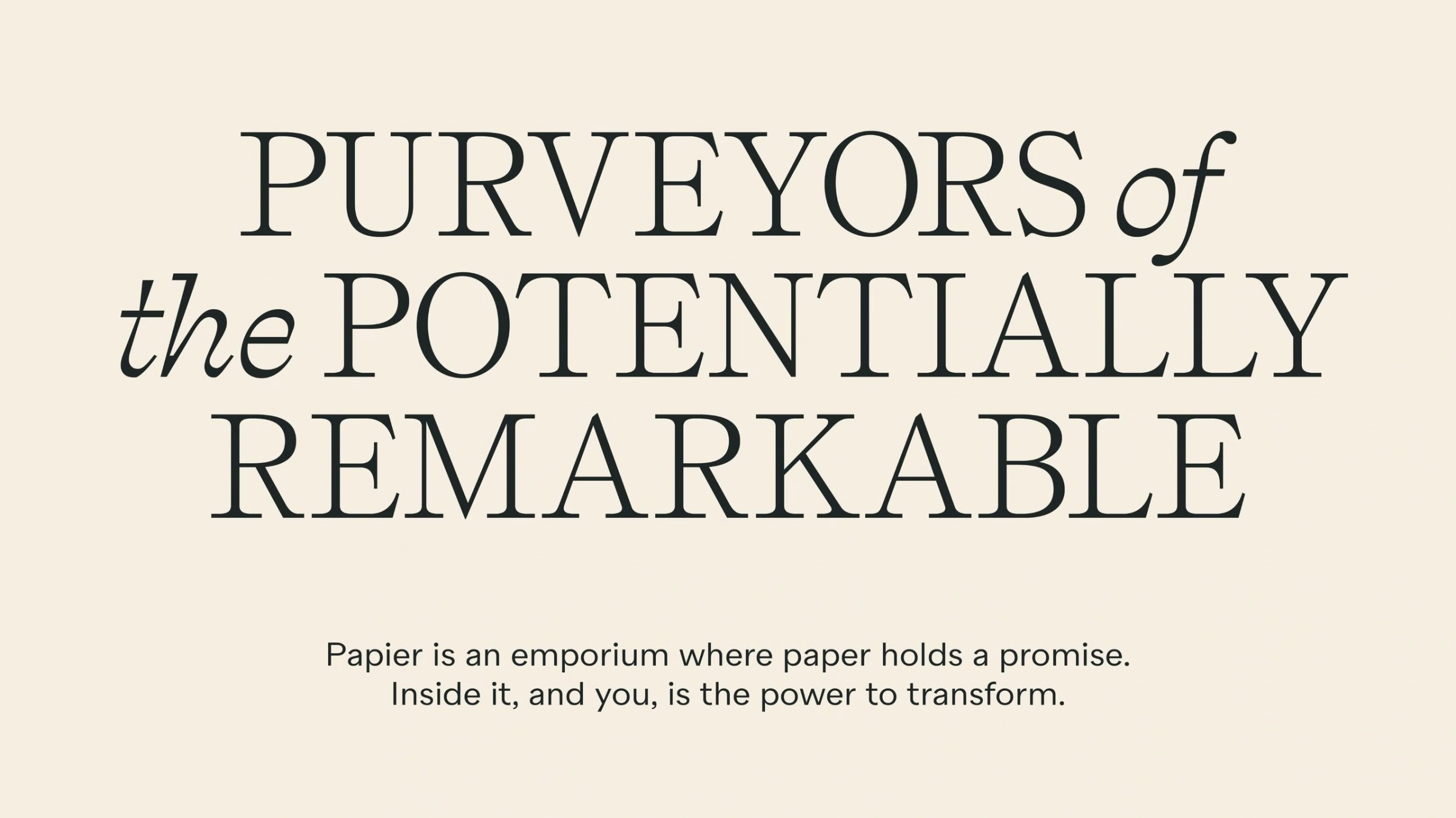
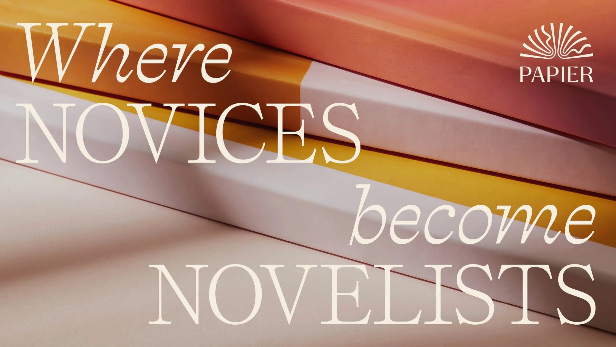
Language does as much work as the logo. The verbal identity is rooted in the transformative power of stationery and speaks directly to an audience the studio calls Paper People, with lines such as “Purveyors of the potentially remarkable” and “Where novices become novelists.” It turns up everywhere from thank-you notes and packaging to diary covers and envelopes.
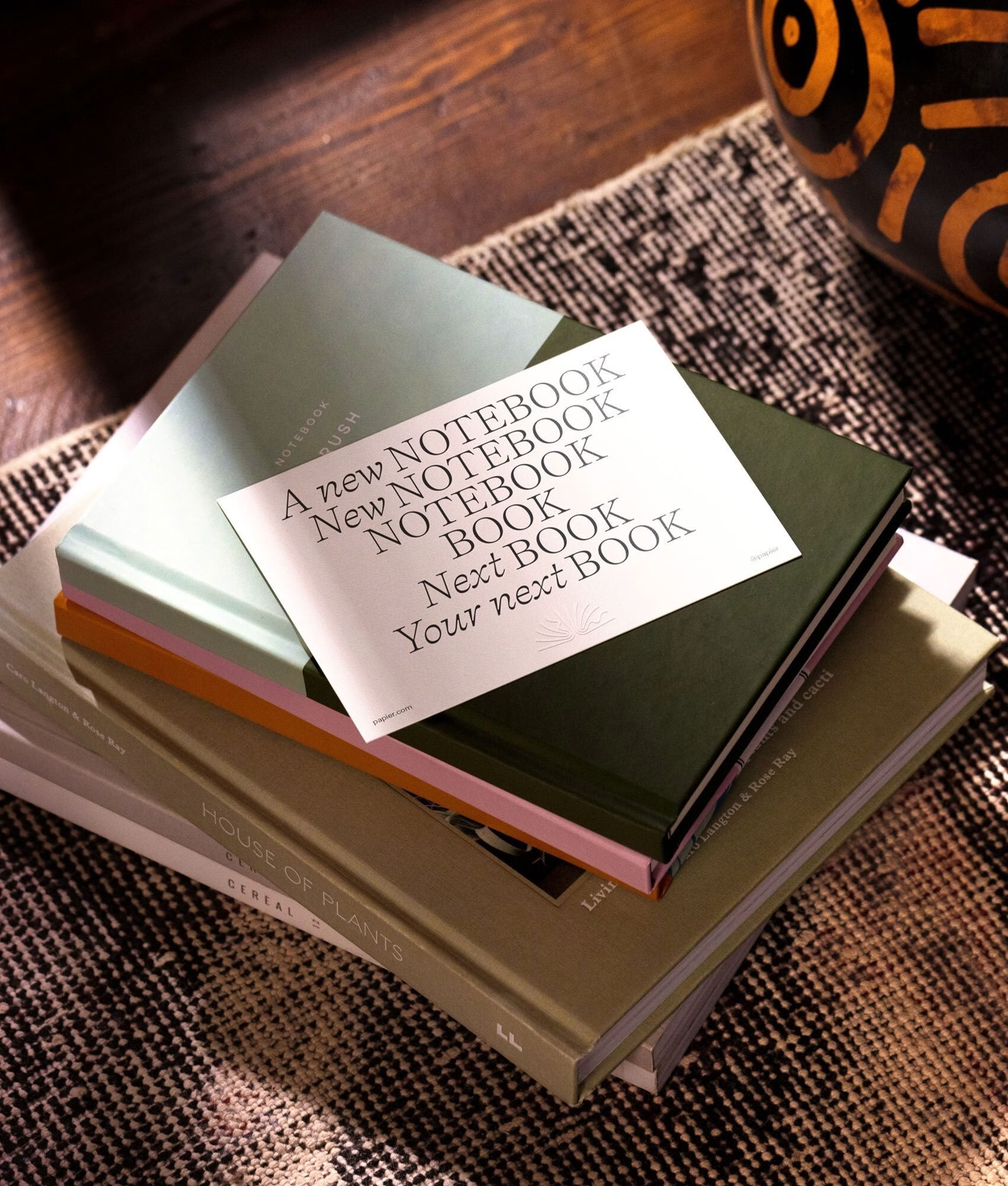
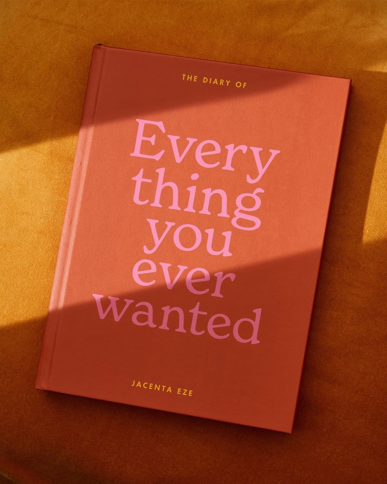
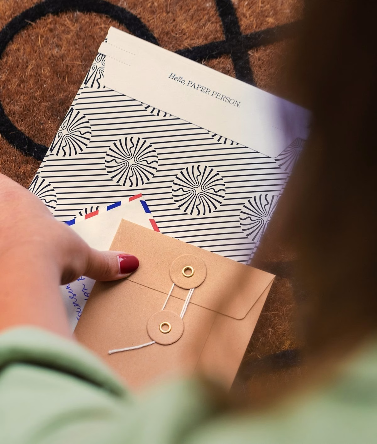
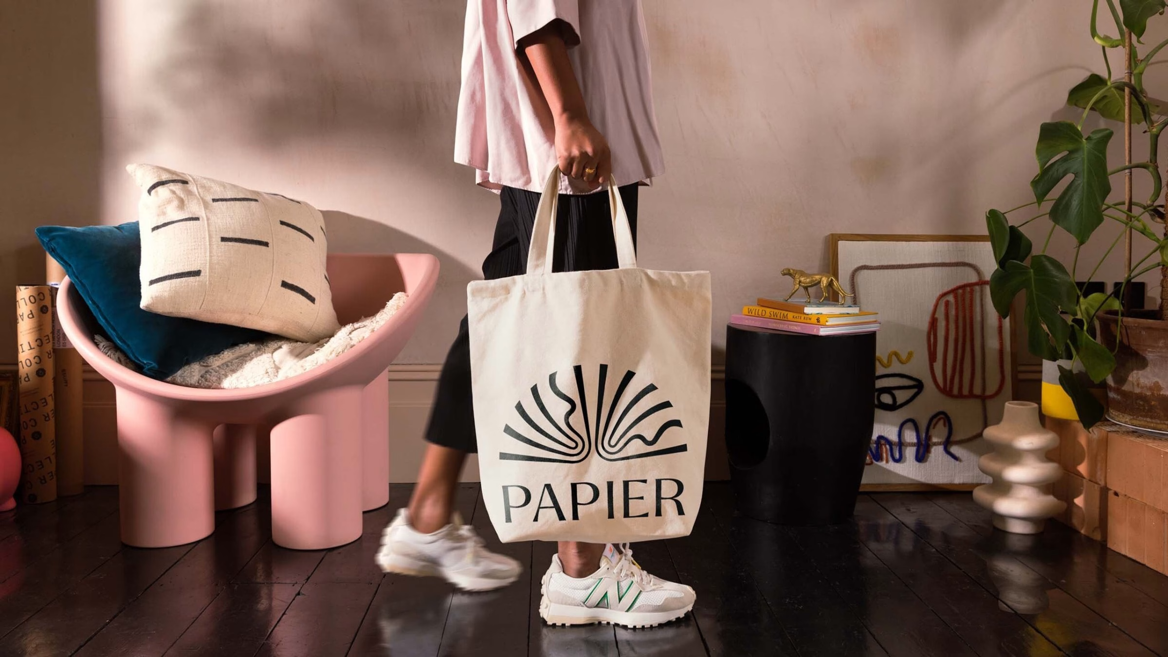
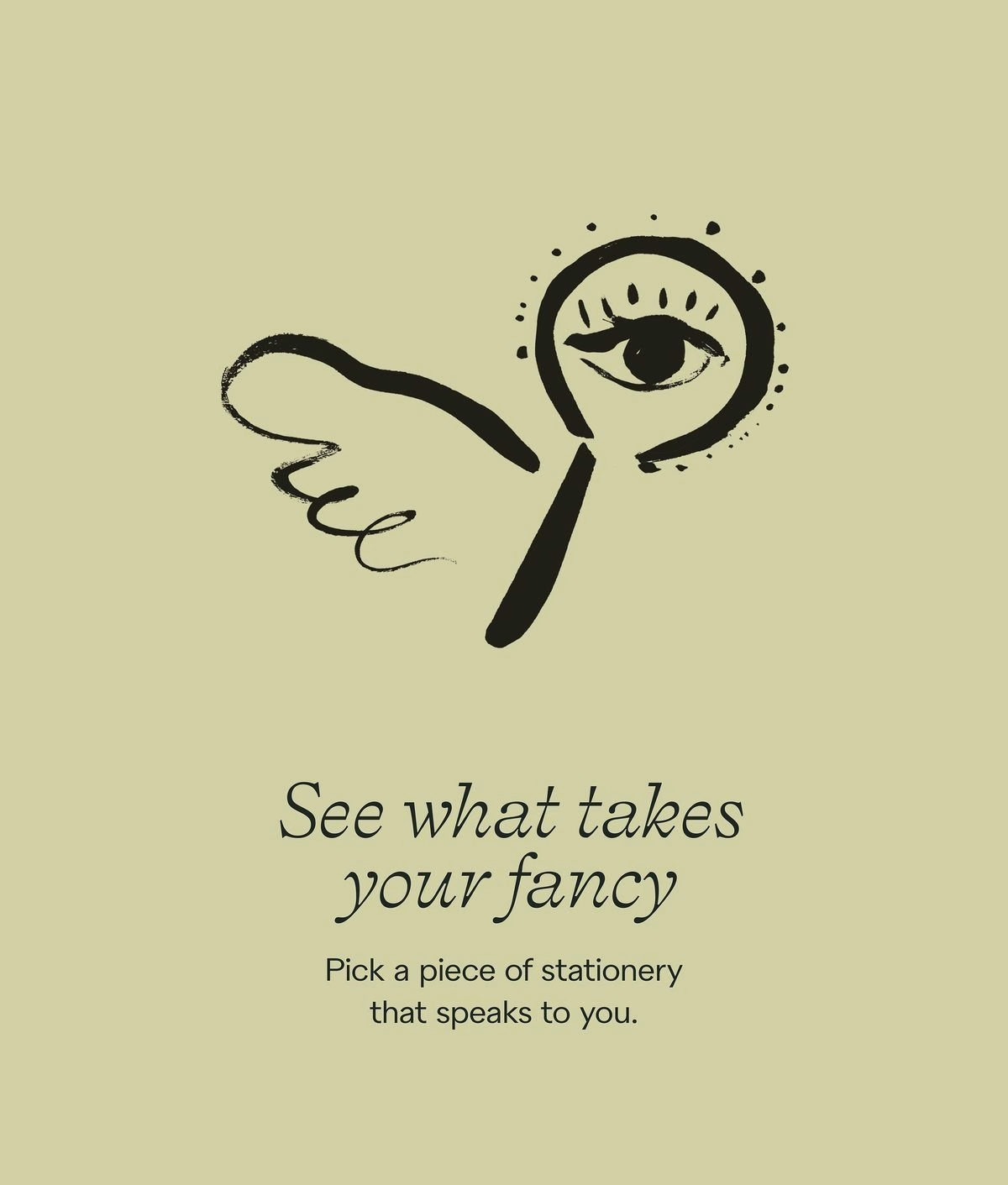
Art direction aims for an atmosphere rather than a look. Photography by Charlie McKay places the products in warm, lived-in rooms and with real people, so a notebook feels like part of someone’s life rather than a product shot. Alongside it, illustration by Ciao Chiara adds small stories of its own, with loose ink drawings of shells, suns and winged magnifying glasses.

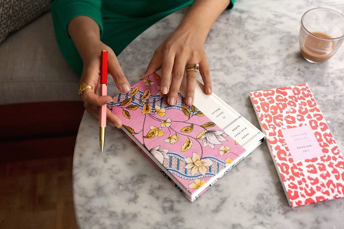
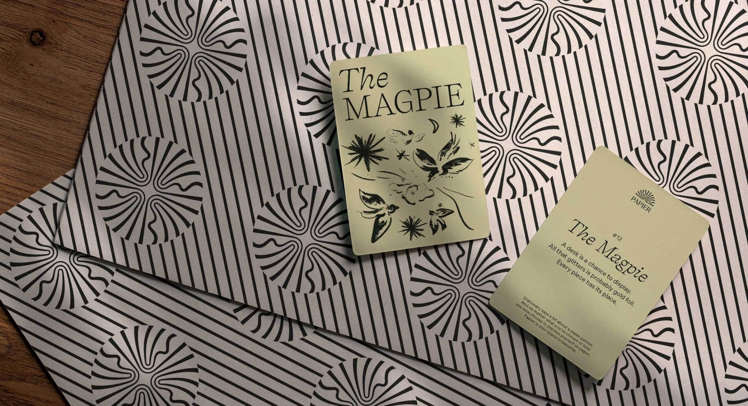

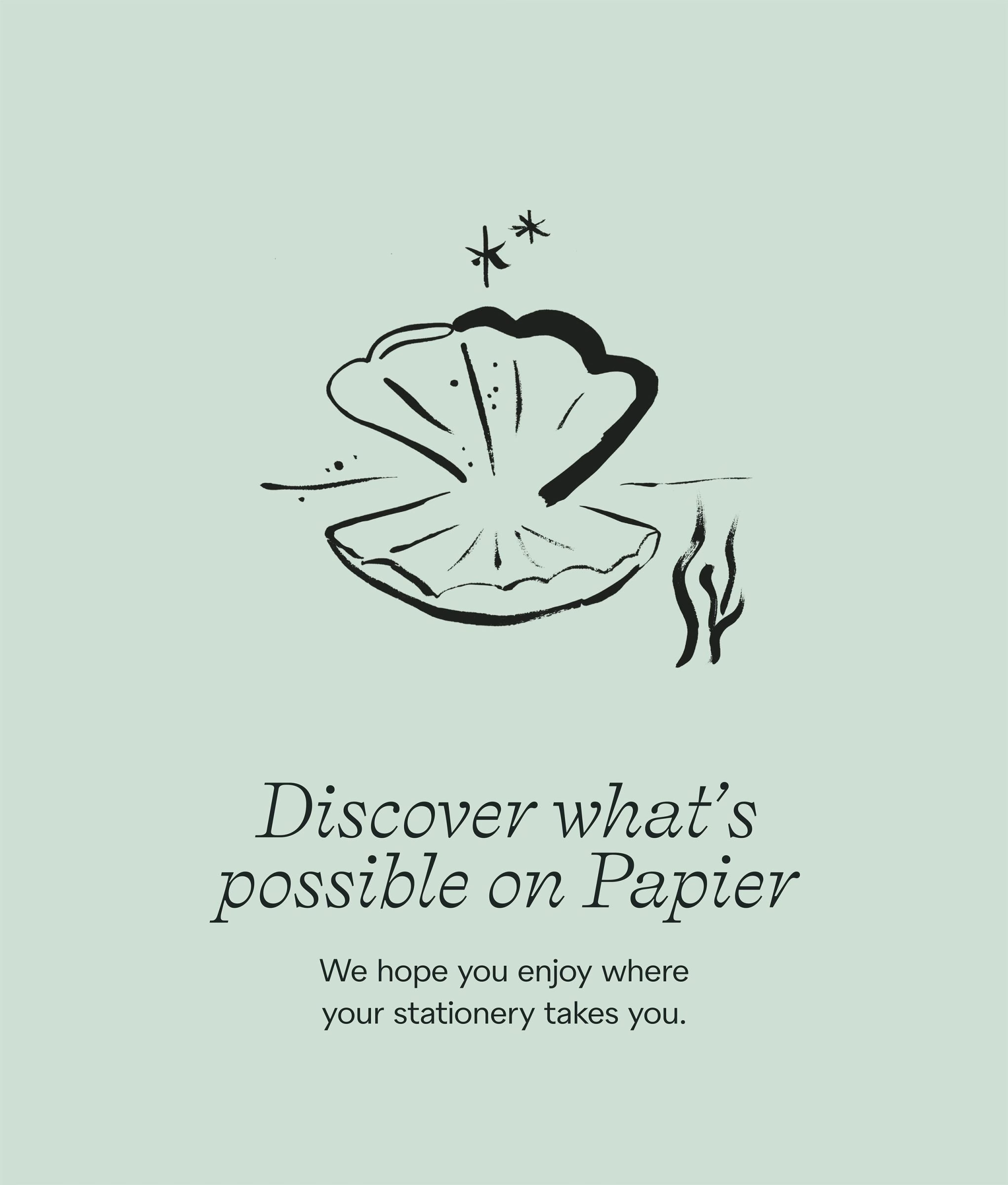

Ragged Edge and Papier worked in different ways to launch the brand everywhere, from close co-creation to lighter consultation. The website, built together with the Papier team, carries the same elegant, evocative tone while staying focused on effectiveness. The result is one consistent experience from Instagram stories and product pages to shop interiors.
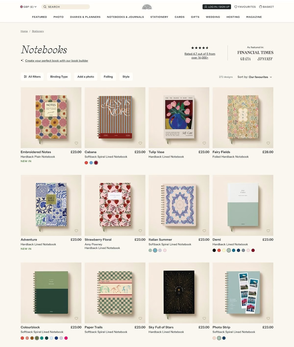
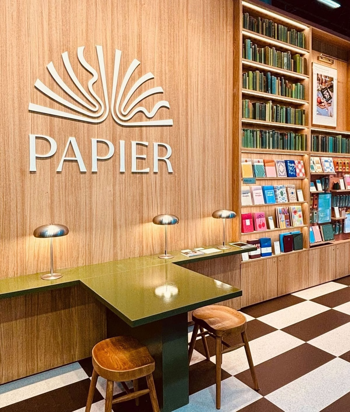
The rebrand set the platform for rapid change. Papier secured a $50 million Series C within three months of the launch, then moved into Barnes & Noble, Nordstrom and Anthropologie before landing in 2,500 Target stores across the US. In 2022 the work also won Creative Review’s Best Rebrand award and a D&AD Wood Pencil for logo design.
Credits: Ragged Edge
Brand Strategy, Identity & Website: Ragged Edge
Photography: Charlie McKay
Illustration: Ciao Chiara
More in Brand Identity
Stay on top of this week's design. Insights, top picks & more.


 Plus