Plus
Plus

 Menu
Menu


Veronika Levitskaya
June 17, 2022
Mindsparkle Mag


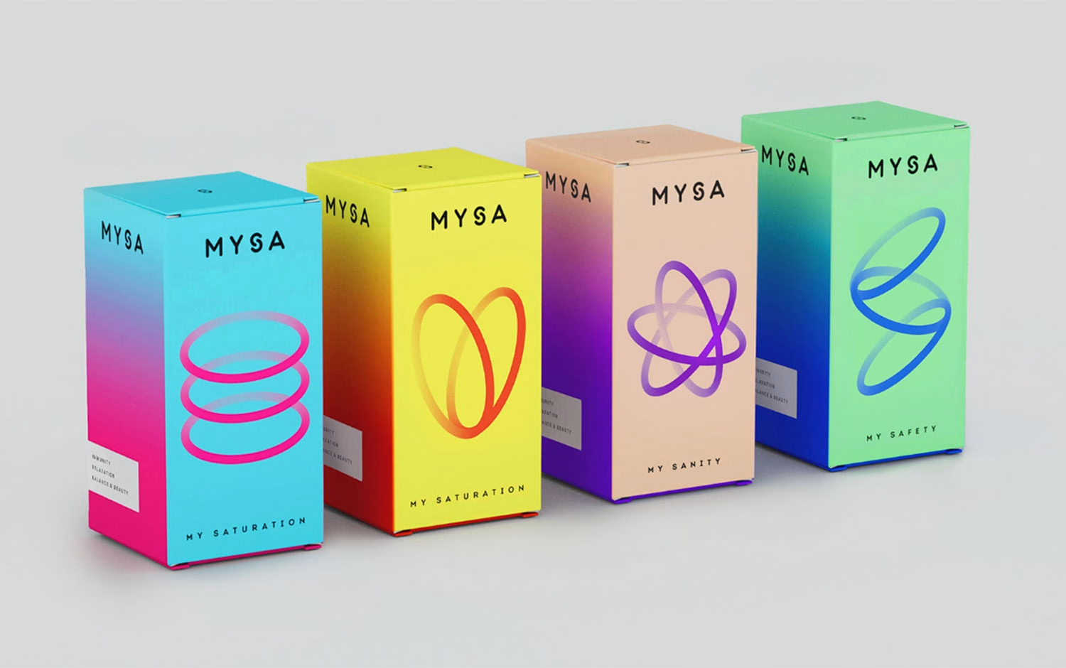
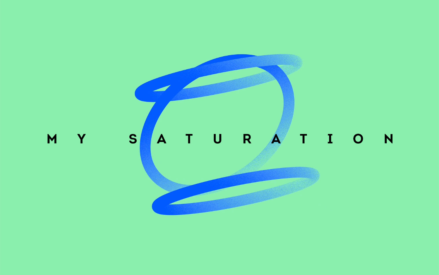
Mysa. My saturation. My safety. My sanity. Vibrant, spirited, balanced, full of bright colors and impressions – that’s the world many wishes for and the life we aspire to live. To achieve a great dose of energy, self-confidence, and inspiration are necessary.
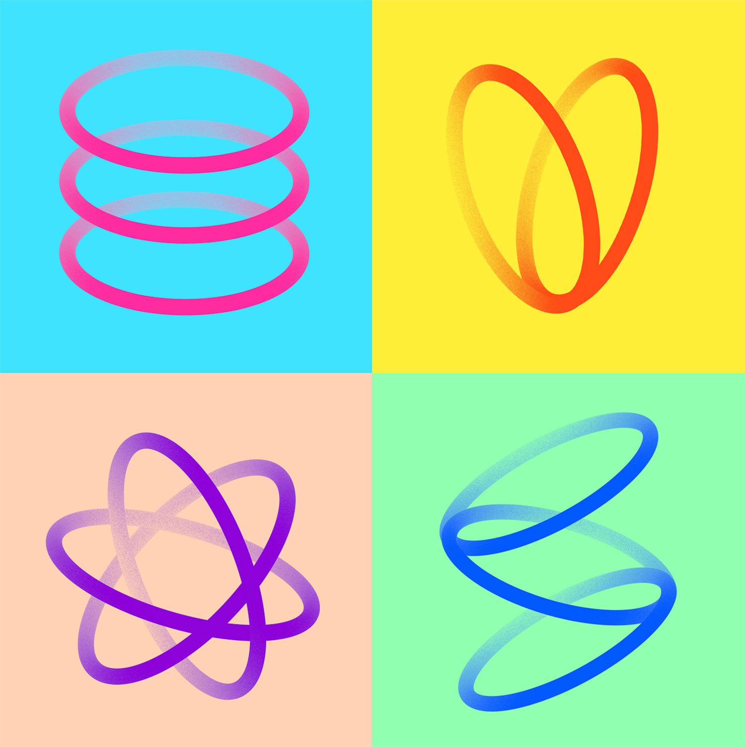
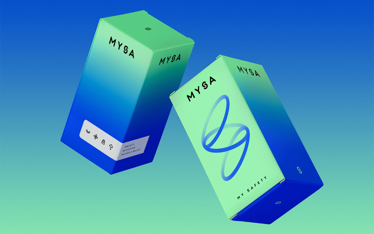
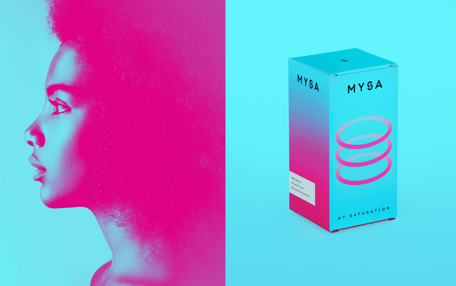
Mysa, the personalized vitamin kit, is the secret combination of ingredients to complement everyone’s daily efforts for a fully nourished way of living. Veronika Levitskaya created the brand’s identity and packaging, where “saturation” is visually reflected in the design with a gradient. Additionally, She applied several key graphic symbols which imply intersection, blending, and mixture, a product's core feature. Finally, she structured the letter S in the logo to imply effective interaction of all the elements.
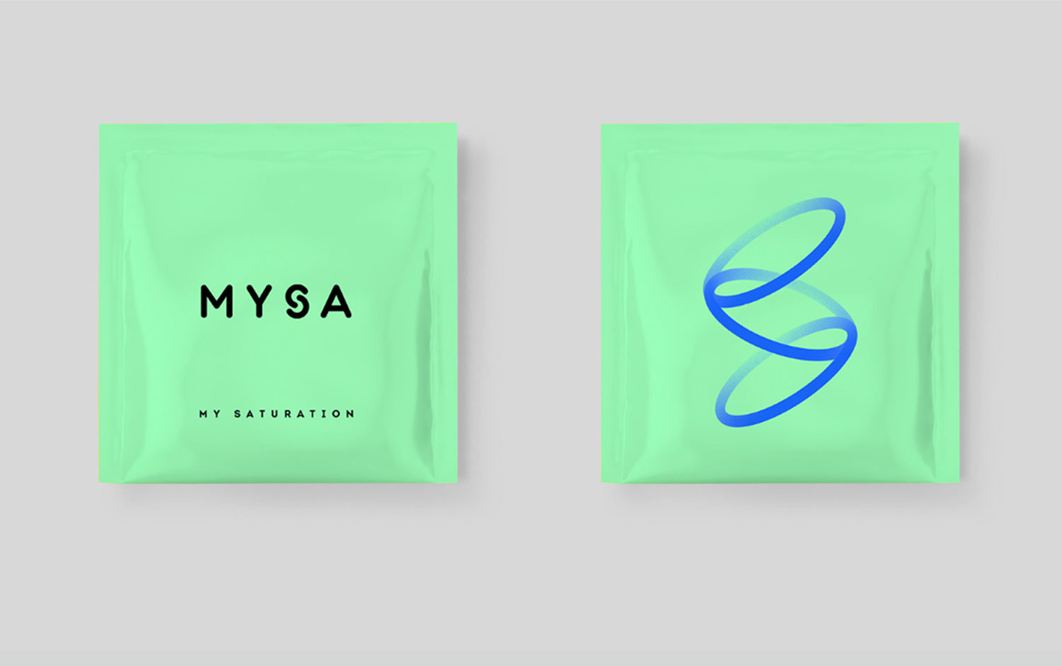
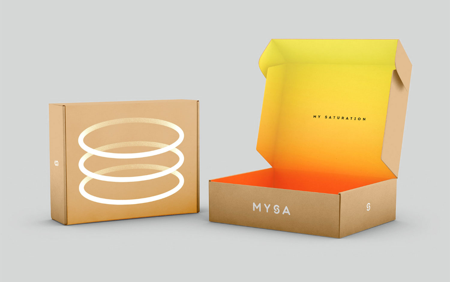
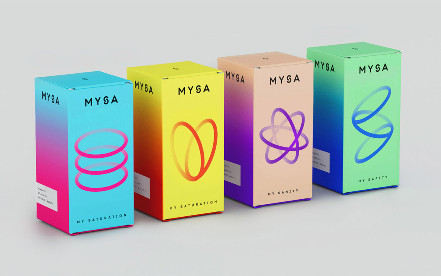
Credits: Veronika Levitskaya
More in Minimal Branding
Stay on top of this week's design. Insights, top picks & more.