Plus
Plus

 Menu
Menu


Pop & Pac Studio
May 26, 2022
Mindsparkle Mag


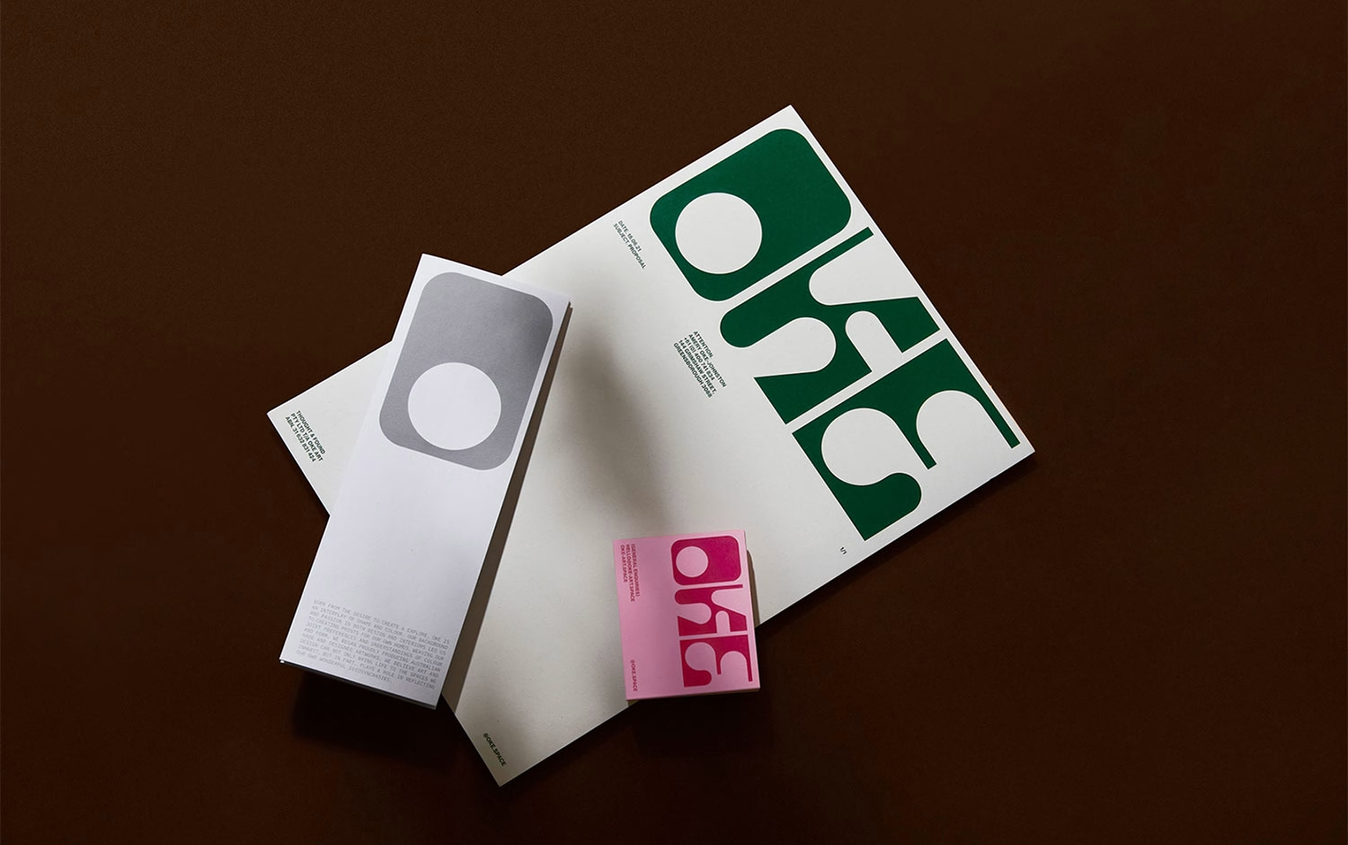
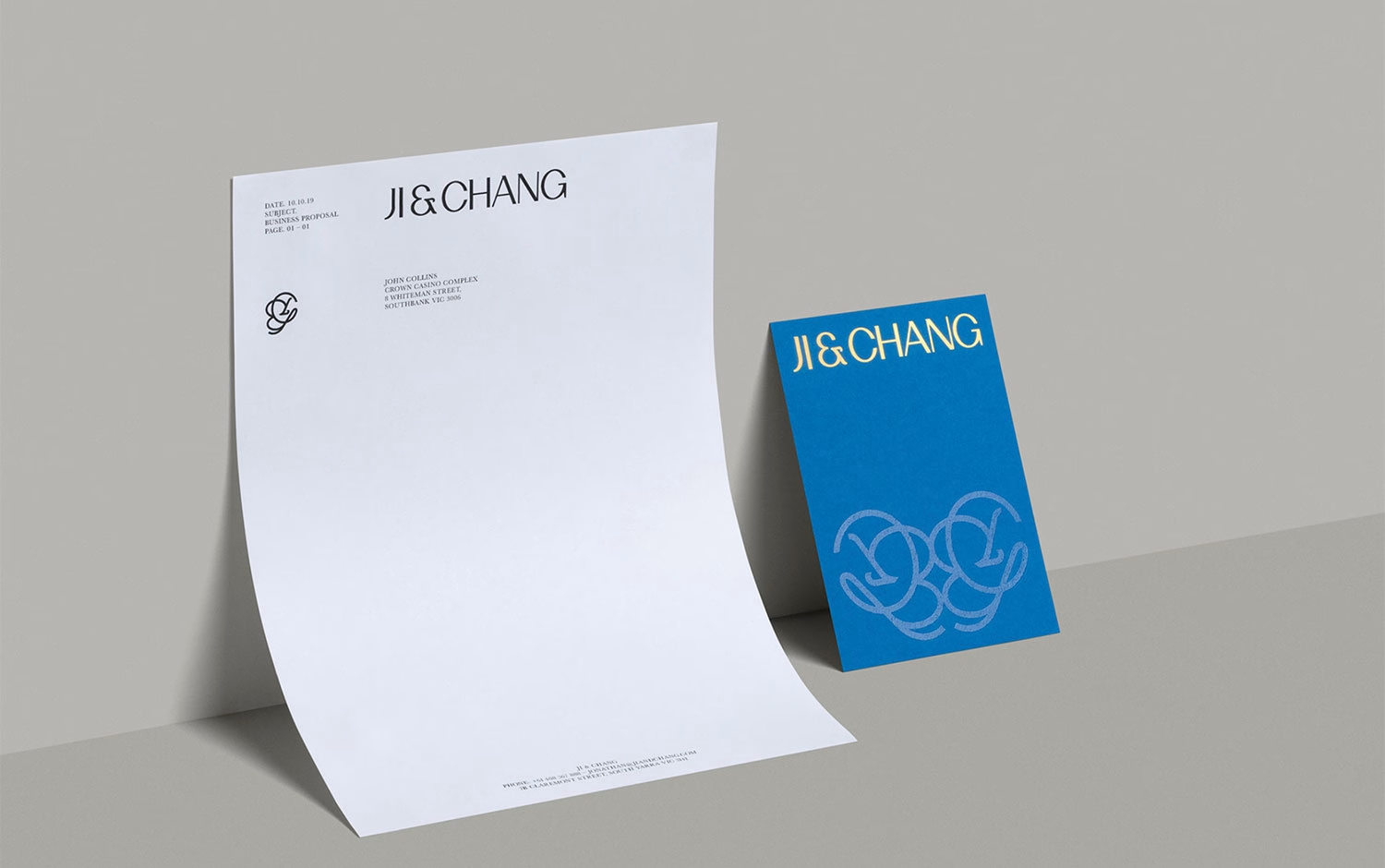
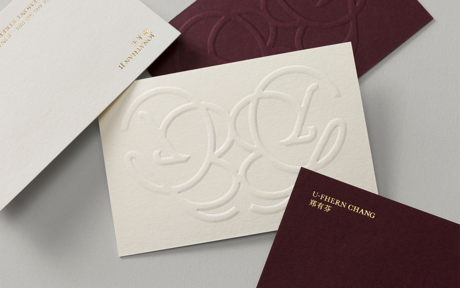
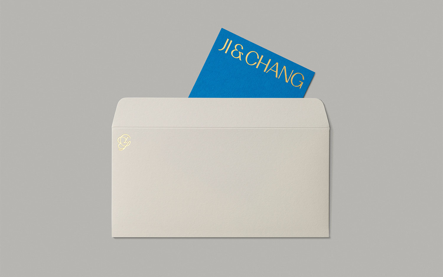
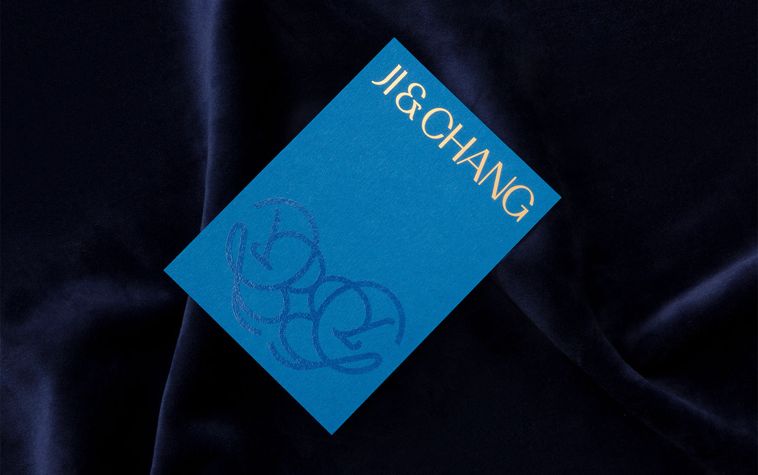
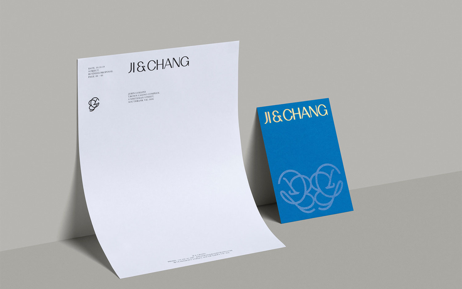
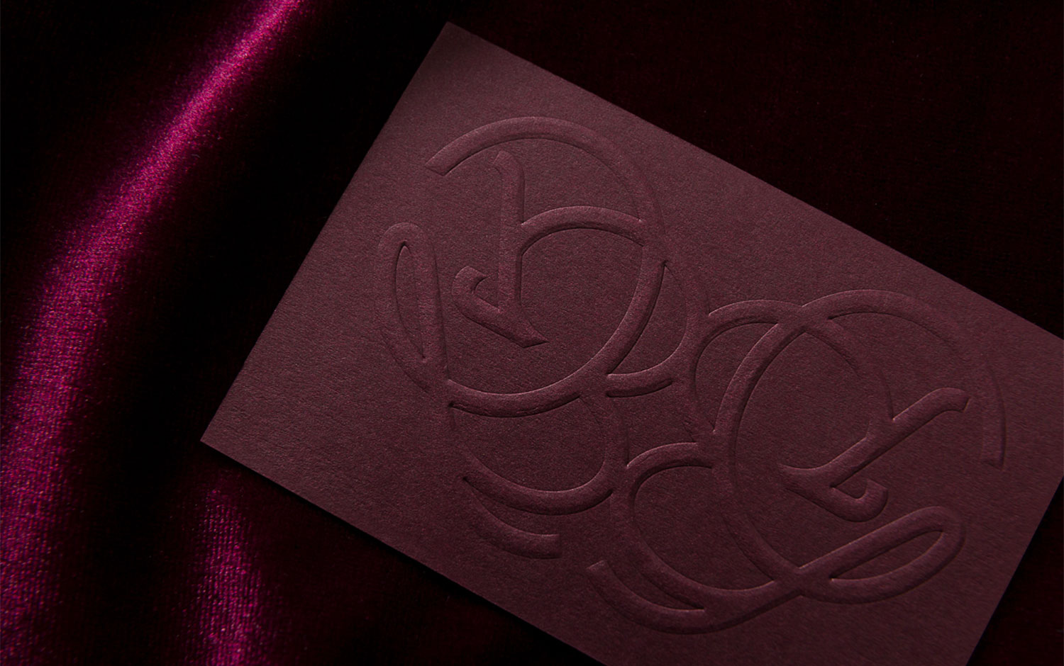
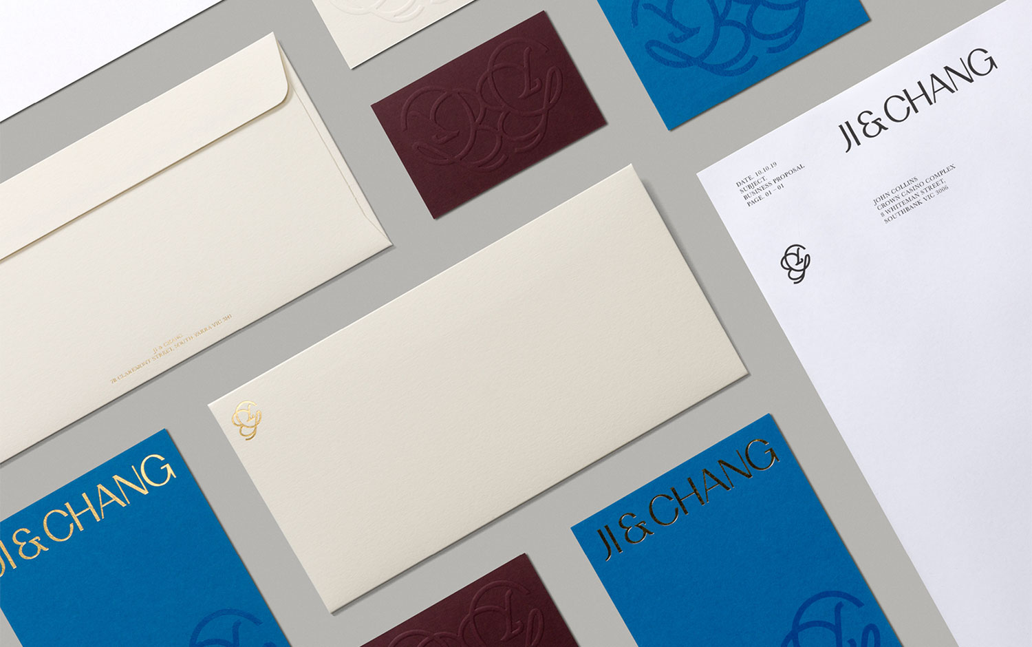
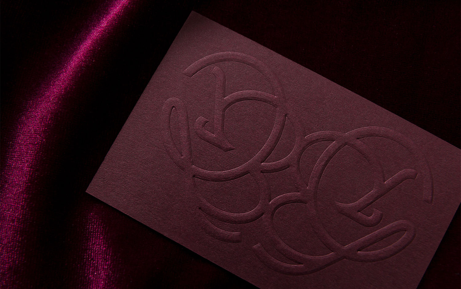
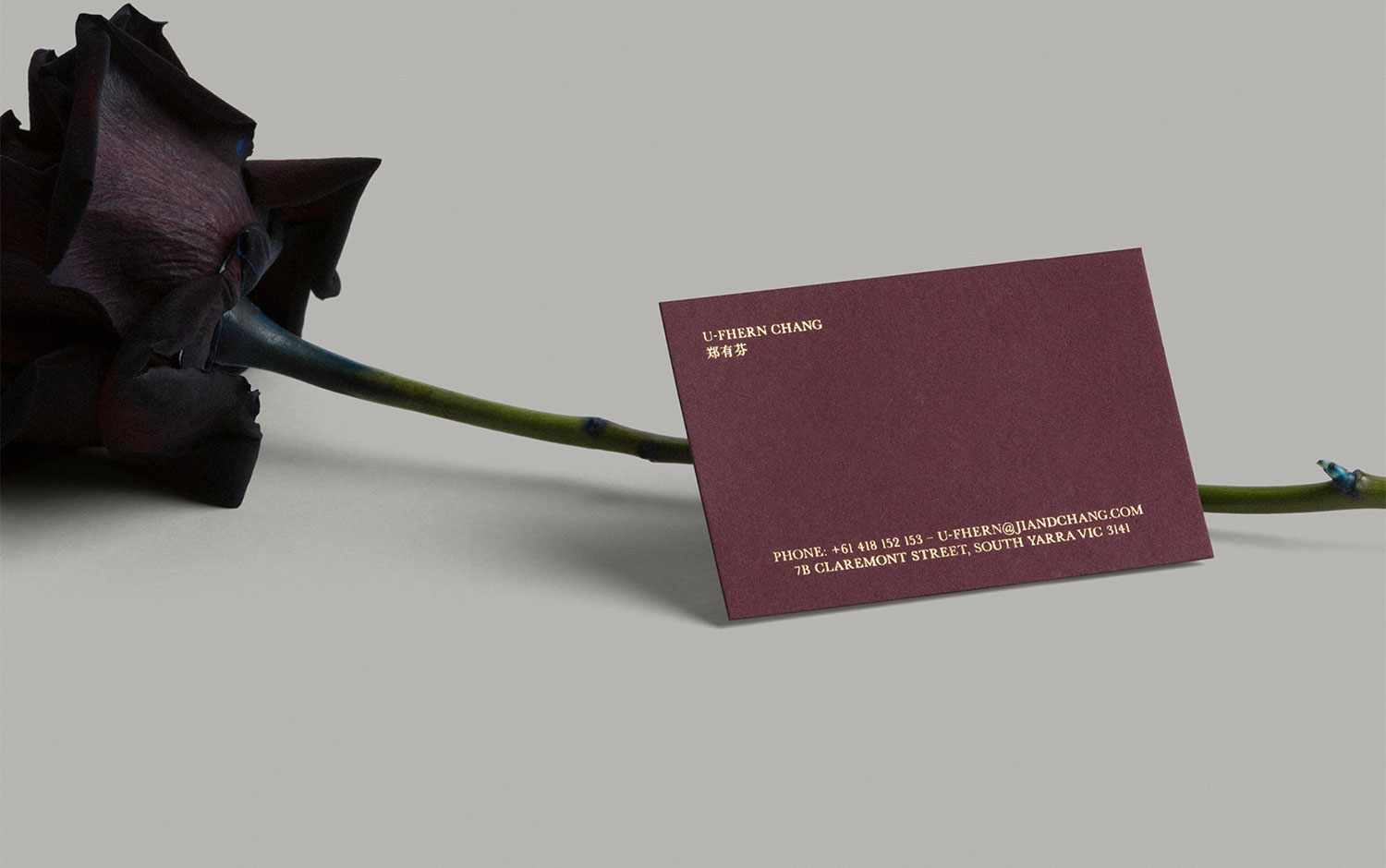
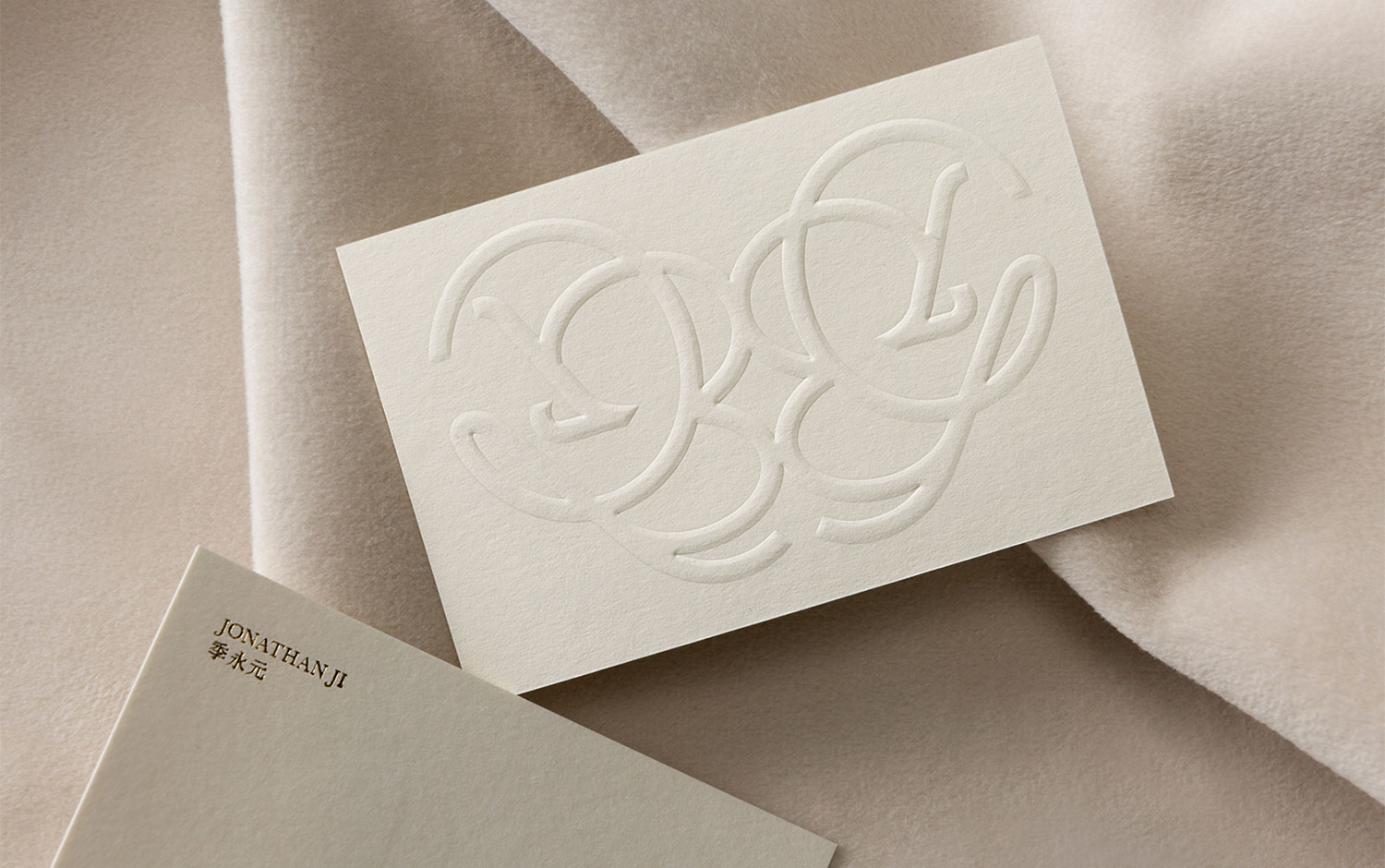
Vision & Virtue Snapshot Ji & Chang is a family office founded on passion, hard work, and knowledge, turning projects and investments into impact. The Objective: Ji & Chang create and invest in businesses with purpose, with each success allowing for greater investment into schools, scholarships, and start-ups. The brand should align with this purpose it should be quietly confident and approachable yet exude ambition and quality. So, they asked Pop & Pac Studio to design their visual identity The Outcome: The brand is exquisitely crafted with no detail overlooked. A subtle Asian undertone acknowledges the client’s heritage. The monogram is an inter-connected ‘J & C’ that seeks to communicate the family bond and Ji & Chang’s profound connection to the community. Abstractly it’s a butterfly (when reflected) that communicates Ji & Chang’s purpose - to create profound change.
Art Direction, Branding, Collateral, Graphic Design by Pop & Pac Collateral Photography by Foliolio Printing by Gunn & Taylor
Credits: Pop & Pac Studio
More in Luxury Branding
Includes freebie bundle, unseen BTS insights and more.