Plus
Plus

 Menu
Menu


Mano a Mano
June 28, 2023
Mindsparkle Mag


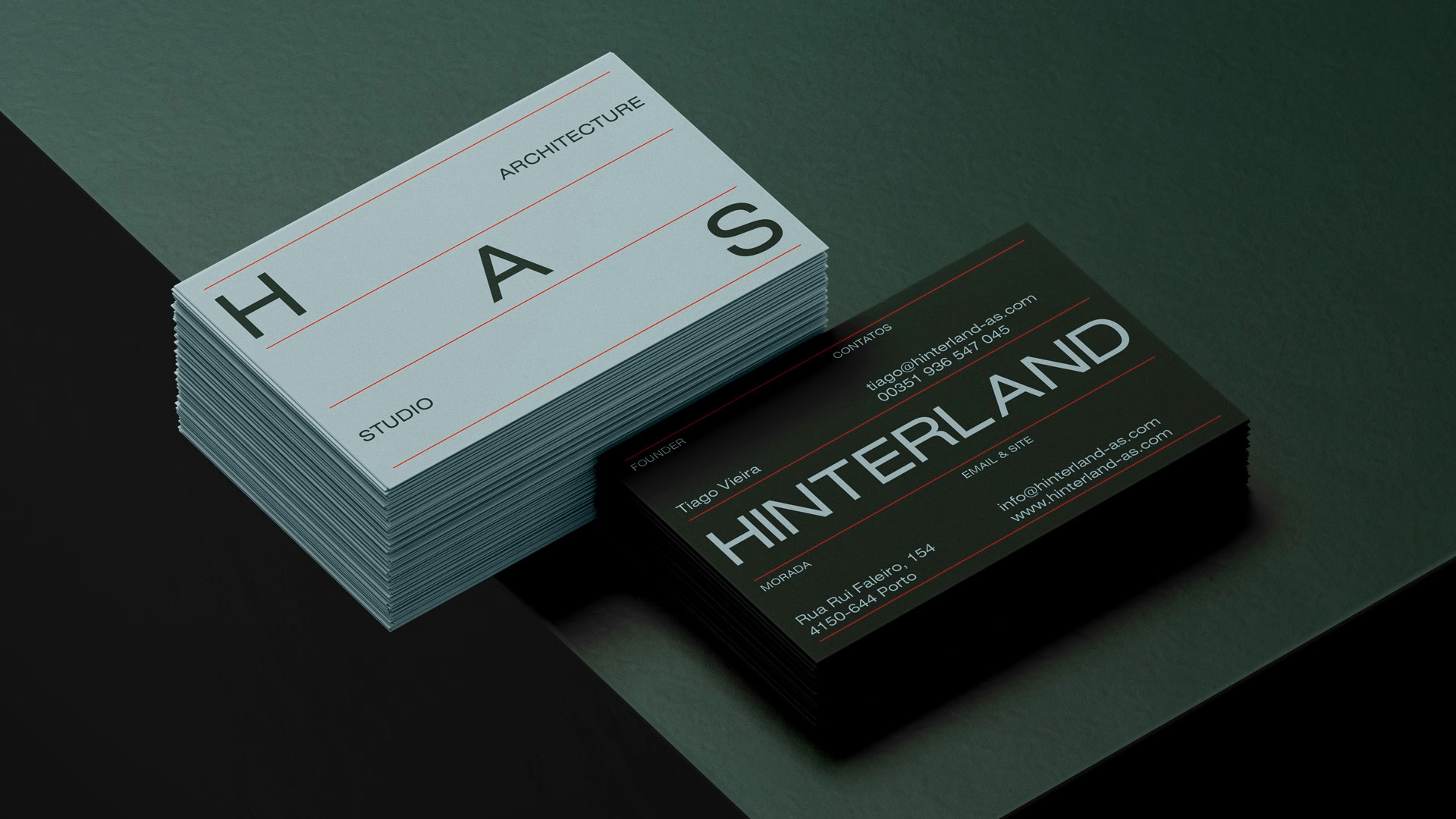
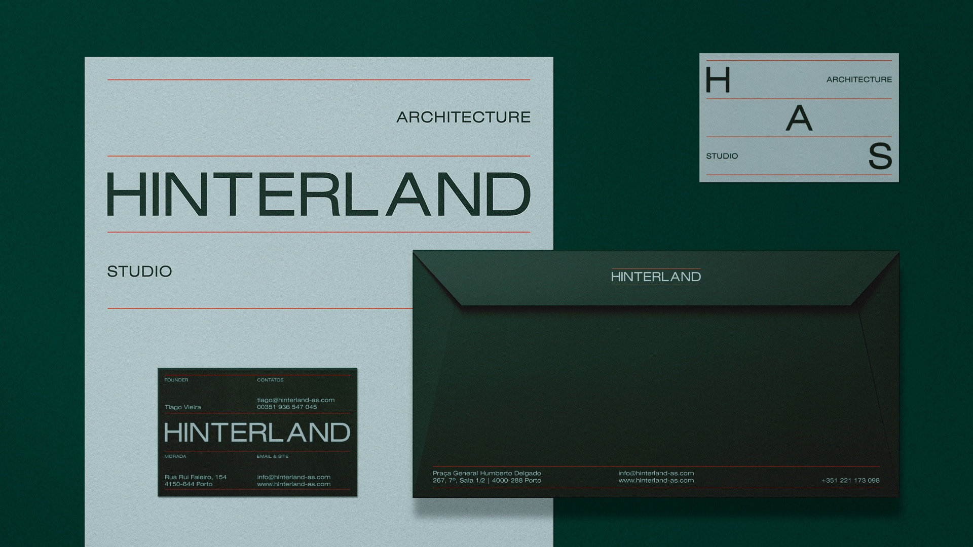
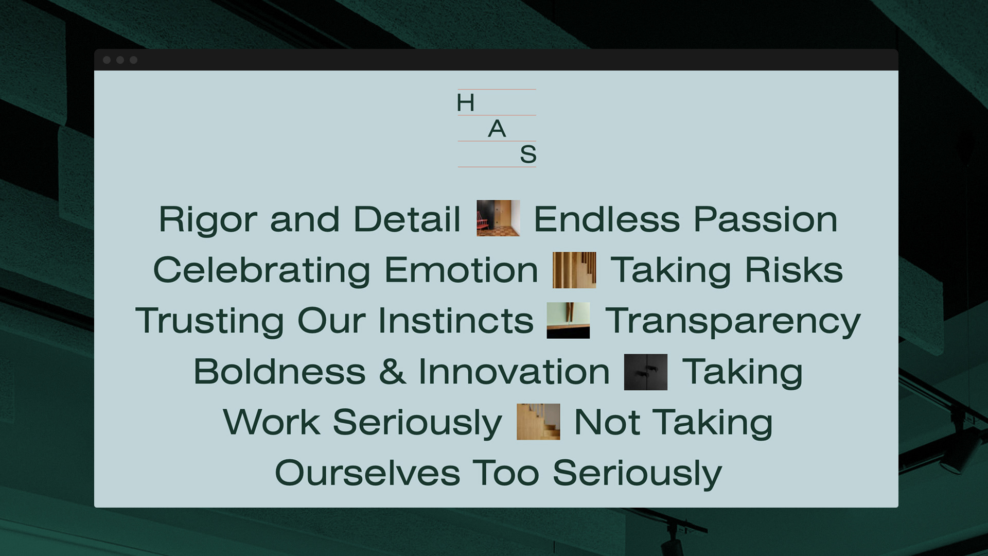
For Hinterland, Mano a Mano main goal was to create a branding that embodies minimalism and modularity, resulting in a communication that leaves a lasting and impactful impression.
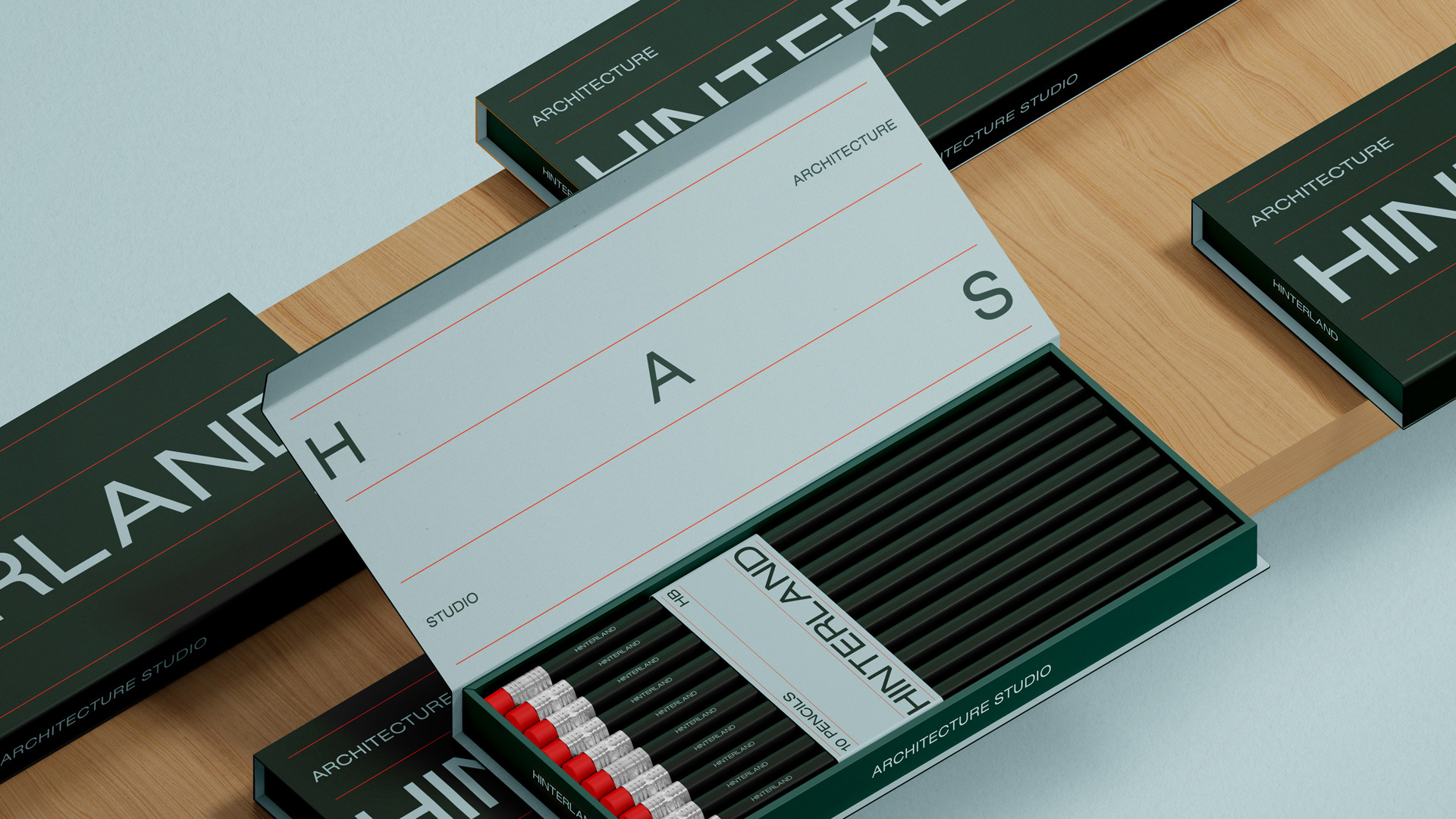
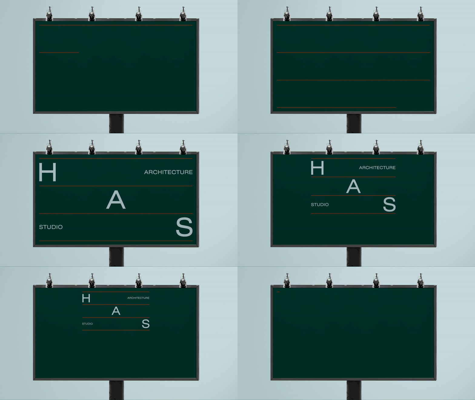
Throughout the project, Mano a Mano have employed a modular design approach, allowing for flexibility and adaptability. This methodology ensures that the space can be easily reconfigured to accommodate different needs and future growth, providing a versatile environment that can evolve with the changing requirements of Hinterland clients.
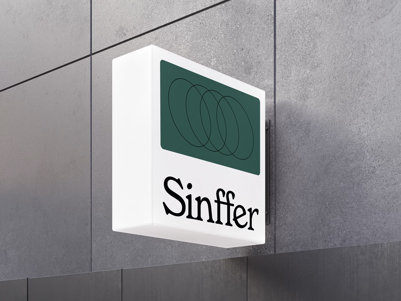
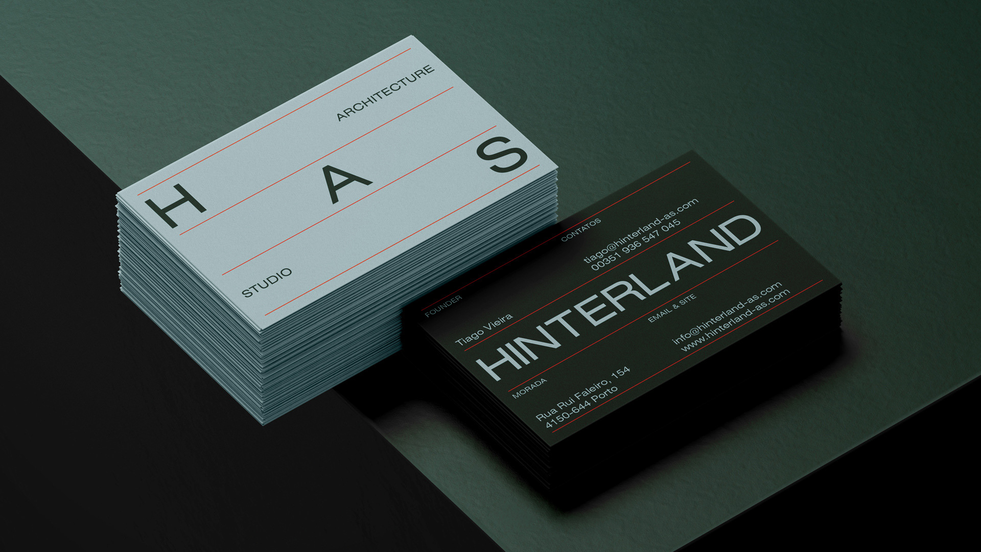
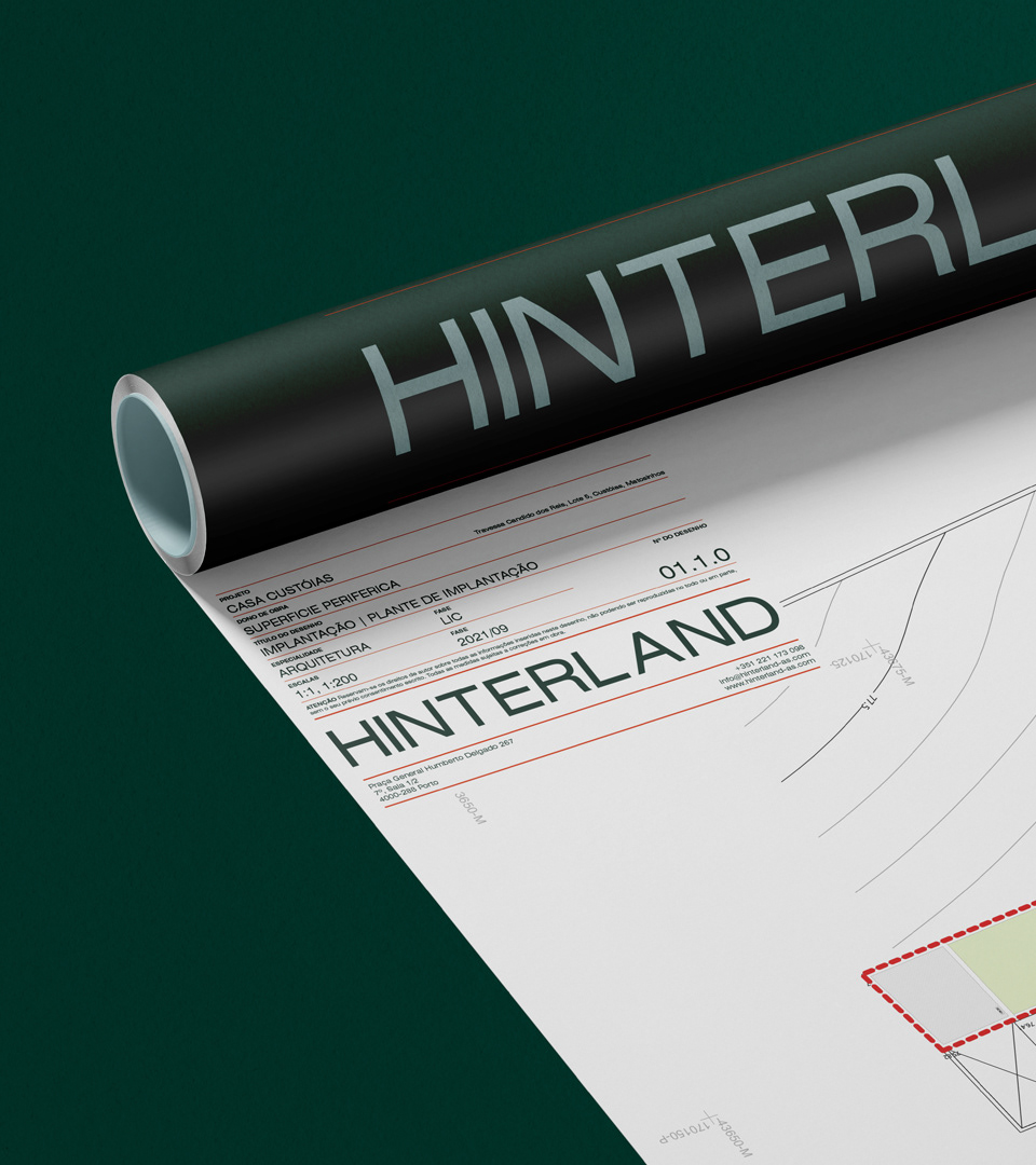
Drawing inspiration from timeless aesthetics, Mano a Mano used a classic dark green, a symbol of elegance and tranquility, to establish a sense of grounding throughout the project. This color choice promotes a serene ambiance and encourages a harmonious connection with nature.
To complement the dark green, Mano a Mano introduced a light blue hue, evoking a feeling of openness and clarity. This shade of blue not only enhances the visual aesthetics but also instills a sense of newness and freshness.
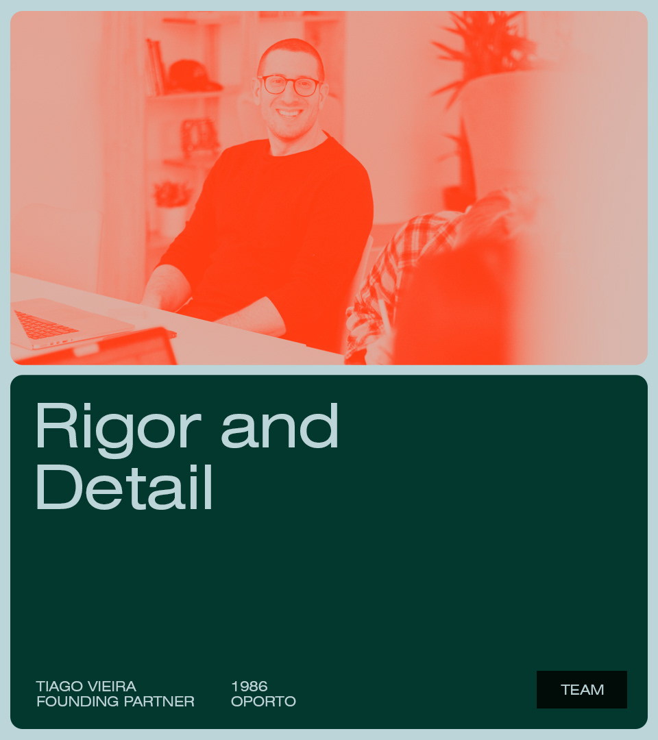
To introduce a vibrant energy and make a bold statement, they strategically used a pop of neon orange. This electrifying color serves as an accent, drawing attention to key elements and adding a sense of dynamism and excitement to the overall communication.
By combining these elements—minimalism, impactfulness, and modularity—Mano a Mano have crafted a unique architectural design communication that transcends conventional boundaries.
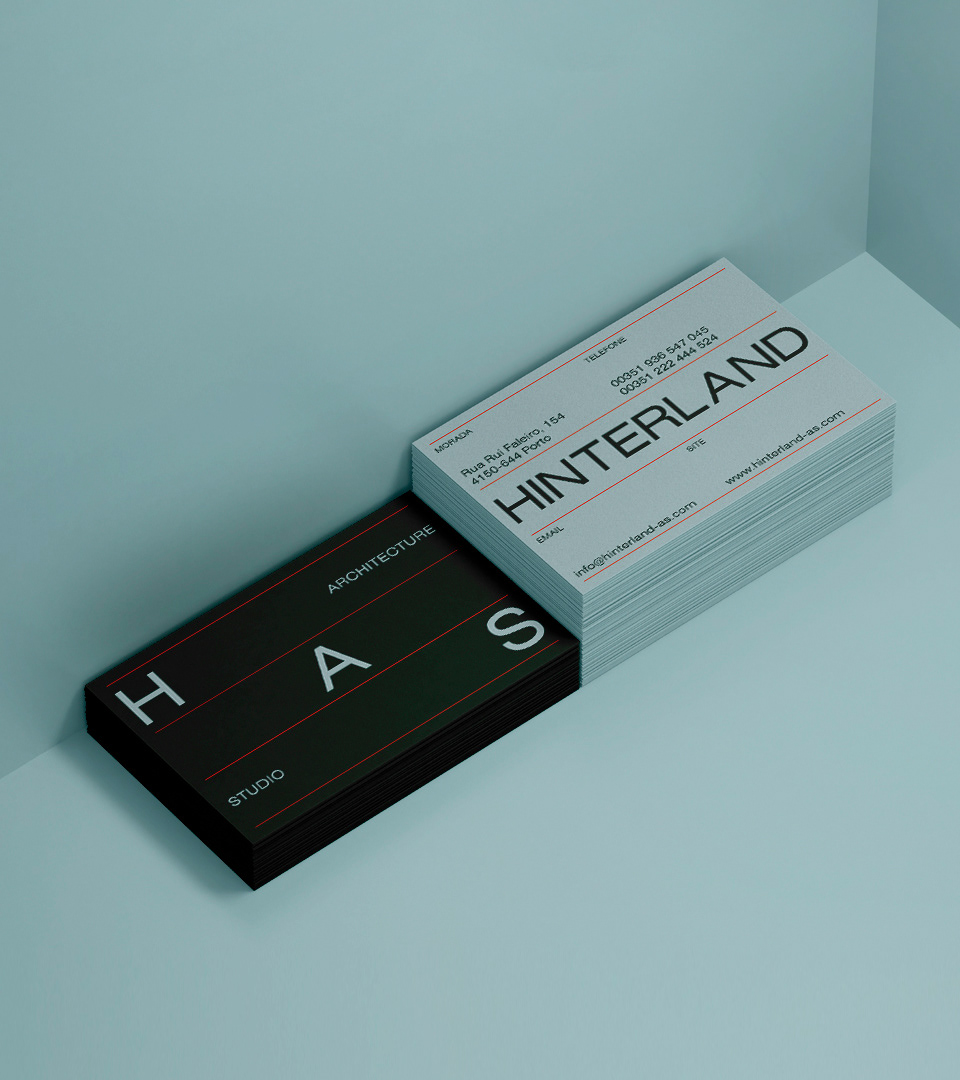
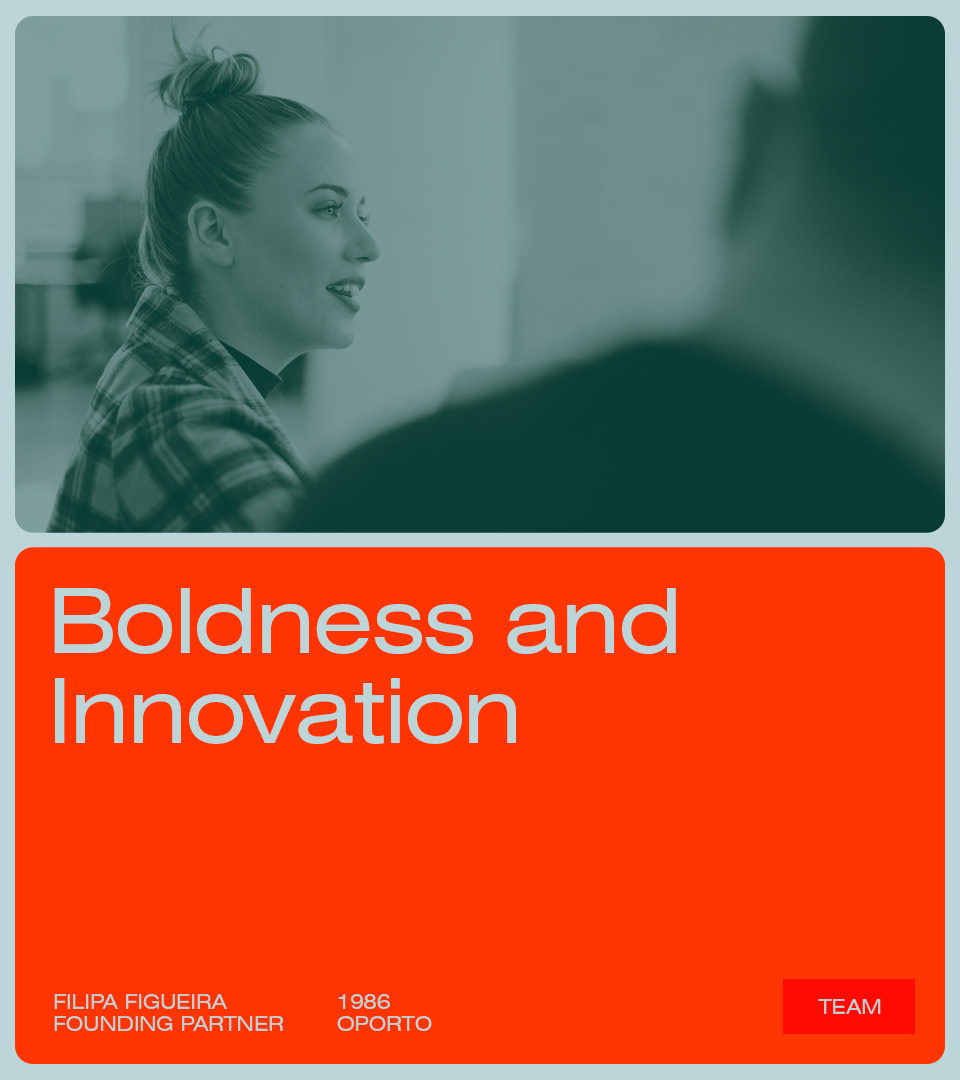
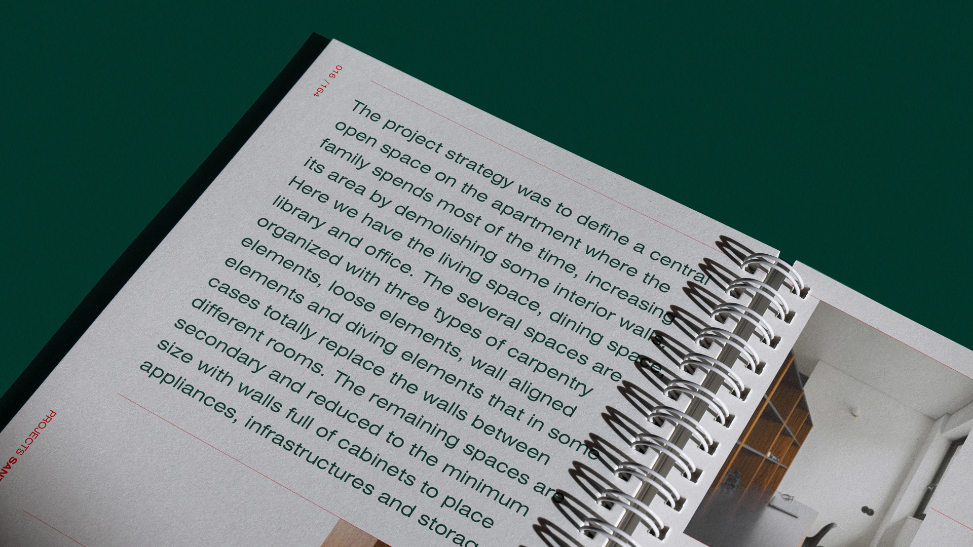
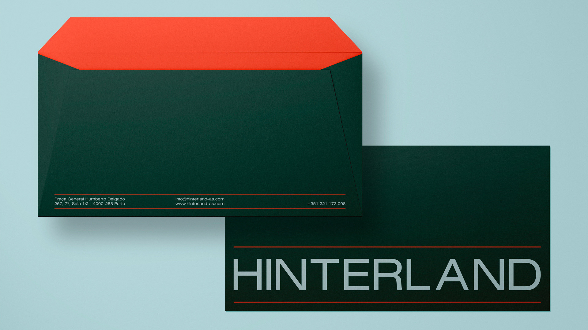
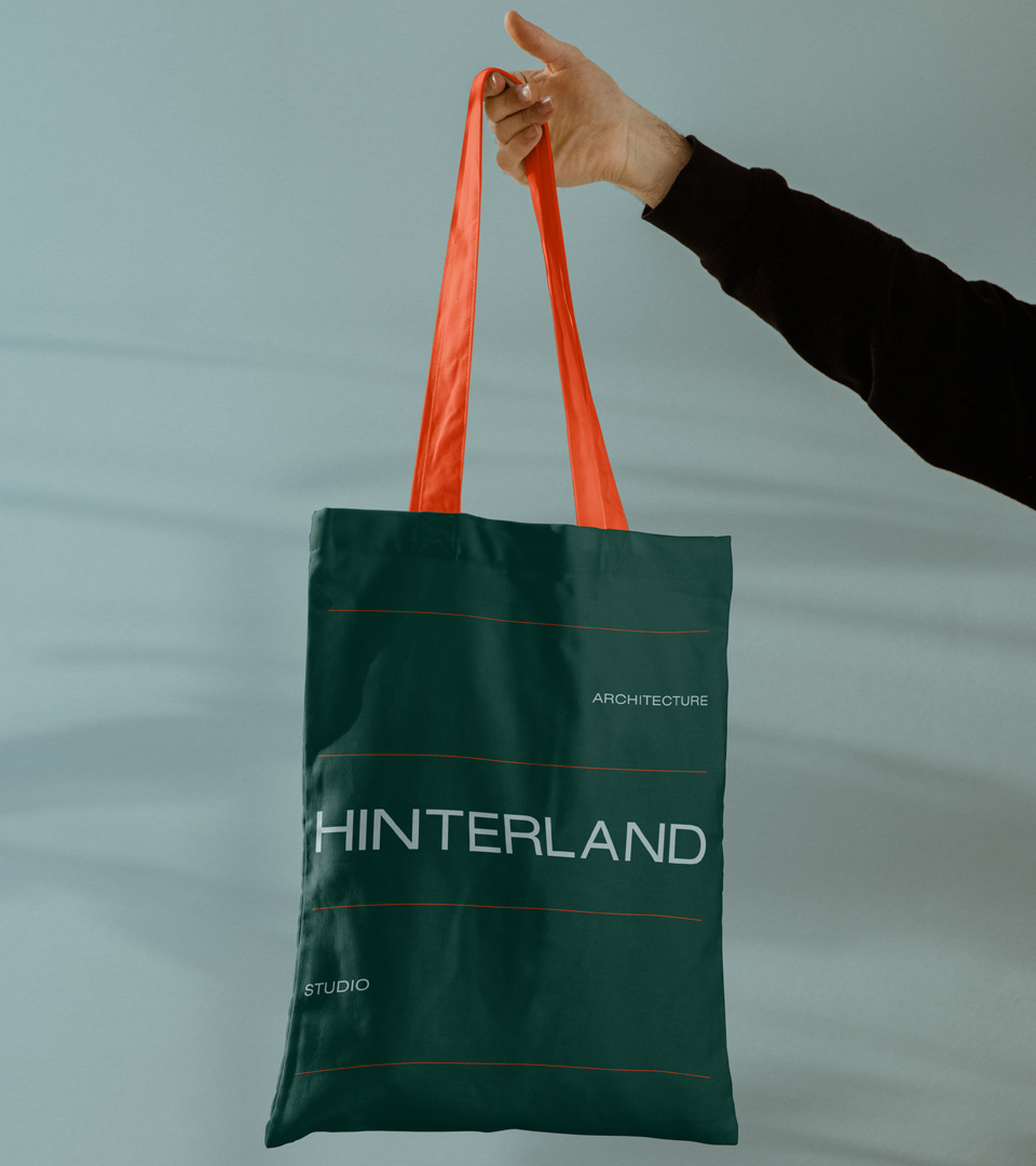
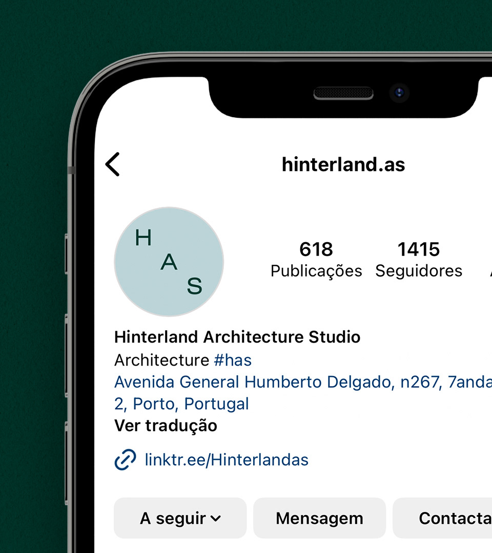
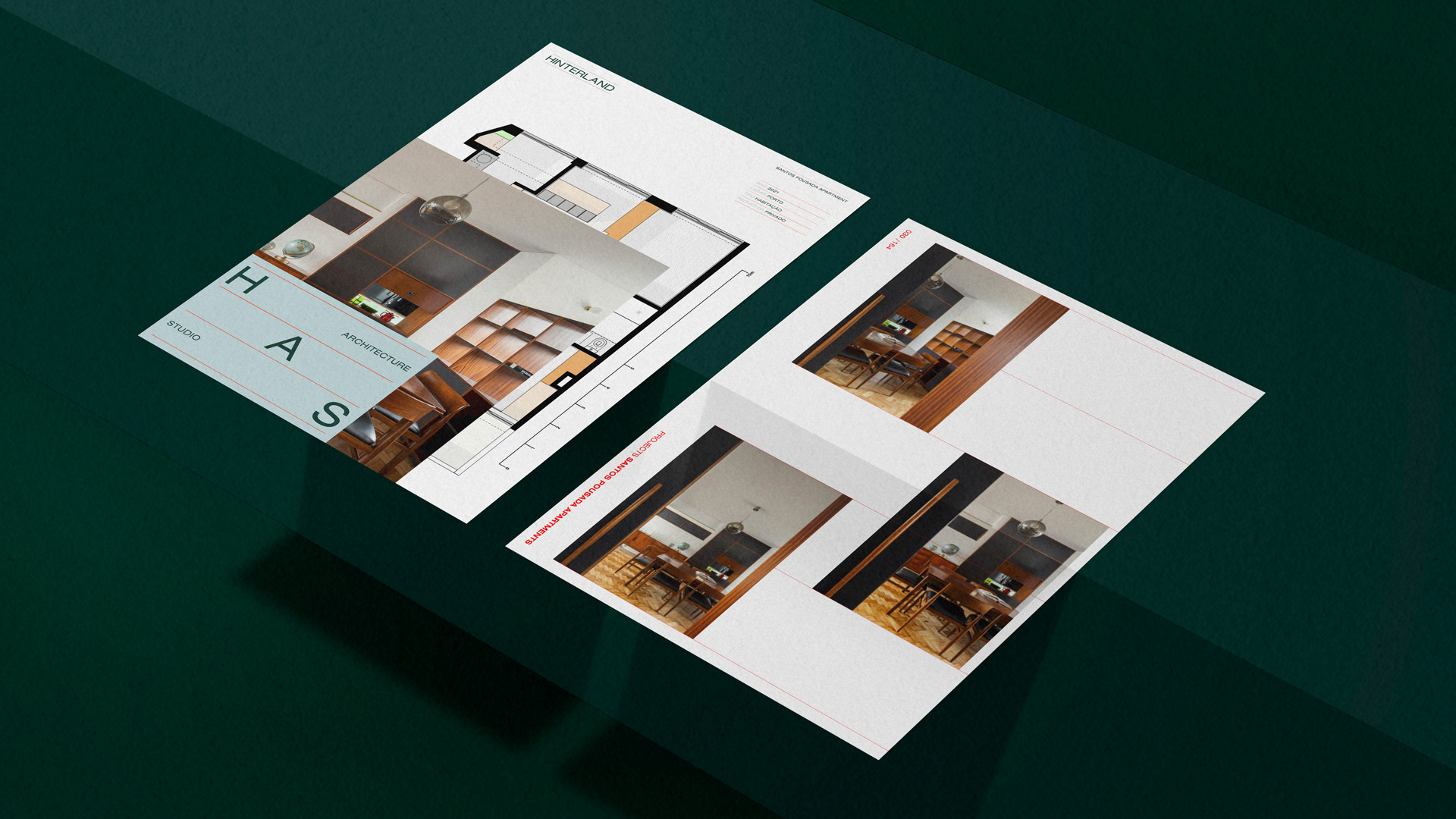
Credits: Mano a Mano
More in Brand Identity
Includes freebie bundle, unseen BTS insights and more.