Plus
Plus

 Menu
Menu


Swearwords
August 15, 2022
Mindsparkle Mag


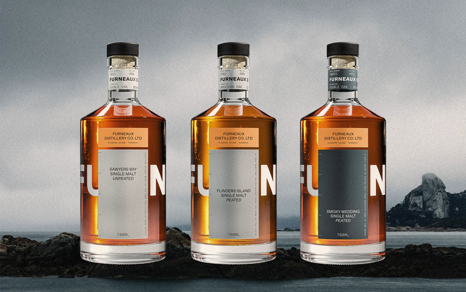
Contrasting a harsh environment with the smooth refinement of their product, Furneaux Distillery’s brand and packaging design feel authentically connected to Flinders Island, Tasmania. Inspired by a deep connection to the sea and the persistent, vast horizon as viewed from their home on Flinders Wharf, the design evokes a sense of ‘maritime utility’ – rugged, functional, resourceful, and enduring. The bottle is an artifact that feels equally at home on the shelf of an exclusive whisky bar as washed up on the beach at Whitemark Wharf after a violent storm. Behind this gorgeous branding and packaging design belongs to Swear Words studio
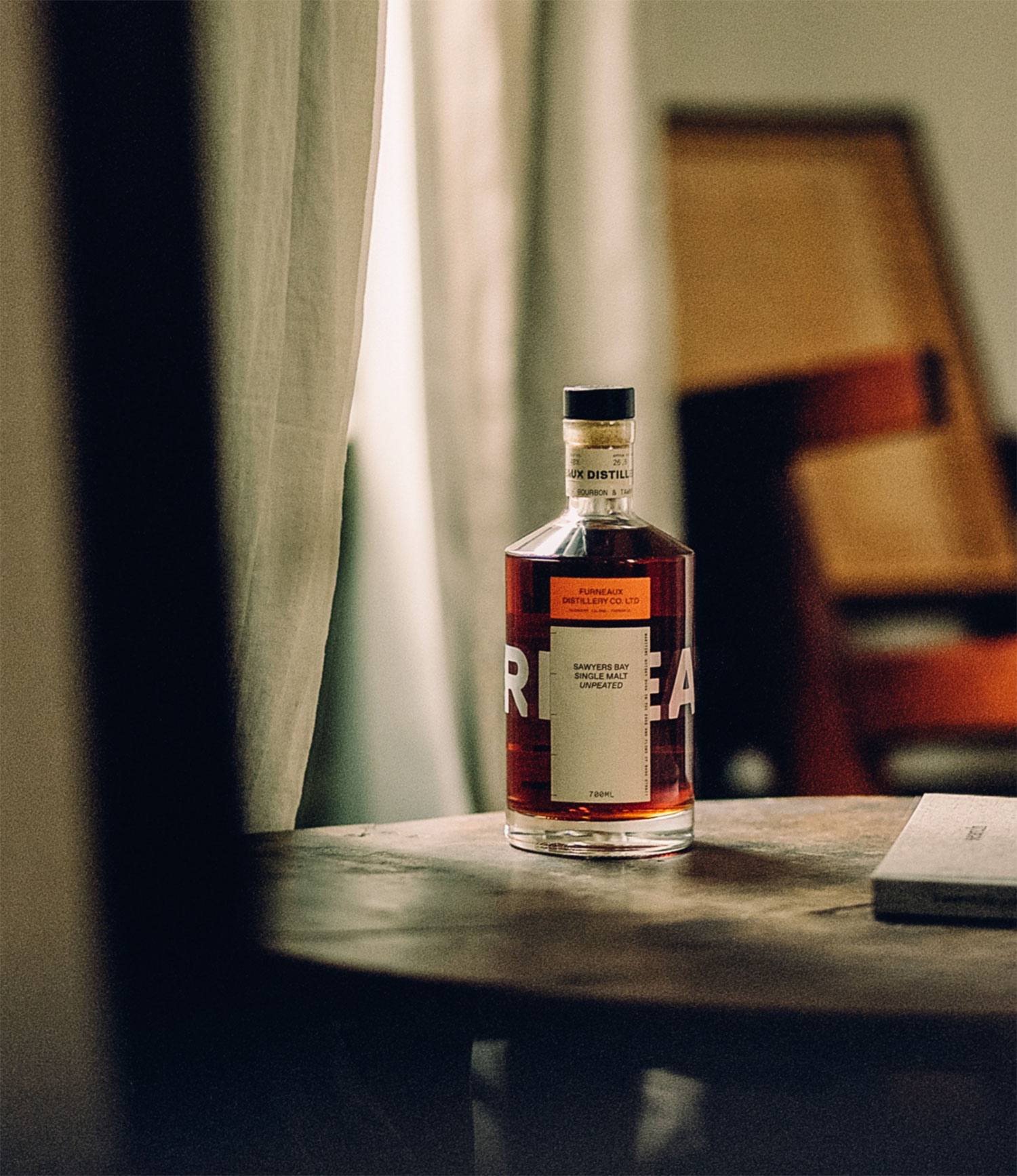
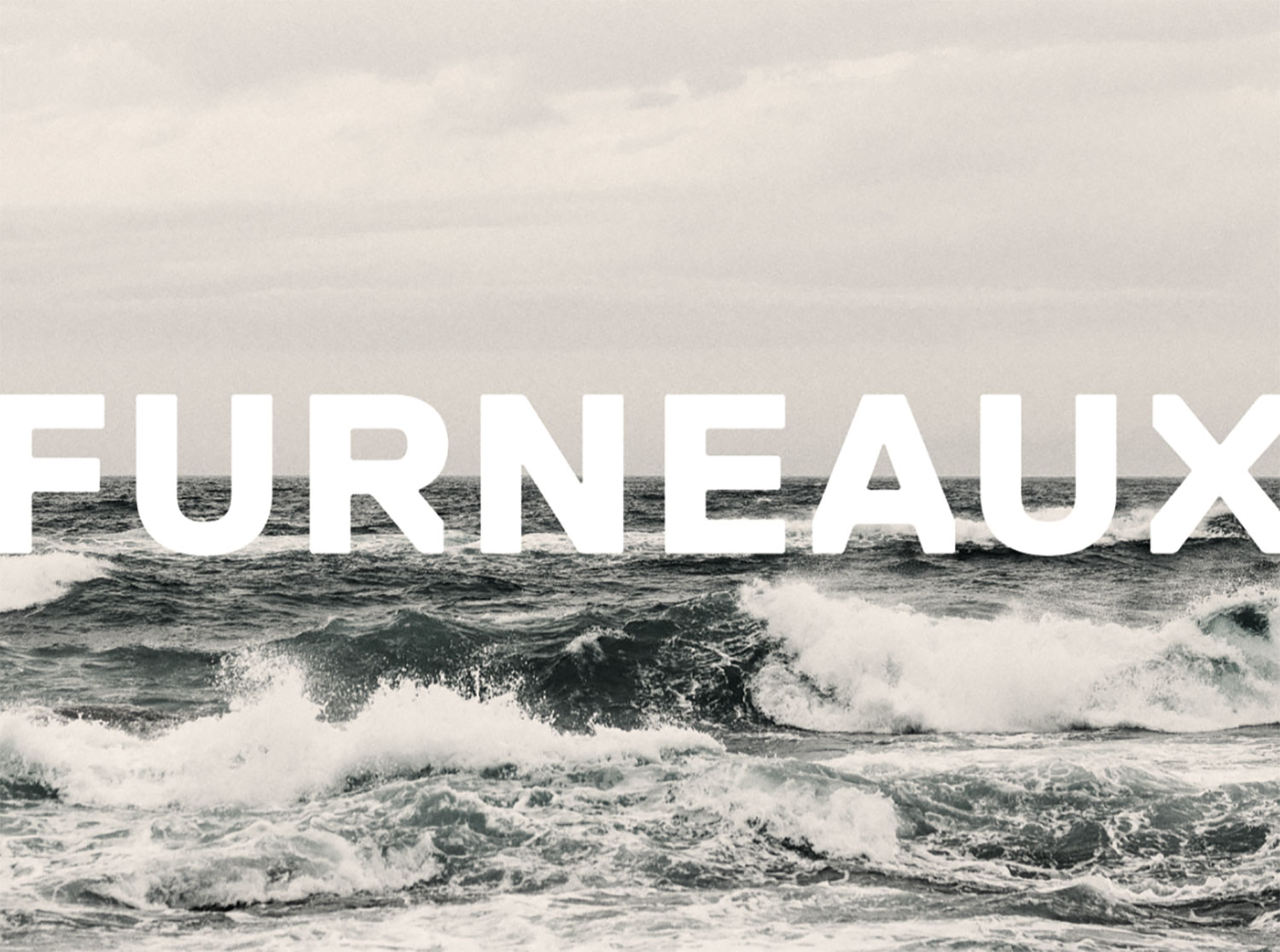
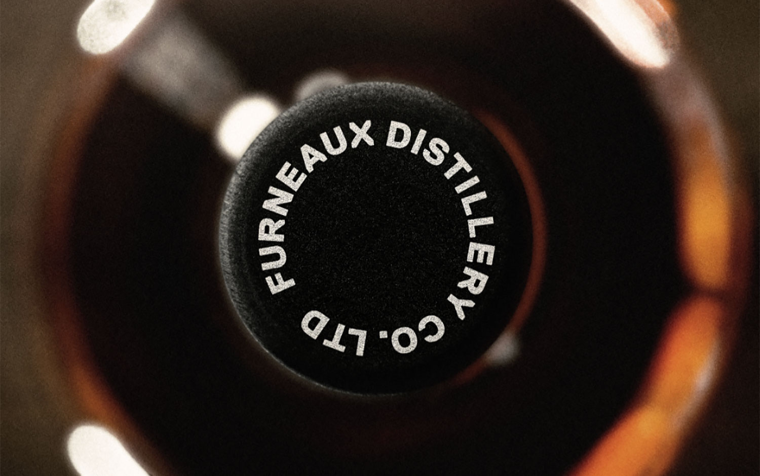
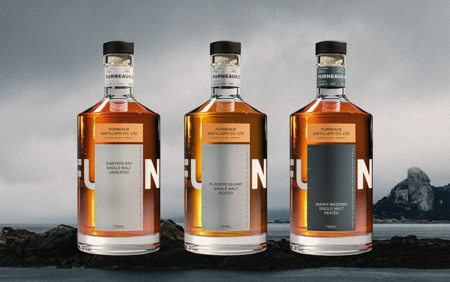
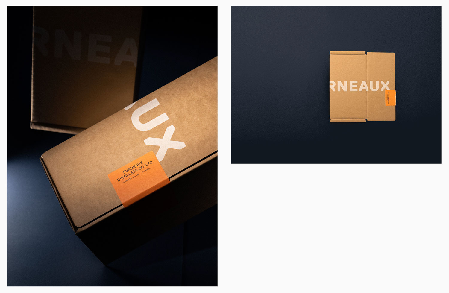
Credits: Swearwords
More in Brand Identity
Stay on top of this week's design. Insights, top picks & more.