Plus
Plus

 Menu
Menu


DRAP Agency
June 19, 2017
Mindsparkle Mag


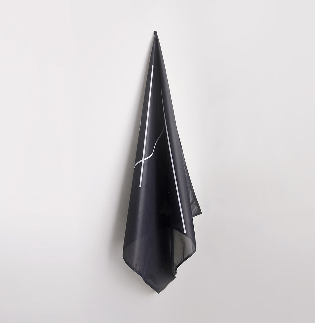
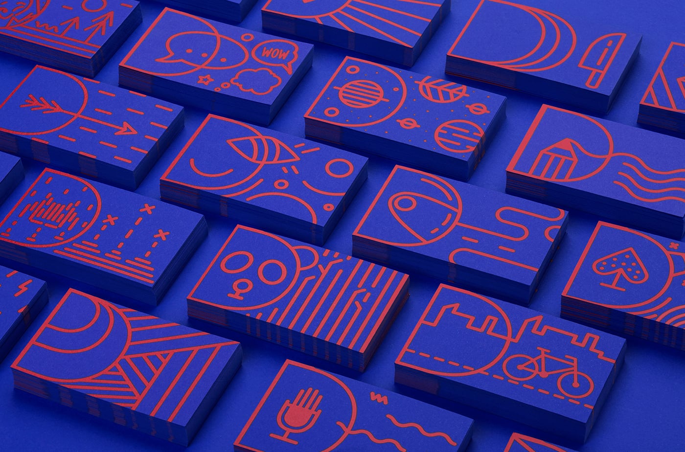
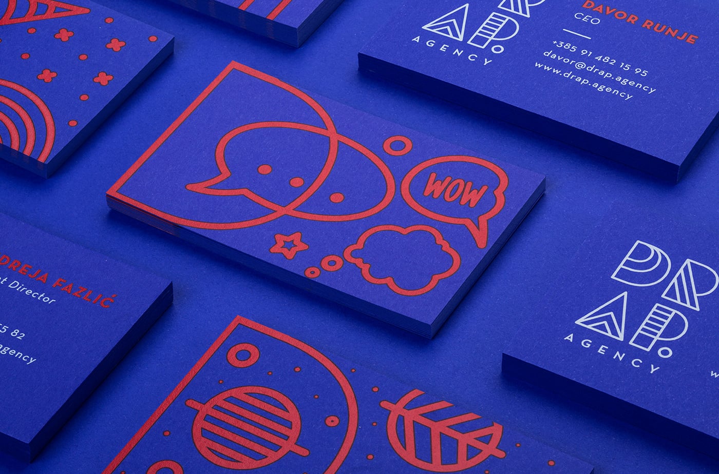
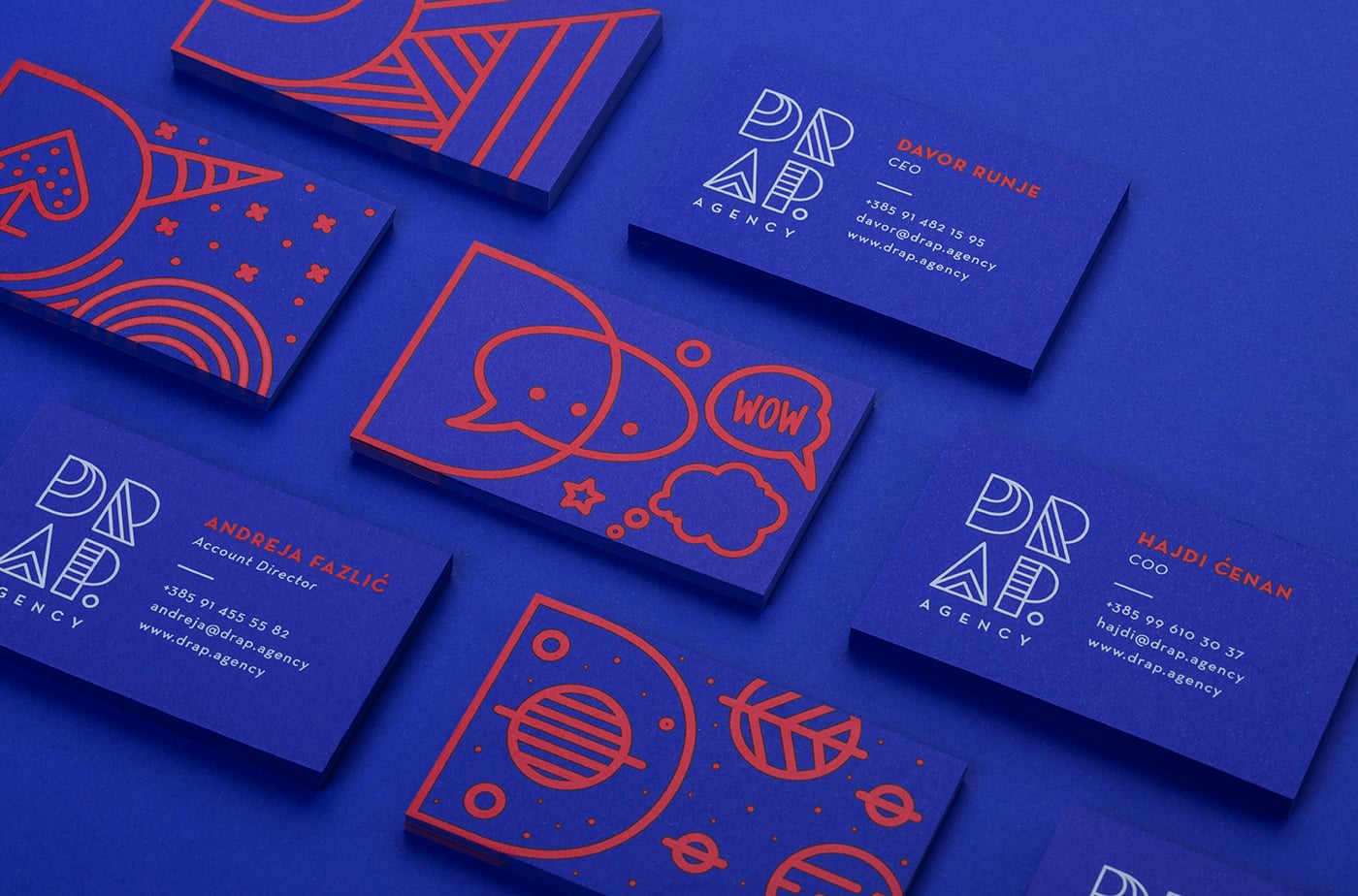
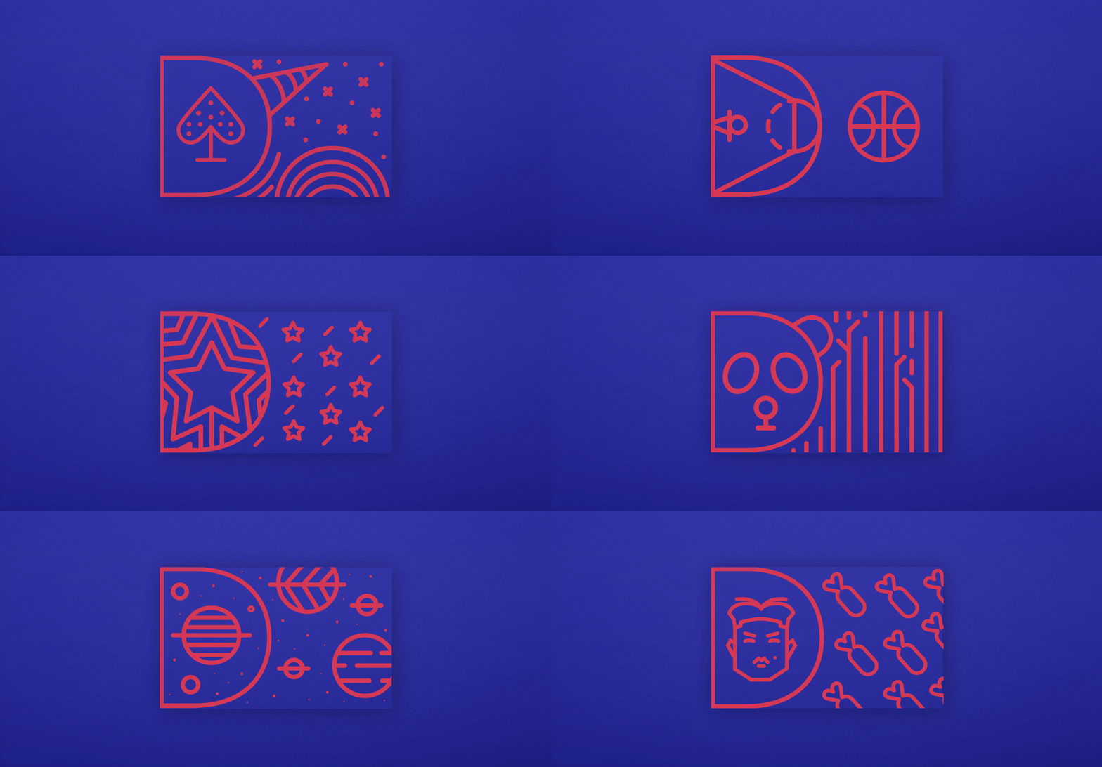
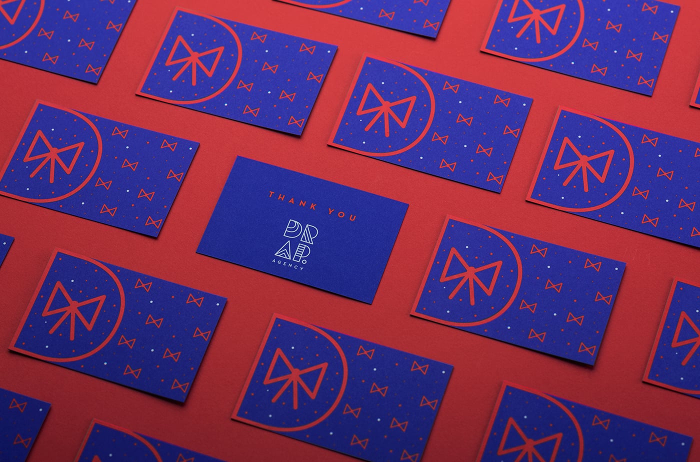
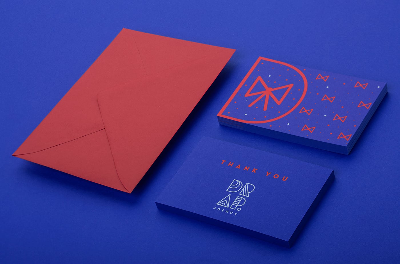
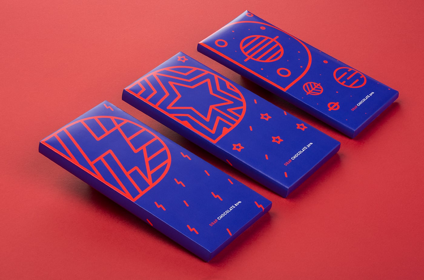
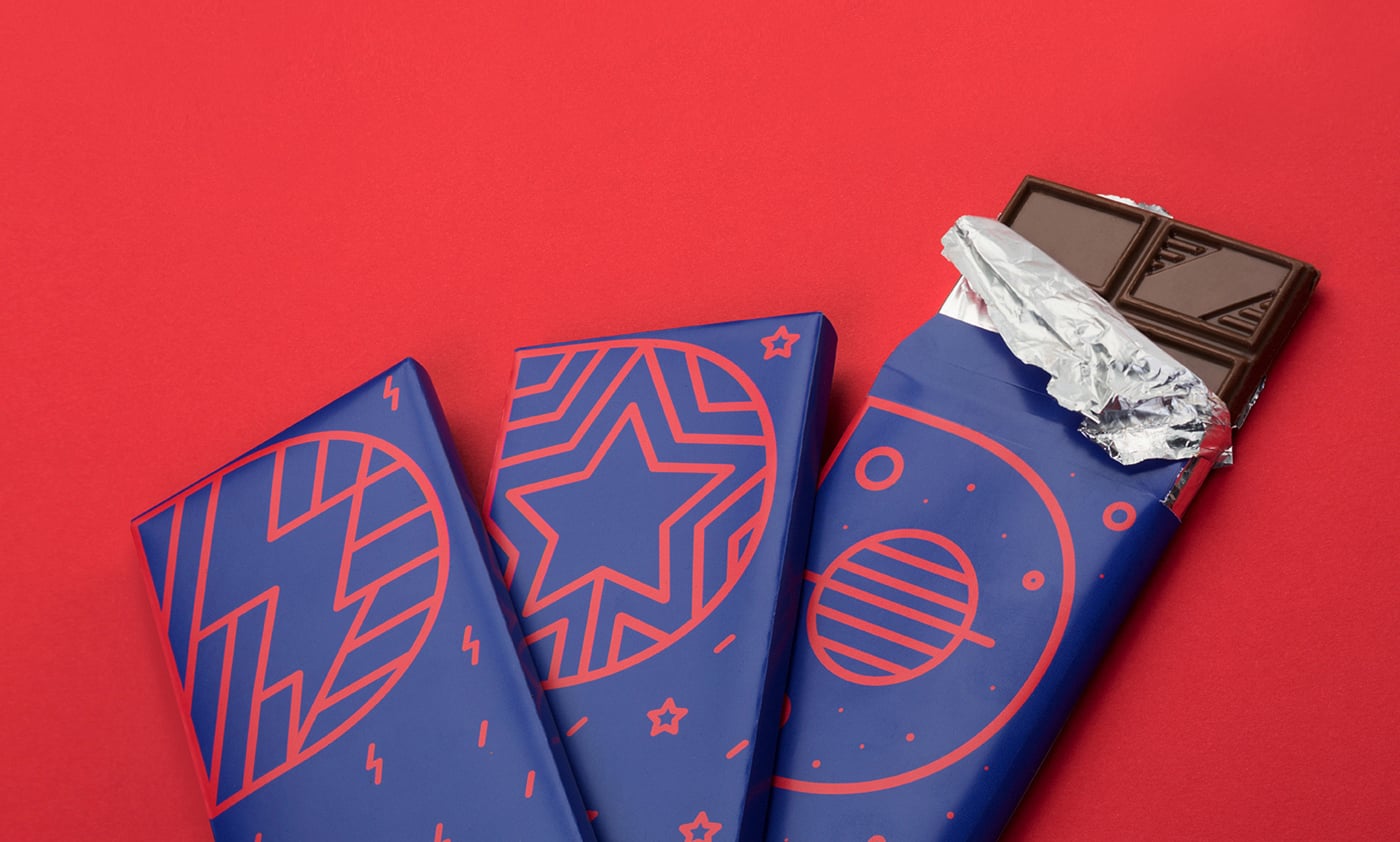
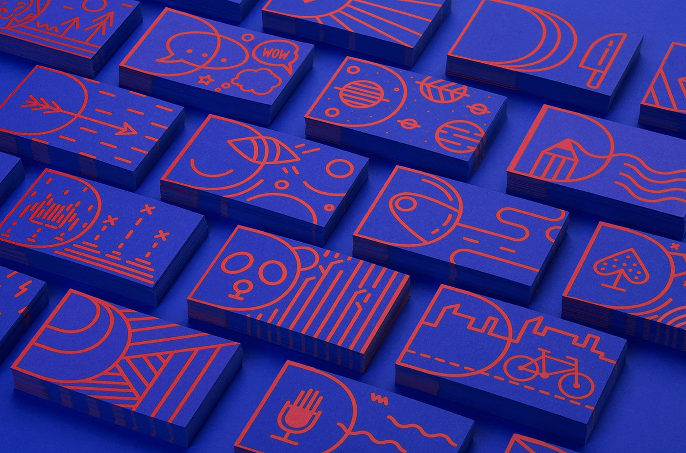
The basic idea of DRAP.agency was to make a visual identity that will unite (on the one hand complementary and on the other hand opposing) all of its members. The logo is a compact typographic solution. It frames the playful line forms that fills its body. This way the mentioned opposing personalities are unified in a compact unique form. At the same time the shape of the logo leaves room for modular intervention. Out of its basis DRAP established a system and created the entire visual identity. All materials are personalized so every employee can have a personal visual identity. Whether one wants to be a "Unicorn", "Space director" or "Panda" this visual identity can make it happen ;)

Credits: DRAP Agency
More in Minimal Branding
Includes freebie bundle, unseen BTS insights and more.