Plus

 Menu


PAPA TOM
October 31, 2019
Mindsparkle Mag


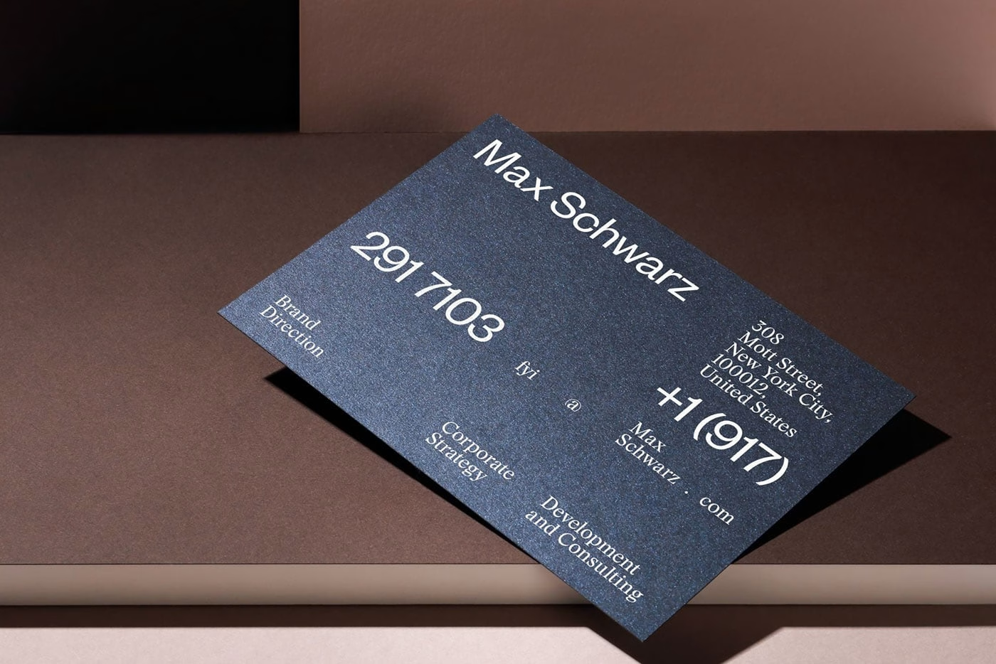
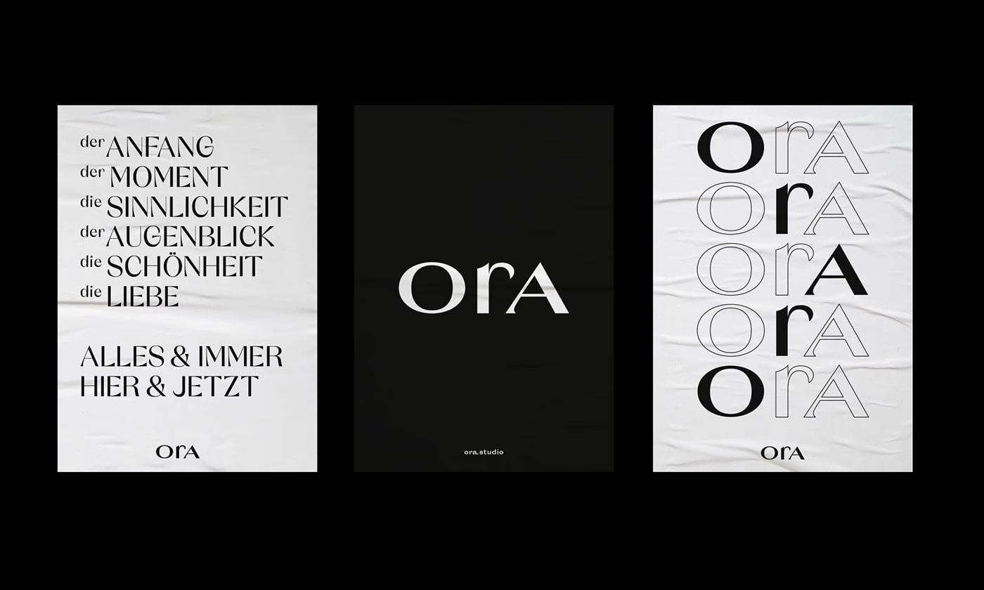
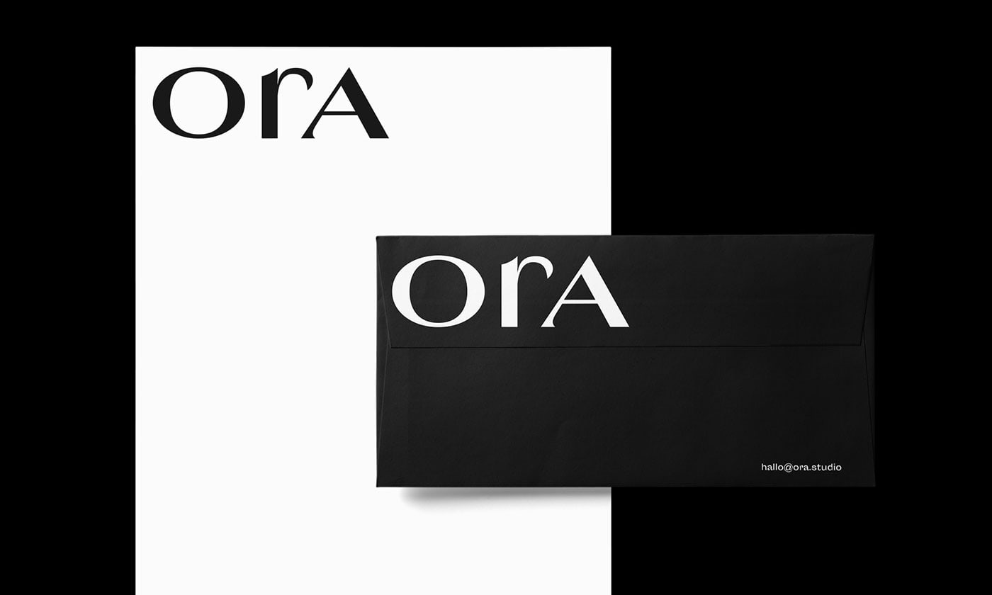
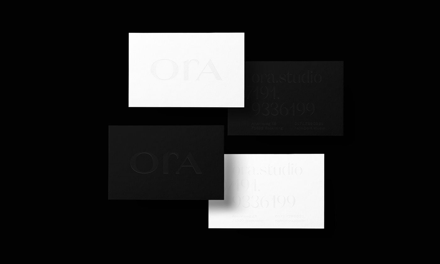
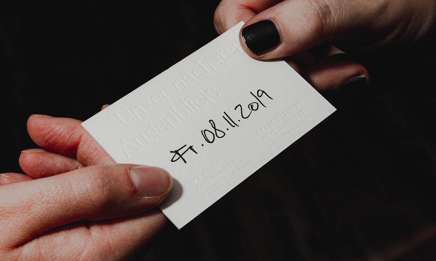
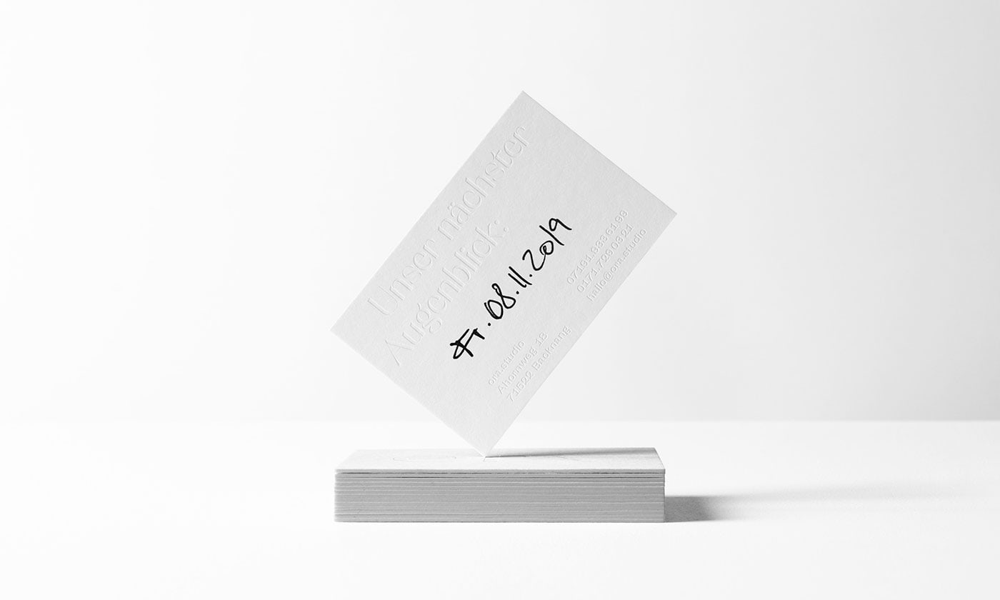
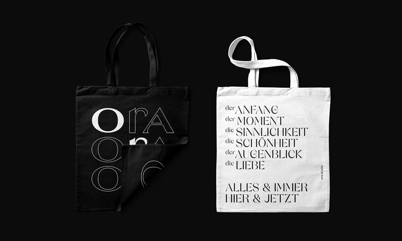
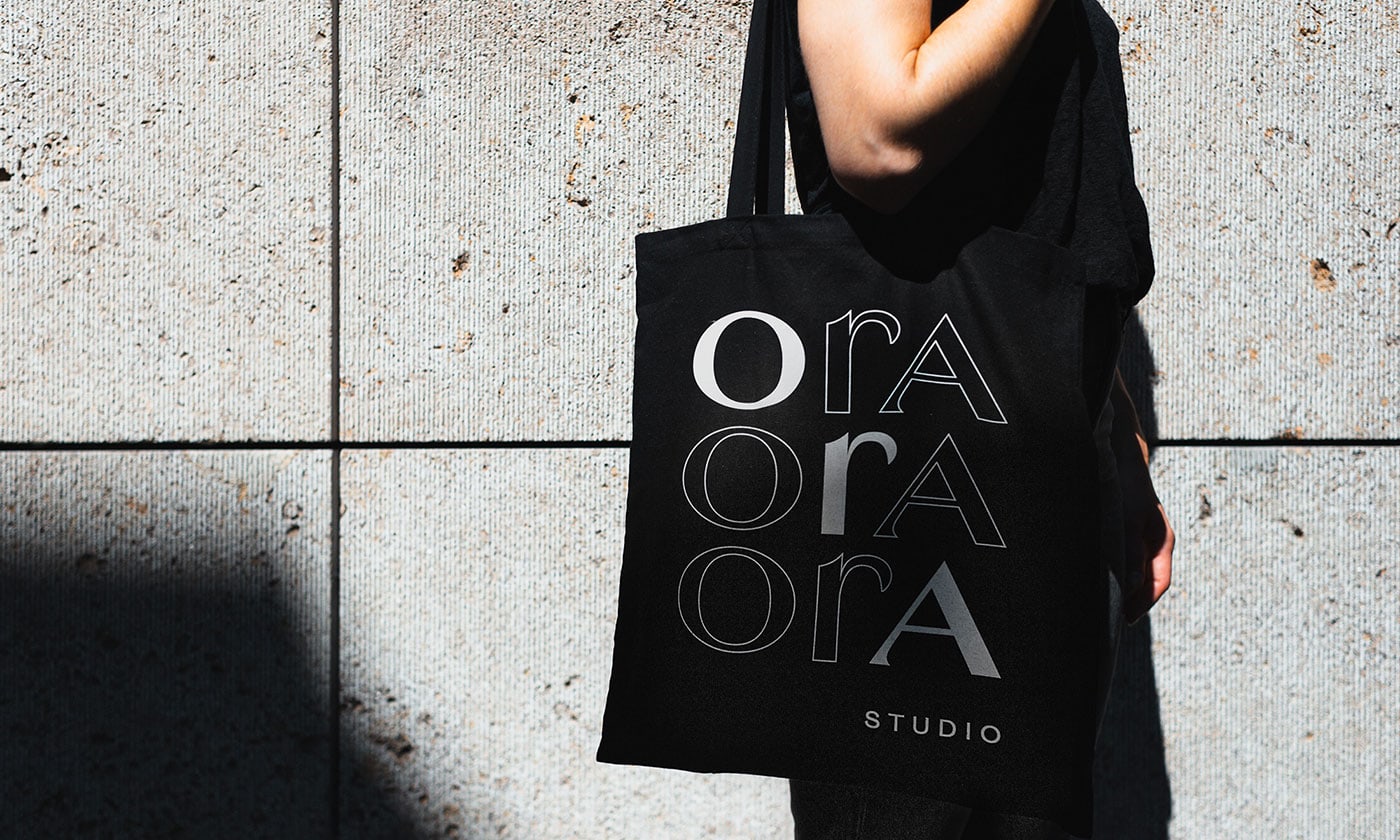
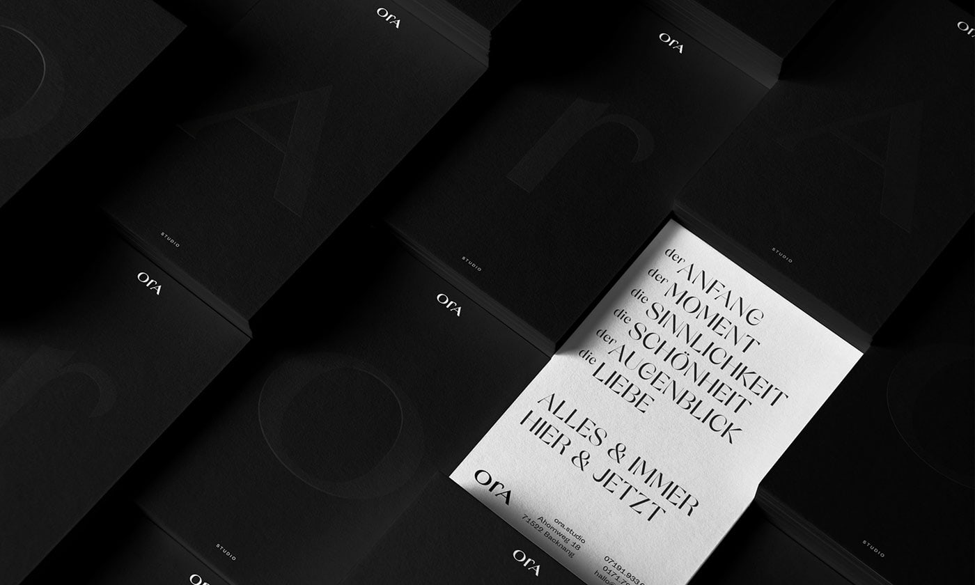
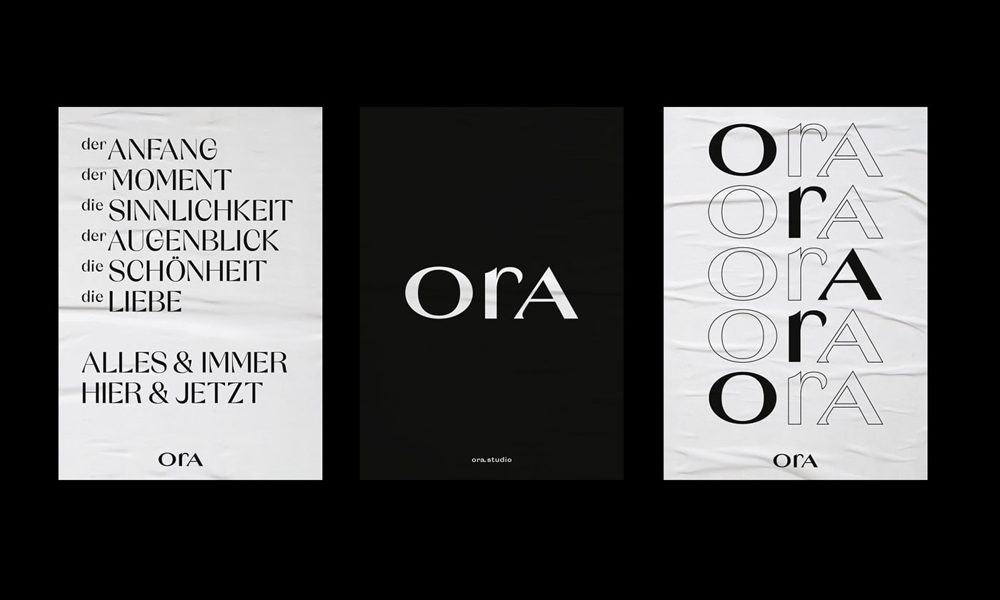
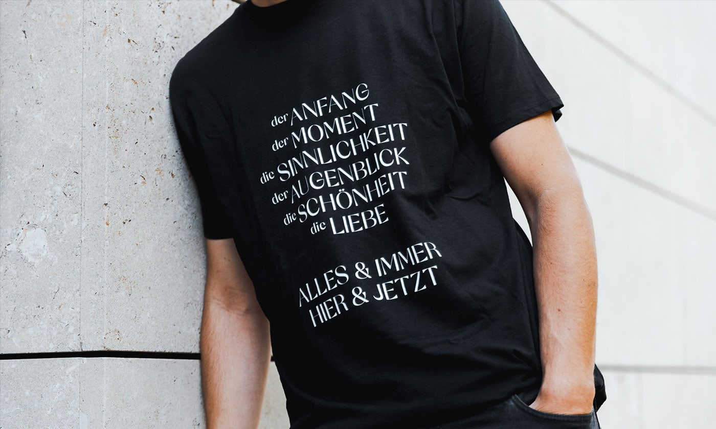
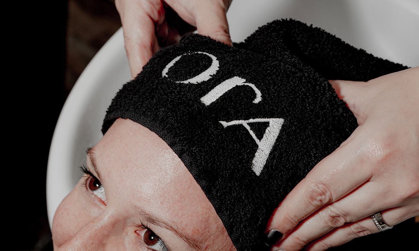
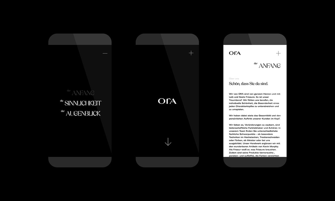
papa tom designed the Branding for Studio ORA. The straightforward and concise branding lives from timeless Italian lightness, which is expressed in particular in the chosen typography - the Orelo. Clarity, calmness and focus characterize the high-quality appearance in print and also online.

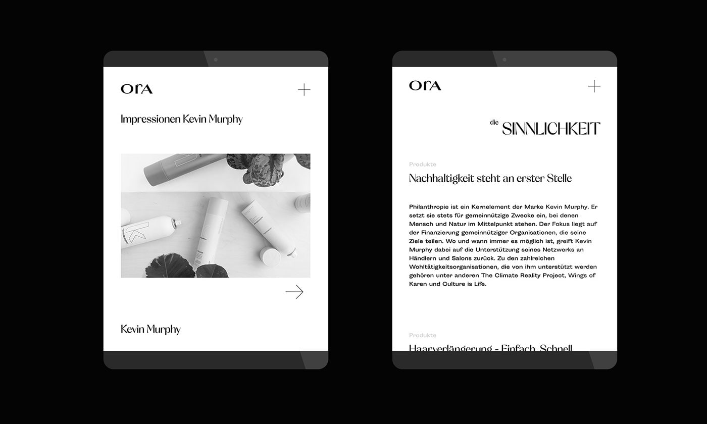
Credits: PAPA TOM
More in Brand Identity
Stay on top of this week's design. Insights, top picks & more.