Plus
Plus

 Menu
Menu


La Tortilleria
August 11, 2019
Mindsparkle Mag


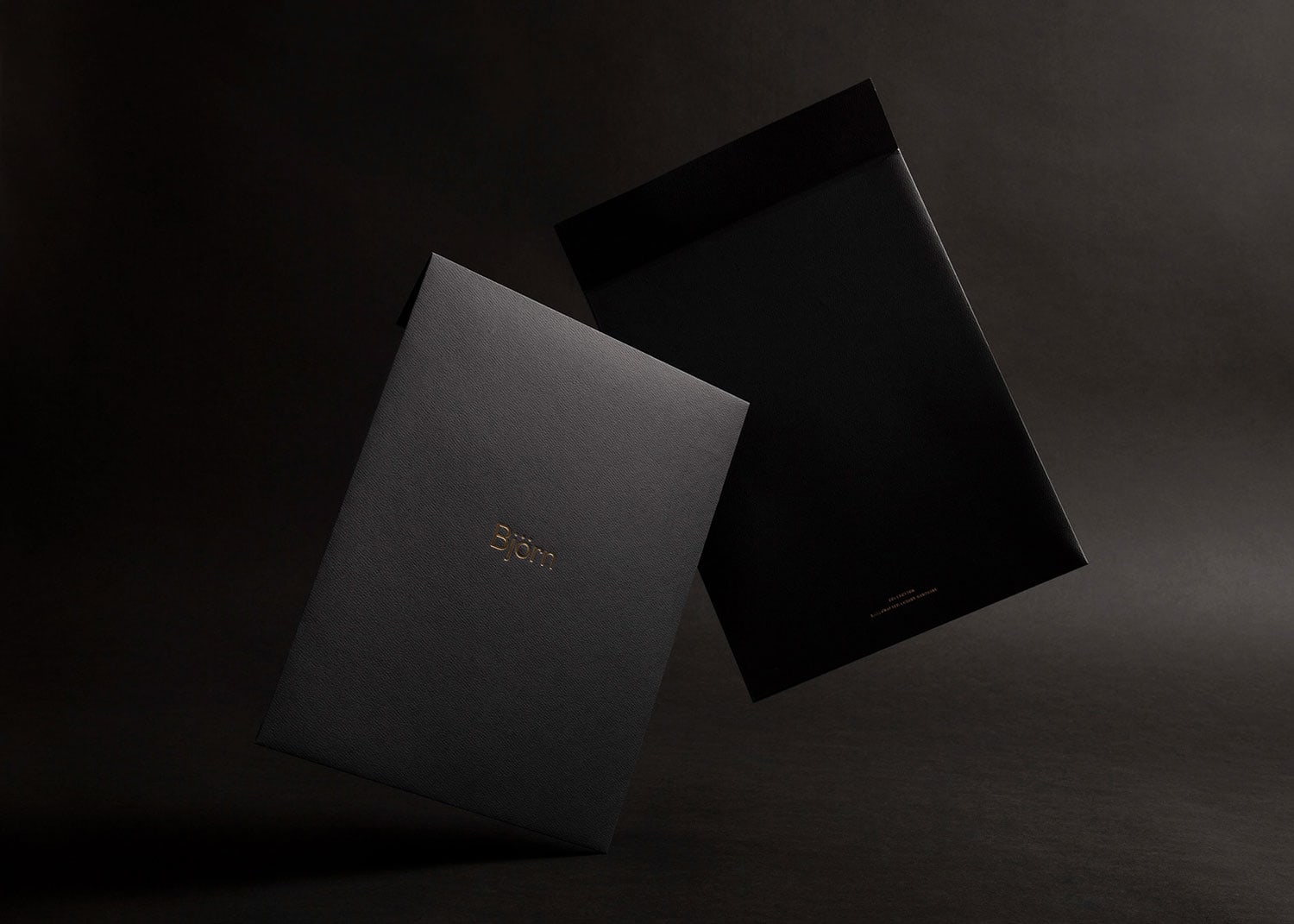
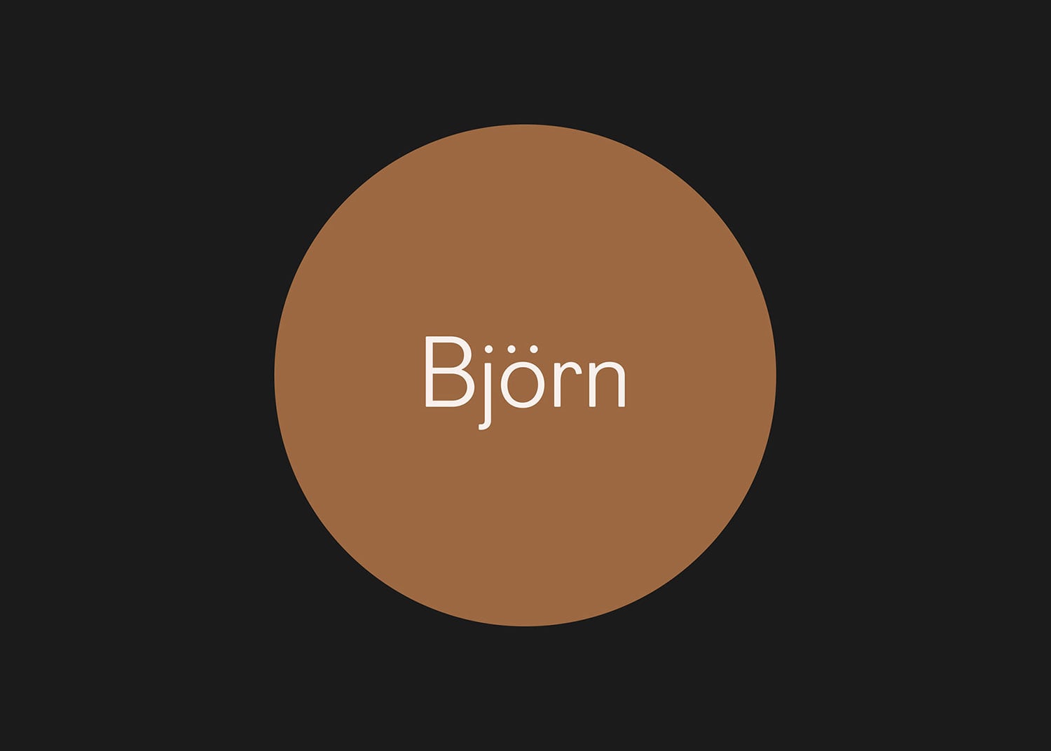
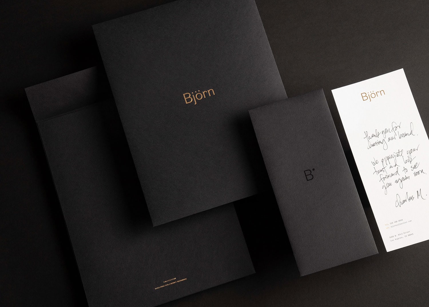
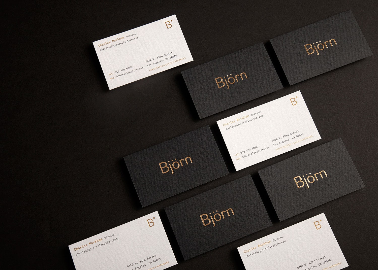
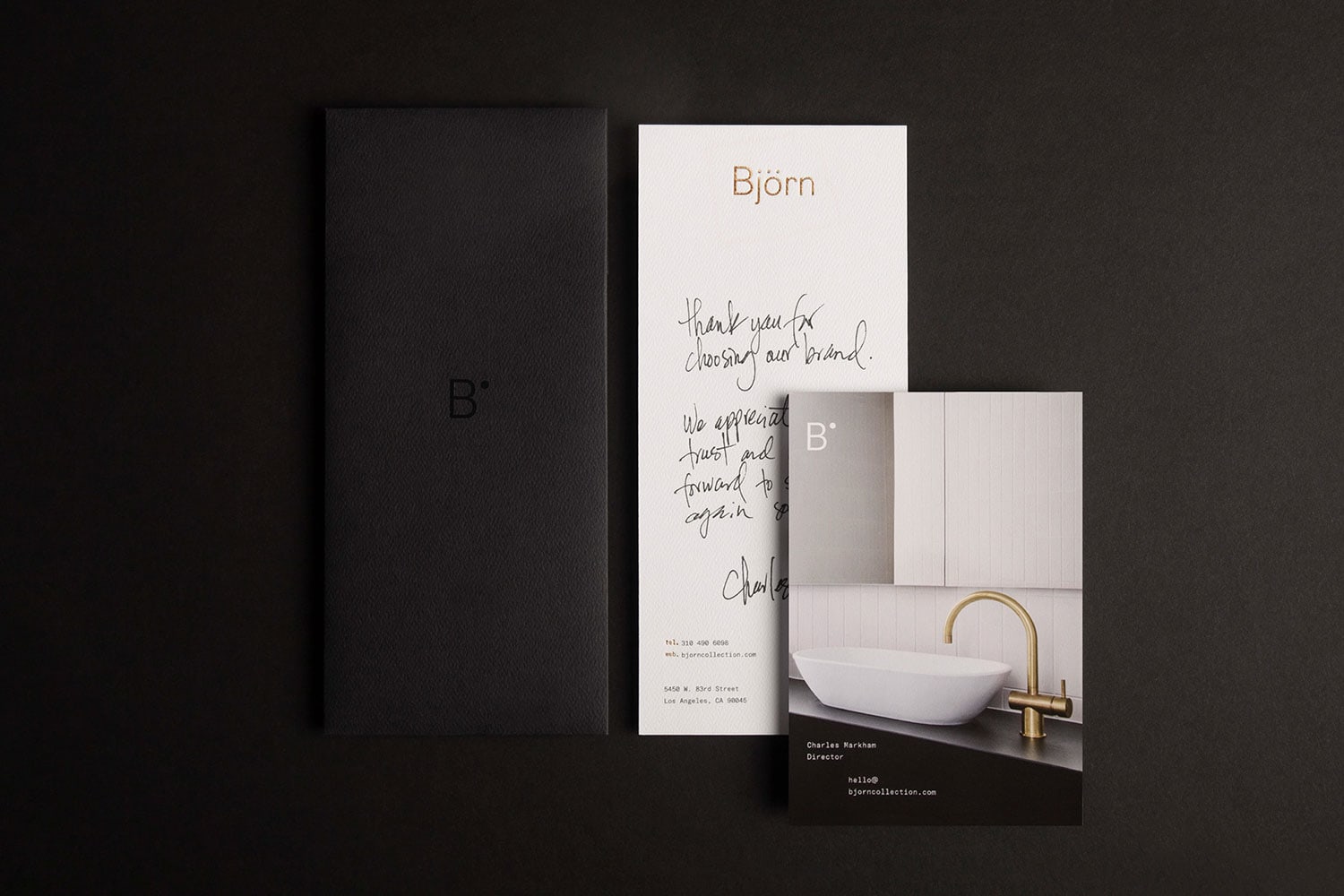
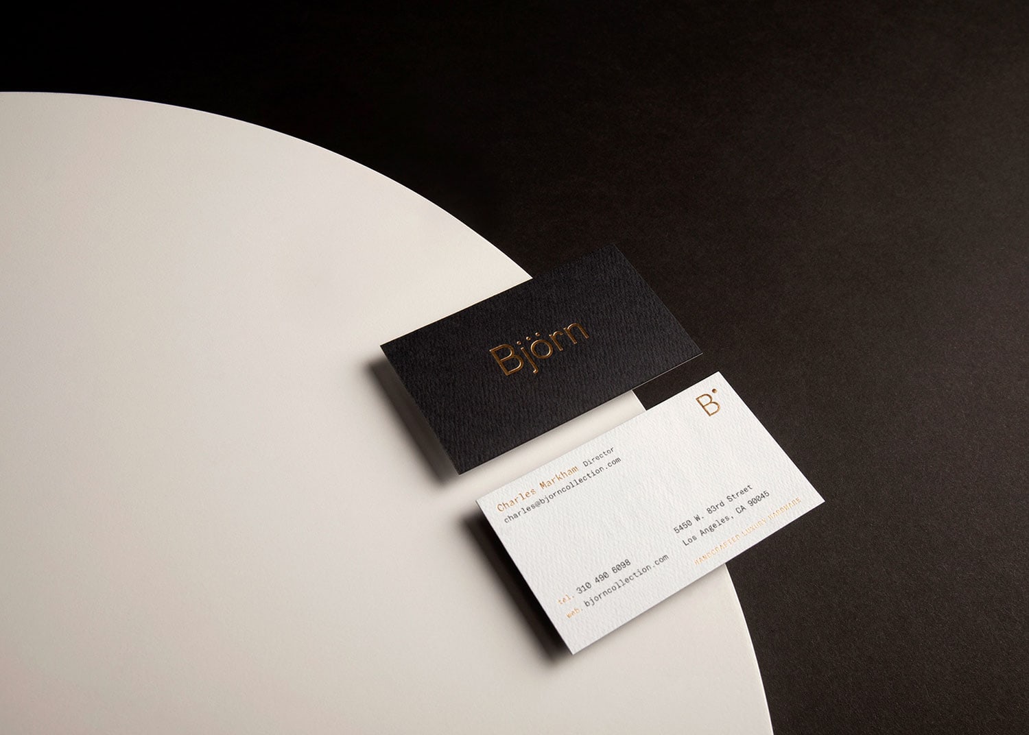
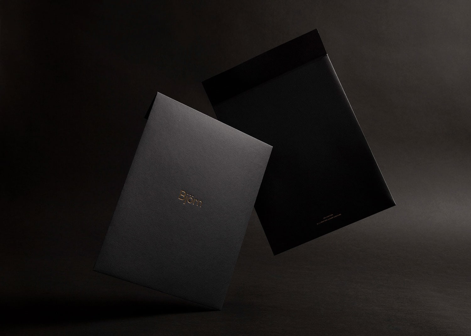
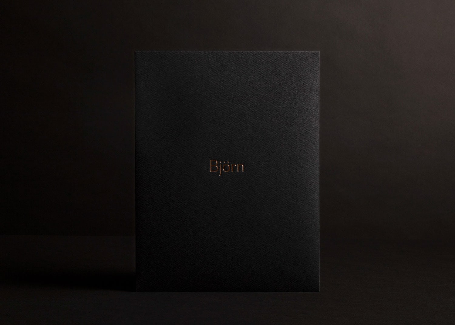
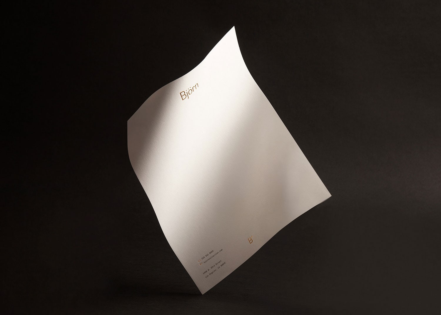
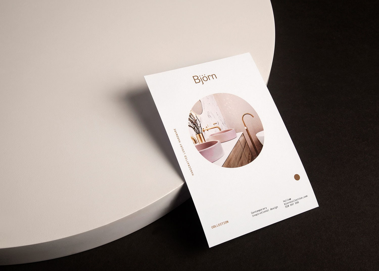
Björn Collection is a luxury architectural hardware brands representative. La Tortilleria created a visual identity with elements that bestow the brand a distinct aura of sophistication. The icon is an abstraction of the logotype and is formed by the brand’s first initial, followed by a superscript character, an overdot extracted from the letter J, which represents a starting point as well as an accent mark. This symbol works as a signature seal of refinement.
Björn Collection’s visual system includes a balanced set of serif and sans serif typographies that clearly express the traditional aspects of its market as well as the brand’s modern spirit. To complete this high-end branding, they came up with a color scheme rich in dark grey, black, blue, white & beige accentuated with gold foil details. Stationery, business cards, marketing material and a website proposal were also created for the brand.
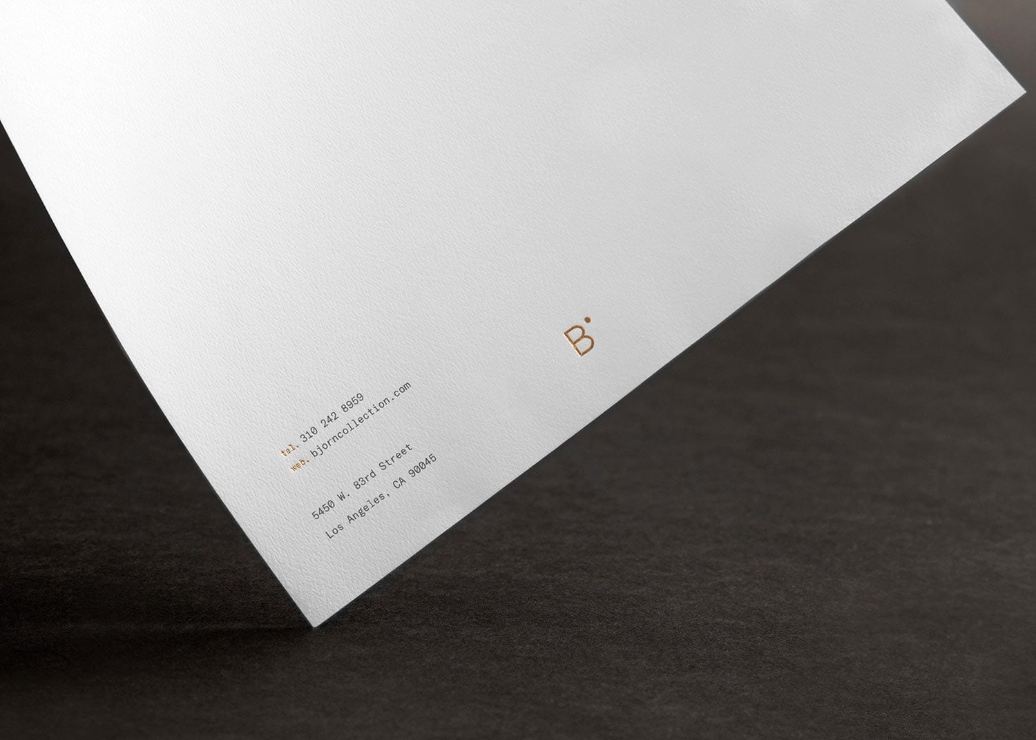
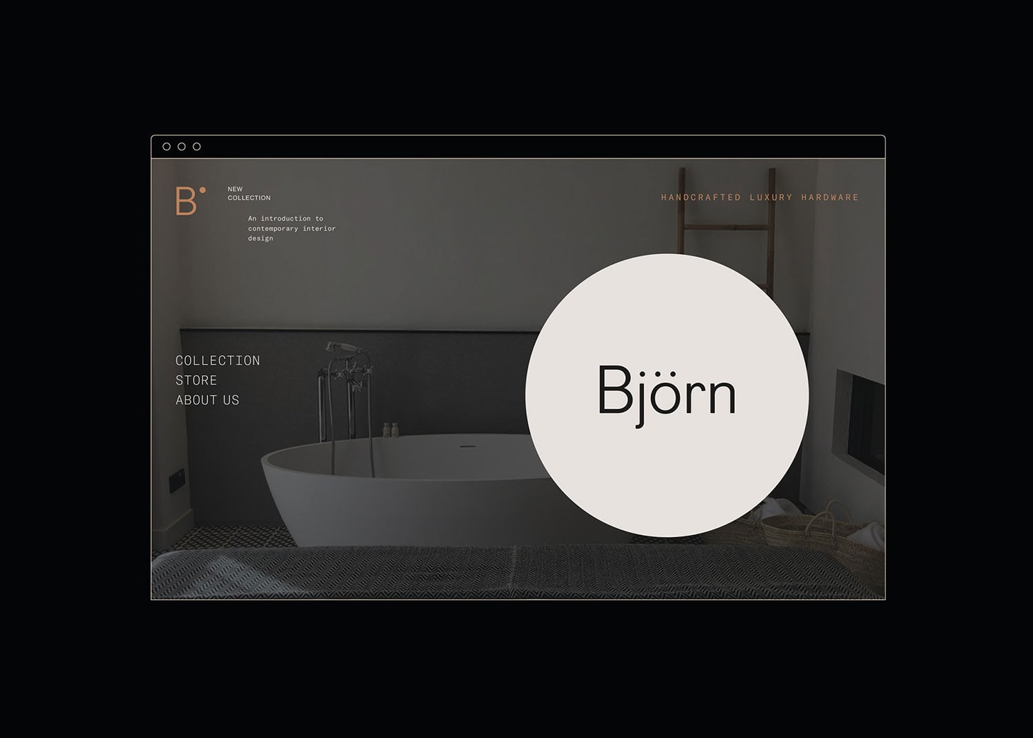
Credits: La Tortilleria
More in Brand Identity
Includes freebie bundle, unseen BTS insights and more.