


UDL
June 12, 2025
Mindsparkle Mag


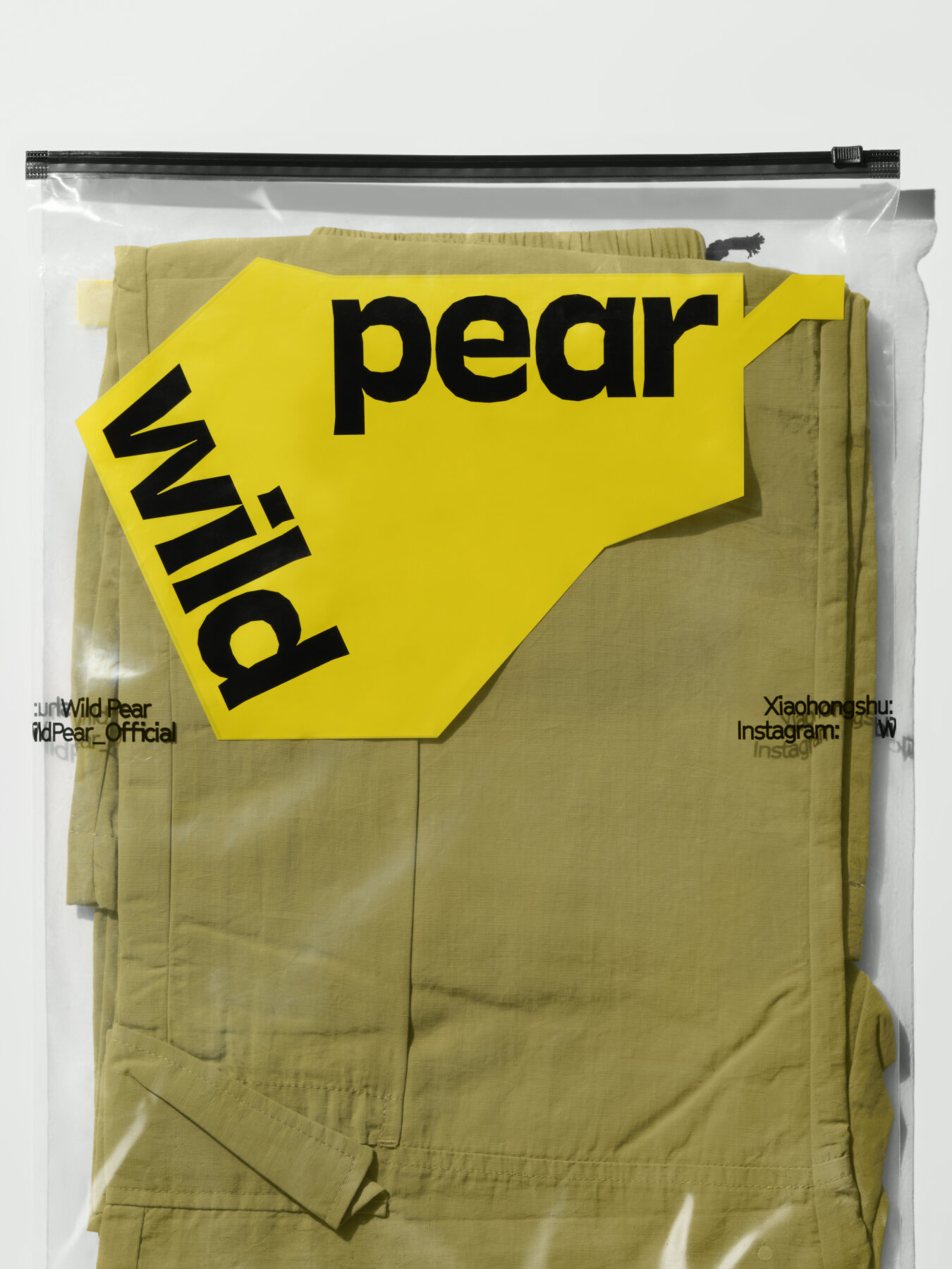
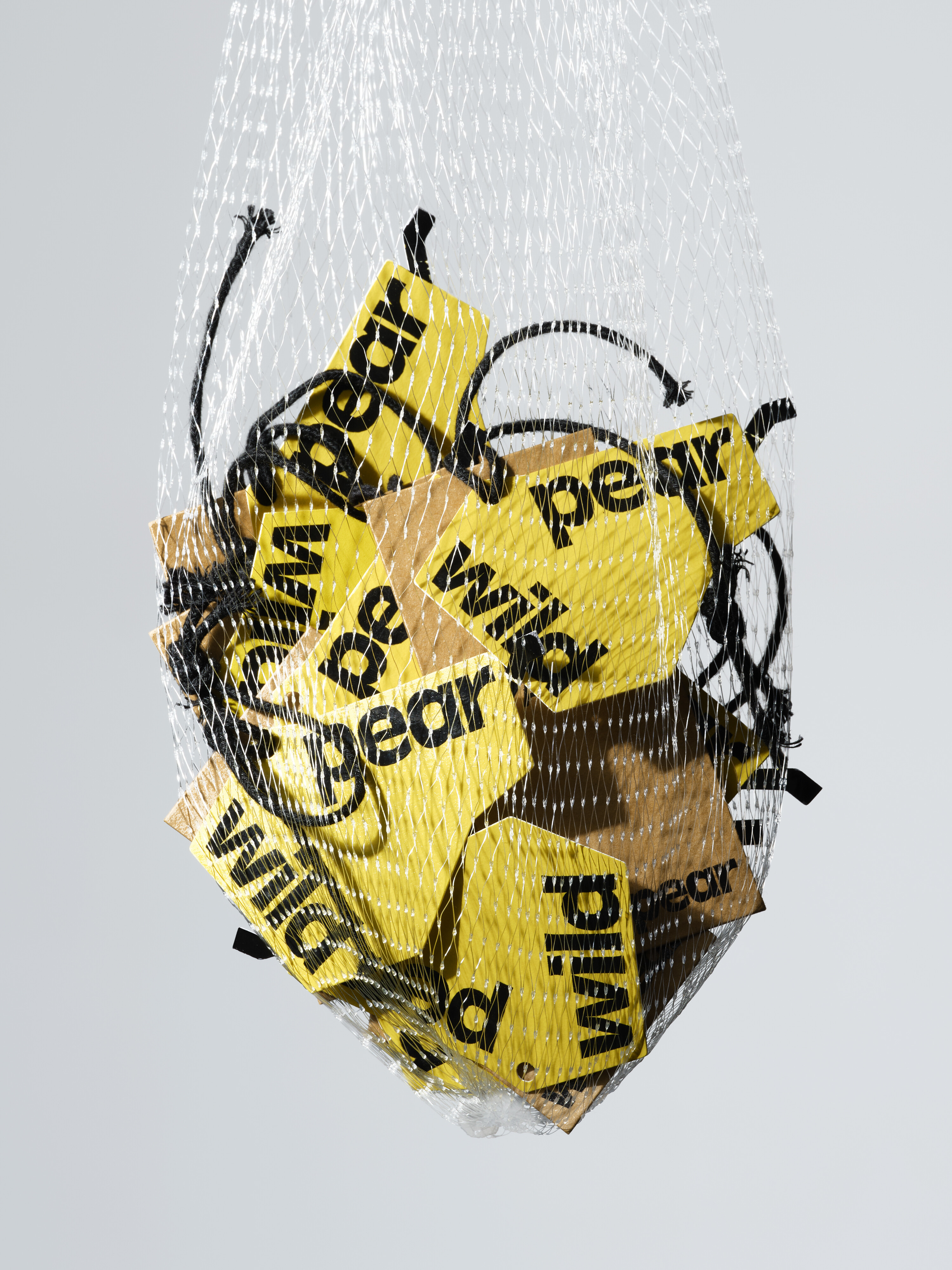
Advocating nature and authenticity, light outdoor brand Wild Pear has quickly captured the attention of young urbanites with a splash of bright /u2018wild yellow/u2019. Relying on eco-friendly functional fabrics, Wild Pear creates items that can be easily managed in both daily life and outdoor adventures, using wild fun to loosen the tension of urban life.
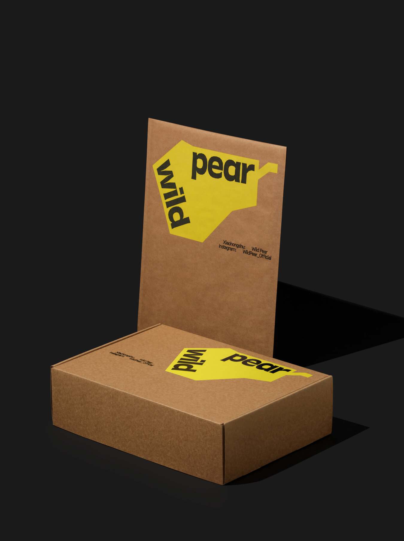
As a new brand, Wild Pear needed to make a deep impression on more consumers. Our task was to create a visual system that could quickly and accurately build awareness of the brand in sync with its pace of growth.
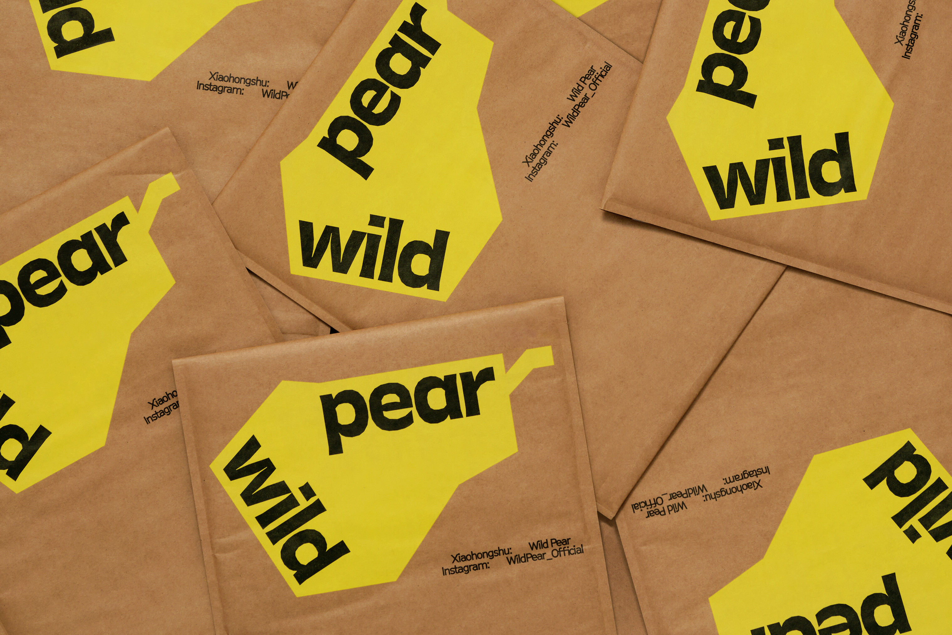
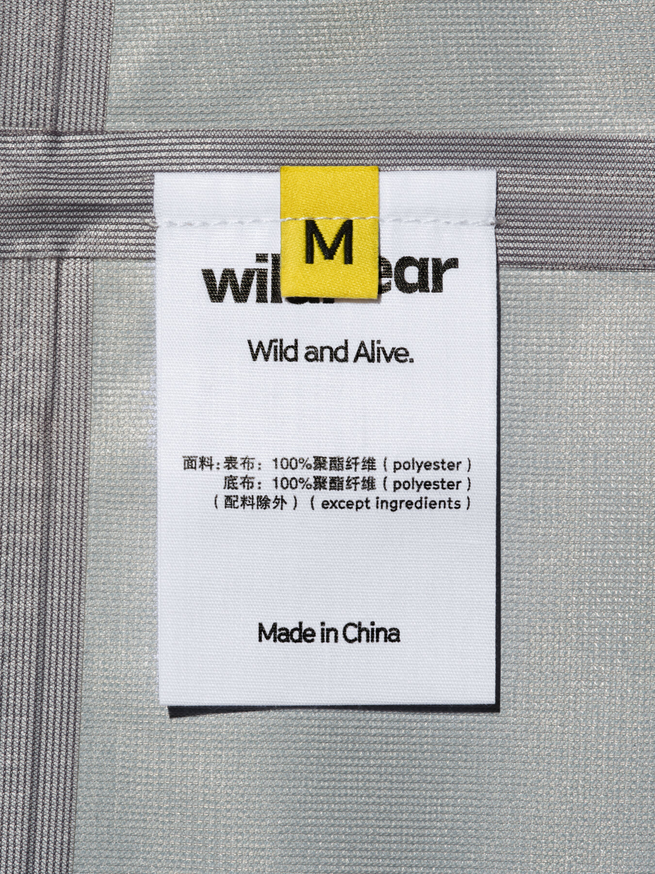
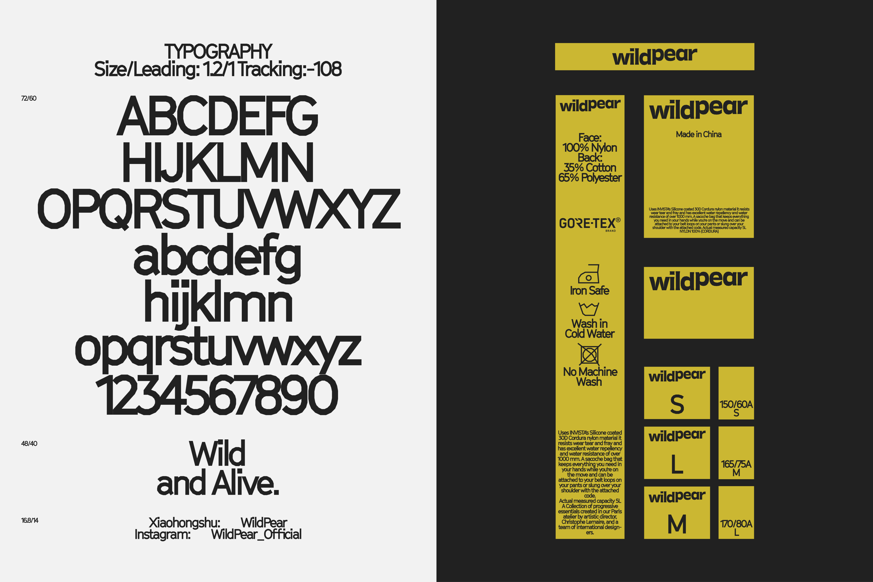
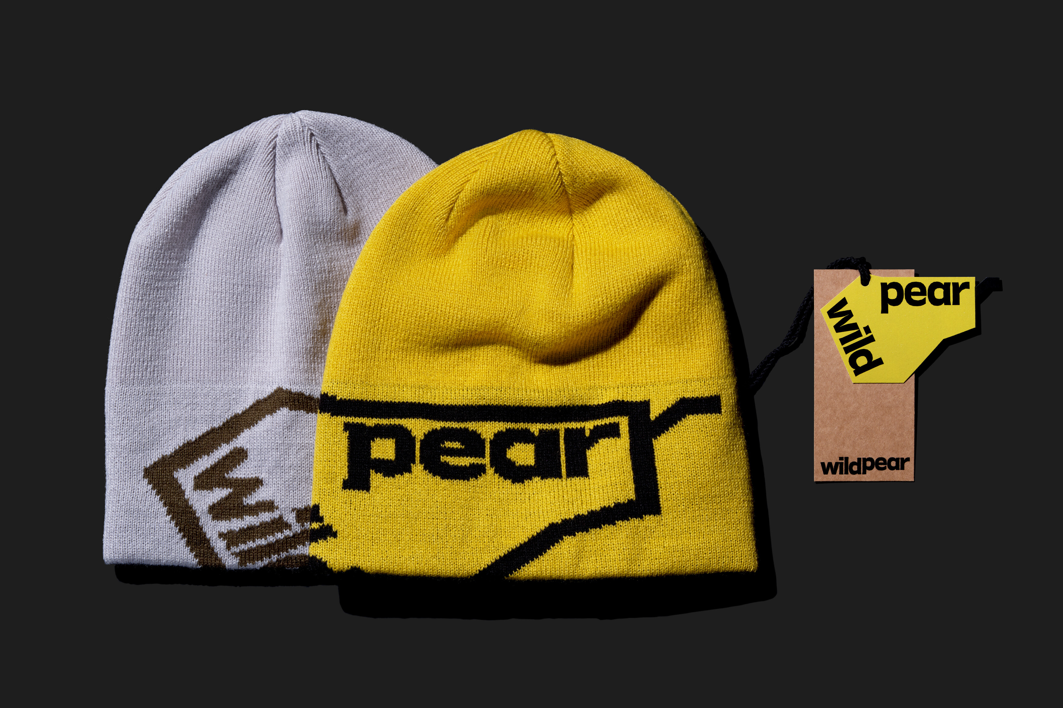
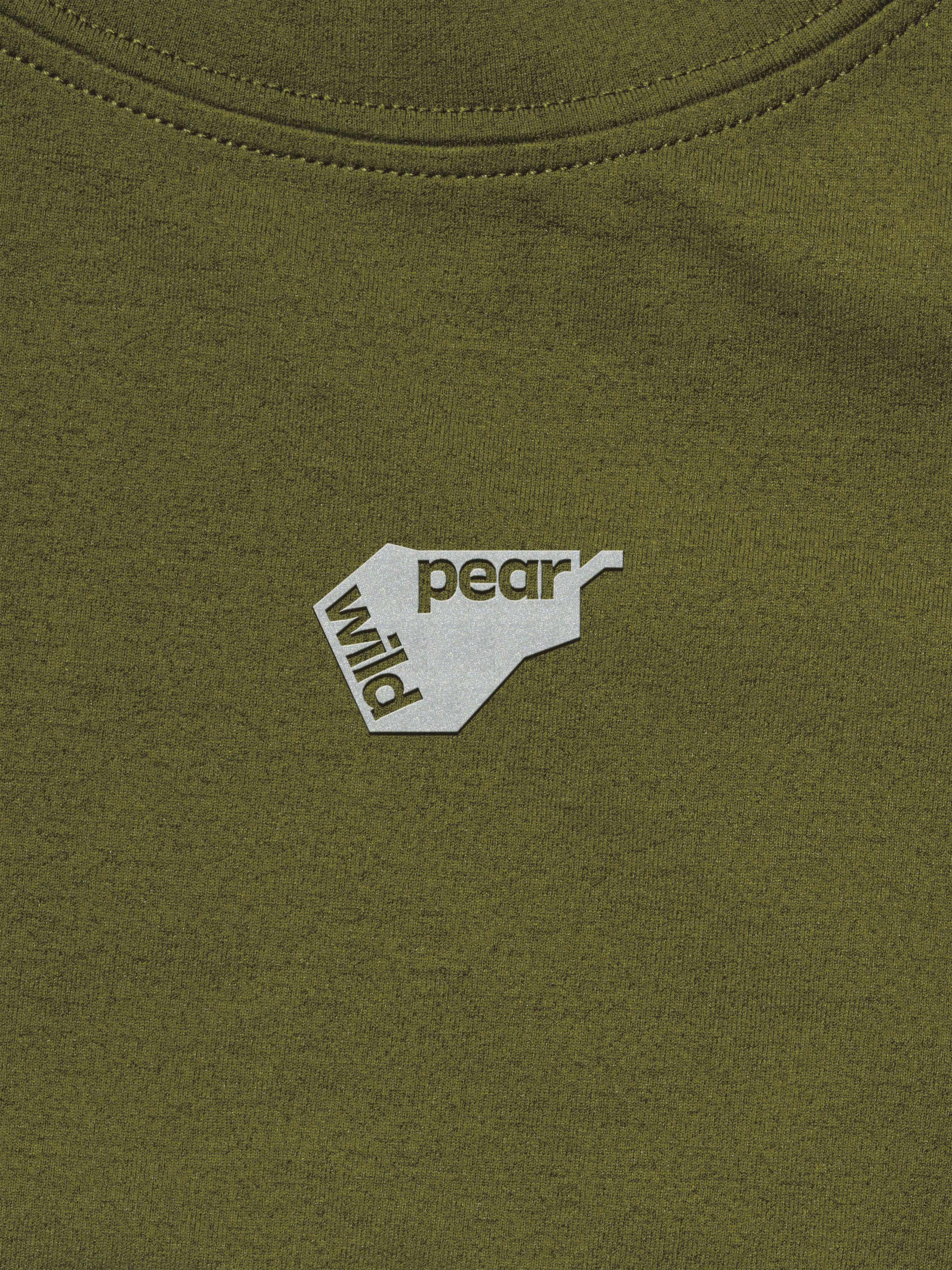
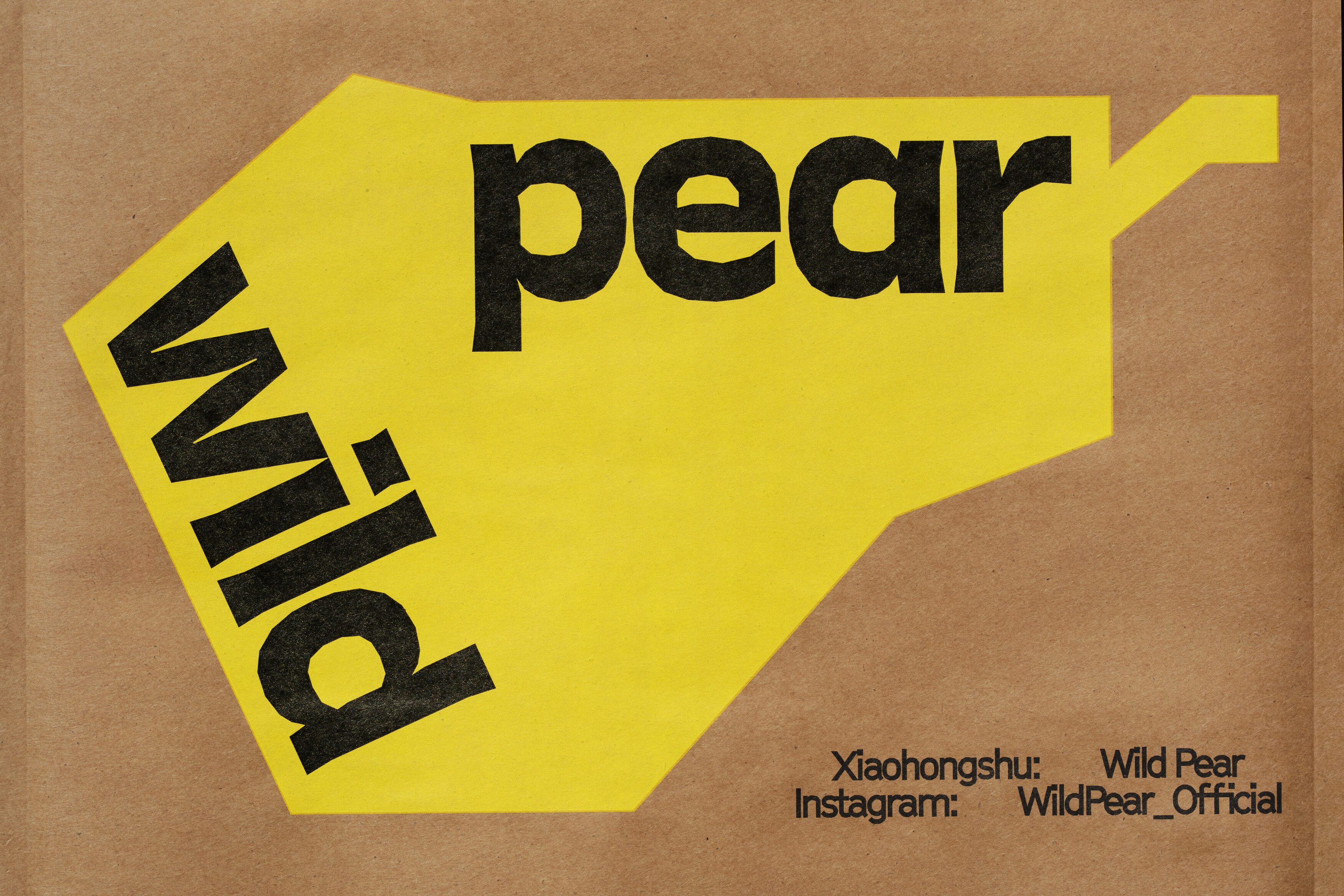
From the catchy and memorable brand name /u201cWild Pear/u201d, it was easy to deduce what kind of graphic identity would be appropriate. Therefore, the most important part of the visual identity system is the pear-shaped logo. In order to strengthen this image, UDL embedded the text of the main logo, which also brings the sense of cutting open a pear.
UDL's design work revolves around the /u2018sense of wildness/u2019 - this is expressed in the various elements of the visual identity. The stylistic features of the graphic logo, the text logo, the u-shape, and the wash logo are all built from simple, inorganic geometric lines, like a wild place that has not been over-exploited.
The studio expect this visual identity system to reinforce Wild Pear's unique brand image, conveying the vitality of nature, comfort, and sustainability in a loose, out-of-the-box way. At the same time, by breaking down the boundaries through design, consumers can imagine a new model between man and nature and the city through the brand, and explore more possible lifestyles.
Creator: UDL


.webp)


