Designsake Studio
February 07, 2019
Mindsparkle Mag


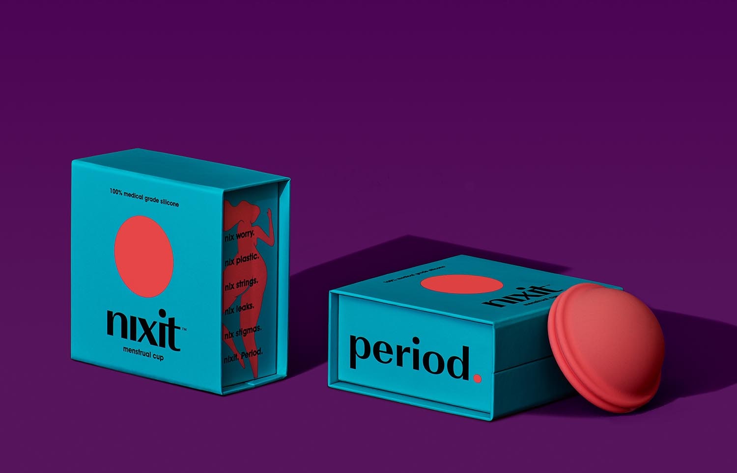
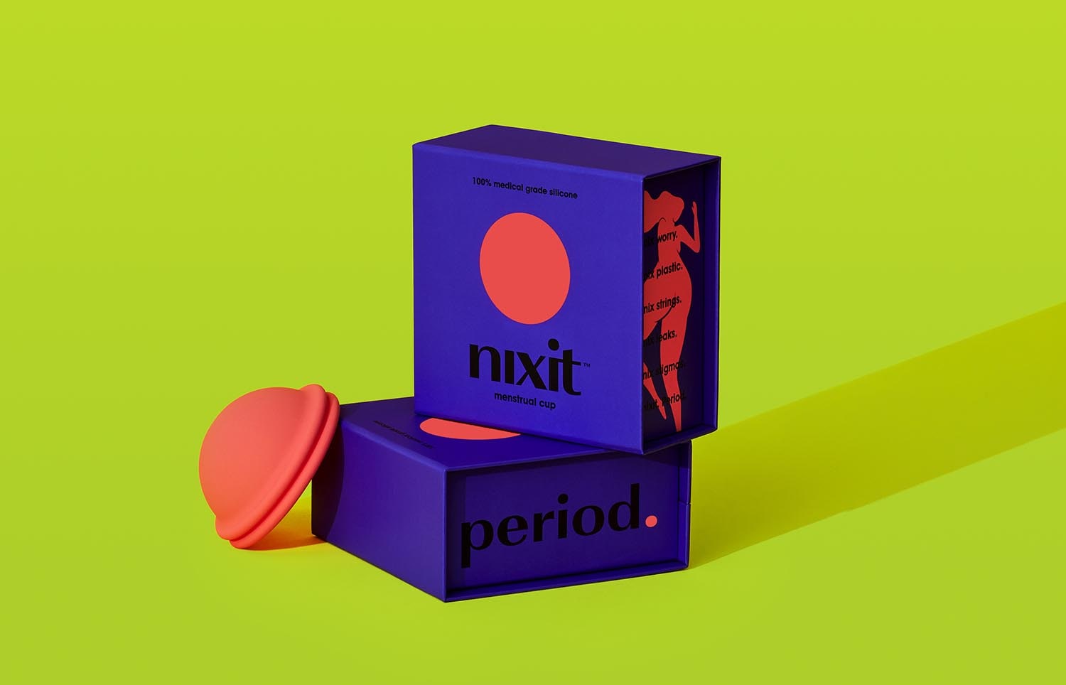
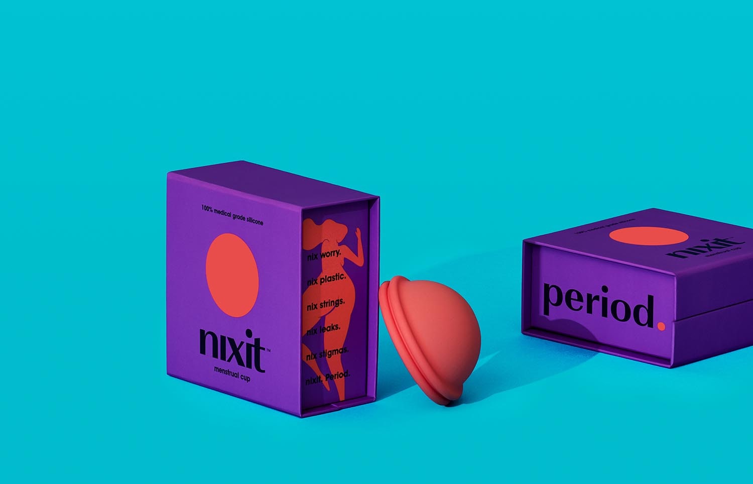
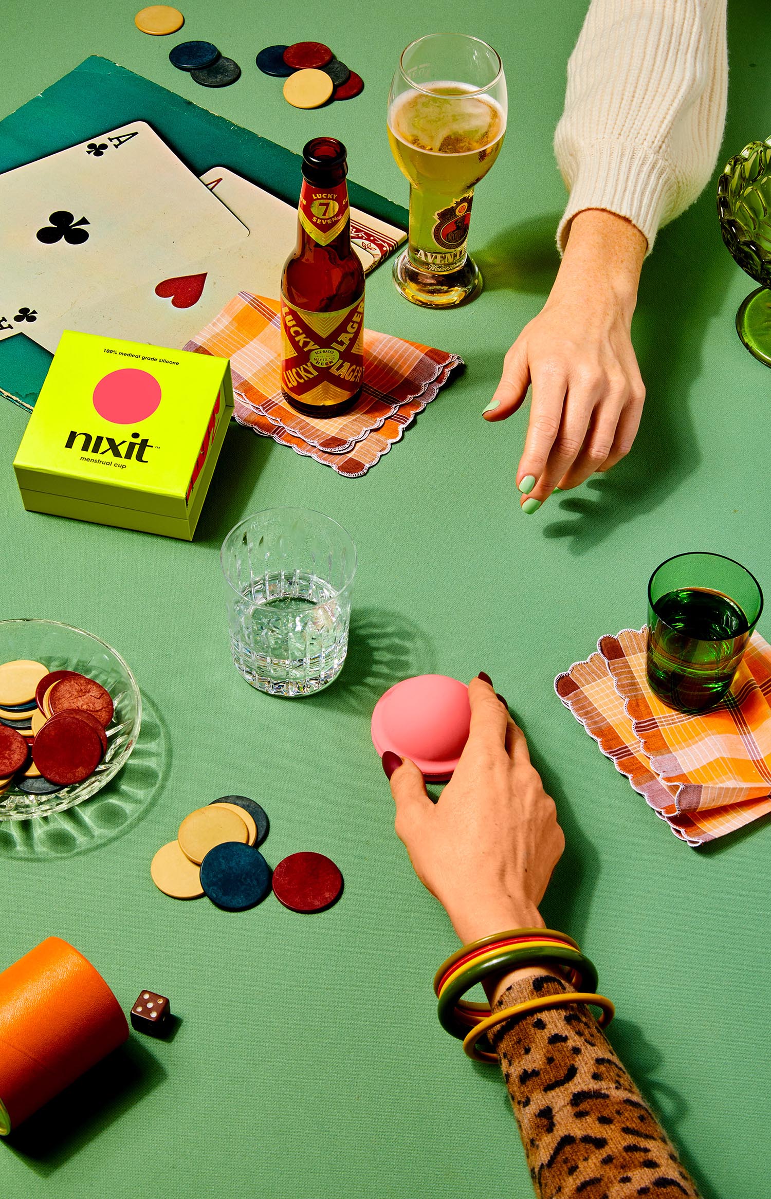
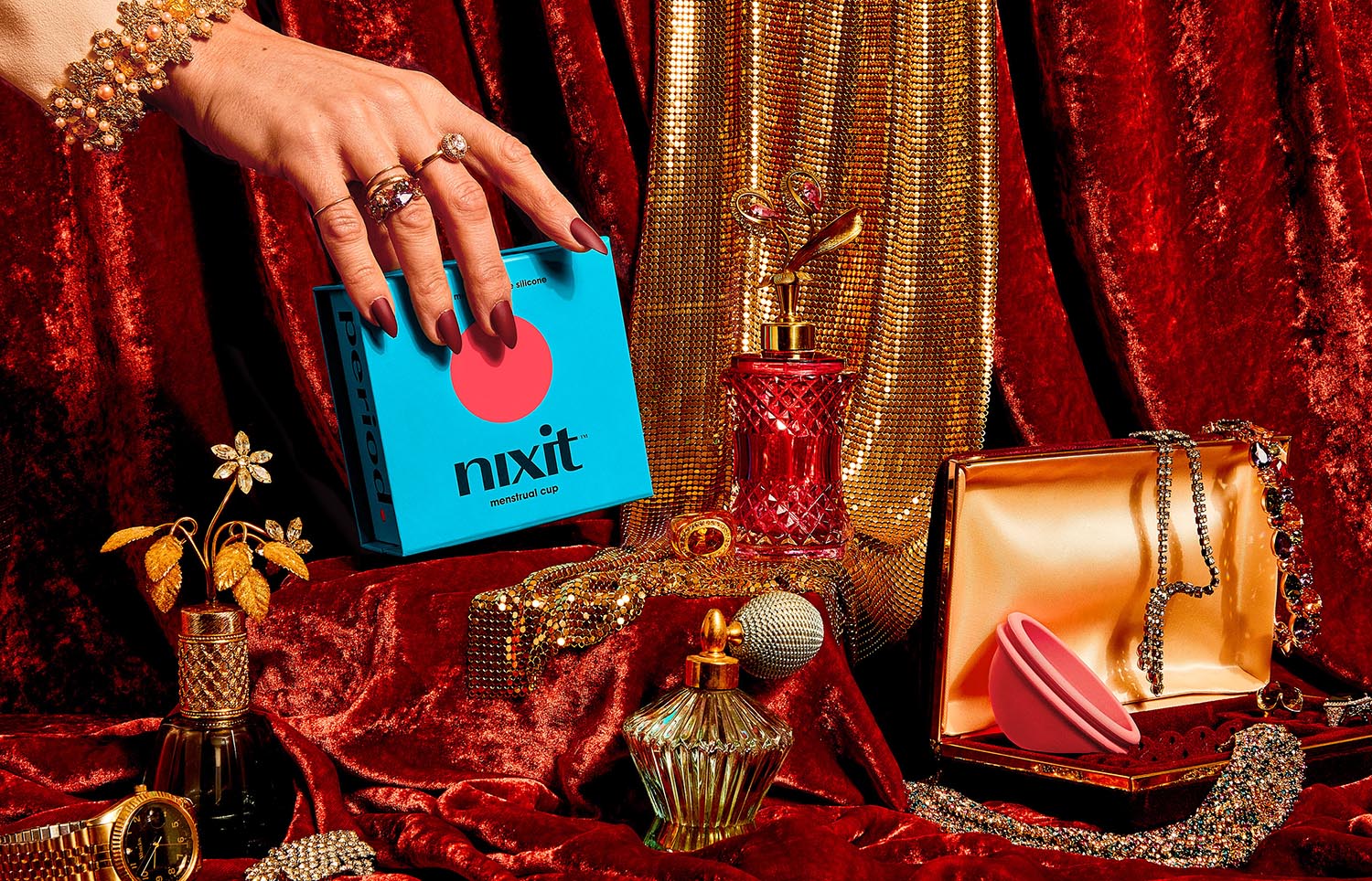
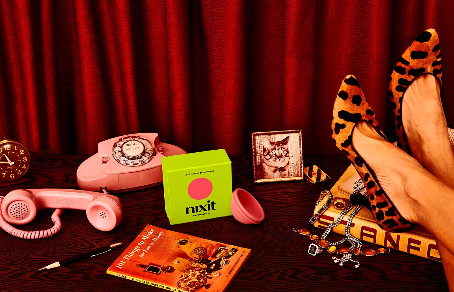
Nixit challenged Designsake Studio to develop the company/u2019s brand identity and packaging, asking for a fresh approach to an otherwise considered 'gross' alternative to typical period products. The studio also needed to highlight the many benefits of using a menstrual cup while empowering women to learn about their bodies, their cycles, and their period/u2019s impact on the planet.
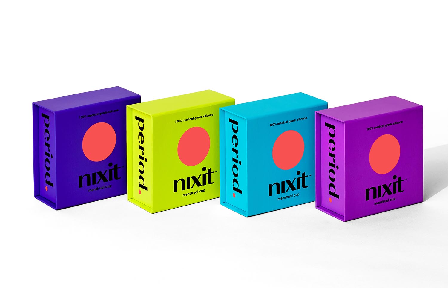
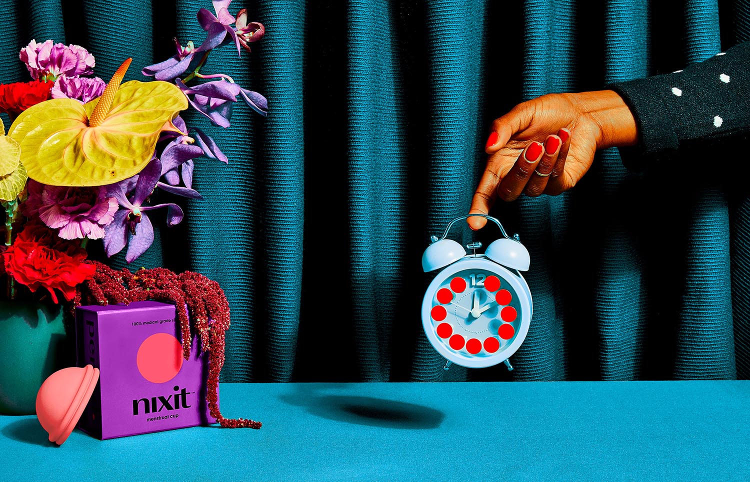
Nixit is a revolutionary one size fits all menstrual cup. It/u2019s circular, soft, suction-free and lasts up to 12 hours. It/u2019s an innovative period product that/u2019s easy to use, better for your health, better for the environment, and won/u2019t bleed your budget.
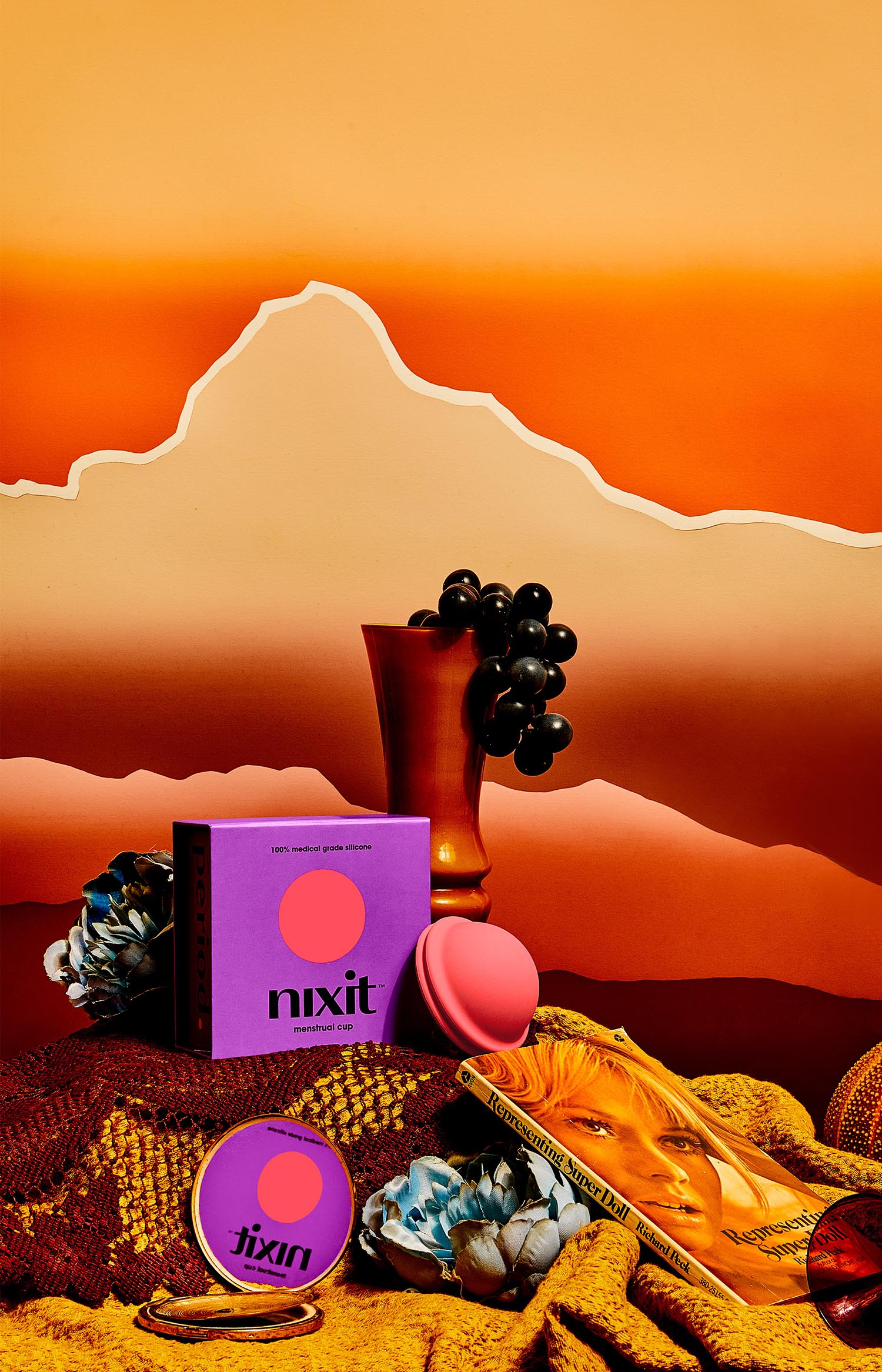
The solve included the use of bright colors, clean typography, premium finishes, and straightforward messaging on several of the boxes/u2019 exterior and interior panels. Playful illustrations allow for a more conversational tone to discuss anatomy and how to use a menstrual cup. Unlike typical tampons, pads, and liners, nixit isn/u2019t overly flowery or feminine. It gives it to women straight because they can handle it.
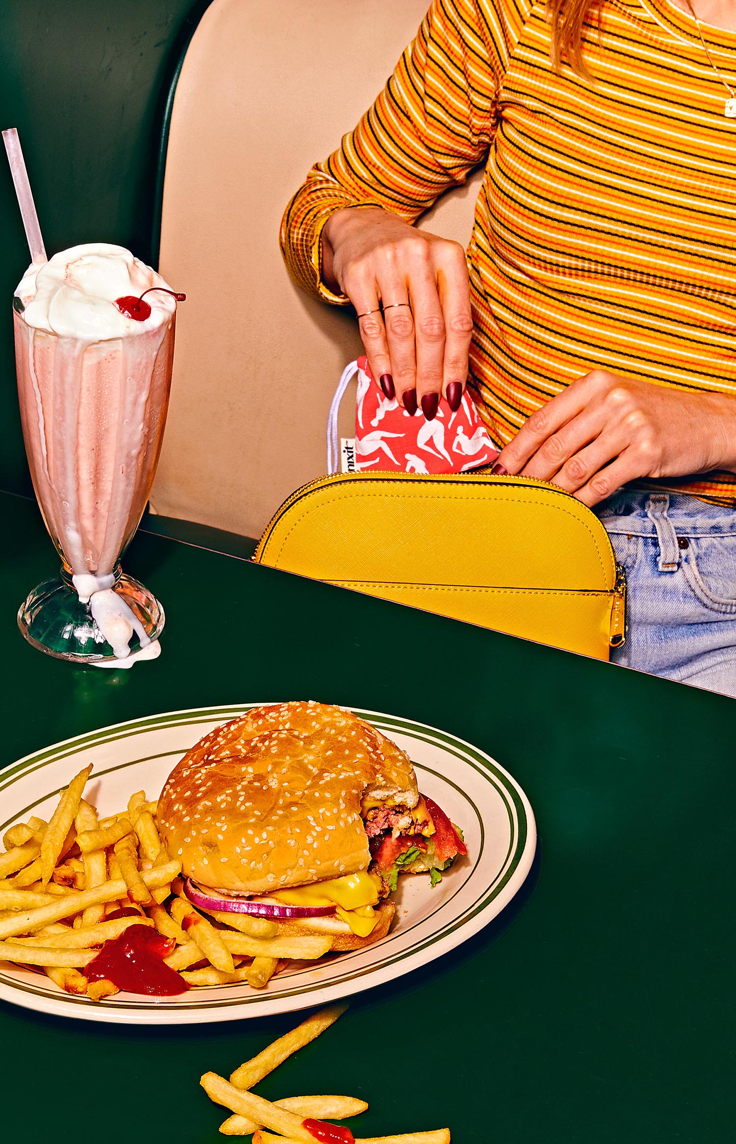
Through the use of photography, Designsake was able to spotlight common slang phrases and euphemisms around menstruation, for example 'lady business', and 'that time of the month', and offer what the 'period positive' version of that phrase would look like. Nix worry, nix plastic, nix strings, nix leaks, nix stigmas. Nixit. Period.
Creator: Designsake Studio