


Epicview
Germany , PfaffenhofenSeptember 27, 2025
Mindsparkle Mag


Coffee isn’t just a drink — it’s a ritual, a culture, and for many, a daily necessity. The way it’s packaged can shape the entire experience, turning a simple bag of beans into a statement of values, craft, and creativity. From bold experiments that push the limits of production to understated designs rooted in tradition, these ten projects show how thoughtful design elevates coffee beyond the cup. Here’s our curated selection of the most inspiring coffee packaging concepts from around the world.
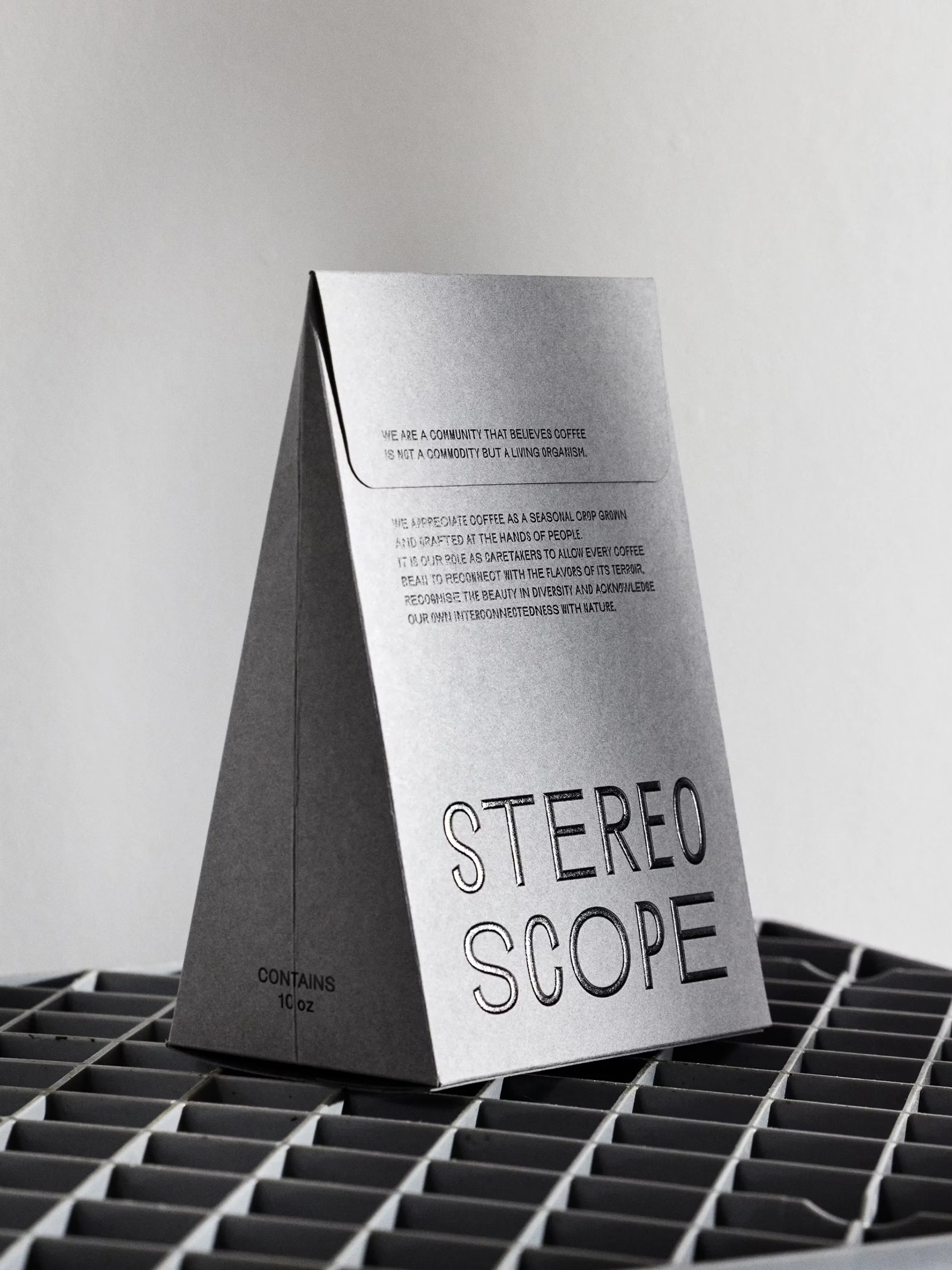
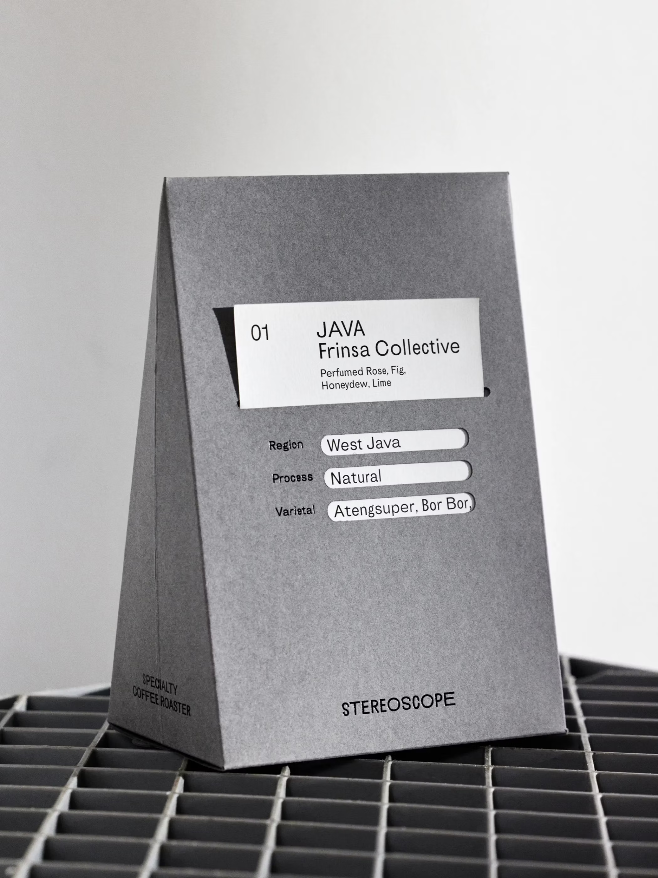
Los Angeles-based roastery Stereoscope teamed with OlssønBarbieri to design packaging that reflects their belief that coffee is a living organism, not a commodity. The concept highlights coffee’s ecological fragility, colonial legacy, and cultural depth, positioning the brand as a steward of nature. Using FSC-certified papers, tactile materials, and typefaces in constant flux, the design embodies duality, balance, and interconnectedness. With plant-based bags, ritualistic tear-open boxes, and a card-based labeling system with trigram cut-outs, the packaging becomes a poetic reminder of coffee’s living story—earning its place among the best in coffee packaging.
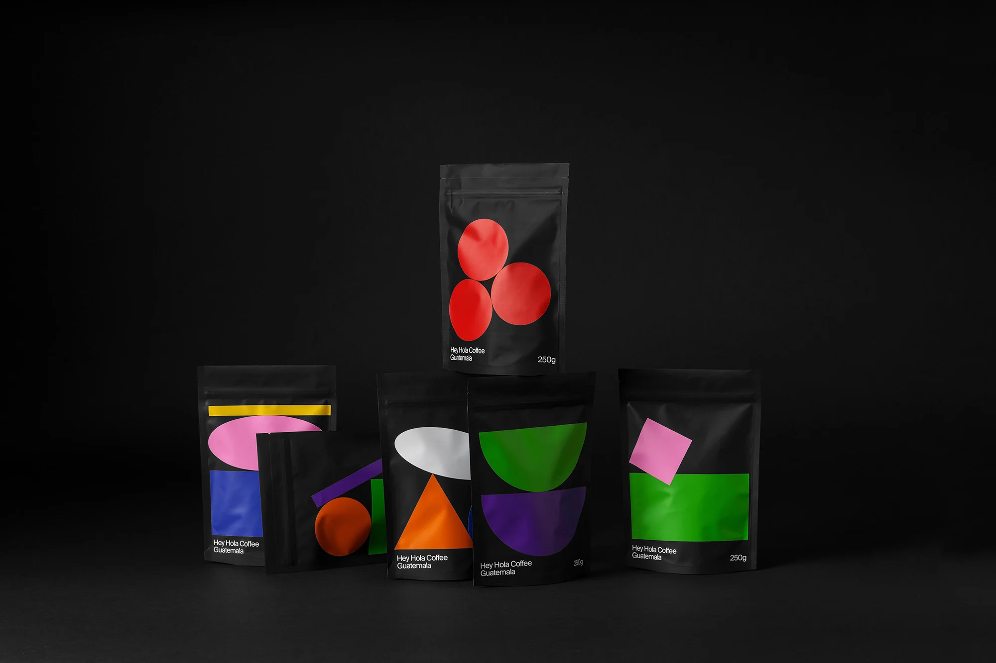
Creativity and coffee have always gone hand in hand, so the launch of Hey’s first specialty coffee—developed with their friends at Madrid-based Hola Coffee—felt like a natural evolution for the studio. The packaging captures Hey’s playful, vibrant spirit through bold geometric shapes, brought to life with hand-applied stickers. This approach makes each pouch a one-off creation, ensuring no two packages are ever the same.
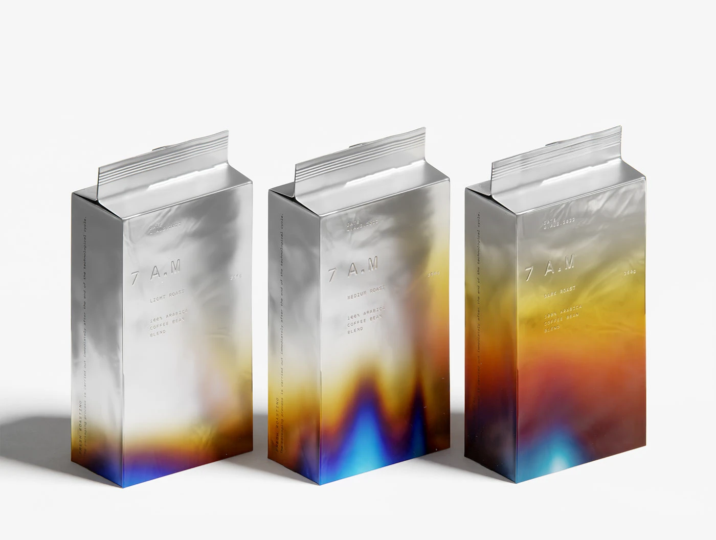
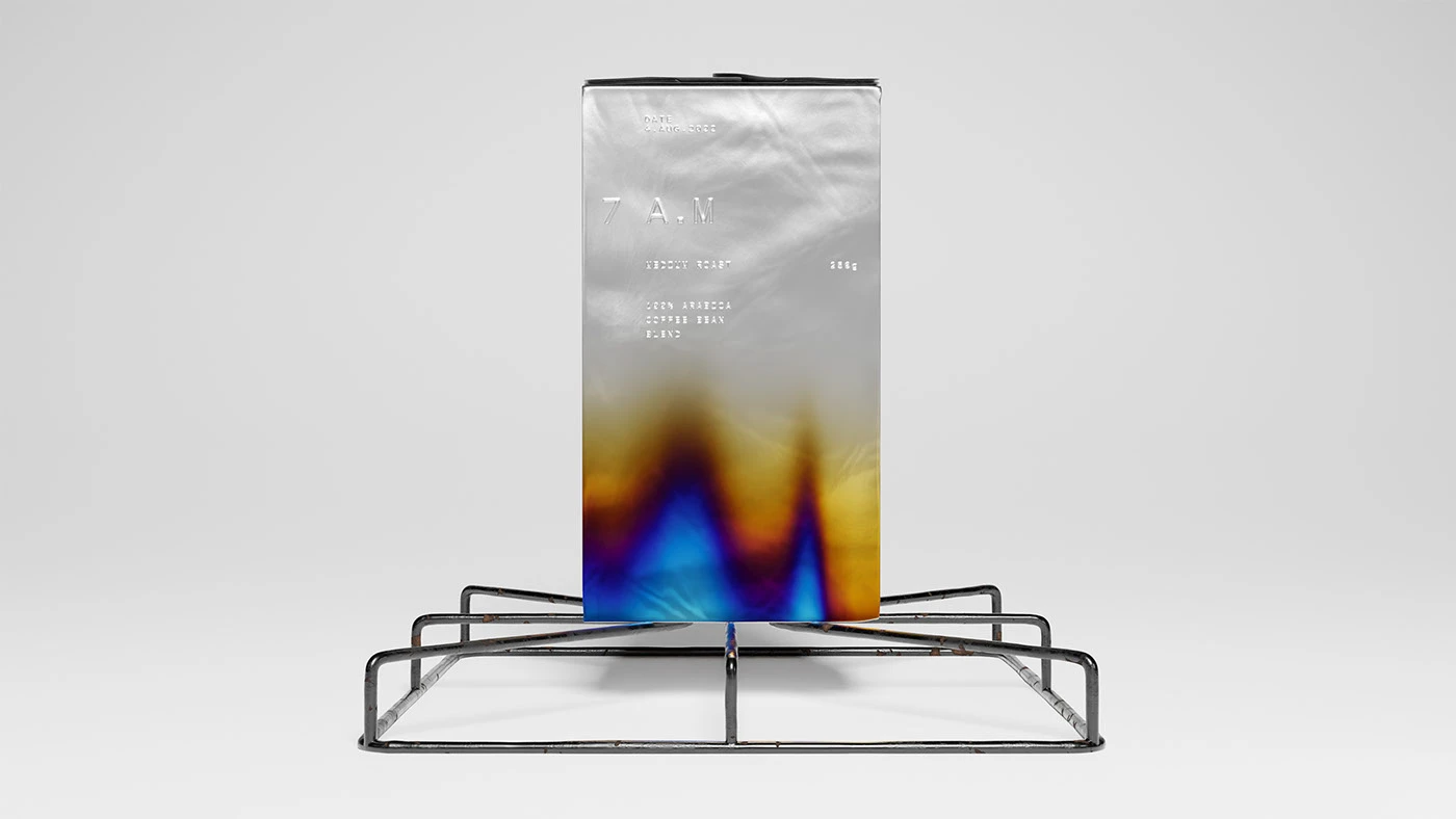
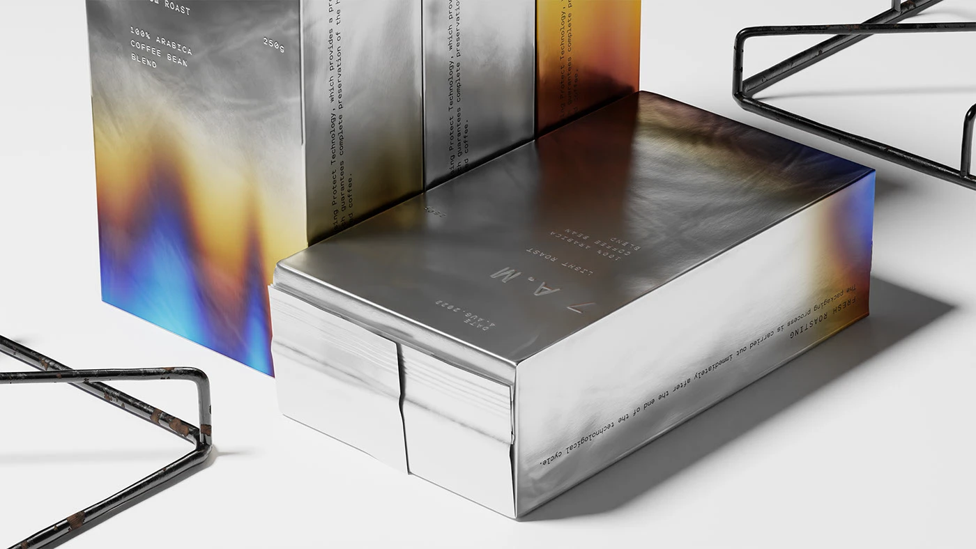
Omsky Studio captured the quiet poetry of morning rituals in their packaging design for 7 A.M Coffee. Inspired by the simple beauty of everyday habits, the concept translates the sensory warmth of freshly brewed coffee into a visual language. Three SKUs represent the roast levels — light, medium, and dark — with the packaging color deepening in tone to mirror the intensity of the roast. The result is a design that turns daily coffee moments into a gentle reminder of life’s small, lasting pleasures.
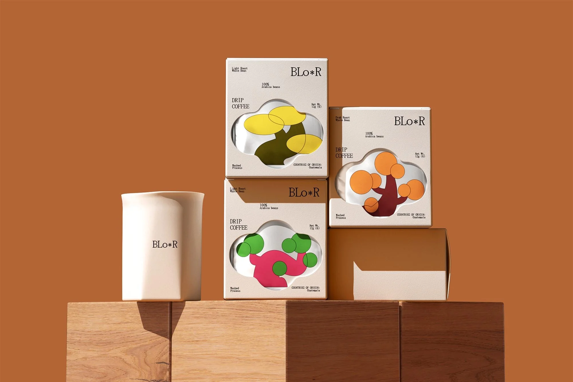
Created by COOOT Studio as a self-initiated project, BLO*R is a conceptual coffee brand that turns daily rituals into sensory journeys. Blending natural vitality with Eastern aesthetic principles, the brand offers 100% Arabica beans and drip bags in five flavors. At its core is the asterisk symbol, representing the intersection of nature and energy while serving as the key visual element across the identity. The result is a bold, experimental system that elevates coffee into a vibrant design experience.
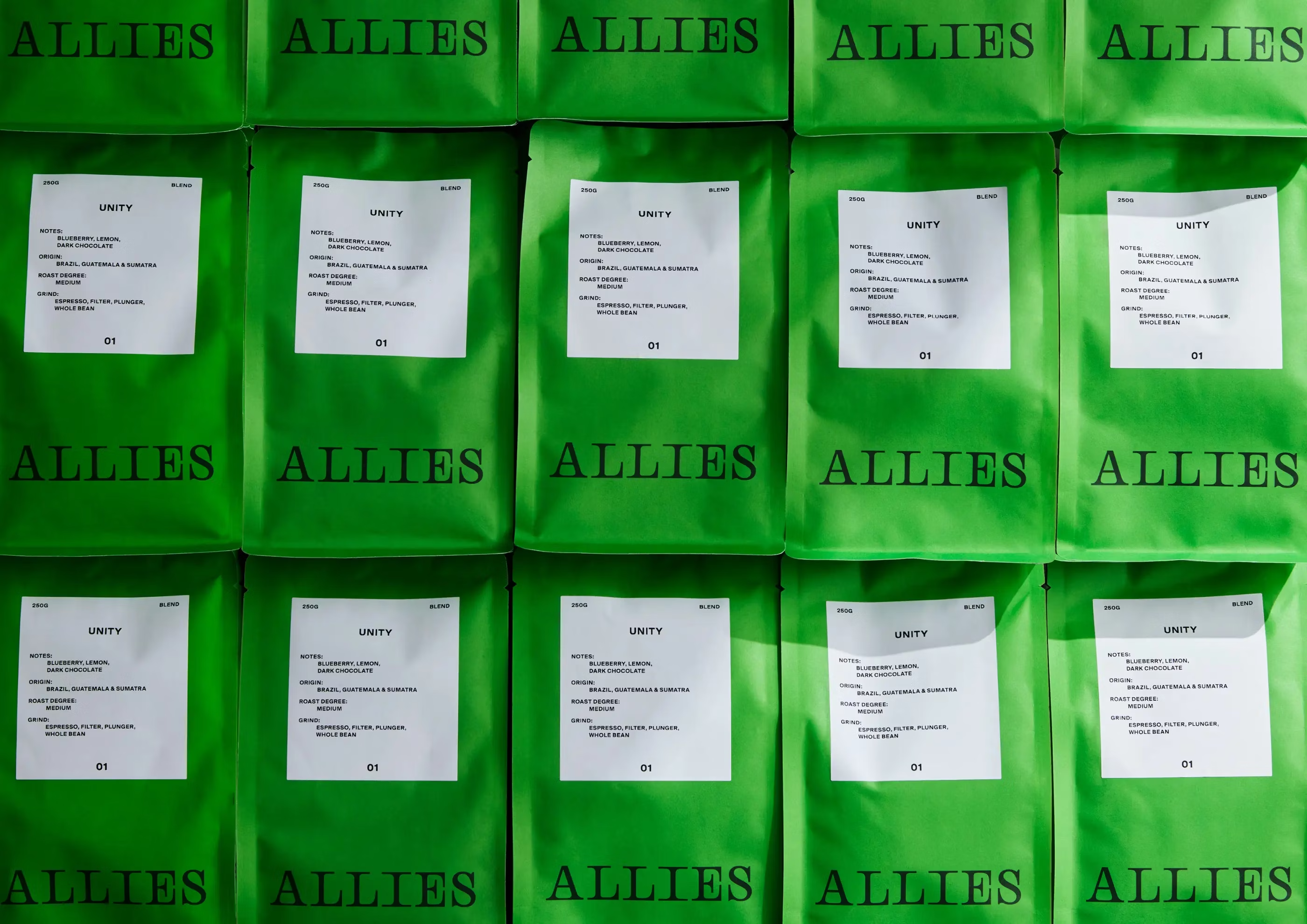
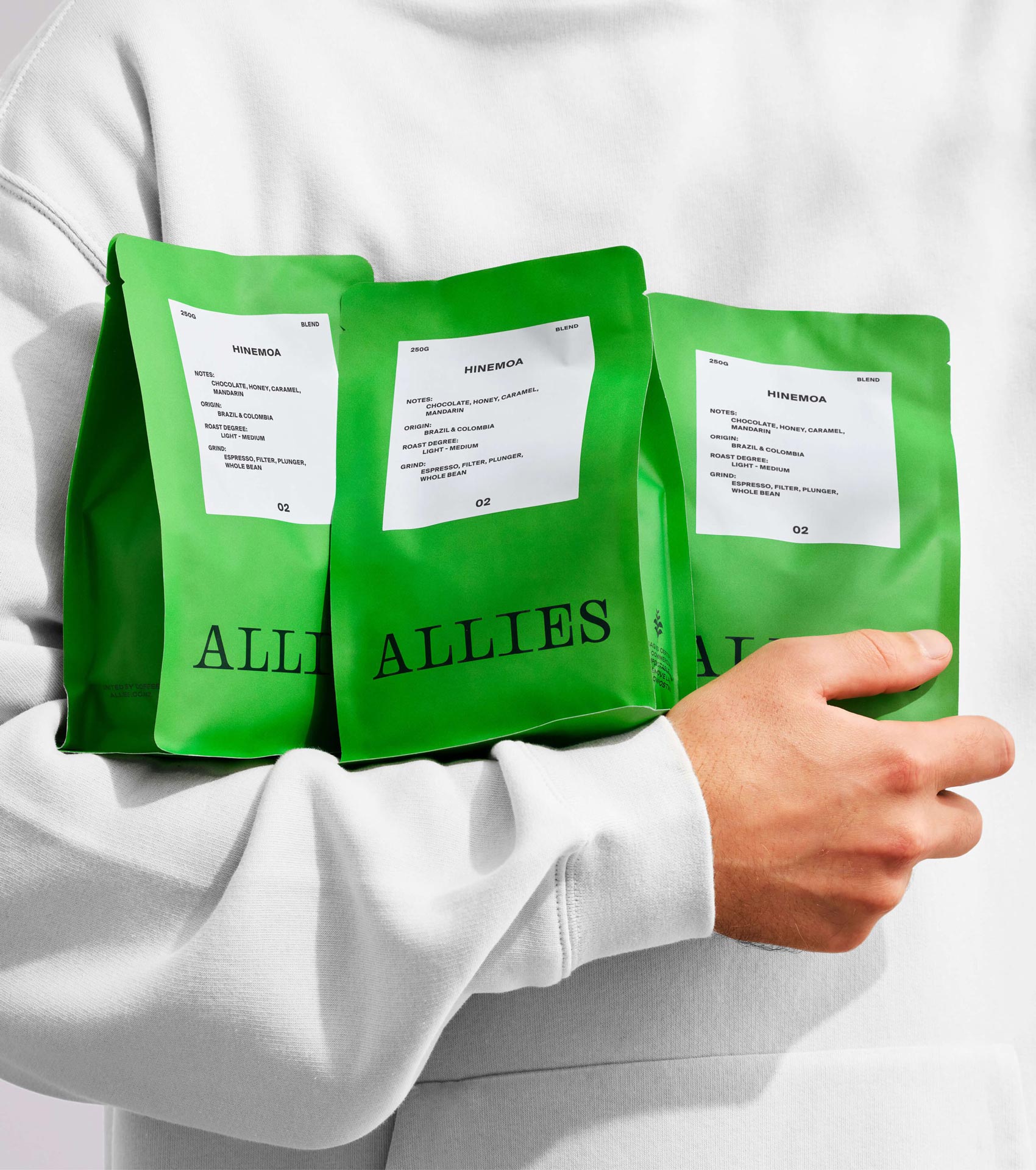
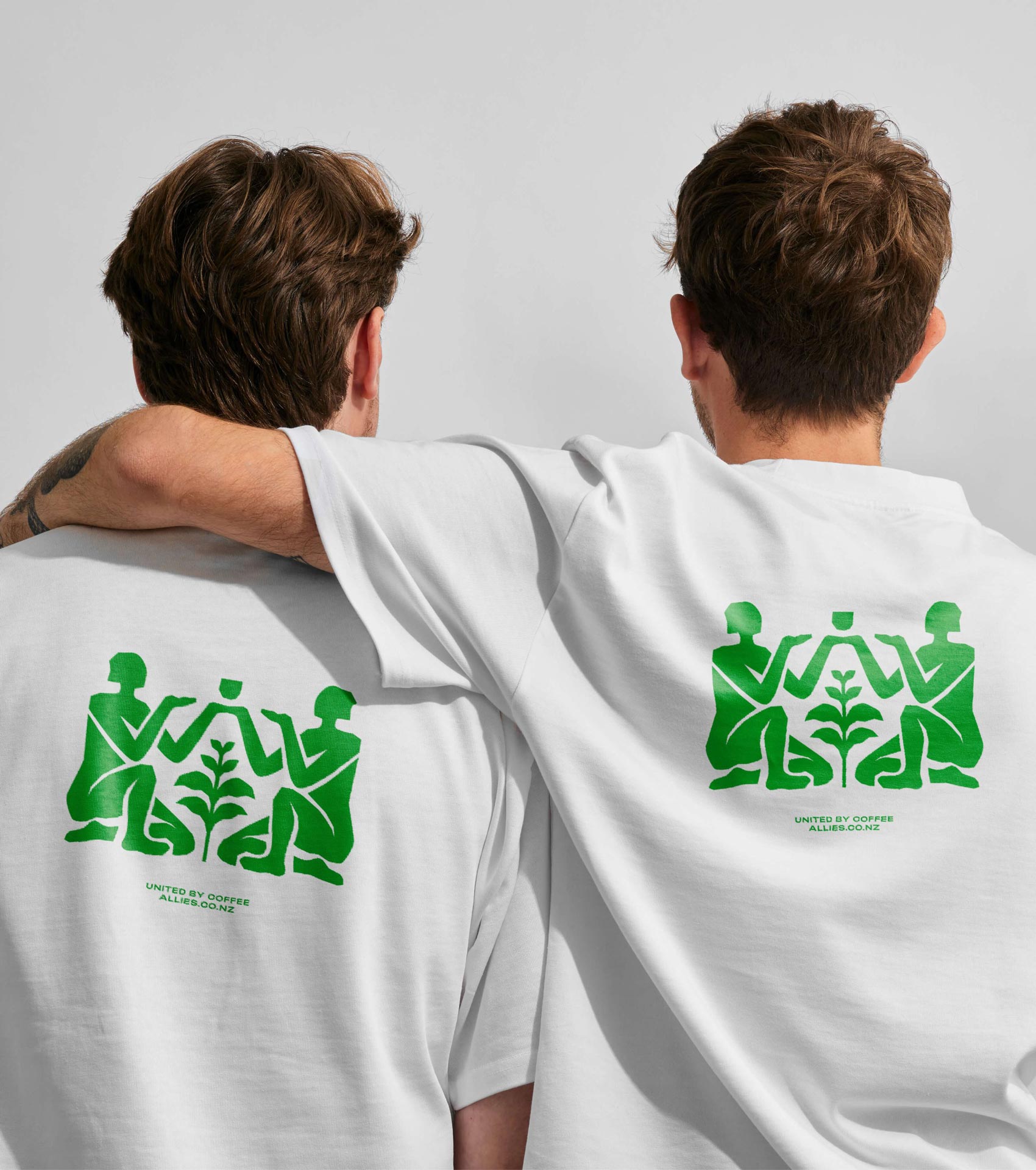
Allies is a small-batch coffee roaster with a big ethos, standing for fairness, freshness, quality, equality, and sustainability. Design studio Seachange created a bold identity that channels this mission into a powerful, unifying brand. The name itself became a rallying call, bringing together customers, cafés, and suppliers around their shared love of coffee. The result is packaging that feels both purposeful and community-driven, amplifying Allies’ passion and values.
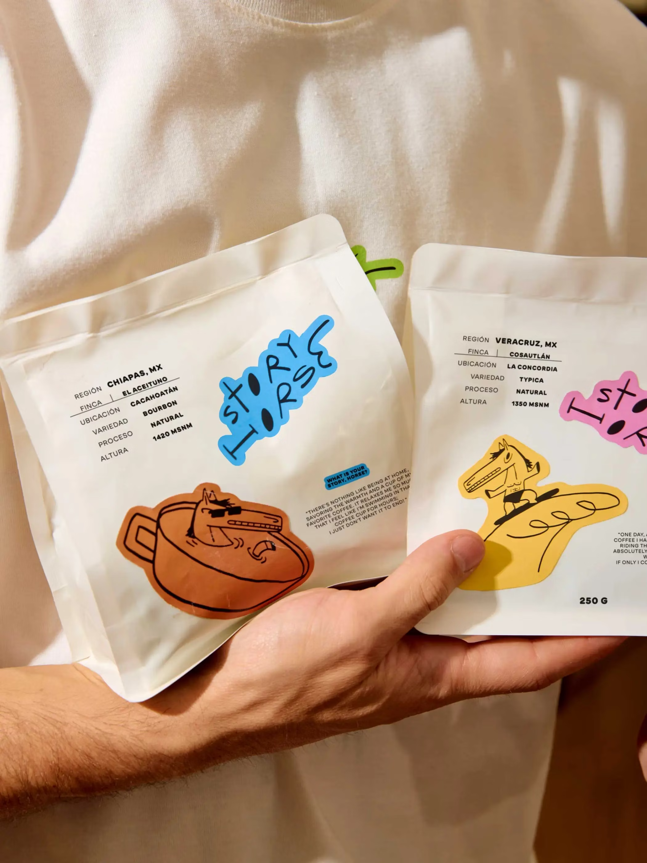
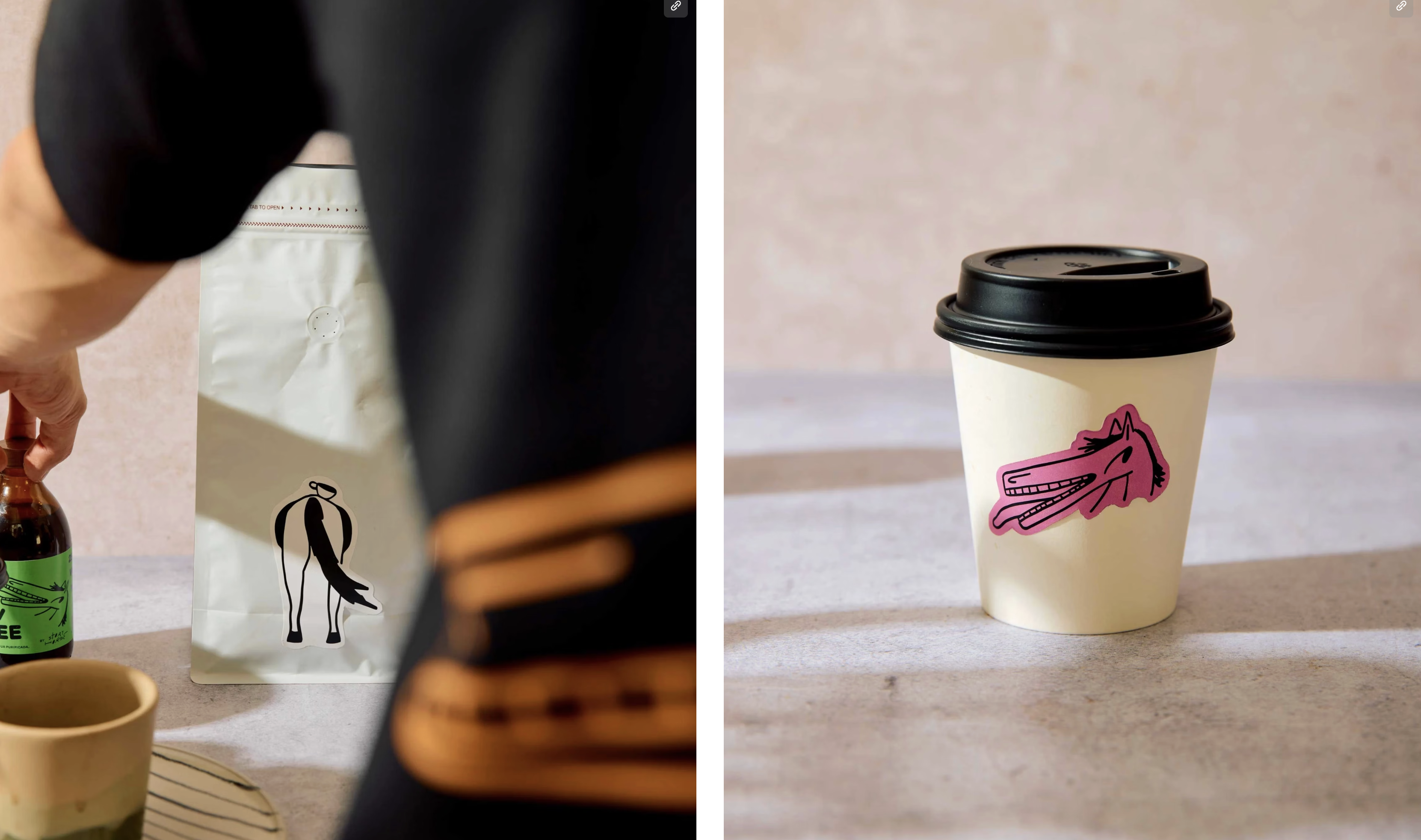
Named after the Irish expression “What’s the story, horse?”, Tulum café Story Horse embodies a playful, laid-back spirit. Mexico City–based designer Andrés Higueros created a custom logo and packaging system centered on a coffee-loving horse character that reflects the brand’s storytelling nature. The design blends bespoke typography with illustration, capturing both the humor of the phrase and the café’s vibrant personality. The result is a distinctive identity that feels warm, fun, and unmistakably memorable.
When chef Borja Roselló founded Dalston Coffee in Barcelona’s El Raval in 2015, he brought with him a love for specialty coffee discovered in London’s Dalston. Collaborating with Ingrid Picanyol Studio, the brand identity began not with a logo but with packaging as its core expression. The result is a playful, neighborhood-focused system where each bag becomes a red-brick house topped with a colored roof that shifts from coffee to coffee. Rich with history, illustration, and typographic detail, the packaging captures Dalston Coffee’s blend of accessibility, community, and craft.
Founded in 2011 as Singapore’s first B Corp coffee company, Bettr is dedicated to social impact and sustainability, from training underprivileged communities to supporting farmers with fair, above-market pricing. To capture this ethos, Singapore-based design studio Anak rebranded the company with an identity built around the beauty of imperfection. Led by Creative Director Hanyi Lee, the design combines bold typography and crafted details to set Bettr apart in the crowded sustainable coffee space. The result is a brand that feels authentic, purposeful, and deeply human.
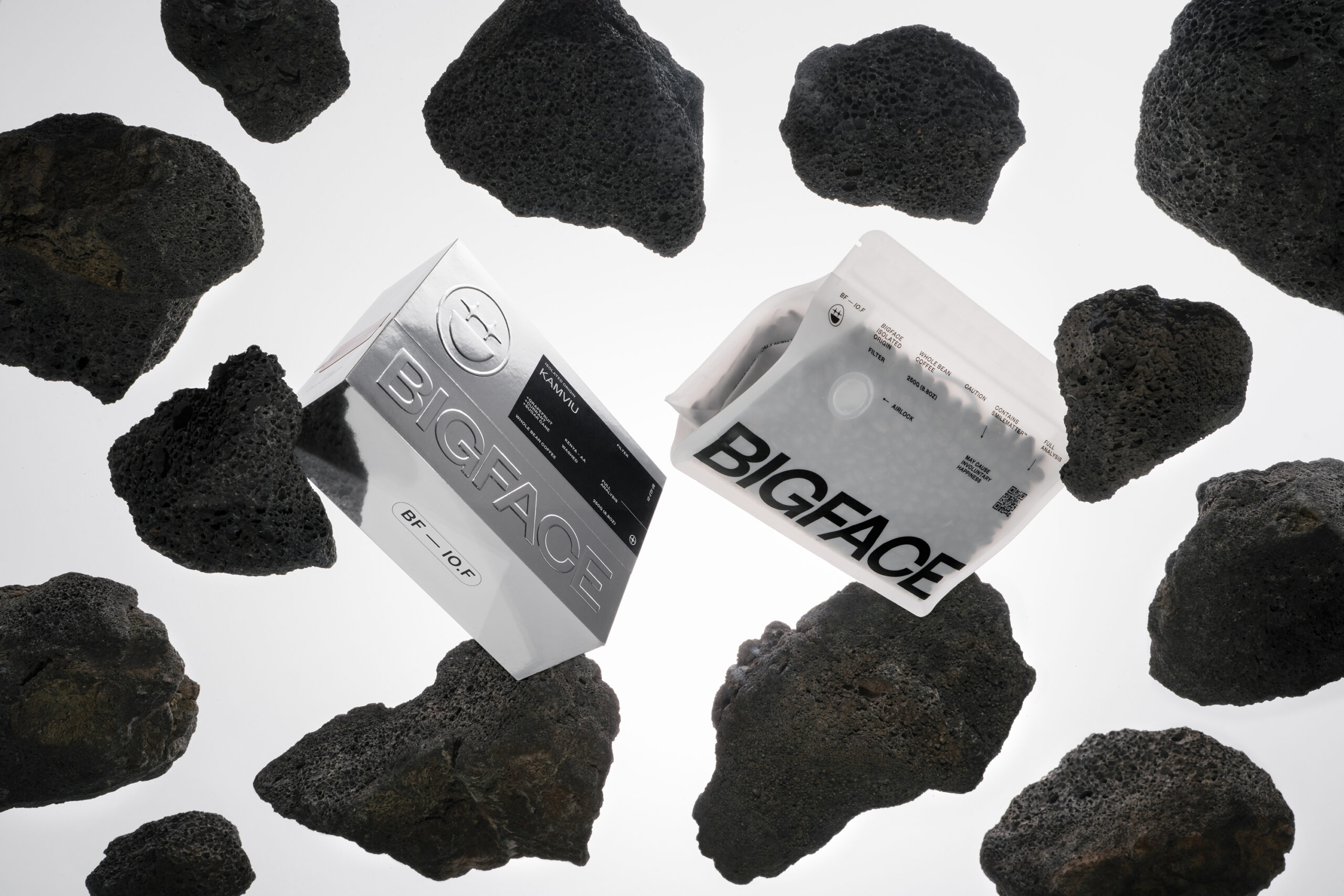
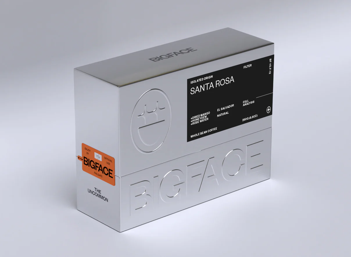
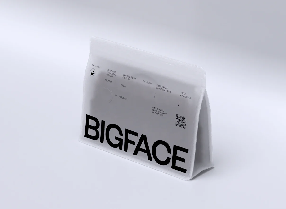
For NBA All-Star Jimmy Butler’s culture-shifting coffee brand BIGFACE, creative studio Brandmonger and manufacturer Zenpack pushed the limits of coffee packaging design. What began as Butler’s hotel-room side hustle during the 2020 NBA bubble evolved into audacious boxes once thought impossible to manufacture. Featuring hyper-precise embossing, custom bags, and meticulous construction inspired by luxury electronics, the packaging delivers a futuristic unboxing experience “too good to throw away.” The bold system has won multiple design awards, cementing BIGFACE as one of the most ambitious and unforgettable coffee packaging projects to date.
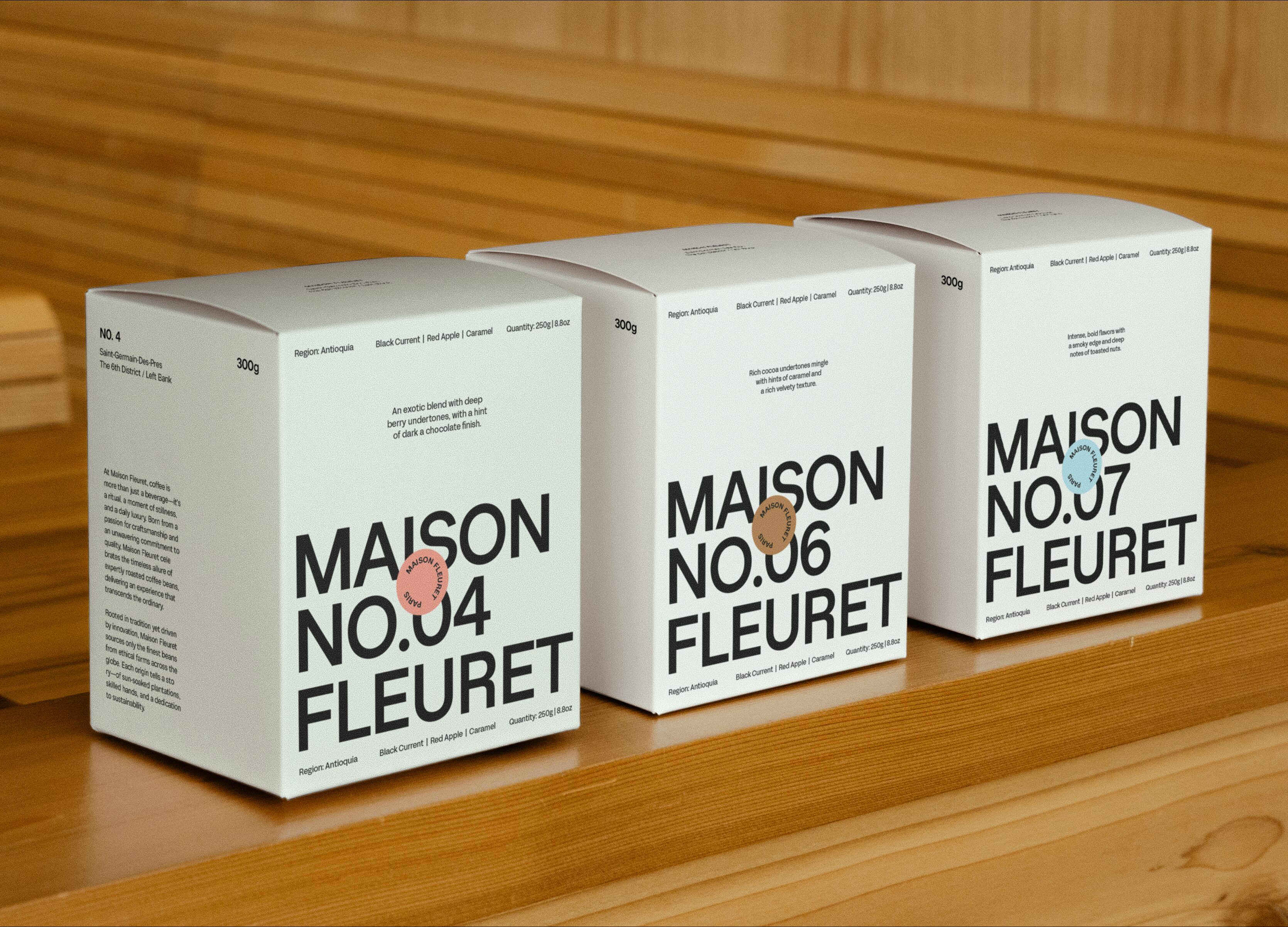
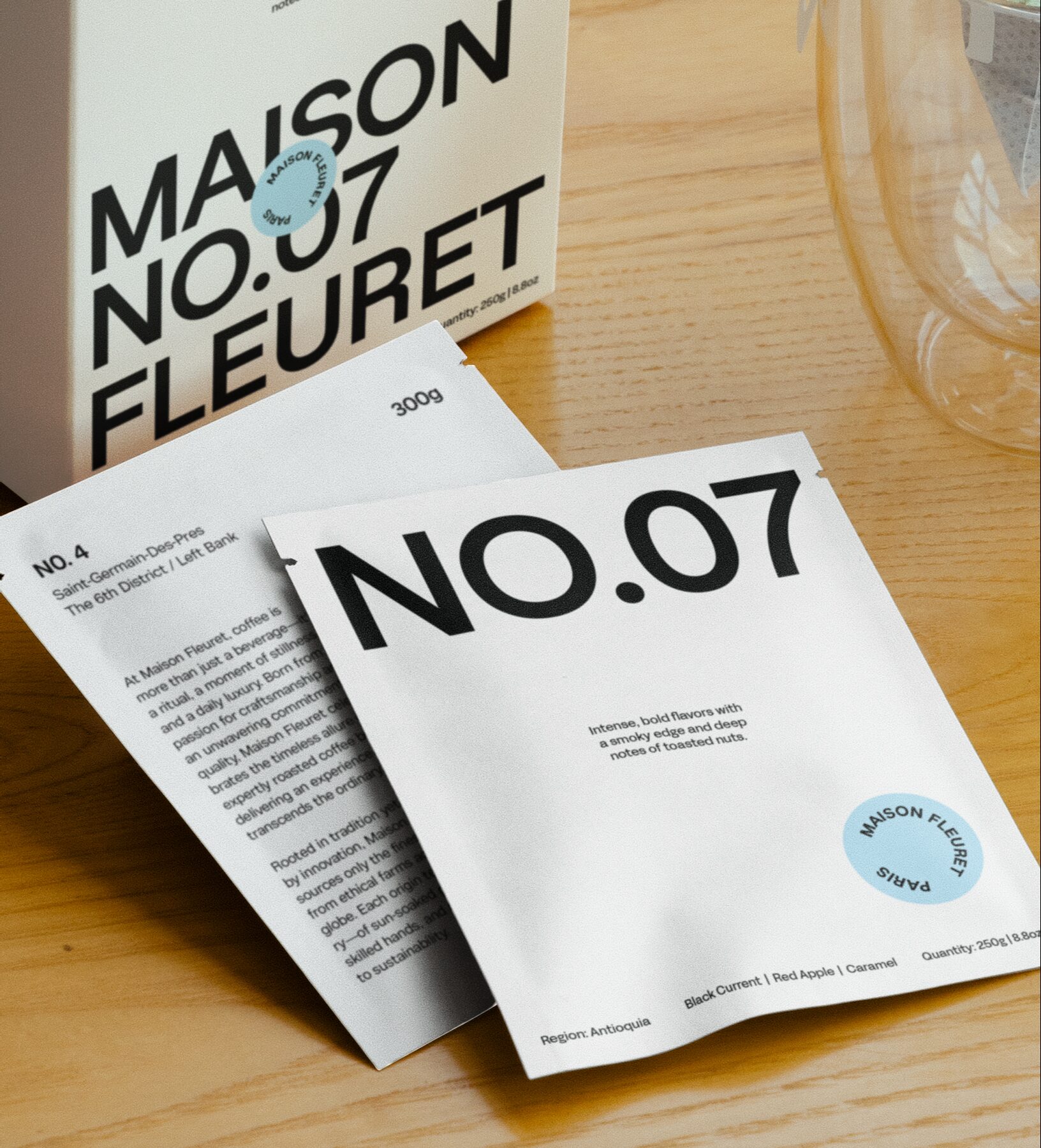
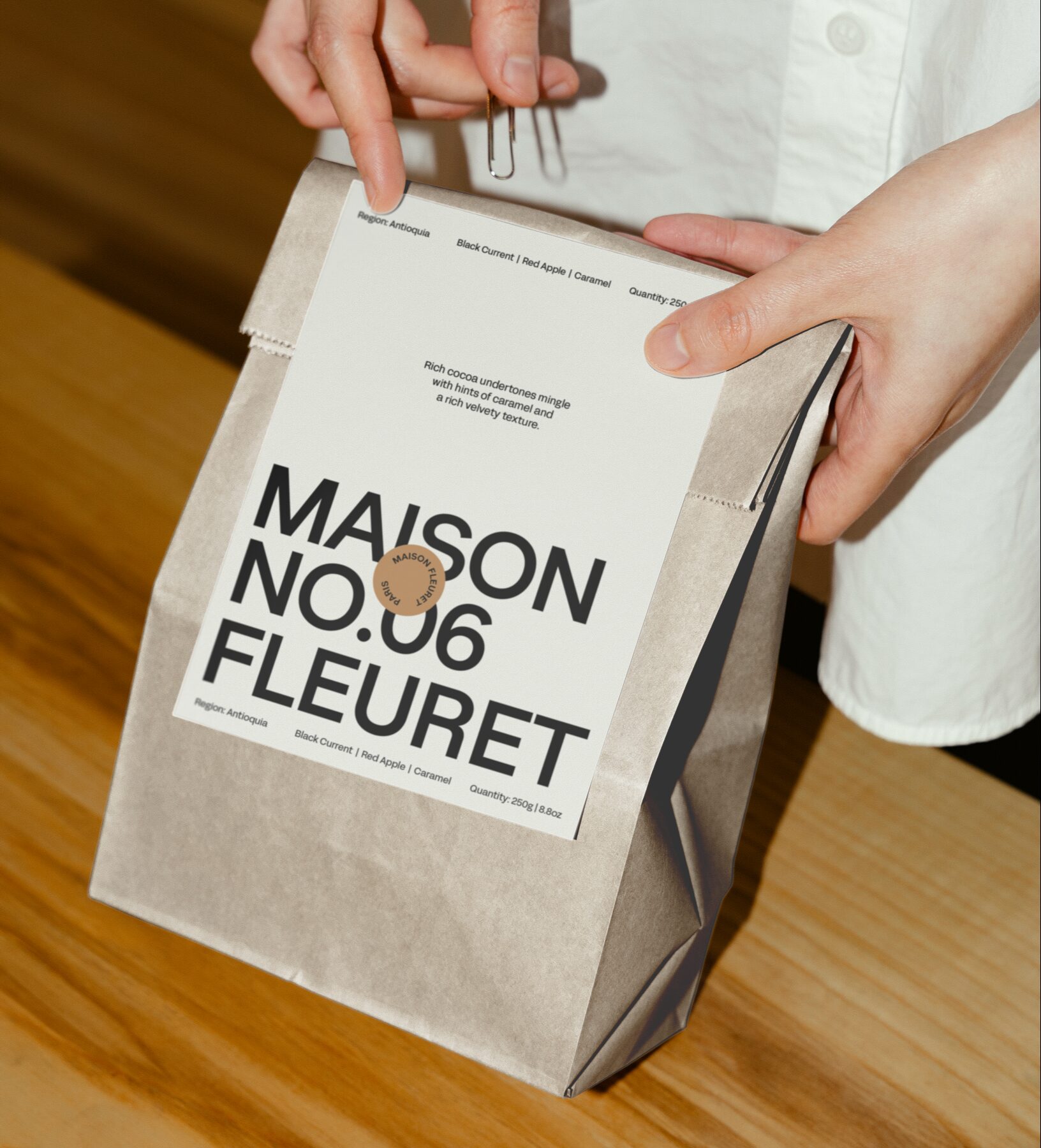
Paris-based Maison Fleuret is a refined brand spanning a coffee shop, baking school, estate, hotel, and a premium product line including wines and specialty coffees. Rooted in French tradition and sophistication, the identity by Carla Palette is intentionally timeless and understated, centered on a custom Sterling Sans logomark that adapts seamlessly across touchpoints. A supporting illustration system enriches each sub-category, while packaging uses a precise color and numeric code—borrowing clarity from luxury cosmetics—to distinguish blends and wines. The result is a cohesive brand world where every detail reflects Maison Fleuret’s commitment to authenticity, elegance, and an elevated customer experience.